Data Visualization Templates
In the world of graphic design, web design and motion graphic design, the use of templates is widely spread. Templates are ready-made project files that can be customized and used as the basis for various types of media content. Working as a web and graphic designer, I myself work with templates on a regular basis. Though discussions have evolved around the pros and cons of their use, templates have permeated all aforementioned fields of design. Hollywood blockbusters and popular music videos use the same Trapcode Form effects (see figure 1), website builders use the same website templates and the same graphic elements keep appearing in logo designs.

Figure 1. The same Trapcode Form effect used in different music videos by Tiësto, Depeche Mode and Radiohead.
These templates can be bought from websites that function as marketplaces for authors and buyers of ready-made content. Some of the most well known websites such as iStockPhoto (launched in 2000), GraphicRiver and VideoHive (both launched by Envato in 2006) feature millions of items in lots of different categories. It is well known that for example stock photographs are widely used on websites and in editorials (so much even that various lists exist of images that have become too popular to use). As mentioned before, certain visual effects seem to be used over and over again as well. And new builders of websites hardly ever start a project from scratch. But what is the state of templates in the world of data visualization?
Data Visualization Templates on Offer
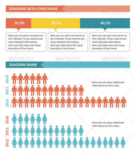
A good starting point would be the aforementioned websites selling templates and stock footage. A search for items tagged with “data visualization” on VideoHive yields only six results of which only two seem relevant. Together however, these templates have been sold 714 times. The same search on GraphicRiver yields 86 items with the top result alone selling more than 1500 copies. Though tagged with the words “data visualization”, most of these items are closer to the description of “infographics” as they are mostly static, non interactive, manually designed visualizations. In a similar fashion, searching for “data visualization” on iStockPhoto returns no relevant results, but changing the query to “infographics” immediately returns large sets of infographic templates similar to the one in figure 2.
 Figure 2. A snippet from an infographic template for sale on GraphicRiver.
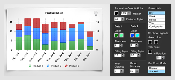
Extending the search to CodeCanyon and ActiveDen reveals a collection of templates for interactive visualizations. These are actual customizable data visualization applications that can dynamically load different data sets (see figure 3).
Figure 3. An example of a customizable interactive data visualization template for sale.
When reviewing the description texts for the items on offer, a common idea can be noted. For example, one description reads:
“This is a nice set for your imagination and the ability to turn a boring business information into something more pleasing to the eye and clear mind [sic].”
Another accompanying text described the contents of the file as:
“8 simple inforaphic [sic] elements, a great way to jazz up your information to make it look beautiful.”
On VideoHive, the description of an animated motion graphic design template (visible in figure 4) reads:
“Infographics are a great way to get simple information across to an audience in a visually interesting way. Although, they mostly remain still images. That is, until now. With ‘Infographic Data Visualization’ you can easily convey the information you need quickly and clearly. And with universal man and woman, a map with indicators, word bubbles, pie chart setups, bar graph setups, tab and flag placeholders, all included, no project is too small. Any data can be communicated; dates, times, dollars, percentages, ages, ingredients, names, you name it, you can do it. And with the color of the whole project wired into three fills, you can easily find the look and feel you and your client are after.”
Figure 4. An animated template on VideoHive. Note how the template tells you what kind of data you need to fill it optimally.
All these descriptions focus on the idea of visually appealing visualizations, that are clear, simple and quick and “jazz up boring” information. Furthermore, there seems to be a sharing of the idea that these design elements can be used to communicate any type of data.
Universal Building Blocks and the Risk and Benefits of Data Visualization Templates
Various authors have looked for guidelines and building blocks for effective communication of different types of data in visualizations. For example, Steier et al. have explored the relationships between data and style elements. In their exploration of how sensory cues direct attention, they note that:
“Timelines work well for summarizing sequential data; network graphs summarize relationship data; and maps summarize spatial data.” (Steier et al. 2012: 4)
Their train of thought here is aimed at how choices for certain style elements can help allocate attention of users of data visualizations.
Engelhardt has performed extensive research into the universal principles of visual representation. Aware of the difficulties of a universal language for visualization, he states that:
“Critics of such assumptions of universality point out that any visual language is a social construct, and greatly dependant on context and culture. And they are right, of course. There is no such thing as ‘the universal visual language’ that all humans share (the visual sign languages used by deaf people also differ enormously throughout the world). This does not mean, however, that no ‘shared basic principles’ can be found in the diversity of visual representations.” (Engelhardt 2012, forthcoming: 8)
Engelhardts work includes an extensive notation of the types of data that exists and how they can be represented (Ibidem: 12). He continues that:
“For designers of graphics it can be useful to be aware of – and to be able to ‘play with’ – the universal graphic representation and combination possibilities arising from the different types of Meaningful Spaces and the different types of Visual Objects that I have suggested here. What really matters in the end however, is how graphics are used.” (Ibidem: 13, my emphasis)
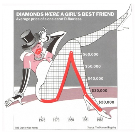
The way graphics are used in data visualization raises various potential benefits and risks (see for example Bresciani and Eppler 2008, Kellen 2005, Steier et al. 2012 and Yudin 2011). Additionally, the use of data visualization templates has another set of potential risks and benefits. Similar to discussions over the use of (web) design templates, more appealing visualizations through the use of templates can empower creators to create visualizations that reach bigger audiences. Furthermore, when certain templates become popular and widely used they may even help audiences understand the story of a visualization better because they more readily understand the meaning of design elements. In that sense they could contribute to a universality of the data visualization language. And templates are exemplar of the existence of certain shared building blocks. Practically, templates may decrease the time needed to make data visualizations, saving money and valuable resources. However, a real danger lies in the tendency of the existing templates to focus on being visually appealing rather than being the best match for data, story and audience. This has historically been a risk in data visualization (see figure 5) and for example 3d bar charts that are often criticized by data visualization practitioners and scholars are quite common in the templates.
Figure 5. A classic example of focusing too much on the visual appeal? Chart by Nigel Holmes, TIME 1983, in Tufte 1990: 34.
A template with great aesthetics can be the icing on the cake for data visualizations when the data, story and presentation match, but when the template becomes the cake problems arise. As noted by Engelhardt, though certain “shared basic principles” can be found in visualizations, he also clearly states that there is no one universal visual language (Engelhardt 2012, forthcoming: 8, 13). The presentation should fit the data and it should fit the target audience so the story can be understood. Certain templates may cater to certain audiences and in that sense be good matches, but it seems unlikely that a certain template will fit all types of data and be understandable for all audiences. Generally speaking, data visualization templates seem to be focused on just being visually pleasing and risk losing the connection with the data, story and different audiences.
Conclusion
Though the number of data visualization templates that are available online is still relatively small (in general, stock sites feature millions of items so a few hundred data visualization templates are only a tiny speck in their database) their existence should not go unnoticed. The spectrum can be widened by including popular websites such as Google Public Data Explorer and Many Eyes that offer limited visualization options – templates one might say – for their online data visualization software. A further increase of the number of templates and standardized visualization tools online seems inevitable though, as the economic gains of offering data visualization elements and software combined with the ever growing number of users and producers probably will prove appealing to smart entrepreneurs jumping on the data visualization bandwagon. In the end, hopefully creators of data visualizations that contemplate the buying of a template will ask the important question: will this template really match the data, story and my audience? If not, do not let the template become the cake and continue to create your own visualization that supports your efforts. If it does match? Buy the template and save the time and resources so that you can work on other more innovative data visualization projects. Maybe your innovative project itself can even become a great template someday, doing justice to its data, story and audience.
References
Bresciani, Sabrina and Martin Eppler. “The Risks of Visualization. A Classification of Disadvantages Associated with Graphic Representations of Information.” Knowledge-communcation.org. 2008. 3 July 2012. <http://www.knowledge-communication.org/pdf/bresciani-eppler-risks-visualization-wpaper-08.pdf>
Engelhardt, Yuri. “Graphics with a Cause – Neurath, Rosling, and the Universal Principles of Visual Representations”. On Information Design. 2012, forthcoming.
Kellen, Vince. “Decision Making and Information Visualization: Research Directions”. Personal website. 2005. 3 July 2012. <http://www.kellen.net/Visualization_Decision_Making.htm>
Steier, David, William Eggers, Joe Leinbach, Anesa Diaz-Uda. “10 Tips for Data Visualization”. Govtech.com. 2012. 3 July 2012. <http://www.govtech.com/pcio/10-Tips-for-Data-Visualization.html>
Tufte, Edward. Envisioning Information. Cheshire, CT: Graphics Press, 1990.
Yudin, Ekaterina. “Decision Making 2.0 With Data Visualization?”. OWNI.eu. 2011. OWNI. 3 July 2012. <http://owni.eu/2011/04/20/decision-making-2-0-with-data-visualization/>


