Music visualizations as a means for discovery
The basic idea behind information visualization (InfoVis) is that it takes an otherwise stagnant data set of facts and numbers and transforms into an imagery filled with visual patterns and elements. While this idea is certainly not new it has been regenerated from the cartographer days to a more modern means to express and exchange information for a variety of purposes. Specifically using visualizations for music has yielded some interesting concepts that transpose the senses from ears to eyes.
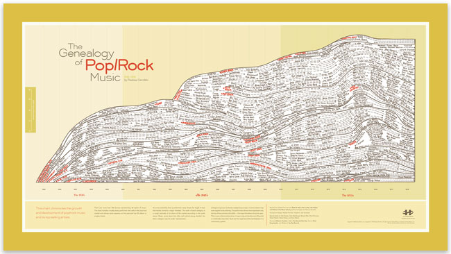
One doesn’t typically think of the music industry as having a scientific element to it. However enthusiasts, executives, programmers and designers alike have gotten a bit more creative with understanding the massive amounts of data entangled in the music industry. Using visualizations in music, or rather for music, can be traced back to the iconic image from Reebee Garofalo – The Genealogy of Pop/Rock Music. Garofalo created this image to chart the growing number of genres and artists in pop and rock between 1955 and 1978. By manually researching and capturing this information as he did, Garofalo ultimately created a piece of music history with his image.
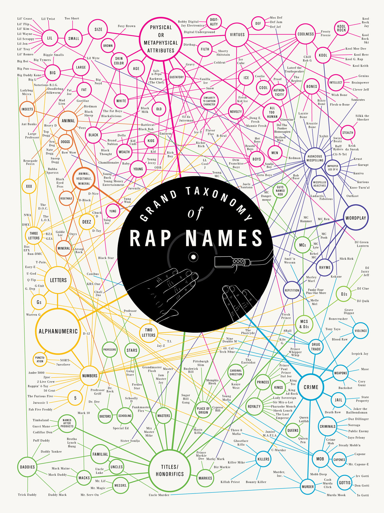
Perhaps a more modern version of this chart is the Grand Taxonomy of Rap Names infographic. This clever image (full disclosure: I purchased it the day I saw it!) is a network diagram which links the artists together based on various semantics.
However, these images are just that – images. They’re stagnant and while they are unique and visually appealing they’re really just reorganizing readily available data. But isn’t this the purpose of InfoVis? Yes. But my ultimate point is that they don’t aim to identify anything that we don’t already know. It’s just basic visualization.
There are however, progressive attempts being made in the music industry to use visualization to discover new trends, build applications and overall, more closely understand music and music listeners. One such pioneer for development is Paul Lamere. Paul is the director of the application developer community for music intelligence company, The Echo Nest. Most recently, Lamere spoke on the state of music visualizations and music discovery at SXSW where he shared some interesting insights.
“In a study of study of 5000 listeners he discovered they had 35,000 tracks of which 65% of them had not been listened to once.”
In short, Lamere seems to be evaluating existing visualizations to create the clearest, not necessarily shortest, path between genres, artists and songs. The idea is that listeners are completely overwhelmed with music options and there has to be a simpler, better way to discover new music. Enamored with his collection of visualizations I reached out to Lamere and asked him about the goal of such a project:
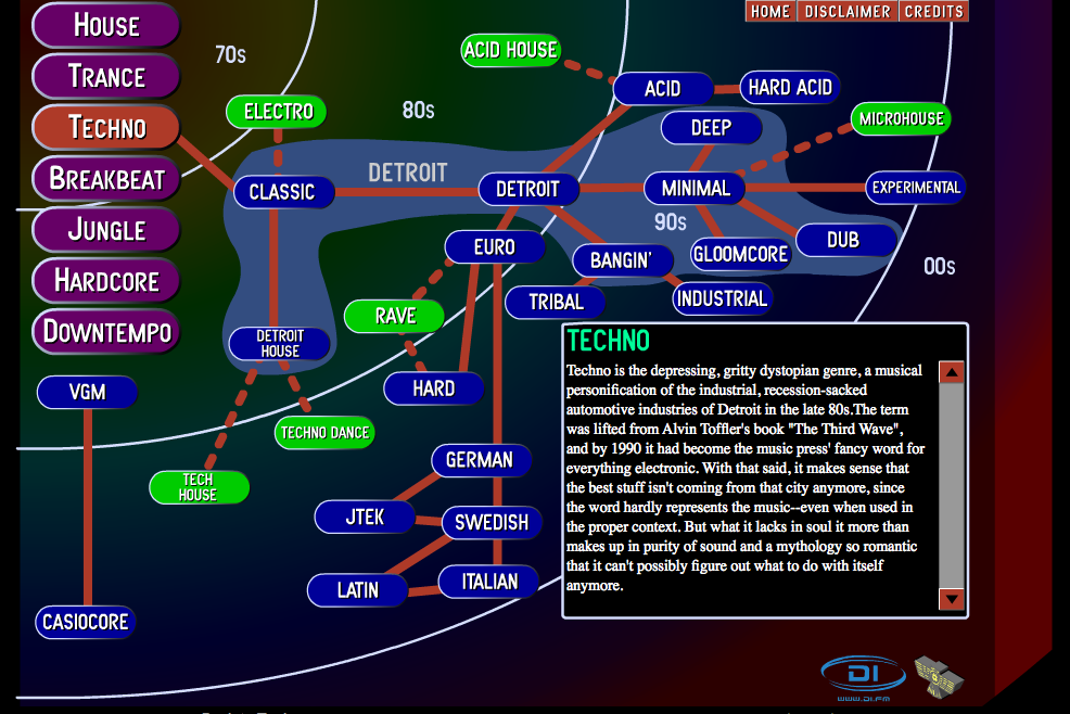
“My goal is to be able to make something like Iskhkur’s guide for all music, one that is personalized for each individual user. An interface that allows exploration, discovery, and provides lots of context. I tend to explore an idea or two at a time, and sometimes will make an app that shows the idea. One day, I hope to fuse the best ideas into a full featured app (but there’s something to say about having a very simple app that does one thing well).”
Lamere has been rolling out smaller applications over time and plans to eventually build those up into one cohesive program. You can check out some of the applications he’s already developed here.  Additionally, Lamere is referring to Ishkur’s Guide to Electronic Music which is an impressive application for ordering and relating various genres within electronic music. While this application lacks technical accuracy the idea and design allow for an exploration and breakdown between genres that is quite extensive.
It should be noted that there is a distinction between visualization and application. Information visualization manipulates data and allows the user to find and make their own story based on the visualization. Whereas an application allows the user to make changes to the data and create different scenarios and outcomes for the data based on programming capabilities.
This exploration of music through visualization is a fascinating way to look at music data. The aforementioned project by Lamere and others are ambitious undertakings to say the least as nothing is a perfect science. Music application development is a crowded market but if there were truly a more finite way to explore listening trends, behaviors and patterns both user and industry alike might find something of real value to invest in. If nothing else the experimentation provides enthusiasts, such as myself, with some clever infographics and visualizations to adorn our music-geek walls.
References
Tufte, Edward. EdwardTufte.com. 25 July 2006. Web. 13 April 2011. http://www.edwardtufte.com/bboard/q-and-a-fetch-msg?msg_id=0002N4
Garry, Hugh. “Finding Music With Pictures: Data Visualisation for Discovery.” Storify.com. 14 March 2011. Web. 13 April 2011. http://storify.com/huey/finding-music-with-pictures-data-visualisation-for


