The Not-So-Functional Art: Putting Information Visualisation Back Into Context
“It’s always been a tricky balance between getting the story across, and making a great image. But thanks to some serious computing power, we’ve arrived at a crunch point. In one corner of the ring is information, and in the other is art, and they’ve been slugging it out.”
Three years ago, in a blog post for Society of News Design (SND), John Grimwade raised his concern about the direction into which the fairly new medium of information visualisation was moving. In many cases, argued Grimwade, the process of making an infographic was reduced to running data through high-end software and wrapping the output into a visually appealing design. The aesthetic component of the visualisation, that is, the image it creates, is given priority over the actual goals of infographics, namely functionality and comprehensibility: “Dreary spreadsheets can be transformed into beautiful artwork. Spirals, circles, piles of dots and other assorted shapes. Lots of overlapping info in brilliant colors. Population trends turned into a wheel of interconnecting dots. I love it, but to be honest, I often have no idea what’s going on.”
The Infographic Inflation
Meanwhile, stating that infographics and interactive data visualisations are gaining popularity would be a grave underestimation. A quick look at Google’s trending search queries shows how public interest for ‘infographic’ has skyrocketed in the past two years. This development is paralleled by the ever-growing amount of big data on the one side, and the availability of user-friendly applications like infogr.am, which recently celebrated the 500.000th visualisation created with it’s web-based interface.
Easy-to-use design software and well-designed templates contribute to an inflation of infographics, which in many cases give priority to design over data, aesthetics over accuracy. The share of functional, well-crafted data stories within the expanding body of infographics is fairly low, and sets Grimwade thinking that maybe as many as “95% of the current output is dubious.”
Unsurprisingly, Grimwade’s concern is shared by others. Forbes editor Jason Oberholzer for example has introduced a ‘Today In Horrible Infographics‘ category in his blog to discuss worst-practice examples, while this Tumblr collects and criticises visualisations that are infoposters rather than infographics.
“Functions Constrain Form”
The interplay of data journalism, design and art is one of the key subjects of Alberto Cairo’s recent book entitled The Functional Art. Borrowing from some of the core principles of industrial design, Cairo puts functionality at the very centre of his book: “The form should be constrained by the functions of your presentation. There may be more than one form a data set can adopt so that readers can perform operations with it and extract meanings, but the data cannot adopt any form.” 1
Similar to Grimwade, Cairo sees the current infographics hype between the poles of art, design and functionality (usually to the detriment of the latter), but suggests an uni-directional process that covers all three aspects. An infographics producer has to be three things, explained Cairo in his keynote to the 6th annual Infographics Conference in Zeist: First, a journalist to develop a story and carry out accurate research. Secondly, a designer to choose the best-fitting, most functional type of visualisation for that data. And thirdly, an artist who produces visually appealing graphics. What is crucial about Cairo’s model is the order it suggests: functionality first, art second.
Dress to Impress
But what if we put the artistic component at the very centre of information visualisaiton, with functionality and comprehensibility taking the back seat?
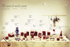
Perhaps the most impressive (and unsettling) information visualisation projectI’ve come across in recent years is 100 Years of World Cuisine by Clara Kayser-Bril, Nicolas Kayser-Bril and Marion Kotlarski. The project seeks to visualise the 38 million war casualties in the past century. The visualisation itself is essentially a photo of a kitchen table cluttered with jars, jugs and bowls, each of which representing one of 25 conflicts and filled with the respective amount of (fake) blood. From a purely functional viewpoint, this visualisation does not excel: The arrangement is random, cluttered and three-dimensional. The containers have different sizes and shapes, making any comparison impossible. And the labeling further aggravates the understanding of the data. Functionally speaking, bar charts or even a table would do a better job in presenting this data in a comparable manner. But scientific accuracy and functionality are obviously not the goal of this project: It is all about evoking a long-lasting, eerie impression in the viewer, as the designers state on the project website: “The horror lays hidden beneath the rigidity of numbers. Figures give us knowledge, not meaning”.
Art First, Information Second
100 Years of World Cuisine exemplifies what Robert Kosara terms an artistic visualisation. Even more, Kosara suggests to categorise information visualisation on a scale ranging from pragmatic to artistic, from utilitarian to sublime: On the very pragmatic edge of the scale, we would find highly function visualisations, the form of which is determined by their goal, that is, their ability to be decoded easily, fast and accurately by the viewer.
For artistic visualisations, quite the contrary is true, Kosara asserts: “The goal is not to enable the user to read the data, but to understand the basic concern. In many ways, this step is the opposite of pragmatic visualization: rather than making the data easily readable, it is transformed into something that is visible and and interesting, but that must still be readily understood.” 2
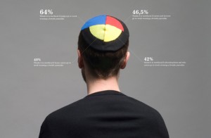
 Giving less thought to the most accurate, scientific representation of data and rather putting the visualisations back into their context is key to the recent work of Danish designer Peter Ørntoft. In his 2010 project Information graphics in context, Ørntoft uses religious symbols to create real-life charts about the results of a public opinion poll in Denmark. The functionality and accuracy of these visualisations are, again, questionable. However, they manage to give the viewer an immediate idea of the story and context of the data, and the popularity of Ørntoft’s approach appears to prove him right.
Symbols and Sublime
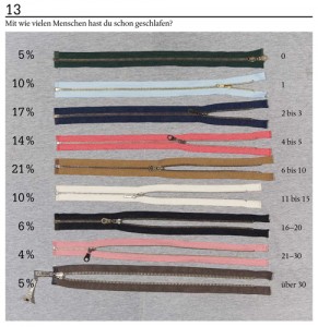
A similar style was employed by Sarah Illenberger to visualise the results of a sex survey for German magazine NEON in the form of still photos. In the right-hand example, Illenberger arranged zip flies to create a real-life bar chart – with the position of the zip indicating the number of sex partners of the survey participants.

What all of the aforementioned examples have in common is that they include visual cues – blood, religious symbols, zip flies – that stand symbolically for the underlying story: They put, as Ørntoft phrases it, visualisations in context, but also context in visualisations. But do they then constitute as information visualisation, art, neither, or both?
If we reduced the question of functionality to the most accurate and comprehensive visual representation of data, then the aforementioned examples would be semi-functional, if that. But if the role of a functional visualisation is also stand out, to contextualise, and to catch the viewer’s attention in the first place, they do succeed.
Since the very dawn of the medium, asserts Manovich 3, information visualisation has followed a set of simple rules: reducing information to numeric variables, representing it spatially through geometric shapes, and giving visibility to naturally non-visual information. But in the midst of an infographic inflation, the examples mentioned above open up a new exploratory space in which functionality may still be one, but not the only core principle in the fast evolving realm of information visualisation. Grimwade: “Don’t get me wrong, there are some great data visualizations around, and I applaud them. But it’s a new form, and we’re still learning what to do with it.”
References
1 Cairo, Alberto (2012): The Functional Art: An Introduction to Information Graphics and Visualization. Berkeley: New Riders.
2 Kusara, Robert (2007): Visualization Criticism. The Missing Link Between Information Visualization and Art. 11th International Conference Information Visualization, IEEE.
3 Manovich, Lev (2011): What Is Visualisation? Visual Studies, Vol. 26, No. 1.


