Techniques of power in branded data visualizations
Brands are increasingly looking into data visualizations as a means to engage their customers online.
Today’s consumer seems to have an insatiable appetite for information, but until recently making sense of all of that raw data was too daunting for most. Enter the new “visual scientists” who are turning bits and bytes of data — once purely the domain of mathematicians and coders — into stories for our digital age.
We can and should think of DaViz as part of the brand’s sense of intuition — that charming and ancient analog quality. Intuition allows us to cut through the clutter and the data overload, observe, perceive and deduct knowledge or understanding that appears to come out of nowhere. In a similar way, data visualization allows us to focus and personalize our engagement platforms and communications with consumers around the essence of the brand’s value and message.
General Electric, February 2012:
We try really hard to draw a distinction between data visualization and infographics. There are times when each is appropriate. When we have a lot of data, we create bigger, more interactive, graphics. We are getting much more sophisticated, and over the past couple of years we have become more sophisticated in terms of how we use the data. And consumers are more sophisticated in how they view the data. They are raising the bar, so we have to work harder and smarter about how we do projects like this.
Furthermore, there is at least one creative agency that specializes in digital brand storytelling through data visualizations – Jess3. It has worked on projects such as Google Politics & Elections, Foursqure’s badge ‘I voted’, The Economist’s Women Economic Opportunity Index, etc.
Volkswagen, Visa, General Electric among others also use data visualizations to enhance their brand communication. The benefit of this trend is that companies open their rich data sets and share them with the public, albeit in a controlled way. Conversely, there is a critical point to be made about the power of such visualis. As Roland Barthes writes:
Pictures… are more imperative than writing, they impose meaning at one stroke, without analyzing or diluting it.
In this sense, there is a lack of research on power dynamics in data visualizations, created by brands. (For more on bias in data visualizations, see Jorrit Schaap’s take and Yeun Au’s post.)
That’s why in my thesis I will study techniques of power in data visualizations. Research will extend Ben and Marthalee Barton’s critique of technical and professional visuals. It states:
Technical and professional visuals are not only instruments of communication or even of knowledge but also instruments of power.
Foucault’s idea that “power to dominate rests on the differential possession of knowledge”, or the benefit to monitor without being seen, will be central to my research on branded data visualizations.
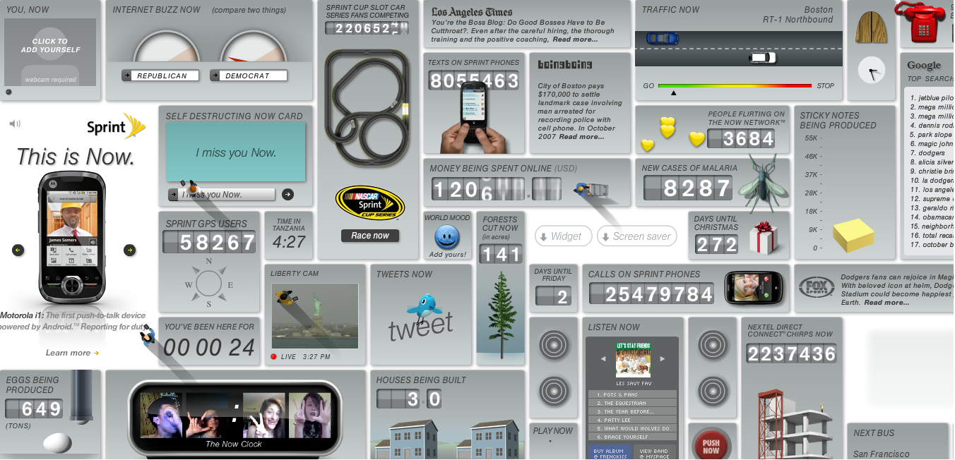
For instance, let’s have a look at US carrier Sprint’s Now network. It displays an overwhelming set of live data about the current state of the world. For example, the number of coffee cups being produced or top Google searches today. Although the visualization is primarily focused on USA, it attempts to create a global impact by displaying information about the current time in Tanzania, for instance.
Ideally, the visualization fosters the image of Sprint as an infrastructure company of the future that carries information people care about. But it also brings to mind displays in industrial control rooms. Every widget can be classified as, what researcher Larry Goodstein calls, “one measurement – one indication.” This may be viewed in Foucauldian terms as overreliance on a “display system based exclusively on the analytic mode of surveillance” (Barton and Barton). As Goodstein points out, because of the thousands of individual displays stacked together, people often have difficulties in “seeing the forest for the trees.” His observation was derived from his reconstruction of the reasons behind the disastrous incident at the Three Mile Island nuclear facility in 1979. Since hundreds of individual indicators annunciated in the first minutes of the crisis, operators failed to identify the cause of the problem.
Another bias in Sprint’s visualization can be seen in its ordering of information. As internet researchers such as Jakob Nielsen claim, users start reading a webpage from its upper left section (F-shape). This is exactly where one can see most data about Sprint services. More imbalances of power emerge when one reads the terms of use. The visualization is not interactive and users can not order or play with the widgets, although they can upload a webcam video of themselves. So this paragraph from the terms of use is striking:
You agree to defend, indemnify and hold harmless Sprint and its affiliates and their respective parents, directors, officers, employees and agents from and against any and all claims, actions, demands, damages, costs, liabilities, losses and expenses (including reasonable attorneys’ fees) arising out of your use of the Site.
Though Now seems comprehensive enough to claim it displays the world as it is, visitors are discouraged to make judgements based on the data.
My study will focus only on visualization projects updated frequently by their creators. Although data visualizations are praised by analysts as a new tool to engage customers, some companies do not view them as long-term projects. For instance, Visa’s Go project showed how many people were smiling back currently at Mona Lisa, thus emphasizing the credit company’s role in helping people “go places and do things.” However, the visualization is no longer available and appears to be a product of a campaign-like behaviour.
There are at least two subquestions related to power about the surge in publishing of branded data visualizations. For instance, when did companies get interested in publishing information visualizations and why? Do they outsource the creation of visualizations or they build them in-house?
Challenges to this research are assessing what is not a branded data visualization and finding an appropriate method to study their employment of power. Another difficulty might be identifying newer media theory discourses that could be connected to a research on branded data visualizations because Barton’s work dates from the 1990s.
References
Barthes, R. Mythologies. New York: Hill & Wang, 1970.
Barton, B., Barton M. “Modes of Power in Technical and Professional Visuals.” Journal of Business and Technical Communication 7.1 (1993): 138-162.
Foucault, M. Discipline and Punish: The Birth of the Prison. New York: Vintage, 1979.
Goodstein, L. “Discriminative Display Support for Process Operators.” Human Detection and Diagnosis of System Failures. Ed. J. Rasmussen and W.B.Rouse. New York: Plenum, 1981. 433-449.

