The Attractive Symbols of the Web
At the beginning of the twentieth century, photography was considered to be the most neutral expression of optical data (Lupston 1986). This changed the perception and according to the Austrian philosopher, economist and sociologist Otto Neurath this development demanded for a system to organize all of the new observations (Lupston 1986). In his view, 1920 was the beginning of a new era of visualisations (Zambrano 2008). The ignorance of the Middle Ages would end if a common culture was created by making al knowledge accessible. This could be achieved by developing a consistent visual language, called the ISOTYPE: International System of Typographic Picture Education (Neurath 1937). ISOTYPE can be seen as a scientific formula independent of culture. It exists of simple designs based on different conventions and it can be related to direct observations (Lupton 1986). This iconic language of uncomplicated images has the goal to present information to contribute to the increase the common knowledge of society (Zambrano 2008). The universal language of ISOTYPE assumes a homogenous group who reads the images in the same way.
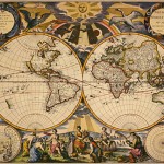
The American geographer Alan MacEachren has a different view. He claims that every visualisation is characterized by cultural aspects. For example, a world map looks like an objective representation of reality; however, a world map is always a reflection of a culture, just like al human artefacts (MacEachren 1995). Therefore the universal symbols of Neurath could not be realized, because the way people think or act is always a result of the culture they are part of. History also plays a big part, because images are always historically determined.
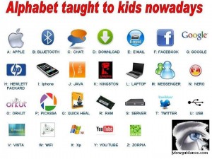
This is not the only problem in the making of a universal symbolic language. The emergence of the computer at the end of the twentieth century also challenged this aim. The interface of a computer or a tablet is made to increase the usability. For example, the iPad of Apple uses square symbols to show all the possibilities. Initially the meaning of these symbols is not always obvious in the beginning, but most of iPad owners get used to the services captured in a simple symbol. Comparing the user interfaces of Microsoft and Apple shows that an universal symbol for an e-mail inbox does not exists and this also applies to symbols for word progressing programs, drawing tools, like Paint and Photoshop.
An other example is the symbol for browsing programs. The symbols for Internet Explorer, Google Chrome, Safari and Firefox are not the same at all and when you are not familiar with these programs it is hard to see what kind of service they deliver to the user.
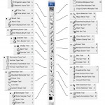
The priority of designers of the icons for the internet is not to create a universal symbol that everyone directly understands. It is more about the attractiveness and the uniqueness. Designers sometimes even want to tell a story with their symbols. For example, the Apple logo is an apple with a missing bite and the story goes that this aspect of the logo is a tribute to Alan Turing, the father of computer science, who committed suicide by eating a poisoned apple. This is in no way in accordance to the idea of Neurath. When we see the Apple symbol we, in the Western World, immediately know that it is a symbol for the technology company. However, this interpretation is something we learned through time. The population of our planet is not a homogenous group and every culture has a different perception of world. Another example is the use of Photoshop. The user has to read the manual or follow a course to learn the exact meaning of the symbols in the toolbar. The information is not clear at first glance.
The reason for this development is that design of symbols is not all about sharing knowledge. It is also about graphical attractiveness and entertainment. In short, universal language in these digital ages is impossible. The directness of the ISOTYPE symbols lose their value because the connection between reality and the world of computers and the Internet is a very vague area. The pictures of Neurath have a direct connection with the extern world (Card 1999). The icons on the internet often only refer to services that only exist on the Web. For example, the symbol of RSS-feeds cannot be connected to a sensory perception in nature.
The study of the logo’s and symbols on the web or on other devices like smart phones and tablets can teach us something about the zeitgeist of a certain period and the development of new techniques of display. How symbols change over the time also contributes to the cultural changes since the emergence of the Internet. It is also interesting to keep in mind that a new generation is growing up and they get used to the symbols at a very young age. Their perception of the world is totally different because they probably cannot imagine a world without the Internet and the symbols.
The goal to create one universal symbolic language cannot be realized on the web but this does not mean that al the effort of Neurath was unsuccessfully. In the ‘real’ world we make extensive use of his ISOTYPE for example at places like airports or train station and it is hard to think of another way to create a new clearer symbol for a departing plane or a restaurant. After all, Neurath did a good job, and we must not blame him for not taking the development of the Internet into account at the beginning at the twentieth century.
Literature
Neurath, Otto. 1937. Visual education: A new language. In: Survey graphics: Magazine of social interpretation, XXVI (1), January 1937, pp. 25-28.
Card, Stuart, Jock Mackinlay, and Ben Shneiderman, 1999. Excerpt from chapter 1 of “Readings in information visualization: Using vision to think”. San Francisco: Morgan Stanley Kaufmann Publishers, pp. 1-34.
Lupton, Ellen. 1986. Reading Isotype. Design Issues, Vol. 3, No. 2, pp. 47-58.
Niño Zambrano, Raul, and Yuri Engelhardt 2008. Diagrams for the masses: Raising public awareness – from Neurath to Gapminder to Google Earth.In: G. Stapleton, J. Howse, J. Lee (Eds.). Diagrammatic Representation and Inference. Berlin: Springer, pp. 282-292.
MacEachren, Alan. 1995. Excerpt from “How maps work: Representation, visualization and design”. New York: The Guilford Press, pp. 10-11.
