About Marijn de Vries Hoogerwerff
Marijn de Vries Hoogerwerff is a New Media theorist, Web researcher and Internet entrepreneur. In 1999 he started working as IT professional at the broadband Internet Service Provider @home (a franchise of the ISP and search engine company Excite@Home). After working here for over eight years he decided to pursue a study in New Media at the University of Amsterdam.
During this study he has been an active member of the Digital Methods Initiative (DMI) research group, working together in a strong team of designers, programmers and theorists to develop new Web-specific methods and tools for doing online research and has written in depth about Internet censorship research, code consciousness and cyber-cosmopolitanism.
Next to several stand-alone projects he also started up CYBERLIFE, focusing on building Web-applications, sites and tools, Web hosting and doing Web research. After receiving his Master degree in New Media he continued his contributions to the DMI, has helped organize the Society of the Query conference for the Institute of Network Cultures and has been a thesis supervisor at the University of Applied Sciences (HvA) for Interactive Media.
His current company,
nochii BV, focusses on utilizing theoretical knowledge and practical experience to help companies get a better understanding about the Web, their network and the space they occupy and its relation to the offline. He holds the strong believe that the Web, both as infrastructure and as concept, can aid in dealing with the increasing complexity of the world (both online as offline) and the relating problematics.
Websitehttp://nochii.nl
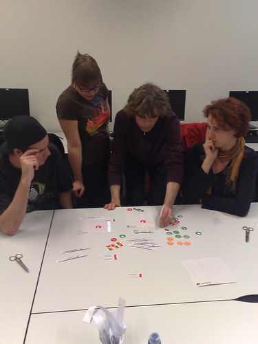
Thursday Christian Behrens and Yuri Engelhardt did a workshop on the Universiteit van Amsterdam on the building blocks of information visualization. Christian Behrens created out of his master thesis on designing pattern taxonomy for the field of data visualization and information design, a website which is a pattern browser that lets the user interactively search for pattern components that fit best with a users particular design problem (be sure to check out his website!). Yuri Engelhardt wrote his dissertation called ‘The language of graphics’ in which he uses a linguistic approach to the analysis of language. He showed briefly how he uses Chomsky tree notations to analysis space, objects and their relation. Together they now bundle their expertise to try to create a universal system of basic building blocks for data visualization.

After an introduction on the different ways of visualizing data that exist, the group was presented with a visualisation notating system on paper by which one can visually construct out of those building blocks the type of visualization which best fits the needs of the user. By cutting out all the different building blocks we where asked to think of some information, needing visualization, and construct from those building blocks a visualization method. Using different cards for spaces like axis space, map space and picture space and combining them with different cut out pieces visually decorated with for instance categories like colour and shape and paths/hierarchies like connectors and containers we could start building our own visualization proposal. Using text to describe a visual process is highly cumbersome, especially for someone not into the subject matter, so I leave the detailed explanaition for them to do. Their building blocks however make visible which tool are available for someone needing to visualize their data and how they relate. Working with actual building block gives a nice hand-on experience and provides means to look at your solution and remove, add or change specific elements to better fit your needs. As a professional it provides means to better work together with your client to come up with the best solution to his or her needs.
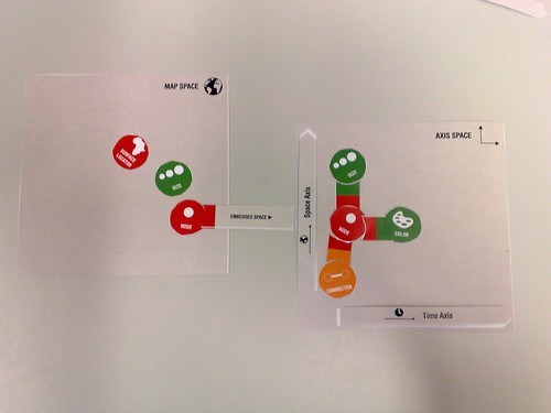
Trying out all the possible visualization with their building block it came to our attention that there is one major field which they are leaving out now, and this is 3-D visualizations. Using 2-D cards to represent 3 axis could be quite a challenge. In the workshop we already experimented with possible solution by putting one axis straight up, but at this point, its not ideal. As visualizing dataset from complex systems like the internet move more and more towards 3-D visualizations, I think it is not as of yet very suited for this group of users. Yuri Engelhardt however mentioned that their development at this point is especially going to be used in a corporate environment. I think this would be the excellent setting for their work and the type of data visualisation issues that generally come up within this environment.
Although it was an experimental workshop, I thing that everybody got a good idea of their work, quite easily created some first designs and provided them with some valuble feedback to continue their work.