INFORMATION VISUALISATION, SHARING THE STORY
No one knows everything, but everyone knows something, all knowledge resides in humanity(1)
While the notion of collective intelligence –as coined by Pierre Lévy– has already been extensively discussed with regards to the collective phenomenon of Wikipedia, the current rise of the social use of information visualisations should also be seen in this perspective. While Pierre Lévy described how individual members of online communities combined their individual knowledge in order to create a shared expertise (collective intelligence),(2) he could not envision the collective use of data. The unanswered question posed by Lévy as to ‘…[how we will] be able to process enormous masses of data on interrelated problems within a changing environment?’ (3) might have found its answer in the collective potential of information visualisations.
This collective (or social) element begins with the option of data-exploration by the visualisation. According to Clay Shirky in ‘Information visualization: Graphical tools for thinking about data’ (4) a good info-vis interface not only provides a visual representation of the data, but invites its users to ask questions about the data. When the interface supports the exploration of the data, the user will be able to form new questions, parallels and hypothesis. But even when the user extracts new information by reassembling data on an information visualisation tool, this acquired knowledge remains individual.
In their article ‘The Social Life of Visualization’ (5) Jeremy Yuille and Hugh Macdonald also acknowledge the potential of information visualisations in order to support collective intelligence. They describe this collective process as ‘shared storytelling’ in which a single idea by an individual via the process of data visualisation ends up in a community. Here, the story of that individual can be shared, discussed and adapted. A good interface should not only entail the option to visualize certain datasets, it should also provide the option for individuals to interpret the data and capture these interpretations. Especially the capturing of the data-interpretations opens up the way for a community to review and discuss the different interpretations made. The picture below represents the process of these social visualisations, in which data is transformed into a (universally understood) visualisation.
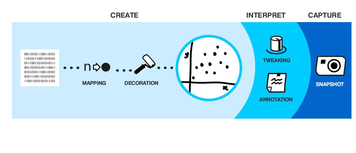
Picture 1. ‘The social life of visualisations’
The final stage of the process entails some interesting processes, namely the tweaking and annotation (interpretation) and snapshot (capture). Firstly (tweaking and annotation), the interface should support reassembling and interrogation of the data. Secondly (snapshot), the interface should ‘…allow annotations to be preserved, commented on, and subsequently reviewed by other members of the community.’ (6) This last phase is where processes of collective intelligence can occur. When communities are able to combine the data-interpretations of individuals towards a combined interpretation, elements of the combined expertise as stated by Lévy can start to occur.
And they are starting to occur. Information visualisation platforms such as Swivel and ManyEyes offer the possibility for the user to start a ‘shared storytelling’. When entering the website of ManyEyes, one line of text is published to explain the website. This line reads ‘ManyEyes, for shared visualisation and discovery’. This discovery is indeed very much possible on ManyEyes. While the process of creation (see picture 1) is possible on the website, the user can also go and look at already-made visualisations. The user therefore does not need to upload its own data in order to explore different data-visualisations. The collaborative element of the website is for example recognizable in the different topic centres of the website. In these centres, small communities dealing with a specific topic are able to form. In the topic centre on Word Trees (see below), the individual user can go to different group-discussions on the visualisation technique of the word tree.
Also, underneath the visualisations itself discussions are formed (see the red box in the screenshot from ManyEyes on the right) 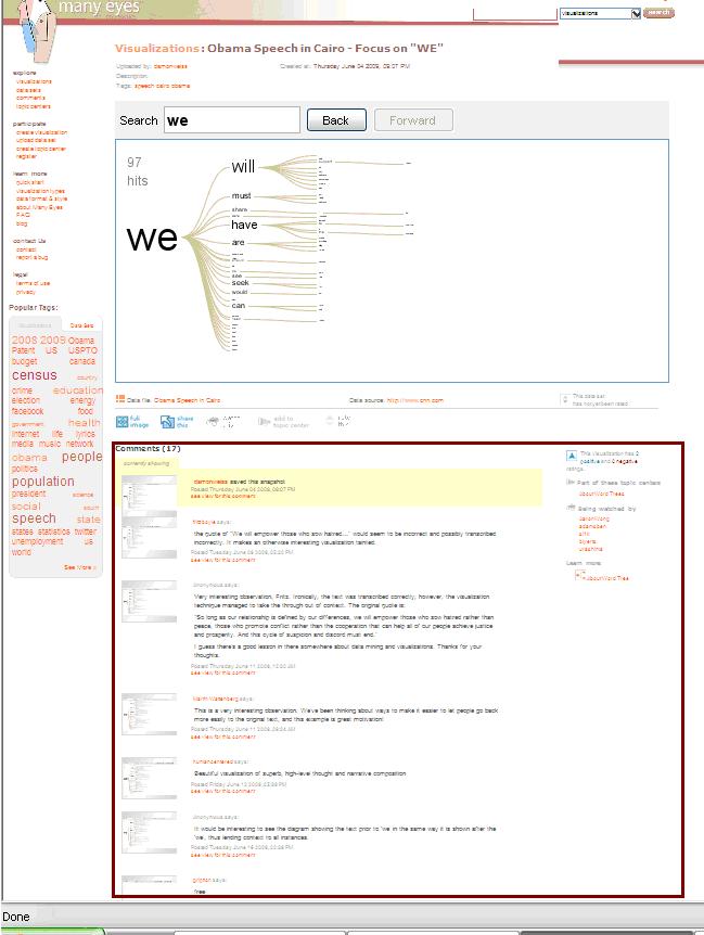 It is not my intention to look at the discussions and see what kind of information is being discussed on these. It is the potential for communities to use these information visualisation tools to engage in discussions that will as a result create collective intelligence. My interest (outlined in this post) lies within the possibilities of these visualisations to engage a community in discussions on the perceived data. Not only have information visualisation tools such as ManyEyes opened up the possibility to make data available and understandable to many, they are also adding the option for a community to form parallel to these visualisations. When data is made accessible by individuals, other individuals could use their expertise to enhance the discussion on the data.
The OECDExplorer also has a tool to leave a comment with a certain visualisation. Parallel to this visualisation on the Ageing Population in OECD EU TL2 Regions 1990-2008, a user is discussing the elderly dependency rate. Again, when an individual can use the information visualisations to explore certain data and raises certain questions, another user might be able to answer these questions or give a certain hypothesis. The strength of the social aspect of these information visualisations within the realm of collective intelligence lies in the fact that one individual can make a dataset available for another individual to comment on, etc.
While wikipedia has created a platform to combine individual knowledge into a community of knowledge, current information visualisation platforms might even do more for they offer a platform for individuals to explore certain datasets and gain new information from these. But let’s not get too euphoric. The process outlined in Yuille and Macdonald’s picture has a lot of phases that the data must pass. In order to gain a community, the information visualisation interfaces should be easily accessible. In the first process-phase of creating the visualisation, the visualisation made should be universally understandable. And while wikipedia offers a single platform, the information visualisation tools are abundant and do not relate or link to each other.
The accessibility of information visualisation tools is something that is increasing though. With Google for example now picking up on the trend by creating its own platform, the availability of data-visualisations is continuing to increase. The potential of information visualisations to create social storytelling or offer a tool for collective intelligence is politically also very interesting. My next blogpost on the topic of information visualisations will therefore elaborate further on the (potential) political implications of the collective use of information visualisations.
(1) Lévy,Pierre. Collective Intelligence: Mankind’s Emerging World in Cyberspace. Cambridge, Mass.: Perseus Books, 1997, p.20
(2) Levy, Pierre, Cambridge: 1997. p.20
(3) Levy, Pierre, Cambridge: 1997. p.62
(4) Shirky, Clay. Excerpt from: “Information visualization: Graphical tools for thinking about data”. In: Esther Dysons’s monthly report, 2002 Volume 20, no. 8
(5)Jeremy Yuille and Hugh Macdonald. “The social life of Visualization”. In: Interactions, 2010 Volume 17, no. 1 p. 28-31
(6)Jeremy Yuille and Hugh Macdonald, Interactions: 2010 p. 31
(7)http://manyeyes.alphaworks.ibm.com/manyeyes/topiccenters/89ade5ae14bdd1cb0114be4f4b01005c