Casual InfoViz – Beneficial or Banal?
Although most information graphics and information visualizations to date have strived to deal with vast amounts of important, albeit often unintelligible, data in new and meaningful ways in the hopes of educating or effecting change, some recent forays into the field are narrowing their focus on more quotidian and, perhaps, ego driven data sets, challenging the notions of its beneficent origins.
In the past, the world of data visualization was limited to an “elite” group of people. Scores of scholars, scientists, designers and programmers worked to mine and interpret information in order to track any previously unnoticed trends in their data sets. Recent interest and academic activity in the area has spawned a new and well-equipped generation of information junkies. The decreases in the price of graphics editing softwares and increased exposure to and availability of large data sets also helped the interest in the creation of visualizations by the public increase tremendously. The arrival of Web 2.0 has seen websites like many eyes and Swivel make it easier for people with limited programming and graphics knowledge to contribute to the visualization of dense data sets. As a result of this rapid progression data visualization is making out of the work sphere in which it was traditionally embedded, the application of visualizations has moved into the areas of art, social networks, and the seemingly mundane examination of habit and happenstance (Pousman et al, 2007).
Take, for example, Dr. Jack van Wijk’s visualization of hard drive contents, on display till September 2nd, 2010 at the Graphic Design Museum in Breda. Van Wijk created and made available for download a program that categorizes and color-codes the contents of users’ hard drives with his ultimate goal being to display the visualizations as pieces of art. The program creates a tree map of all files on the hard drives by producing nested rectangles of each of the folders and files contained therein, and assigning color by general categories as follows: music (.mp3, .wav), movie (.avi, .mpeg, .mov), web (.php, .htm), image (.jpg, .png, .raw), etc. Interestingly enough, the less colors present in the individual visualizations the easier it is to determine the creator’s occupation or main interest and the more useful the visualization ultimately is to the viewer. The visualizations that tend to be the most visually compelling are those created by people with a wide variety of content present on their hard-drives as it allows for the most variety in colors (perhaps even extending the virtue attributed to the renaissance man into the dominantly digital 21st century). But to what extent is the critical component of the visualization sacrificed and an artistic one gained?
Social networks have made it easier to keep track of the people we encounter in our lives but have added another stream of constantly updating information that isn’t always that easy to keep track of. Visualizations for social networks have existed since the late nineties, but since then have still mostly been limited to node-link representations of networks (like Vizster) or visualizations of most active users in the network measured by posts (like flowerGarden). This can be useful to identify key hubs in social networks who play a key role in mobilizing friends for activities or online initiatives. Similar visualization have now become easily available through add-ons and apps on sites like Facebook and MySpace.
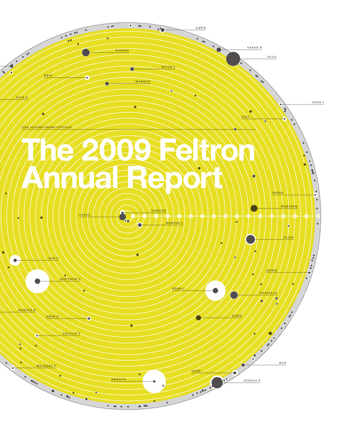
One of the most interesting cases of casual information visualization are the Feltron Annual Reports. These reports have been released every year since 2005 by graphic designer Nicholas Feltron. The visualizations catalogue everything from the number of bars visited per month and the number of drinks consumed to the number of magazines read; from the number of teeth his cat lost in a year to the number of burglars he confronted. Although the focus of his reports seems to be on what we would normally consider trivial facets of our everyday life, Feltron manages to present it in such a way that gives new meaning to the massive amounts of data we’ve become so used to processing and subsequently forgetting about in both our work and leisure hours.
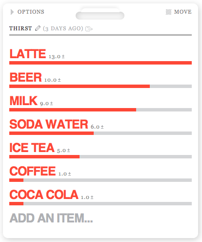
This practice has become known as life-tracking and an increasing number of people are becoming interested in the patterns and trends that can be discerned based on both the conscious and the subconscious decisions they make every day. Feltron happens to have developed a website expressly dedicated to making life-tracking fun, easy and immediately visualizable. At daytum.com the user has the ability to create displays to which they submit categorized entries. The entries are immediately converted into one of 16 customizable and interactive visualization options. (Below is my own beverage tracking experiment.)
The kind of insight that can be gained from casual information visualization varies on a case by case basis. In the case of artistic representations, creators need to clearly define the intent of their visualization. The utilitarian nature of traditional information visualization is lost if too much attention is paid to constructing unneccesarily intricate aesthetics. Van Wijk’s representations of hard drive contents is only really useful for the owner of the hard drive being examined. For second-party viewers the representations can serve only as a mere curiosity that offers a small window of insight into another’s digital existence. Insight into social networks can be valuable to those interested finding more efficient ways of navigating through their social environments and can even lead to improved productivity. The insight that life-tracking provides is perhaps the most useful and beneficial. The results of life-tracking practices help trackers to be more aware of data flows that they may have previously ignored. For example, by tracking the number and types of beverages you choose the caffeine addict can actively reduce his latte intake or the athlete can monitor progress in the weeks leading up to a marathon. Increased awareness of data flows keeps the mind more open to making connections between different data sets or events. Once life-tracking has become routine the insight gained from these actions over long periods of time can be be considerably deeper than before. Like Feltron, the users can track and reflect upon larger patterns in their lives by comparing yearly summaries of habits and accomplishments. These reflections have made it possible for people to make vast improvements in the areas of health, time and finance management, social behavior and environmental impact, just to name a few. Just by developing the discipline of tracking a number of personal actions on a daily basis, users could actively improve behavior based on personal goals.
Overall, casual information visualization is a fragmented practice, independent of any comprehensive study. If the collective power of these individuals were to be harnessed larger trends in society could be more accurately tracked.
Pousman, Zachary, John Stasko, and Michael Mateas. “Casual Information Visualization:
Depictions of Data in Everyday Life.” IEEE Transactions on Visualization and
Computer Graphics 13.6 (2007): 1145-1152. Web. 28 April 2010.
<http://www.cc.gatech.edu/~john.stasko/papers/infovis07-casual.pdf>.

