Visualizing for America
On the 8th of this March, the Sunlight foundation launched the Design for America contest. This non-profit organization aims to make government data more accessible for citizens. The development of information visualizations from governmental data is becoming a fruitful way of translating the bulk of government data into an understandable and comprehendible modus. Through the Design for America contest, the Sunlight foundation is emphasizing the importance of data visualization in the process of bridging the gap between citizen and government. The contest entails six specific visualization possibilities withmoney prices for the winning visualization. The instructions are made very clear. The instruction reads: ‘The Data Visualization category is about taking large datasets provided by the Sunlight Foundation or by the Federal Government and making compelling visual stories out of them.’ [1] One assignment involves the visualisation of the Community Health Data in order to help citizens in comprehending the health performance in their community. The concept of a good (according to the Sunlight foundation) info-vis is explained in this complementary video.
The winning visualizations not only receive a reward, but are also being exposed on the gov 2.0 expo in Washington DC. The relation between these information visualizations and the recent discussions on governing is structured around the changing position of the citizen in relation to its government. In one of President Barack Obama’s first blog posts after his inauguration, President Obama explains his vision on the relation between government and citizen according to three main components: transparency, participation and collaboration. In this Open Government Initiative, President Obama states:
‘My administration is committed to creating an unprecedented level of openness in government. We will work together to ensure the public trust and establish a system of transparency, public participation, and collaboration. Openness will strengthen our democracy and promote effectiveness in government.’[2]
The emphasis on this public participation can be recognized in the ongoing theoretical debate on this government 2.0. The debate on this new modus of government and Obama’s blog post both discuss the relation between citizen and its government. In one of his later blog posts, Obama states that ‘The way to solve the problems of our time, as one nation, is by involving the American people in shaping the policies that affect their lives.’[3]
This citizen involvement could be strengthened through the conversion of the available data into understandable visualisations. This conversion makes the governmental data transparent; it makes it visible, understandable and thereby invites the citizen to participate in the discussion that surround that data. The instruction video of the Design for America contest also stresses this last element. The video starts by saying that ‘Government Data can be boring.’ But can information visualisations actually overcome this? The Sunlight Foundation seems to be convinced that info-vis could be a way to get citizen to connect to the data.
The amount of data on governmental issues (such as health care) can for example be found on www.data.gov. By putting all this government data online, the US Government is on its way to create a transparent and collaborative government. The next step in this process would be not only to make the data available to all citizens, but to make the data understandable. According to www.data.gov, ‘ One of the major reasons for creating Data.gov was to empower the community to innovate.’ [4] This empowerment is now able via data visualizations. The Design for America contest emphasizes this importance of the translation of the data in to visualizations.
Recently, the debate on governance (this government 2.0) has been centered around the position of the citizen as active participant in governing processes. In Obama’s New Media Team, the director of citizen participation Katie Stanton acknowledges the possibilities that the new media can offer to engage the active citizen in the process of governing. In one of her blog posts (on www.whitehouse.gov) on enhancing public participation in government activities, she states: ‘New social technologies like this blog are making it possible to participate in government in new ways. With the right tools, there are opportunities to bring government decision-making to the people.’[5] By emphasizing the notion of participation in the decision-making process, Stanton reflects the way the Obama government is trying to negotiate its relation to the citizen.
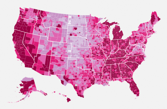
Now one of these ‘right tools’ could be the information visualization tools. These tools empower the citizen by making governmental data understandable and therefore debatable. But the new perspectives that citizens might gain from these information visualizations, could also be critical perspectives towards the government. This visualization ( Bleeding country) was for example made from the data on the unemployment numbers that the Bureau of Labor Statistics recently released. It offers an insight into the development of the unemployment in the US within the course of five years.
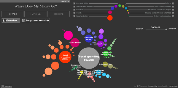
The Where does my money go? tool visualizes the spending of the UK government. While these tools itself might not be a direct critique to the US and UK government, they could be interpreted like that by the citizen. The understandability of the data therefore not only strengthens the relationship between the citizen and its government, but can also critique it.
The info-vis Who is coming to America? visualizes the different nationalities that immigrate to the US. The explanation of the data-vis states that: ‘ Immigration may have taken a back seat during the financial crisis, but the issue still needs resolving. While illegal immigrants sneaking over the border is still a primary concern, it’s good to know who came to our country legally, and from where. Our latest Transparency is a look at the 20 countries from which the most people came to America in 2008, how many immigrants already had family here, and how many received asylum when they arrived on our shores.’
Now this is transparency too. The translation of data for the citizen in this data-vis is clearly used to criticize the policy of the US government and make a strong political statement. The question might rise whether or not we want this kind of transparency. But this transparency is also a part of the empowered and active citizen. With more available governmental data and more users visualizing this data, the citizen might become more informed on governmental issues. But while www.data.gov and the Sunlight Foundation aim to bring the citizen closer to its government, visualizations such as Who’s coming to America seem to do the opposite. I am therefore very curious to follow the further development of the translation of governmental data into data-visualizations.
Mark your agenda’s at the 25th of March: this is when the winners of the Design for America contest will be announced.
[1] http://www.sunlightfoundation.com
[2] http://www.whitehouse.gov/sites/default/files/microsites/ogi-progress-report-american-people.pdf
[4] http://www.whitehouse.gov/blog/Enhancing-Citizen-Participation-in-Decision-Making
[5] http://www.whitehouse.gov/blog/New-Technologies-and-Participation