Narrative Structures in Data Visualizations to Improve Storytelling
Interactive data visualization has emerged as a complete new field within journalism. Large editorials like The New York Times, The Guardian, the Economist, the Washington Post all have special teams dedicated to data visualizations only. However, in the recent years, the storytelling potential of data visualizations has been debated.
Interactivity
Static graphics have long been used to support stories. Graphs and diagrams are used within a larger text to augment the story. Within this format, the text conveys the story and the graphics give additional detailed information, usually numbers and relational structures; stuff that is hard to imagine and complex to describe. In the contemporary media landscape, there arises a mixture between the traditional value of storytelling and the new media buzzword interactivity. The transition from static graphics to dynamic interactive graphics has led to a stream of complex data visualization on the web. It seems now that the visualization is not subjected to the story, but that the visualization is the story. However, this does not mean that the importance of the visualization transcends the narrative. On the contrary, the story becomes with the help of an insightful visualization a lot more significant and hopefully a lot more insightful. The creator of the infamous We Feel Fine visualization, Jonathan Harris, considers himself a storyteller first and a visualization designer second. He says that ‘the data is just part of the story. The human stuff is the main stuff, and the data should enrich it’. In my last post, I argued the importance of incorporating a sense of story and narrative in a visualization. Here, I am going to talk about a certain facet that interactivity brings to the playground; namely the fact that with interactivity also comes new structures of storytelling (and yes, also great responsibility).
The upcoming of interactive data visualizations ensures, similar to other mountains in the new media landscape, that the reader isn’t only reading, just like media consumers are no longer only consuming. Due to interactive visualization, the reader can now, despite the fact that it is little, have some agency on creating the story. Interactivity incites engagement. According to Gee (2003), it is easier for an individual to assimilate knowledge if it is immersed in activities and experiences that use data for certain purposes and plans within a coherent knowledge domain. Therefore, knowledge should be treated as an activity, an experience and not merely as facts (Gee 2005). Presenting data in a story could do that. Gershon and Page (2001) acknowledge that stories communicate information in a psychologically efficient format, which according to Segel and Heer (2010) is a central goal of data visualization.
Author-Reader Driven
In their article, Segel and Heer describe the various aspects of a data visualization as a storytelling medium. They are particularly focused on the balance between author-driven narrative and reader-driven narrative:
The visual narrative genres, together with interaction and messaging, must balance a narrative intended by the author with story discovery on the part of the reader. We thus place narrative visualizations along a spectrum of author-driven and reader-driven approaches (9)
I would argue that these approaches should not be placed along a spectrum, because a spectrum suggests that it is the one or the other; more author-driven means less reader-driven. It seems to me that applications could have a lot of both and Segel and Heer do make that clear in the end, so the word spectrum is just a bad pick.
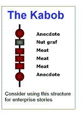
Segel and Heer mention several narrative structures that are placed along the author-driven and reader-driven paradigm. One of those structures they call the Martini Glass structure. This is yet another bad pick, because the Martini Glass structure is a common way of storytelling, especially in the field of journalism, that has nothing to do with the balance between author- and reader-driven approaches. The only thing that these two martini glasses have in common is that they represent the structure of when to tell which facts. Other known structures of storytelling are the Inverted Pyramid and the Kabob structure. (Yes, it seems that storytellers like to explain their work with food)
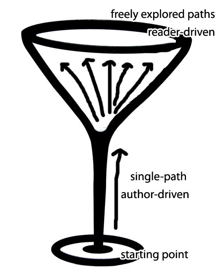
These known structures are defined for non-interactive stories like news articles, blogs or even novels. In the author-reader-driven paradigm, interactivity comes into play and this changes how journalists and storytellers convey the narrative. The Martini Glass described by Segel and Heer is a metaphor for the author-reader-driven ratio. The stem of the glass represents the single-path author-driven narrative. If the author’s intended narrative is conveyed, the widening mouth of the glass represents the multiple-narrative paths the user can freely explore on its own. As soon as the user enters the mouth of the glass, it can choose-his-own-adventure. Although I think this is a nice and insightful way to visualize a narrative structure, they forgot about the foot of the glass, which in the non-interactive martini glass plays the important role of the kicker/the twist in the end. In the interactive martini glass, the foot could represent the starting point of the application, where the width represents the choices a user has for author’s intended narratives.
What Genre?
The analysis by Segel and Heer on different narrative visualizations is elaborate and inspiring. However, I realise that they have underexposed a large and important part of the equation and that is the question of how different types of narrative structures affect the user differently. To draw back on the analogy with non-interactive storytelling, what kind of narrative visualization genres are there? Although Segel & Heer did talk about genres of narrative visualizations, these were genres that were based on the medium, such as ‘magazine style’, ‘comic strip’, ‘slide show’ and ‘partitioned poster’. The kind of genre I am looking for is based on the content such as ‘drama’, ‘adventure’, ‘crime’ and ‘comedy’: especially those genres that convey specific feelings in often familiar structures. Although some might argue that this kind of genre is defined by the story of the data and the subject of the visualization, I feel that there are genres present within the narrative structure. These genres define the way the application approaches the user and the methods for addressing emotions. What balance between author-driven and reader-driven is best for which kind of visualization? Are Martini Glass structures more dramatic? Are purely reader-driven narratives more adventurous? This is important to journalists and any other storyteller because it adds an invisible message to the intended narrative. Suppose that a long Martini Glass is tied to the comedy genre, then it probably will fail (or be worst) to convey a story that is serious and dramatic. To truly transfer the intended story, one must keep in mind the potential and the implications of different narrative structures.
Literature
Gee, J. P. (2003) What Video Games Have to Teach Us About Learning and Literacy. ACM Computers in Entertainment, Vol. 1, No. 1, October, BOOK01.
Gee, J. P. (2005) What Would a State of the Art Instructional Video Game Look Like? Journal of Online Education, Vol 1, Issue 6 August/September.
Gershon, N. and Page, W. (2001) What Storytelling Can Do for Information Visualization. Communications of the ACM. August, Vol. 44, No. 8.
Segel, E. & Heer, J. (2010) Narrative Visualization: Telling Stories with Data. Visualization and Computer Graphics, IEEE Transactions on. Vol 16: 6.
Images retrieved from Cubreporters.org, except for the last one, that one is selfmade.


