Data visualizations: a global matter
Two levels of information processing
Our world is saturated with information. Images, objects, texts, numbers, audio, moving visuals, and everything in between. There’s a reason some call the present the Information Age and invent terms like informatization. [1]
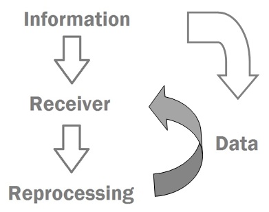
All of this information is processed on two equally important levels. On the first level there is the receiver. This receiver can be anybody from a traveler passing by an advertisement on the street, to a reader of a book, to a doctor looking at test results. This level may bear the name of primary processing and occurs in the individual’s brain. The second level of information processing happens when at the receiver’s end, the information is turned into study material on a meta level, transforming it into data. Causally, this will be called secondary information processing or reprocessing. When a receiver takes ‘raw’ information from his/her surroundings and repurposes it, the information becomes data. It may be analyzed, adapted, recontextualized and/or molded into another shape. Reshaping contains displaying the data in another form, such as a visualization.
In an information infused world, the secondary processing is increasingly important. It is helping the receiver to make better sense of the world around him/her. Information reprocessed clearly doesn’t only make the information better understandable, it can also point out important aspects of that information. In that sense, reprocessing is a subjective practice. But (expert) vision on a topic allows for that information to be fully put to use. Gathering information is the first step of reprocessing, making sense of it comes next (primary processing), and morphing the data in any way is last. After that, information processing commences from the beginning.

Schematization of reprocessing
Why is it important to distinguish these two levels of information processing? Because as much as we are already dealing with both, it will only become more prominent in the future. Everywhere we look, there will be touch screens to be interacting with, video and imagery, produsers’ shared stories, a Semantic Web anticipating our next move; the world is calling for our attention 24/7. In an information saturated world, it is important to manage its reception on both the internal/external cognitive side and the side of reprocessing.
Data visualizations: grasping universal matter
All information mentioned above can be reprocessed and visualized. Lev Manovich, for instance, has shown that images can be transformed into metadata in his project Cultural Analytics. Computational methods have opened up a lot of possibilities in large scale data processing, modeling and visualizing. Especially data visualizations are becoming more and more important. As long as the world is producing information on this scale at this increasing rate, information management and data visualizations are essential. A prime need, even. Think of all the organizations and institutions that would fall apart in case of information shortage. My guess is that we wouldn’t be able to survive any lengths of time anymore.
But keeping our daily pursuits up isn’t by far the only job of data visualizations. In contrast, data visualizations are at their best when they strive to point out an issue or observe something interesting on a meta level. Visualizations are especially talented in showing people things that are important, remarkable, abstract, large scaled and difficult. Using open data and the latest media technology, visual representations can raise awareness. [2] Otto Neurath, Hans Rosling and Yuri Engelhardt all have in common that they believe in the power of visualizations to bring knowledge to the people, in which there is a universal visual language that everybody can learn to understand perfectly. Arguably, some principles are so universal that they can be understood without any training, such as the notion of ‘up is more’ in bar charts and line charts, a notion that has to do with gravity on our planet which makes things stack on top of each other (Engelhardt).
Global issue, global solution
As can be derived from the arguments above, the severity of the role of visualizations in understanding our world can hardly be overestimated. A global visualization in particular, like a world map, is quickly becoming an important visualization. Human perception of the world is improving. Connectivity now reaches across the globe within a second, and above that, humanity is facing major global issues, like the economic crisis, the energy crisis and the climate crisis. [3] In 1969, David Brower http://www.browercenter.org/node/179, founder of Friends of the Earth http://www.foei.org/, used the words ‘Think Globally, Act Logically’. Paul N. Edwards builds on this.
Thinking globally ” meant seeing the world as a knowable entity — a single, interconnected whole — but in a sense that lacked the secure stasis of maps, parlor globes, or pre-Darwinian cosmologies. Instead, it meant grasping the planet as a dynamic system: intricately interconnected, articulated, evolving, but ultimately fragile and vulnerable. Network, rather than hierarchy; complex, interlocking feedbacks, rather than central control; ecology, rather than resource: these are the watchwords of the new habit of mind that took Earth ’s image for its emblem. [4]
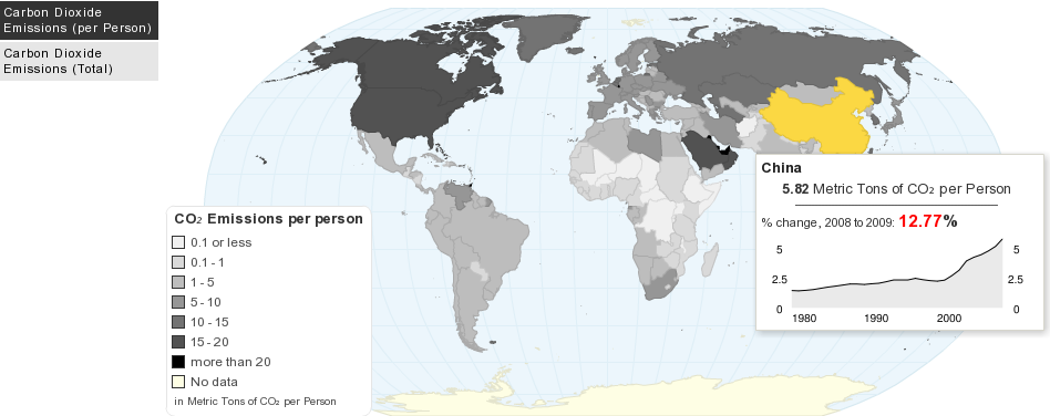
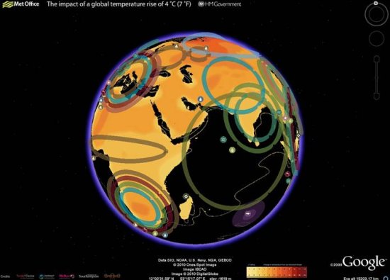
Edwards sees ‘climate science as a global knowledge infrastructure’. All across the globe, there are information gatherers and processors. It is a vast network of distributed data. The sources of that data should always be evaluated, Edwards says. But that’s a whole different debate. What is equally important, is how that data is displayed. Reprocessed. Formed into a data visualization. How do you grasp the complexity of the entire world into one visualization? Of course, a global visualization generally focuses on one specific view or topic. Below are two nice examples.

ChartsBin Interactive visualization on carbon dioxide emissions.
—

FCO (Foreign and Commonwealth Office) Google Earth layer: 4 degrees Celsius temperature rise.
This interactive map shows some of the possible impacts of a global temperature rise of 4 degrees Celsius.
It underlines why the UK Government and other countries believe we must keep global warming to 2 degrees Celsius, because beyond that the impacts will be increasingly disruptive to our global prosperity and security. Source.
What is at stake here, is the well-being of the globe and humanity. Visualizations can make these issues graspable to everybody. When information is transformed into workable data and then to a visualization, this reprocessing is (in)directly contributing to a solution of the issue it is trying to bring to attention. Tiffany Holmes, for instance, supports the idea of combining art and technology to make people contemplate their energy consumption and thereby reduce it. [5] This will make the information even more appealing. Whatever the reprocessing may hold, fact of the (global) matter is that there are some serious world-wide issues to be taken care of, and data visualizations can help humanity to grasp it, model proposals, project impact and show us what we have to gain – and lose.
—
References
[1] Kluver, Randy. ‘Globalization, Informatization, and Intercultural Communication’. American Journal of Communication, June 2000. Available online: http://unpan1.un.org/intradoc/groups/public/documents/apcity/unpan002006.htm
[2] Engelhardt, Yuri. (In print, 2012) Graphics – Neurath, Rosling, and the Universal Principles of Visual Representations. On Information Design.
[3] A very interesting view on the three crises is by Jeremy Rifkin. He talks about an energy revolution, in which renewable energy is distributed like the internet. See the video on this here.
[4] Edwards, Paul N. A Vast Machine. Computer Models, Climate Data, and the Politics of Global Warming. London: MIT Press, 2010.
[5] Holmes, Tiffany. ‘Eco-visualization: Combining art and technology to reduce energy consumption’. 2007. Updated version of paper originally published for C&C’07, June 13-15, 2007, Washington DC USA.