iPhone 5: The Ultimate User Review
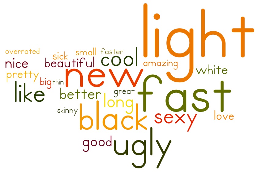
Device reviews are not really the subject of choice on this blog. However, measuring the general sentiment on social networks towards a certain gadget can be quite insightful. In this post I will be examining the iPhone 5 through the eyes of a thousand Twitter users. I have compiled a word cloud explaining the most popular adjectives that people were using when talking about Apple’s latest smartphone.
I believe the data to be quite well representative, as my sample size of 1040 tweets is, according to the confidence level calculator, enough to provide me with a confidence level of 99% and a confidence interval of 4. But more on the methodology later.
Sentiment
The findings of my research reveal that the top 5 words used in relation to the iPhone 5 are: light (101 times), fast (81), new (58), ugly (51) and like (38). While opinion on the top characteristic is unanimous (there are no cases of the word heavy found in the 1040 tweets), the rest of the terms have their counterparts. The statistical correlation between opposing terms is explained in the graphic below.

Opinion distribution in performance, design and overall sentiment towards the iPhone 5. Infographic by Bozhan Chipev.
As we can see, the opinions are leaning towards the positive, especially when it comes to performance speed. Design, being a highly subjective matter in itself, is more divided in opinion, with only a slight advantage for the positives – beautiful, pretty and nice (combined 66 mentions) against ugly (51 mentions). The general sentiment towards the iPhone 5 is overwhelmingly positive with love and like gathering 78% of the mentions compared with 22% for don’t like and hate.
When examining the stronger sentiments love and hate, it became obvious to me that most of them were directed not to the iPhone 5 in general, but to one of its two stock color versions. In the graphic below I have compiled the sum of negative opinions of the white iPhone 5 with the positive opinions of the black one and vice versa.
The outcome, as seen above, is vastly in favor of the black edition of the device. This is interesting because of the stark contradiction with previous Apple devices, where white has always been generally considered the more desirable color.
Issues
In a separate research on Twitter with the same sample size, I looked for what problems and issues with the iPhone 5 are users complaining about. The most discussed topics were the “purple flare” (or “haze”) that the phone’s camera produces when taking photos in direct sunlight (62% of tweets), the integrated “Maps” application (34%), and out-of-the-box scratched devices (11%). The combined percentage is over 100%, because many users mentioned more than one issue in their tweets.
When examining the sample, I observed that a great deal of the mentions of these issues (almost 30%) were in fact quoted news articles. The increased media attention to the above mentioned three issues is probably the reason why the public is so aware and complaining to such a high degree.
It is important to note that, in some cases, the users that were complaining about a certain issue, still stated that they “love” their new devices. This means that even the results of the second research don’t necessarily negate the results and analysis of the first.
Media objectivity
After coming up with the research results and their statistical correlation, I was curious to see whether there were similarities between the ovarall “user score” for the iPhone 5, and the score given by the top technology and gadget websites and blogs.
I will limit my comparison experiment within the two most popular portals CNET and The Verge, because their readership outnumbers significantly the combined audience of all the smaller gadget blogs. CNET gave an overall score of 80% (4 out of 5 stars), which comes extremely close to the results of my “overall sentiment” research.
The Verge, which provides separate scores for the separate aspects of the device, as well as a combined score, is where a bigger difference can be observed. First of all, the final score is 88% (8.8 out of 10), which is 10% higher than the results of my research. Also, the “design” grade is 90%, which is quite far off the 57% mark represented in by study sample.
The obvious conclusion is that CNET’s take on the device is much more realistic and matches well the public opinion, while The Verge seems to have joined Apple’s marketing and hype machine.
Methodology
In order to reach these conclusions, I underwent a lengthy and laborious process of data mining. Using Twitter Scraper, I queried the network’s search engine for fixed phrase “iPhone 5 is so” with an exclusion of retweets (-RT). The reasoning behind this approach is that I wanted to get as many adjectives in the search results (hence, the “so…”), and I wanted to focus on original content and personal opinion (I wanted to avoid my subjects echoing other people’s opinions as much as possible).
I put the resulting .tsv files of my query through MS Excel, where I stripped all the unnecessary data like date, time, usernames etc., leaving only the text of the sampled tweets. I then pasted the text into the online word cloud software Wordle, where I set a maximum of 50 words to be visualized. I used the built-in capabilities of the software to remove common English words that did not persist to my research, as well as censuring obscenities. The cloud ended up losing half of its content, leaving only the most important adjectives and sentiment describing verbs.
In the case of the “issues” and “problems” research, I followed a similar path, but instead of using Wordle, I manually searched “purple flare”, “maps” and “scratches” in the database.
