Visualisation Aesthetics: Creative ways of visualising food and nutrition data
Communicating data can be a difficult task to embark on. Perhaps one of the biggest challenges would be to present / visualise data in a way that even viewers that are not informed or familiar with the subject visualised would gain interest and more importantly, understanding. Data extracted from a number of different sources is visualised for both informational and help purposes. Food, being a universal subject of interest, is not only the easiest to communicate to a broad audience but is also the perfect multi-layered data source.
As a food enthusiast and an individual that is highly intrigued with health and nutrition, I have reviewed and experienced a high number of calorie and exercise tracking websites, as well as followed a number of different health food blogs. Within my quest of trying to find the most informative way of presenting food and the right ways of consuming it, I stumbled upon photographic visualisations that grabbed my attention. Similarly to the way people prefer to know what a certain meal would look like before they follow a recipe and subsequently, cook or order it. Seeing what a 100 calories or a pound of fat looks like makes it easier for viewers to register what they eat, how much of it, and what it means.
People are highly interested in being in control of their bodies, health and nutrition. There is a broad variety of very successful calorie tracking and nutrition advice websites like My Fitness Pal, Calorie Count and LIVESTRONG, which allow users to learn about health and nutrition as well as what sort of nutritional values different foods posses. The aforementioned websites, thus help users collect information and be in control of what they ingest and how they lead their lives. However, those websites serve as more of a data source rather than a device that lets the user really see and understand what nutrition is. That is where data visualisation comes in use; there are many food visualisation projects that can be found online. Within this post, however, I am only going to focus on a certain type of visualisation – Infotography.
Infotography is a type of visualisation that shows and communicates information through photographs.
One of the visualisation projects I will be looking at is the Fat or Fiction project by Anna Brooks, Christina Winkles and David Paul Rosser. Their project addresses how much fat, calories or sugar is in commercially sold, guilty pleasure products such as sweets, cakes, alcohol and so on. The visualisations are presented in the forms of pie charts and timelines, the percentage being represented by pictures of food. The strength of this type of visualisation is in the clarity and accuracy of presenting numbers and information. The viewer can clearly see how much of their favourite treat they can afford to indulge on and what nutritional values it holds. This way of showing a real time photograph of the product and adding a set of nutritional values and information next to it helps the viewer understand what is in the food they choose to eat furthermore, the information provided can later serve as a connotation when the user decides to purchase that same product in the future.
“This series of infotography will guide you through your favourite naughty snacks breaking down the nutritional information bite by bite!” – Fat or Fiction
Another strong point of this visualisation is the interactivity of the application and the entire website. Each visualisation is highly interactive, by hovering over a piece of cake or cheese, the viewer can see how much fat content there is in the food they have hovered over, along with the rest of the nutritional values which appear on the left side of the screen. Using photographs instead of simple colours and information, not only makes the visualisation fun it also makes it easier to read, understand and register. Furthermore, the accurate vector photographs exclude the process of colour selection, which might concern might be a concern for users that are colour blind.
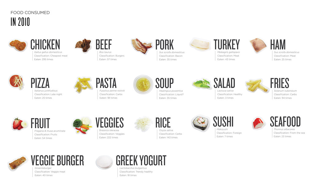
The second visualisation project I will be looking at is Lauren Manning‘s 2010 project. Lauren Manning, a New York-based designer did a data visualisation project for her Master’s thesis. Her project consisted of 40 different data visualisations of food. One of her main goals was to see what the effectiveness of data visualisation is, and how different types and methods of visualising data affect the viewer in terms of memory, interest and understanding. To collect the data for her visualisations, she tracked her daily food intake for 730 days and visualised it in a number of different ways, including pie charts, infotography, mapping, word clouds and so on. Her goal as a designer was mainly to gather information to help develop her research. In the end, what I found most intriguing is her findings on which visualisations the viewers found to be most effective.
“One result that surprised me was how many people chose the pie charts as the most effective. Maybe it was familiarity, or maybe they really did find it most effective, but the two pie charts in the installation got pretty good results.” – Lauren Manning for Visualizing.org
This finding further communicates that familiarity and clarity are some of the main points in creating an effective and understandable data visualisation.
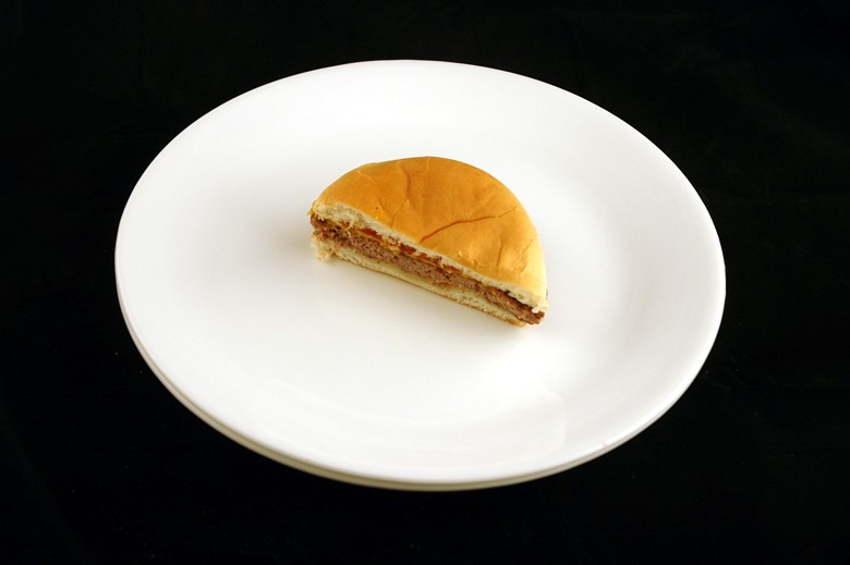
The last visualisation project I will be looking at is WiseGEEK‘s infotography project What does 200 Calories Look Like. Where the website has used simple nutritional information data about different types of food and taken a picture of the different products, on the same sized plate, showing what 200 calories really looks like. The project’s aim is to show the viewers how many calories unhealthy and processed foods contain in such little portions. By using photographs aligned next to each other, this visualisation allows the user compare many different types of foods and drinks in one moment. That gives the consumer the opportunity to really understand how much food is really needed and it makes him see what calories look like in real life. Much like the first project mentioned, this information provided may create a connotation in the consumers mind which would influence his eating habits as well as buyer behaviour in the future.
We can conclude with the thought that each person undoubtedly has different interests, aesthetics preferences and views. Depending on those interests and views, they might or might not be captivated by certain ways of showing data. It could be that every human being remembers or looks at data differently, depending on their preferred way of organising data as well as their understanding of the data shown.
References:
Lauren Manning Design – http://cargocollective.com/thedesignzoo
Fat or Fiction – http://www.fatorfiction.info/
Visualizing Food 40 Ways – http://www.visualizing.org/stories/visualizing-food-40-ways
Wise Geek – http://www.wisegeek.com/


