Where should I live? Visualizing well-being in different countries
Raw data on its own does not contain much meaning. It presents values of quantitative or qualitative variables that are results of measurements and computations. Data needs some context so that it can be analyzed and visualized in order to become meaningful, or in other words: to become information. In that way, data can be used to tell stories. Visualization is a convenient technique to do this, through creating graphs, charts and figures that can present data in an understandable manner.
Nowadays data visualizations may be associated with modern technologies and computational tools, but the visualization of information existed long before the computer was even invented. Can you imagine: making a good-looking and reliable infographic with just pencils and paper! New technologies and tools to analyze and visualize data have made this process much easier, faster and more accessible. The biggest change new technologies have introduced to the field of information visualization, however, is the possibility to make visualizations interactive. That means that users can play with the data through the visualization, thereby having the possibility to discover a story on their own. This aspect covers perhaps the most significant difference between interactive and non-interactive data visualizations: the essence of storytelling. In non-interactive data visualizations the author tells a story, whereas in interactive data visualizations the user finds a story. In their 2010 article Segel and Heer refer to this as they distinguish between author-driven and reader-driven approaches. They argue that most visual stories fall somewhere in between these two approaches.
The choice of making a visual story more author-driven or more reader-driven depends on its goal and can have very different effects. I will discuss an example of a visual tool that successfully implemented a reader-driven approach to illustrate how the choice for a certain approach can make a difference.
Your Better Life Index
Your Better Life Index is an interactive visual tool developed by the OECD (Organisation for Economic Co-operation and Development) and sets a good example of a visual story based on a reader-driven approach. The goal of the project is to let users compare some of the key factors that contribute to well-being in OECD countries. This involves thirty-six countries and eleven factors of well-being, such as income, education, environment and safety. The eleven topics “reflect what the OECD has identified as essential to well-being in terms of material living conditions (housing, income, jobs) and quality of life (community, education, environment, governance, health, life satisfaction, safety and work-life balance).” This results in an enormous dataset of country-specific data for different topics that contribute to well-being. To provide a story with all this data, the OECD has decided to opt for a reader-driven approach. Instead of telling users what might be the best country to live in, the OECD lets users make their own decision: “the tool allows users to see how countries perform according to the importance you give to each of eleven topics that make for a better life.”
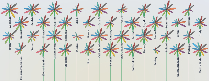
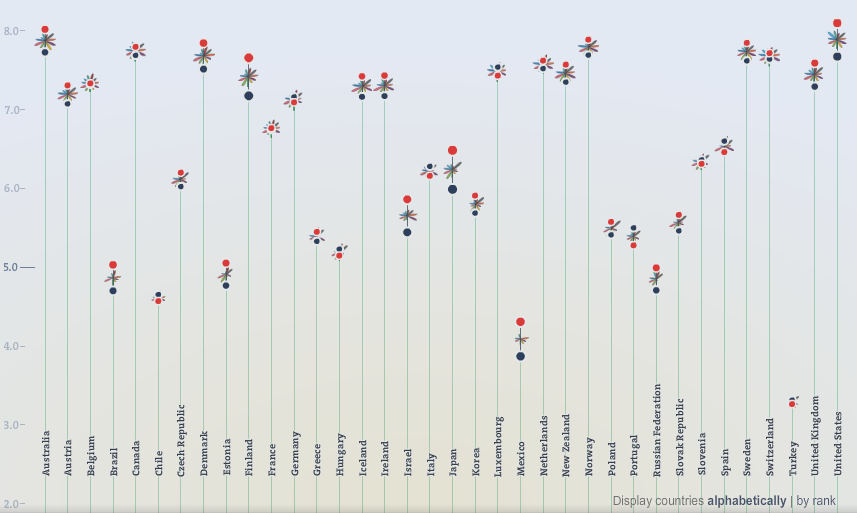
The main page of the website provides an overview of the countries and the factors related to well-being and allows you to create your own index according to your own ratings. The countries are represented by symbols of flowers and each petal of a flower represents one of the eleven topics. The length of a petal symbolizes the country’s score in a topic, while the width shows the users rating of importance given to that topic. The scores of a particular country on the different topics are also displayed in a simple pop-up bar graph when you scroll over that country. This makes comparison between the different topics easier than looking at the lengths of the petals. Furthermore, the countries are ordered along a vertical axis based on their scores and can be displayed alphabetically or by rank. When you adjust the ranking of the topics, the countries will move up or down the scale according to these rankings. You also specify the visualization by using the option to compare men and women.
In short, the main page lets you make a comparison between different countries and topics. These are defined by the OECD, and therefore refer to an author-driven aspect of the visualization. However, you have complete freedom to rate these topics according to your own interest. Therefore, it is up to the user to decide which country ranks number one. This makes the main page primarily reader-driven: the user can discover a story by interacting with the tool.
The second informational layer of the tool consists of the country-specific pages and the topic-specific pages. These pages provide you with an overall description for a particular country or topic plus detailed textual information for each country and topic. Small supportive graphs are shown on the side to demonstrate comparisons with other countries and show statistics of gender and social inequality. In general, the country and topic pages are more author-driven. However, at country-specific pages users have the possibility to compare the displayed country to another country. This results in a “highlighting” of the scores of that other country in the small supporting graphs. In this way, the country-specific pages let you compare two different countries at a time while providing rich and detailed information about all topics.
Finally, another interactive aspect of Your Better Life Index is the possibility to share and compare your personal Index with other users. For instance, I can compare my Index with the indexes of other Dutch women in my age category. But I can also compare it to other indexes and see if there are any notable differences between countries, sexes or ages.
Functional storytelling and future ideas
As Alberto Cairo points out: think about function before you think about aesthetics. According to his recent talk at the Infographic Congres 2013 in The Netherlands, infographic making depends on three core skills: dealing with information, striving for functionality and experimenting. Your Better Life Index seems to do a good job at all three: the tools presents a lot of information in a clear way on the main page and in more detail on the country and topic pages. In terms of functionality, the countries on the main page and the small graphs on the country and topic pages are presented as bar graphs, which is the best visualization for comparison according to Cairo. Lastly, by letting users do the ranking and create their own indexes, the project experiments with story telling.
By comparing different countries and topics you can find some interesting stories, such as that some of the countries that score highest on well-being have a relatively low score on income. Australia for instance has the highest score on well-being based on all eleven topics, despite having a score of only 4.6 out of 10 on income. This supports the idea of “money does not make you happy”. But the tool can also make you aware of missing data or a lack of options. For instance, what if you are interested in information about cities or specific regions? The tool only provides information for the whole of a country. So if my personal Index shows Australia as the country with the best life according to my own preferences, then where should I go in Australia? Also, I am surprised that there is no topic about climate or weather. This could most certainly also influence well-being. For instance, research has demonstrated that people living in North-Scandinavia are more likely to get depression compared to countries and regions closer to the equator. Finally, in order for the data to stay relevant it should be updated over time, for instance every year. It would then be interesting to explore data over time, and maybe even give users the option to link mayor events to the data, such as natural disasters, political conflicts or events and the economic crisis. These could be possible ideas for updates in the future.
Creating your own story to generate new data
Your Better Life Index lets users visually explore topics that contribute to well-being and their scores in different countries without presenting it in a static author-driven story. By avoiding an absolute top-down ranking of countries but instead letting users rank the different topics, the project gives notice to the subjective aspects of these topics. Subsequently, the creation and sharing of personal indexes allows the OECD to create another story based on this data “to build up a picture of what citizens from across the world believe shapes a good life”. All in all, Your Better Life Index sets a great example of the added value that results from new technologies to create interactive visual stories.
Here you can see my personal Index:
Visit the website to make your own Index.
References

