Mapping the Web
By zooming in and out, you navigate through the digital Pompeii of millions of abandoned homepages. While you pass the neighbourhood called ‘Pentagon’, you see military images and short stories about the army. By entering another district named ‘Vienna’, you are confronted with information about classical music and ballet.
The Deleted City
Long before the rise of social media like Facebook and Twitter, GeoCities was used by tens of millions of users to conquer their own territory online. Users created their own homepages for free, containing information about themselves or topics that they were specialised in. By connecting these homepages by theme, neighbourhoods like Vienna or Pentagon emerged.
In 2009 GeoCities was taken offline by Yahoo!, who bought the digital city in 2001 for 3,5 billion dollar. By then, most of the users had left GeoCities and now used their profiles on MySpace and Facebook. Just before the website was finally deleted, The Archive Team made a back up of GeoCities of 650 gigabyte of data, that was generated by the 35 million users over ten years.

Richard Vijgen – The Deleted City
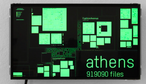
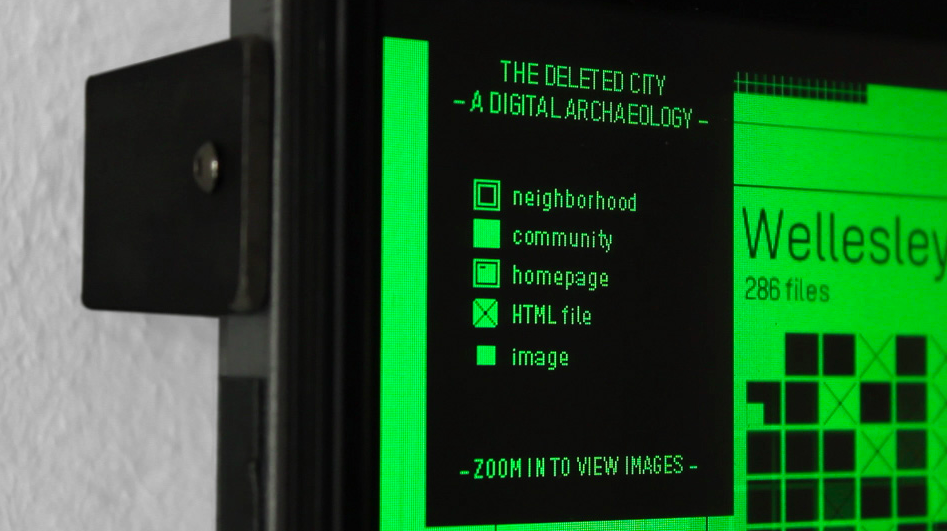
Information designer Richard Vijgen created The Deleted City (2011), a visualization of the 650 gigabyte of deleted homepages. With the interactive datavisualization you can navigate endlessly through the digital Pompeii of GeoCities. Vijgen reordered the archive by neighbourhood, and visualized it as a large blueprint of a city with houses. In the visualization, you find the names of the neighbourhoods and by zooming in you can visit the individual homepages of the users. By visualizing the remains of GeoCities, this part of web history is not just archived, but actually accessible and navigable by end users (see video below).
Mapping the Web
Meanwhile, the Internet has more and more become a medium for mapping and visualizing the physical world. With Google Maps and Google Street View you can wander around in the city or take a walk through the countryside. Geotagged photos on Flickr show you what has happened before on a particular place. And especially social media are filled with what is happening offline. The virtual has now become the everyday (Lovink and Rossiter).
But the Internet is not only a medium for representing the everyday world, it is also a cultural sphere itself (think of GeoCities) and a digital universe of data that is often times incomprehensible. What does the Internet look like? You might think of the browser that you use right now, and probably you also think of Google Search, but these are only portals to enter the Web.
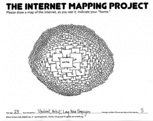
 Many people, including theorists and information designers, have asked themselves this question. In 2009 Kevin Kelly has started the Mapping The Internet Project. He asked visitors to draw their own map of the Internet. It turned out that apparently everyone has a different view on the Web.
Next to this particular ‘folk cartography’, some information designers tried to actually map the entire Internet. One recent and interesting example is a project by Ruslan Enikeev, who took 350.000 websites, and arranged them in a vast map, organised by visits and location.
This Internet map is a bi-dimensional presentation of links between websites on the Internet. Every site is a circle on the map, and its size is determined by website traffic, the larger the amount of traffic, the bigger the circle. Users’ switching between websites forms links, and the stronger the link, the closer the websites tend to arrange themselves to each other.
To draw an analogy from classical physics, one may say that websites are electrically charged bodies, while links between them are springs. Springs pull similar websites together, and the charge does not let the bodies adjoin and pushes websites apart if there is no link between them. Originally, all such electrified bodies (websites) are randomly scattered on the surface of the map. Springs are stretched, repulsion energy is high – the system is far from being at equilibrium. Then the websites start moving under the influence of the forces exerted and in a while come to a halt – forces of attraction now become equal to forces of repulsion, the system has reached its equilibrium. It is exactly that state that is shown on The Internet map. (Enikeev)
Cultural Analytics and Finding Patterns
In 2007 Lev Manovich proposed his method of Cultural Analytics: the use of computational and visualization methods for the analysis of massive cultural data sets and flows.
In the present decade our ability to capture, store and analyze data is increasing exponentially, and this growth has already affected many areas of science, media industries, and the patterns of cultural consumption. (…) We feel that the ground has been set to start thinking of culture as data (including media content and people’s creative and social activities around this content) that can be mined and visualized. In other words, if data analysis, data mining, and visualization have been adopted by scientists, businesses, and government agencies as a new way to generate knowledge, let us apply the same approach to understanding culture. (Manovich: 3)
Cultural Analytics can be applied both on digitized material and born-digital, real-time artifacts to create an understanding of all kinds of culture. By visualizing large datasets, one is able to find patterns. A pattern sometimes tells a story that could not have been found or understood by reading the raw data. The Internet Map by Ruslan Enikeev and The Deleted City by Richard Vijgen allow you to navigate through the Internet as universe or the ‘Internet city’ of GeoCities. Both data visualizations are interactive environments in which you can explore the patterns, or zoom in to the detail of only one website or homepage.
By visualizing something as complex as the Web itself, we can get a better understanding of this particular environment. Since these visualizations also (re)shape our view on the Internet, it would be interesting to repeat the ‘folk cartography’ project of Kevin Kelly once in a while. And by visualizing the patterns in all these drawings over time, through cultural analytics, we might get a better understanding of how we perceive the Web and its cultures.
Works Cited
Enikeev, Ruslan. “About The Internet Map” 2011, last visited March 20, 2013.
<http://internet-map.net/>
Kelly, Kevin. “The Internet Mapping Project” 2009, last visited March 20, 2013.
<http://www.kk.org/ct2/2009/06/the-internet-mapping-project.php>
Lovink, Geert, Ned Rossiter. “The Digital Given: 10 Web 2.0 Theses” Fibre Culture Journal
V.14, 2009, last visited March 20, 2013.
<http://fourteen.fibreculturejournal.org/fcj-096-the-digital-given-10-web-2-0-theses/>
Manovich, Lev. “Cultural Analytics: Analysis and Visualization of Large Cultural Datasets” 2007.
<http://www.manovich.net/cultural_analytics.pdf>
Manovich, Lev. “Cultural Analytics” 2009, last visited March 20, 2013.
<http://lab.softwarestudies.com/2008/09/cultural-analytics.html>
Yunker, John. “A Whole New Way of Looking at the World” 2011, last visited March 20, 2013.
<http://bytelevel.com/map/ccTLD.html>
