#IC14NL: Selfiecity
The 7th Infographic Conference took place last month on March 7th and featured Selfiecity, a collaborative project led by Lev Manovich and the Software Studies Initiative that was presented to the audience by fellow team member Mortiz Stefaner. Launched in early 2014, Selfiecity is an interactive and exploratory data visualisation that investigates a multitude of Instagram self-portraits (or selfies) from five global cities using a mix of theoretic, artistic and quantitative methods. If you want to see a selection of women wearing glasses in New York who tilt left or find out what the characteristic selfie mood for people in Moscow is, you are in the right place.
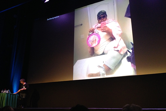
Fig 1. – Mortiz Stefaner presenting Selfiecity at the 7th Infographic Conference in Zeist
For a cultural phenomenon born lately of the webcam and front facing smartphone camera, the selfie has been subject to a substantial amount of media hype and dissection. Instagram user “Jennlee” is said to have shared the first photo of herself with the hashtag #selfie in 2011. Since then, everyone from the Pope to Kim Kardashian has been spotted in one and an estimated 78 million have been uploaded to the platform. The selfie hubris reached saturation point in 2013, when Oxford Dictionaries announced the ubiquitous noun as the “Word of the Year”. According to Oxford Dictionaries, a “selfie” is “a photograph that one has taken of oneself, typically one taken with a smartphone or webcam and uploaded to a social media website”. Others however, have labelled them as the “ultimate emblem of the age of narcissism” and a “new way not only of representing ourselves to others, but of communicating with one another through images”. Although there have been various critical think pieces and historical examinations of the selfie, few have systematically explored it as the Selfiecity team, who have put this technological self-documentation under a data-driven microscope. Organised under the banner of cultural analytics, the project can also be interpreted as an attempt to visualise a fraction of the images that circulate on the Web through new tools and methods. My interest in Selfiecity rests in this approach, which attempts to process raw data into quantifiable representations of a cultural trend, that in turn can aid of understanding of society.
Selfiecity’s intuitive usability and rich visualisations mask what was an extremely complex and multi-stage research project, beginning with the data collection process. During one week in December 2013, the team collected raw data by querying Instagram’s API through GNIP for images taken from New York, São Paulo, Berlin, Moscow, and Bangkok. This yielded a large corpus (650,000) that later relied on workers crowd-sourced through Amazon’s Mechanical Turk for human judgement to winnow down the amount of selfies in a random sample of 120,000 photos (20-30,000 per city). Although the results varied slightly, an interesting finding was that approximately 4% of all images from the cities were indeed selfies, highlighting that people take less selfies than often assumed. Moreover, the Mechanical Turk workers were also asked to estimate the age and gender of those in the images to extract demographic trends. Further statistical data derived from automatic image analysis that spotted whether the person in the photo was wearing glasses, in addition to their mood, eye position, and head rotation/tilt. After final formatting the end result was 3,200 selfies (640 per city) and their connected external metadata. However, although the trimmed number may seem high there is no real indication if it was statistically significant. Furthermore, the data collection process was also lacking when it came to determining the age, gender and mood of those in the photos, as these qualities differ from one culture to another.
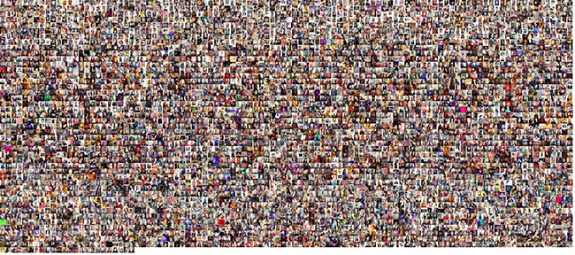
Fig. 2 – Montage of the 3,200 Instagram selfie photos used in Selfiecity.
But “how do you spot patterns across a vast image collection?” asked Stefaner during his talk. The biggest challenge presented to the team was summarising the most interesting and essential aspects of their data, whilst still allowing the user to uncover interesting facts. As Manovich et al. note, analysing large cultural datasets in combination with interactive interfaces and visualisations has the potential to sharpen and enrich our understanding of society and culture (4). Selfiecity for instance, allows us to acquire a new depth into the phenomenon of selfies and the public psyche by the sorting and clustering of over a thousand cultural objects along multiple dimensions. This can deepen our understanding of a single object as we are able to visualise it in relation to precisely delineated larger patterns (Manovich et al. 4). Moreover, and of equal importance, it also eliminates the distinction between the precision of a “close reading” (the analysis of singular texts) and Franco Moretti’s notion of “distant reading” (the analysis of large scale patterns). Rather than privileging one scale of analysis, the user is able to transverse between both of them by “zooming” (in and out) to observe global/local patterns and individual selfies that reveal more detailed information. In the words of Jeffery Heer, Selfiecity attempts to achieve this through a variety of visual representations that allow the user to triangulate their understanding of the subject matter.
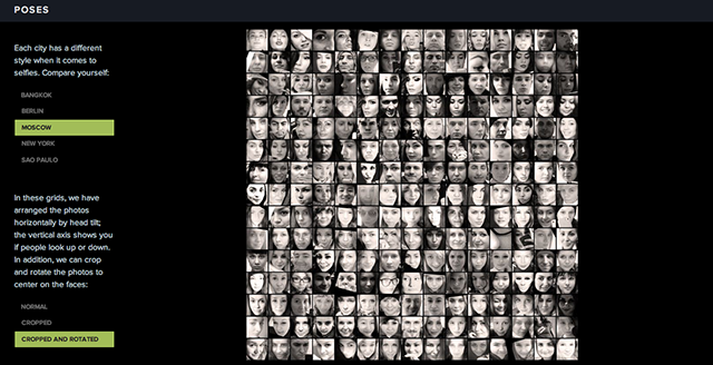
Fig. 3 – Image plot with selfies arranged by head tilt (horizontally) and if people are looking up or down (vertically)
Figure 3 allows the user to select a series of city-specific “image plots” and examine differences in selfie poses through a process inspired by Manovich’s work, specifically as outlined in “How To Compare One Million Images?”. Similar to a scatter plot or a line graph, which display data as points and lines, an image plot superimposes images over data points in a graph and is useful to compare datasets ranging from a few hundred to one million images. Conceptually, this is the simplest technique used to portray a number of similar visual objects together, in this case organised by internal metadata. However, not many insights can really be gleaned from Figure 3 alone and I was not left any smarter about the norms behind cultural expression in selfies. However, Figure 4 allows the user to easily quantify facial expressions to reach more substantial conclusions. In the words of Alberto Cairo, as a visual species this image plot helps us perceive patterns across the cities that would otherwise be beyond our natural reach (10). Moreover, the images plots highlight techniques used in cultural analytics. In comparison with cultural analysis, which relies on human interpretation, Manovich describes cultural analytics as relying on computer algorithms to recognise and interpret culture. Hence, Figure 4 reveals an interesting method employed by the team that sorts images by their algorithmically extracted visual features.
This allows the user to visually quantify and compare demographics across cities through a “distance reading” or “zoomed out” view. They also allow the user to conduct a “close reading” and browse through specific images by hovering
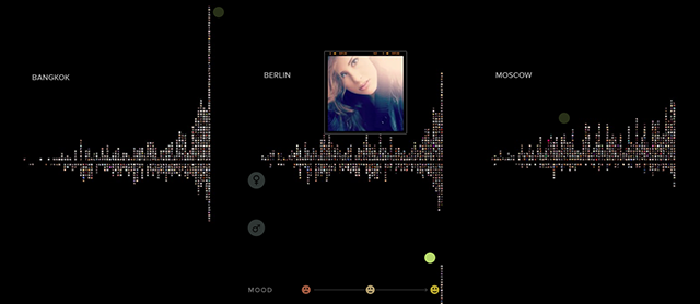
Fig. 4 – Image plot of facial expressions in selfies distributed by gender and city
Towards the end of his talk, Stefaner highlighted that the team decided to take the project one step further by incorporating the full dataset into an interactive application, allowing the user to become a “data detective”. When using the aptly named Selfiexploratory, the user can filter images by city, age, gender, pose, features and mood, whilst the algorithmic output immediately displays the results in a grid layout (see Figure 5 ). Following Heer’s taxonomy of interactive dynamics for visual analysis, this aspect of the project is best described as falling under the “date & view specification” model (1). It uses a dynamic query that allows the user to perform direct manipulation to the dataset in order to make their own findings, correlations, and conclusions, whilst also raising his/her own awareness about the selfie phenomenon.
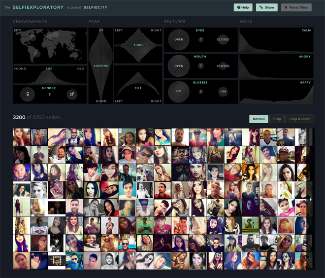
Fig. 5 – You can explore the data set by using Selfiecity’s interactive visualization tool Selfiexploratory
Furthermore, it allows the user to verify the results presented by Selfiecity. This resonates with Stefaner’s blog post claim that “data does not always equal truth” and we should always remain critical consumers of information. I think Selfiecity’s main strength rests in the openness of their dataset, which does not follow a traditional proprietary format and invites the user to dig deeper. However, just as Peter Warden cautions against the blind acceptance of a data visualisation, we should also remember that the results of Selfiecity should not be understood as universal traits nor are they applicable to the wider community. There is also digital divide in the unequal access to technologies and the Internet by the general public, and selfie production is limited to smartphone users who are active on Instagram. Thus, Selfiecity predominantly features members of Western society and completely excludes data from Africa or the Middle-East for example. Although we should keep these socioeconomic limitations in mind, the opportunities Selfiecity offers are still intriguing and it reveals a lot about Instagram as an exemplary online image-sharing platform, therefore offering insights into some of the uses of social media in general.
References
caltech. “Interactive Data Analysis – Jeffrey Heer – May 23, 2013.” Youtube. 12 June 2013. Accessed 11 April 2014. <http://www.youtube.com/watch?v=WwNs-lDq7f4>.
Heer, Jeffery, and Ben Schneiderman. “Interactive Dynamics for Visual Analysis.” ACMQUE. 2012. Accessed 11 April 2014. <http://queue.acm.org/detail.cfm?id=2146416>.
Manovich, Lev, et al. “How to Compare One Million Images?” Software Studies Initiative. 2011. Accessed 11 April 2014. <http://softwarestudies.com/cultural_analytics/2011.How_To_Compare_One_Million_Images.pdf>.
Moretti, Franco. Distant Reading. New York: Verso Books, 2013.
Warden, Peter. “Why you should never trust a data scientist.” Peter Warden’s Blog. 18 July 2013. Accessed 11 April 2014. <http://petewarden.com/2013/07/18/why-you-should-never-trust-a-data-scientist/>.