Red, Greyscale, Blue: Mapping Colour Intensity against Political Bias in News Media
In a world where mainstream media outlets are increasingly being bought by tech corporations,[1] fake news sites might sway elections,[2] and supporters of different political viewpoints rarely read sources with opinions that differ to their own,[3] it is important that we have the tools to perceive news media critically.
Our research project aims to open up a new dimension to interface analysis, focusing on the colours used in web design and the intensity they produce when used together. We hone in on news sites because the future of traditional news outlets in the new media landscape is an ongoing debate. Technology has driven a demand for online news, and falling print circulation has forced many news outlets to rethink their business strategy, with many now turning to their web offering to provide income.[4]
With this in mind, we’re interested in whether there is a relationship between the colours used on news sites and the site’s political bias. For our research, we will take the most-read news websites across the political spectrum, and work out the intensity of their colour palette. A site with high colour intensity will use a vibrant colour palette, where as low colour intensity means a site sticks to greyscale.
We predict that there will be a positive correlation between colour intensity and media bias, with the most biased news sites having a more vibrant colour palette. Whatever our findings are, we want them to be available to the public to interact with. Therefore, we will also create a new media tool that encourages the public to consider how their perception of a news site can be swayed by the site’s use of colour.
Why Colour Choices Matter in News Media
In our daily lives, we have the opportunity to read the news from whichever sources we want. If we do not have a preference for media brand, or want to Google a particular issue, we could end up on any number of sites. Drawing on Herman and Chomsky’s idea of manufacturing consent, we know that each news site has its own bias, motive and ownership.[5] We want to see if there is a link between these biases and the colours used by the site.
According to affect theory, colour is central to forming an emotional response to a visual cue.[6] Colour also contributes to the sensory affordances of a website. Sensory affordances are the design features of a website that are associated with visual or other sensations – such as font size and logo.[7] This makes colour an important asset of design across all industries. For instance, a recent piece of consumer market research found that 80% of the information we take from logos comes from colour alone.
Our study not only contributes to the general debate surrounding the future of news media, but it also provides further insight into interface design and affect theory. According to Papacharissi, affect is defined as “the intensity with which we experience both reason and emotion”.[8] While this research focuses on colour intensity as a variable to determine a correlation between political bias, it can be extended in order to provide a framework by which news sites can be analysed based on various visual factors such as font, lines, space, and layout etc.
The websites used for this analysis represent the most read news sites who fall under different degrees of political bias. This provides a significant selection of news sites will appear when readers are searching for news: particularly as popularity affects how highly Google places a web result.[9]
Finding a correlation between colour intensity and political bias means our research could inform academics, media professionals, and give the public a new tool for new media analysis. Our research will provide insight into the visual cues that are often overlooked by the naked eye and the biases that may inform these cues.
Turning Qualities into Quantities: Mapping Media Bias and Colour Intensity
In order to identify and analyse the possible correlation between colour intensity and the level of bias in news media, we need to first choose our object of study. For this research, we have selected a pool of highly read news media websites with varying degrees of political bias.
To make sure we cover the entire political spectrum, we have grouped the news sites into five categories: left bias, left-centre bias, least biased (centre), right-centre bias, right bias. We have taken this classification system from the website Media Bias/Fact Check (MBFC). Despite MBFC’s subjective elements in its measurement and categorisation, we find it to be the most comprehensive and relatively consistent tool available for measuring political bias in news media.
We then use Amazon’s Alexa Top Sites function to identify news media websites with the largest readerships around the world, as indicated by Alexa’s Global Traffic Rank. Based on the ranking results, we cross-reference with MBFC’s classification system and collect the top five news sites for each of the five categories mentioned above.
We made the decision to manually exclude certain sites that did not fit in with our research, due to their uncertainty in media bias or narrow geographical focus. For instance, we excluded sites that predominantly feature user-generated news contents (Reddit), focus exclusively on national news (Indian Express, USA Today), or gather news contents from other sources based on user customisation (Yahoo News, Google News).
To determine if there is a correlation between the level of bias and colour intensity, we need to assign a “bias value” to each site. Although MBFC has a bias rating system on the scale of 0 to 10 in its methodology section, the ratings for individual news sources are not publicly available. Therefore, we assign left/right media a bias value of 8, left/right-centre 5, and centre 2.
The left and right sites will differ tremendously in their coverage of the news, but both are as far from the centre as possible. Therefore, they both have an equally high bias rating in our study. The resulting pool of 25 news sites is shown in Table 1.
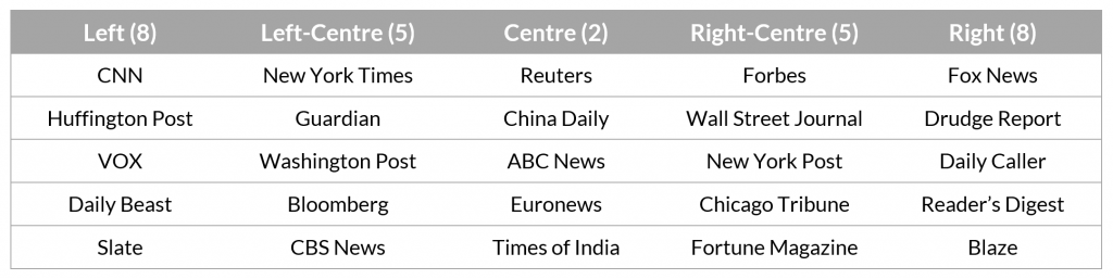
Table 1: Top five news sites within each bias category.
Now that we have a numerical value for the level of political bias, we need to quantify our other variable: the colour intensity of each of these sites. To do this, we use the colour sampling tool Picular, which extracts a single dominant colour based on each image of the Google Images search results.
Take Fox News for example: we take the four colours in the top row, manually checking whether each image matches the news media using the website’s preview function. We then collect the hex triplet colour code for each colour and create a colour profile for the site – visualised as four concentric circles, as shown in Figure 1. The steps are then repeated for the other 24 news sites.
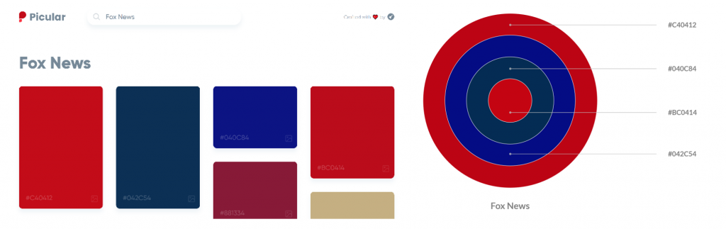
Figure 1: Picular interface and the visualisation of Fox News’ top four colours.
A high colour intensity means a site has a vibrant colour palette. In technical terms, a vibrant colour palette means the colours have high saturation. In order to measure saturation, we convert the hex colour codes to RGB values, which measure the relative strengths of red, green, and blue. Greyscale colours appear when the amount of the three colours are equal – for example, black’s RGB value is (0, 0, 0). On the other hand, a high saturation indicates greater dispersion among the RGB values – for instance, bright red is (255, 0, 0).
Therefore, we calculate the standard deviation, a measure of dispersion within a dataset, of the RGB values in order to determine its saturation. A more vibrant colour will have a higher standard deviation, whereas a greyer colour has a lower value.
To determine the overall colour intensity of one site, we then take the average of the fours standard deviations derived from each sampled colour. The colour data and calculation for Fox News are shown in Table 2.
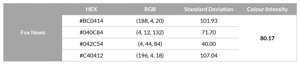
Table 2: Conversion from HEX to RGB colour codes and the calculation of colour intensity.
Now that we have defined and quantified each site’s colour intensity, we repeat the same steps for the other 24 sites. With each site now having a numerical bias value and colour intensity, we can start to visualise our results in different ways. For instance, in Figure 2 we can see each of the news sites listed with decreasing levels of colour intensity.
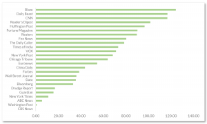
Figure 2: All 25 news sites with decreasing level of colour intensity.
To analyse the correlation between colour intensity and the level of political bias, and therefore working out if our prediction was correct, we plot a scatter graph of the two variables, which can be seen in Figure 3.
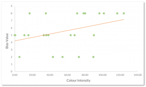
Figure 3: Correlation between bias value and colour intensity (correlation coefficient: 0.4).
From Correlation to Visualisation: Mapping the Results
As is shown in Figure 3, there is an indication that our initial prediction of a correlation between colour intensity and media bias is correct. However, with a correlation coefficient of around 0.4, the correlation is moderate at best (a strong correlation would have a correlation coefficient between 0.7 and 1). For our prediction to be fully realised, the centre would have the least colour intensity and saturation would increase steadily along with the level of political bias. This would result in a stronger correlation indicated by a steeper trendline in the above scatter plot.
The weaker correlation means that part of our dataset might be behaving unusually, going against the general trend. To tease this out, we can arrange our results in a different format that allows us to compare the average colour intensity across the five categories of political bias, as seen in Figure 4. By arranging the data in this way, we are able to see what is causing the weakened correlation.
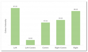
Figure 4: Viewing the average colour intensity across the five bias categories.
As we can see in Figure 4, the left and the right columns act as predicted, boasting the highest colour intensity. The move from centre to right follows our predicted pattern, increasing in colour intensity as bias intensifies. However, there is one category that is glaringly obvious in its defiance of this trend.
This category is the left-centre, which has a significantly lower colour intensity than all other categories. This implies that the left-centre use a much less vibrant colour palette than outlets across the rest of the spectrum, which becomes obvious when we compare each site’s colour profile, as seen in Figure 5 below. Visualising the colour palettes of each news outlet in this way highlights the absence of colour in most of the left-centre’s outlets, and amplifies their penchant for greyscale.
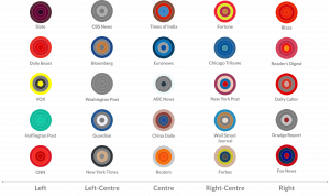
Figure 5: Visualising colour use across the news media’s political spectrum.
Figure 5 also interestingly highlights how outlets are recognisable just from the colours associated with them, even displayed in a format that doesn’t resemble their logo or homepage. An individual’s ability to connect their memories of looking at actual sites with this abstract visual representation enhances how sensory cues build feelings of familiarity in web design.
Focusing back on the anomaly of our results, the left-centre column, and contrasting it to the centre raises further questions. We predicted that the centre outlets would have the lowest colour intensity, due to how colour is linked with emotional responses and political ideals, and the centre is the most neutral reporting stance. This prediction would mean that the centre would use more greyscale than any other category, but this is not the case.
It is significant that the left-centre category holds a much lower colour intensity score than the centre, with most outlets opting for a colour palette closer to greyscale. There will be many factors that are considered when choosing the colours for a news outlet: such as readability, association with previous print editions, and user research. However, we can still pose an interesting further question with these results: is it possible that left-centre outlets want to present themselves as neutral, or picture themselves as neutral, and are therefore prone to using a colour palette that is associated with neutrality?
Redesigning the Left-Centre: A Recent Example
Earlier this year, The Guardian redesigned both its print and digital offerings, changing its logo and colour palette in the process. The Guardian is one of the outlets picked up by our research: it is the third most-read news site in our study. It also sits in the left-centre bias category, which is why its redesign is particularly interesting to examine through the lens of our research.

Figure 6: Comparison of The Guardian’s old and new logos and colour palettes.
As shown in Figure 6, we can compare a screenshot of The Guardian’s website a year ago to current day. Before the redesign, the front page used colours which would have given it a higher colour intensity score in our research, including a header with the Guardian’s signature blue. The new front page features a lot more greyscale, and uses hints of colour to guide the reader towards different sections and breaking news stories.
There will be many reasons why The Guardian decided on this new colour scheme, but it is interesting that an increased use of greyscale means their colour palette aligns more closely with the other left-centre outlets in our study.
Encouraging Critical Engagement: Introducing the New Media Tool
Using our results, we want to create an informative, interesting and interactive tool that encourages users to consider how the use of colour affects their perception of news websites. We think that the best way to do this is to create a website; meaning that engagement with our results is not just restricted to an academic context, but is accessible by the general public.
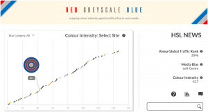
Figure 7: User interface of the website prototype.
As per our prototype (Figure 7), this website would extend its dataset beyond the 25 sites we used, initially mapping out Alexa’s top 100 news sites (minus any necessary exclusions). The main focus of the website would be the graph of these results, which allows users to search for a news site and see where it is mapped in comparison to other sites for factors such as colour intensity, media bias, and the site’s Alexa rank.
This tool would be an open and informative way to encourage the public to engage with our results. Given that the general public will have various levels of competency with graphs, we will give users the option to pick a different graph style, allowing them the opportunity to visualise the results in ways that make sense to them and their purposes.
Although open to the public, our research tool can also be utilised in an academic environment. The tool provides academics with a solid collection of news sites, their political bias and reader statistics, and an important factor of their interface: their colour palette. Further research could be conducted to intervene in the debate surrounding the future of news. Possible avenues for further research are the presentation of news sites on social media platforms, comparing public perceptions of bias with MBFC’s bias rating, or even analysis of the design of fake news sites.
Reflections, Limitations, and Further Research
Our research has found that there is a positive correlation between colour intensity and media bias. However, perhaps the most interesting finding of our research is that our prediction wasn’t entirely correct: the correlation was weakened as a result of left-centre sites using more greyscale than sites in the centre.
Using our results, we have created a prototype for a website which encourages users to critically engage with news sites. We hope that the insights users gain from using our tool enhances their analysis of news sites they engage with on a daily basis, as well as news sites they stumble across on Google.
Of course, there are some limitations to our research, such as the use of Media Bias/Fact Check. MBFC only shared bias categories, as opposed to numerical ratings of bias, which would have increased the precision of this study. Similarly, using the tool Picular, we are uncertain how dominant colours are generated and the search results are dependent on Google images. Consequently, the results and their layout may change in real time, providing different colour profiles.
Our research operated at a global level, but our methodology could be taken further to map bias and colour intensity on a national news level as well. This would make for particularly interesting results when comparing countries where colours have differing political associations.
This research aims to provide an intersection between affect theory and interface design, focusing on the most read news sites worldwide and and their underlying biases. The methodology used in this study forms a foundation upon which future academic research can be conducted, and the website will offer a new tool to perceive news media critically.