MOM Over Time: A meta-analysis
Introduction
MOM, a weblog belonging to the students and professors of Media Studies at the University of Amsterdam, has been online for about fifteen years now. Master of Media blog (MOM), is about new media phenomena and digital culture and its contributors are posting about their academic explorations and research projects. This weblog was launched in 2001, but it mainly became active in 2006. Analyzing posts on MOM offers a fertile ground, specifically interesting for conducting academically motivated research concerning digital culture for at least two reasons. Firstly, it is a considerably relevant blog to media and digital culture with 2,890 published posts authored by students and faculty members in the cutting edge academic institution of new media. Secondly, this weblog has been constantly updated for the last thirteen years. In the rapidly changing digital media environment, thirteen years is a long history. Thirteen years ago in January of the year 2006, Facebook was still only restricted to university students, Twitter was not launched yet and there were no iPhones in the world!
Therefore, here, we are concerned with a meta-analysis: an analysis of an analytical weblog about new media and digital culture. This brief research was initially an attempt to answer two questions through text analysis and visualizing the outcome (as it will be explained more thoroughly in the methodology part): (1) Have there been trends for Master students of media studies over the years? If so, what were the trends?, and (2) What could be considered a new media object over time?
Methodology
In order to effectively answer the research questions and go about studying content on the MOM blog, the article employs a text analysis software named AntConc. The software, developed by Dr. Lawrence Anthony, a linguist and professor of Engineering & Science scans through large corpuses of texts and performs 7 actions specified under 7 different tools.
The software requires a user to upload a corpus of data before employing any of the tools. The ‘concordance’ and the ‘concordance plot’ tool of the software show us the search results in its context and the occurrence of the search term in a barcode format. ‘Cluster’ and ‘collocates’ tool gives us the complimentary words for the search term and with what words has the term been used the most. ‘Fileview’ tool allows us to reach the paragraph/article of the search term. ‘Wordlist’ and the ‘keyword list’ tool let us know the most frequently used words and frequently used keywords in the corpus.
In order to go about researching the blog, it first had to be reduced to several different corpuses of dot-txt format; categorized according to the years and the corresponding blog posts containing all the text from the particular year. The reason for doing this; AntConc being a software for text analysis and is compatible only with dot-text files. Once the corpuses of data were ready, they were loaded to the software and employed under the aforementioned 7 different tools, the results of which were visualised using tools like Giphy, DataWrapper and presented further in the essay.
Findings
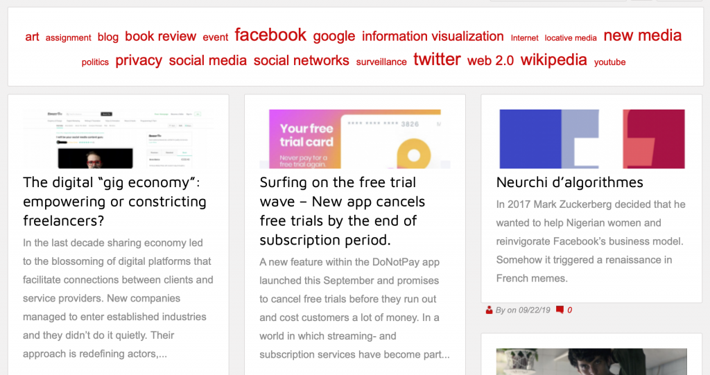
Preliminary answers and further exploration: If we were to consider the word lists and keyword lists as viable data on the perception of new media objects throughout the years, we would come to the conclusion that in a very broad sense, New Media Students’ objects of interest did not change much over the years. Terms like “User”, “Data”, “Application”, “Apps” as general terms are pervasive throughout all the texts and even singular platforms like “Facebook” are a consistent mainstay in the blog posts of New Media students.
The keyword list could serve as an indicator of what changes are the conversations around those terms, subjects, and platforms.
Word Association: We tried to explore the most relevant and pervasive words and what words they were most associated with throughout the years. For this, we used the concordance and data cluster feature of the software Antconc.
While we did find some consistency in the occurrence of word associations throughout all the texts,we realized that the word association analysis entailed the creation of an entirely new data set which would not be possible to do manually and in the framework of this project, much less visualize it.
Another insight one can gain from this, is that word association analysis, at least when done manually, involves a lot of subjective judgment calls and one can often encounter the issue that context is essential to the interpretation of terms.

After looking at the pre-interpreted data collected using AntConc and trying to visualize the most important keywords, it became clear how all findings should not only be looked at individually but should be brought into connection to make clear how certain trends and phenomena affect each other within the field of new media. Figure 01 shows the trending keywords from 2015 until 2019 in form of a subway/metro map. Each line represents a trend with its keywords as stations. The end station of each line stands for a trend that derives from the keyword research. In the center of the visualization stands the field of new media studies. While the visualization shows how multilayered and versatile the field of new media is and how connections can be made between all elements, it has to be made clear that this is a subjective form of visualization.
During the visualization process, we realized that a lot of essential judgement calls had to be made to structure the map which affects how the keywords are categorized and connected to each other. Nevertheless, this visualization can be seen as an example of attempting to connect new media objects and trends to each other and how complex the organization of keywords can be. Many design options are possible and creating such visualizations should never be considered as an objective process.
Years and Trends: Key-platform of the year and most popular platform
Figure 02 shows, during the history of the MOM blog, which platform appeared the most in the blog posts, and which platform was remarkably frequently mentioned, compared to all other years, in that specific year’s post. By visualizing this, some patterns and correlations become apparent.
We can observe that a key-platform of one year sometimes became the most mentioned platform of the next year. A good example would be the platform YouTube, which was the key-platform of the year 2010 but then it became the most mentioned platform for the next year.
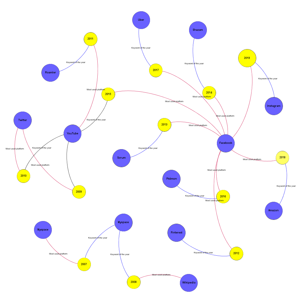
Figure 2
Red Edges: Most frequently used Platform
Blue Edges: The key platform of the year
One other observation that this visualization makes possible is clustering platforms concerning the proximity of the years and the platforms together. Then we could draw four clusters, according to the similarity (proximity) of the years, and the platforms. (See table 01).
Table 01: Clusters and their Associations
| Cluster number | Cluster’s associate years | Cluster’s associated platforms |
| 1 | 2007- 2008 | My Space-Wikipedia |
| 2 | 2009-2010-2011-2015 | YouTube-Twitter-Roamler |
| 3 | 2013-2014-2017-2019 | Uber-Shazam-Instagram-Facebook |
| 4 | 2012-2016-2018 | Amazon-Pinterest-Pokémon-Facebook |
One noticeable limitation for this part, however, is without subjective judgment, or a well-conducted qualitative method, it is not possible to discover the context that the platform name was mentioned in the text. For instance, the word Facebook could be used for the company Facebook and also the social networking site (the platform) Facebook.
Word and Keyword Analysis: The larger discussions and deeper debates around a new media object
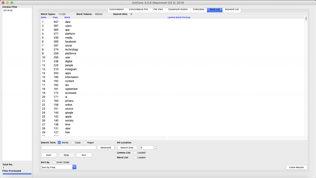
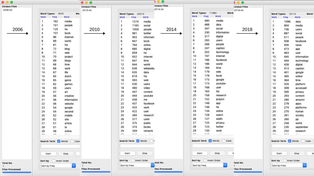
A major part of this study intends to shed light on what was perceived to be a new media object in the past years and if there has been a transition in the way it is being looked at. Wordlist and Keyword-list tools of Antconc help us in knowing the most frequently used words every year and the most frequently unusual words of a particular year; which qualify as ‘most-used words’ and ‘most-used keywords’ respectively. As shown in Figure 03 (a screenshot of the wordlist tool), the most frequently used words/terms in the year 2019 (as of 23rdOctober), not surprisingly, were ‘data’, ‘users’, ‘app’, ‘platform’, and ‘media’. The thing worth paying attention here, is that these particular words were also noted to be the ‘most-used words’ in almost every past year from 2009 to 2109 as shown in Figure 04. This talks about how the broader themes of the blog posts have always revolved around those specific terms.
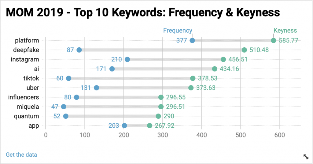
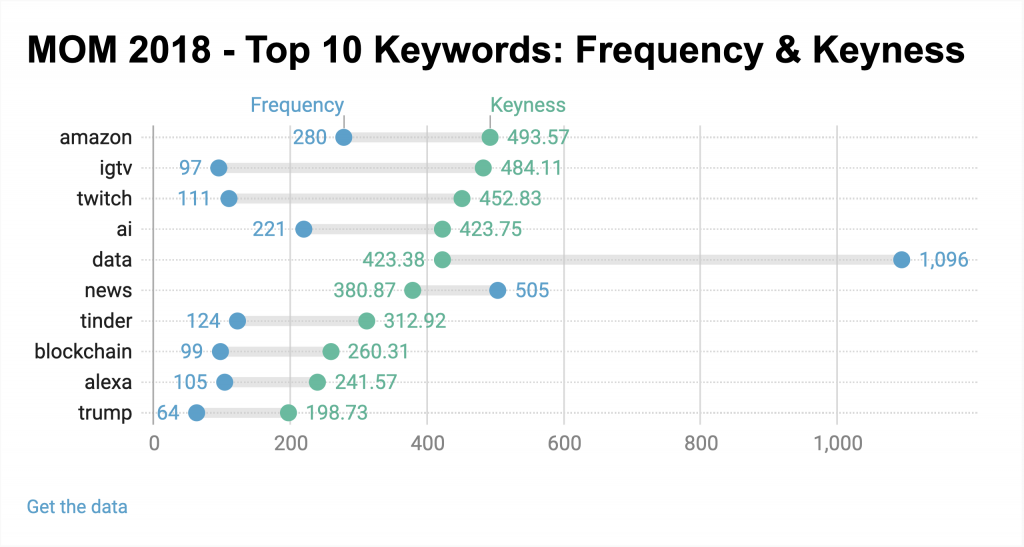
Keywords tool, which specifies the words/terms that are unusually frequent in a particular year can be good point know what specific new media object was the most talked about. The tool highlights the actual names of the discussed platforms, the most talked-about technological trends etc., As shown in figure 05 (a visualization of the top 10 keywords of 2019), it can be noted that the discussions around ‘Deepfake’ were at a peak, a possible reason being the current media trends on the ambiguity surrounding the morality of this technology. To name some platforms; Instagram and TikTok were the most talked about and Artificial Intelligence as a technology was discussed a lot too. Looking at the previous year 2018 (below figure 06), Amazon as a platform stands first for various possible reasons and IGTV stands second, reason being its launch in the month of June 2018 and most of these blog posts created after its launch. The takeaway here is, if we’re looking at the blog posts made on MOM from a bird’s eye view (most used words), we fail to note many differences as words like ‘data’, ‘media’, ‘app’ etc.are used the most every year, which gives us a sense of how the larger discussions have always remained the same. But, as we delve deeper into the details of every year’s blog posts and look for the highly frequent keywords, we can note a consistent change every year; we can note how discussions around Artificial Intelligence, Block chain and Deepfake as concepts are rising and how platforms like Instagram, Twitch, Uber are the talk of the town.
Data do not exist independently of the ideas, instruments, practices, contexts and knowledge used to generate and analyse them, hence, accepting them at their face value can be harmful (Kitchin 1), similarly, the outcomes of the current study can give us only a textual level of knowledge on what has been considered to be a new media object and the other aspects remain unexplored. While it is beyond AntConc’s capacity to decipher the contexts in which the words were used, the fact that the discussions always revolved around the aforementioned words and keywords remain true.
Discussion
As Gray et al. demonstrate in analyzing textual data, it can be “fruitful to study the categories and classification systems articulated by the data” and it can be achieved by visualization (236). That is the starting point of this project. We conducted this brief research to systematically categorize data and then discover what can be observed if we visualized it with different approaches and whether we can observe any meaningful trend for instance?
Objectivity and data visualization: As mentioned in part.. all group members were confronted with multiple decisions when it came to visualizing extracted data. The decisions involved in the design process of a visualization always affect the outcome in a subjective manner. As Kennedy et. al argue, data visualizations are the result of the decisions and priorities of the people and organizations who make them, who influence and shape the design, development, arrangement, and implementation of data/visualizations in many ways“ (5). Consequently, visualized data should always be critically viewed and not taken as coherent and clear.
Reduction in our project: Lev Manovich argues that reduction is an intrinsic and inseparable principle of any visualization (Manovich 38). The aforementioned project, clearly shows how a visualization could reduce meaningful objects to statistical nodes, shapes and edges. The text this project analyzes is over 2500 blog posts, each at least 500 words, with many references, meanings, concepts, notions and arguments. However, these visualization steps we took here, skipped all that, reduce the whole texts to words and then the words to visualized text. However, as we saw, such an approach was not without virtue. Many trends, and correlations, could not become apparent without such an endeavor.
Conclusion
We chose to analyze the MOM-Blog to find out what the new media object of each year was and if there were any differences and changes over time. To extract data each group member worked with the same software and data set. Looking at the data and different visualizations it became clear that within the last years the new media objects have not changed. The difference lies in the details. If we look at Facebook as a protruding keyword over the last years, we do not know what exactly the subject of discussion of each blog post mentioning the word Facebook was. Only by taking a closer look at the posts (e.g. by analyzing word associations) it is possible to find out if the way a certain new media object is looked at has changed.
We think that the best way to analyze such developments might be the implementation of quantitative and qualitative research methods combined. Finding out that there were no major changes in the new media objects over the years prompts the following question: Are there any possibilities for major changes when it comes to new media object trends in the upcoming years?
The study visibly shows that even during a quantitative method, we were required to make some subjective decisions. Moreover, as we indicated in the previous parts, no parts of this project could be considered purely objective and unbiased. For instance, the decision we made about what data should be extracted, the decision on categorising data on a yearly basis, the logic behind the data extraction algorithm and the visualisations tool took the virginity of the project. Therefore, we can conclude that do data is truly raw. “that data are always already cooked” (Gitelman and Jackson 2).
We could conclude that our project, in order to discover general patterns and correlations, visualization can be an excellent research tool. However, it might be hard to make definite and concrete conclusions based on this quantitative method (e.g. figure 1 and 2). Arguably, to move more in-depth, these visualizations should be accompanied by some meaningful qualitative methods.
Bibliography
Constine, John. Instagram Launches IGTV App for Creators, 1-Hour Video Uploads. https://techcrunch.com/2018/06/20/igtv/.
Foley, Joseph. 8 Deepfake Examples That Terrified the Internet. https://www.creativebloq.com/features/deepfake-examples.
Gitelman, Lisa and Virginia Jackson. “Introduction.” “Raw Data” Is an Oxymoron. Ed. Lisa Gitelman. Cambridge, MA: MIT Press, 2013. 1-15. Print.
Gray, Jonathan, et al. “CHAPTER 12: Ways of Seeing Data: Toward a Critical Literacy for Data Visualizations as Research Objects and Research Devices.” Gray, Jonathan, et al. Innovative Methods in Media and Communication Research. Cham: Palgrave Macmillan, 2016. 227-251. Print.
Kennedy, Helen and Rosemary Lucy Hill. “The pleasure and pain of visualizing data in times of data power.” Television & New Media 18.8 (2017): 769-782. Web.
Kitchin, Rob. “Conceptualising Data.” Kitchin, Rob. The Data Revolution: Big Data, Open Data, Data Infrastructures & Their Consequences. London: SAGE, 2014. 1-26.
Manovich, Lev. “What is visualisation?” Visual Studies 26.1 (2011): 36-49. Web.
Masters of Media. https://mastersofmedia.hum.uva.nl.
UvA. Communication Science & Media Studies ranked 1st in the world in the latest QS Rankings. 2108 Feb 28. Web. 23 10 2019. <https://www.uva.nl/en/content/news/press-releases/2018/02/communication-science–media-studies-ranked-1st-in-the-world-in-latest-qs-rankings.html>.