From Cartography to Digital Mapping: Do you know the truth?
An online exhibition called ‘Bending Reality’ reflects on how the history of persuasive cartography is relevant for a contemporary society consumed by an overabundance of visual data that doesn’t always show what it claims to
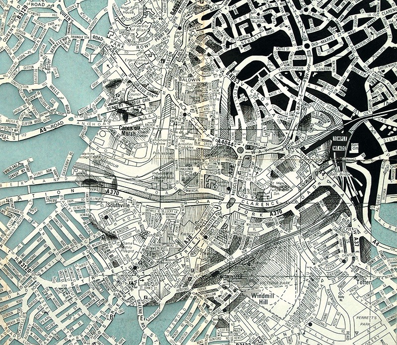
‘Bristol Envelope’ by Ed Fairburn (Jobson)
Before the pandemic we already saw a drive towards digitisation. Especially cultural institutions like art galleries, museums, libraries and archives faced criticism to make accessible their objects through the digital medium (Kahn). These institutions can turn the current pandemic crisis into an opportunity to change. Adaptation will allow for sustainable ways to conserve, present and consume heritage for everyone anywhere, catering to a contemporary audience that “expects both stability and flexibility” (Innovation & Cultural Heritage Research 8).
What else does a contemporary audience expect? The ways in which exhibitions offer heritage consumption, they should also offer ways to study history as a critical tool. Used for reflecting on present challenges, the tool can be very handy. There is no limit to the ‘space’ a digital object can take up, so why not utilise that freedom? (Kahn)
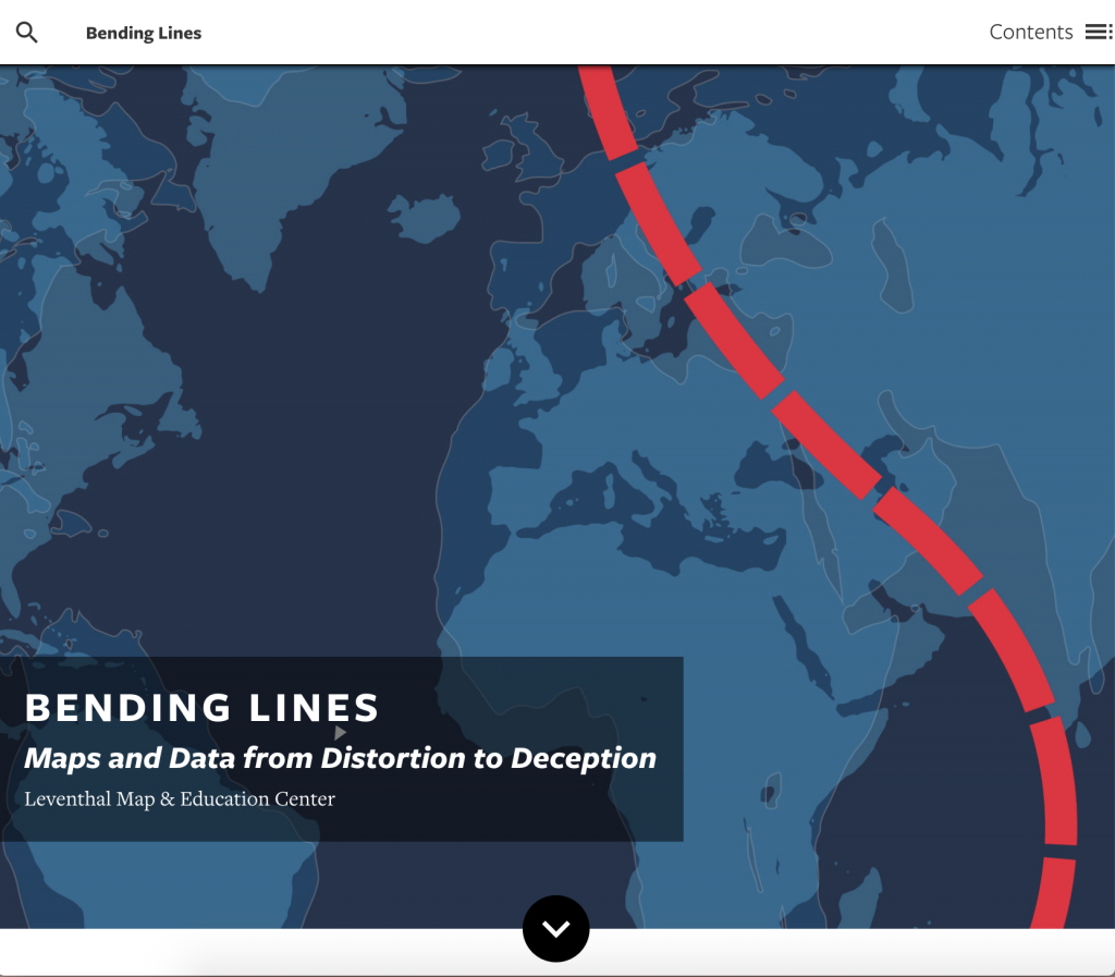
‘Bending Lines’ — an exhibition on ‘bending’ reality
The Boston Public Library’s Leventhal Map Center is currently curating a year-long online exhibition called Bending Lines: Maps and Data from Distortion to Deception. It challenges traditional online displays by offering interactive materials for students. The idea originates from ‘Persuasive Cartography’ — the history of how maps and visual data manipulate reality for subjective agendas (Bending Lines). If you think you’ve never heard of this, trust me, you’ve seen it. How about national propaganda and political campaign maps, advertisements, or statistical graphs on the news?
Garret Dash Nelson, Leventhal Center’s map curator, explains how the exhibition guides the viewer in becoming a responsible map reader (Bliss):
“Every map is infused with its maker’s decisions, which ultimately present a pattern, story or argument.”
He’s not only referring to medieval maps of Prussia or the WWII Japanese Empire, but highlighting how persuasive cartography’s history is relevant “in an age of abundant data and digital tools” (Bliss). We might think ‘modern’ tools bring objectivity and accuracy, but the relationship of data to truth remains ambiguous — be it on paper or digital.
“How can you tell what’s real, and what’s a distortion?” asks Nelson (Bliss).
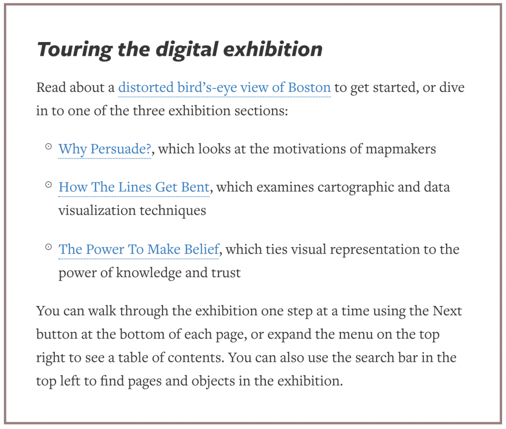
Touring the digital exhibition
The exhibition’s interactive format takes you through three sections: Why Persuade?, How The Lines Get Bent, and The Power to Make Belief. There are photos, descriptions, explanations, immersive content, mini-tours and much more. It forces us to ask who makes maps, what meanings motivations and persuasions do they hold, and how do they ‘bend’ reality?
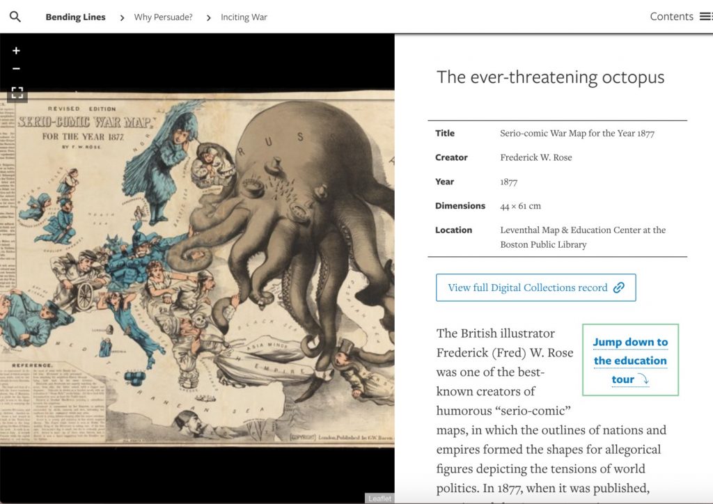
The first section draws scrutiny towards the intent behind map creation, like patriotism for nationalist and imperialist agendas. For example, ‘The Ever-Threatening Octopus’ is a widely recognised 17th-century map of the Russo-Turkish War using the visual motif of an octopus to represent and exaggerate threat.
The second section dives into data classification techniques, including representational choices to communicate and symbolise information. As part of this, Nelson explains they commissioned a project called Same Data, Different Stories to show how the same set of data can produce different visual results.
One example came from Massachusetts’ geographical data from categories of environment, infrastructure and demographics. From this, cartographers were asked to make a pair of maps with opposing conclusions. Maggie Owens, an analyst, created a map pair showing toxic hazards across the state. One visual map argued cities are most affected by pollution while the other showed rural areas are.
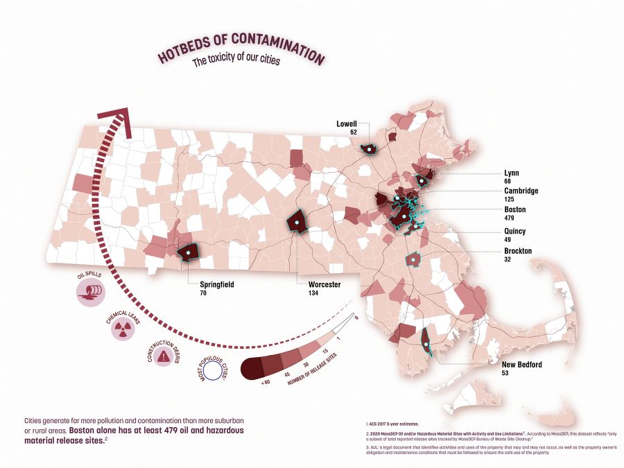
Cities are most affected by toxic contamination in Massachusetts by Margaret Owens (Bending Lines)
“We’d like to think that numbers speak for themselves, but whenever we’re using data there’s a crucial role for the interpreter, and the way people make those maps can really affect the assumptions they’ve brought into the assignment,” says Nelson (Bliss).
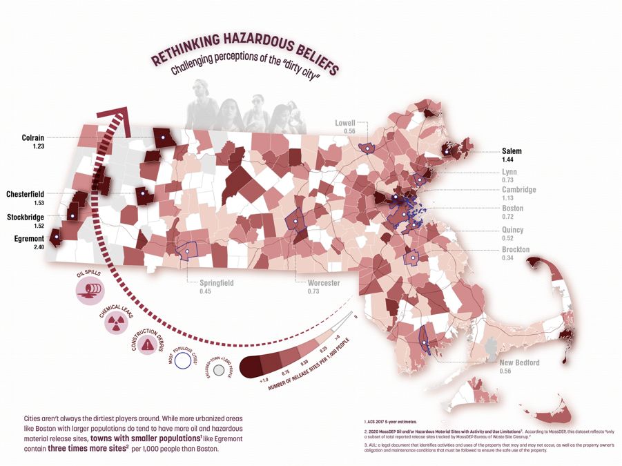
Rural areas are most affected by toxic contamination in Massachusetts by Margaret Owens (Bending Lines)
The last section is about the relationship between truth and power; and how it’s represented visually, touching upon themes including race, language, and territory. Ending with special educational activities, it leaves younger students asking for more.
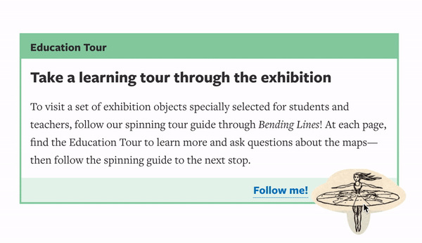
Education Tour menu (Bending Lines)
Why care for maps in a Covid-world?
In a time of endless information, or an “infodemic” (Mooney), it’s crucial to learn which visual representations of data are trustworthy. In the news, when you see electoral maps or statistics about Covid-19, they’re subject to biases. Given the pandemic context, Bending Lines has a larger objective as explained by Nelson:
“We also wanted to think about this as a way to promote data literacy, which is a critical attitude towards media and data visualisations, to bring together this long history of how maps produce our sense of reality.”
Nelson is right. While “the web is crawling with numerous sophisticated visualisation projects” (Manovich); and seeing how misinformation spreads like a beehive explosion (Doan), we need to learn how to become responsible data readers. One of the major drawbacks of visual data and maps is disproportional reductionism. Numbers, lines, points, shapes and colours claim to represent objects and their relations “regardless of whether these are people, their social relations, stock prices, income of nations, unemployment statistics, or anything else” (Manovich 38).
On the web and in the news, Covid-19 maps tend to emphasise on some factors while hiding others. For instance, they normally show only confirmed cases and not all cases. This means while claiming to show a country’s state of outbreak, they’re actually representing the country’s scale and level of testing for the disease (Vox).
Without contextualising visual data within things like geography, socio-demographics, cultural aspects and political decisions, misinformation continues to spread (Mooney 266).
Past the mapping naivety
Why does misinformation continue to spread by visual maps? They possess a certain power by enabling people’s trust in them and tendency to ‘naively’ accept them as true (Mooney 266). Visual language is largely linked to the paradigm of scientific objectivity (Bliss). As a viewer, we tend to forget that the data we see is never free from context, interpretation or explanation (Atherton).
“Data is often communicated in visualisations that are crafted to tell a specific story, and context is often lost in the process of simplifying data; similarly data is often touted as objective, inherently factual information, untouched by human interference.” (Atherton 2).
Visual data is subjected by where it’s situated, like every act of communication. So, Covid-19 maps and graphs we see every day aren’t the ‘objective’ representations they claim to be. We associate them with “logical arguments and scientific enlightenment” (Doan 2) while forgetting their social, cultural and political context.
Bending Lines is a powerful exhibition, both in its format and content. It tries and utilises digital freedom in new ways to exhibit history interactively, while allowing the viewer to engage and reflect on history from a critical lens. We learn to spot what is and isn’t trustworthy data in a time when ‘truth’ is more distant than ever.
Bibliography
Atherton, Rachel. ‘“Missing/Unspecified”: Demographic Data Visualization During the COVID-19 Pandemic’. Journal of Business and Technical Communication, SAGE Publications Inc, Sept. 2020, p. 1050651920957982. SAGE Journals, doi:10.1177/1050651920957982.
Bending Lines: Maps and Data from Distortion to Deception. www.leventhalmap.org, https://www.leventhalmap.org/digital-exhibitions/bending-lines/. Accessed 21 Sept. 2020.
Bliss, Laura. ‘What History Teaches Us about the Biases of Maps’. Bloomberg.Com, 28 May 2020. www.bloomberg.com, https://www.bloomberg.com/news/articles/2020-05-28/how-to-deconstruct-and-interpret-maps.
Doan, Sara. ‘Misrepresenting COVID-19: Lying With Charts During the Second Golden Age of Data Design’. Journal of Business and Technical Communication, SAGE Publications Inc, Sept. 2020, p. 1050651920958392. SAGE Journals, doi:10.1177/1050651920958392.
Innovation & Cultural Heritage Research: 20 March 2018, Royal Museum of Arts and History, Brussels : Conference Report. Publications Office, 2018. DOI.org (CSL JSON), https://data.europa.eu/doi/10.2777/303242.
Jobson, Christopher. ‘Elaborate New Portraits Drawn on Vintage Maps by Ed Fairburn’. Colossal, 7 Jan. 2014, https://www.thisiscolossal.com/2014/01/new-portraits-drawn-on-maps-by-ed-fairburn/.
Kahn, Rebecca. ‘Locked down Not Locked out – Assessing the Digital Response of Museums to COVID-19’. Impact of Social Sciences, 8 May 2020, https://blogs.lse.ac.uk/impactofsocialsciences/2020/05/08/locked-down-not-locked-out-assessing-the-digital-response-of-museums-to-covid-19/.
Manovich, Lev. ‘What Is Visualisation?’ Visual Studies, vol. 26, no. 1, Routledge, Mar. 2011, pp. 36–49. Taylor and Francis+NEJM, doi:10.1080/1472586X.2011.548488.
Mooney, Peter, and Levente Juhász. ‘Mapping COVID-19: How Web-Based Maps Contribute to the Infodemic’. Dialogues in Human Geography, vol. 10, no. 2, SAGE Publications, July 2020, pp. 265–70. SAGE Journals, doi:10.1177/2043820620934926.
How Coronavirus Charts Can Mislead Us. 2020. Vox, https://www.youtube.com/watch?v=O-3Mlj3MQ_Q.