What Data Visualization Can Learn from Game Design
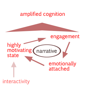
When reading articles and books on data visualization, the focus is often on amplifying cognition by using external (visual) aids. In this blogpost I attempt to conduct a kind of meta-analysis on data visualization by looking beyond the content of the visualization and concentrating more on the intrinsic motivations of the user.
Data Visualization as Learning Environment
Data visualization is a fairly broad term and includes concepts on a variety of scales. Visualization is defined by Card et al. (1999) as ‘the use of computer-supported, interactive, visual representation of data to amplify cognition’. I dispute this definition because I think that a visualization is not inherent to computer-support or interactivity; a simple graph on paper could also be a visualization of data. However, I do agree with Card et al. on the purpose of visualization, which is to give insight and to increase our ability to perform cognitive processes like discovery, decision-making and explanation.
These cognitive processes are very similar to what one would find in challenging educational issues, or more specifically, in learning environments. I have tried to find connections between learning environments and data visualizations by asking myself to what extend a data visualization a learning tool is. Is it for entertainment purposes or does it have complex learning cyclus integrated for educational purposes? When thinking about these concepts, a certain field in the digital landscape comes to mind that cleverly blends both and that is the gaming industry. Despite that games are made for entertainment purposes, they often have complex learning cycles integrated, which according to some constitutes the challenge and is the base of the fun.
A data visualization’s goal is to amplify cognition. This could be considered a subgoal, a means to the overall goal, which is transferring knowledge, teaching the reader, providing new insights, etc. Within game design and 3D learning environments there are a few key concepts that I will try to apply to the field of data visualization. These are; involvement, motivation and narrative. I am not trying to break into the narrativists-ludologists debate in the gaming arena. With narrative here, I simply mean the storyline a game provides. These three concepts have a complex interdependent relation in gaming environments and I would like to argue briefly that these elements are fundamental to successful data visualizations.
The Tangled Interplay
It is often proven that Virtual Reality (VR) learning environments provide better results for cognitive tasks compared to non or less VR learning environments. Although VR is often regarded as a vast complex room with big screens on each wall and sensory equipment on the person, a simple videogame could most certainly also be considered as VR. According to Bowman and McMahan (2007) the goal of VR is to let the user experience a computer-generated world as if it were real and consequently creating a sense of presence and ‘being there’ in the mind of the user. Most successful games have all that. First Person Shooters, RPG’s and adventure games where the player is a character in the game aims at getting the player mentally in the game world.
According to Brown and Cairns (2004), involvement in games consists of three different levels: from the least involvement (engagement) to semi-involved (engrossment), to fully involved (immersion). Immersion is the highest end of involvement and is also the highest goal for game designers because the more immersed a player feels, the more attention and effort it will invest.
This involvement of the user in the game is made possible by interactivity, a feature that a lot of data visualization applications also offer. The interactive element of the application, i.e. the ability to change the variables or the way the data is presented, could be considered tweaking of the storyline. According to Gee (2003),
In computer and video games, players engage in “action at a distance,” much like remotely manipulating a robot, but in a far more fine-grained fashion. Cognitive research suggests that such fine-grained action at a distance actually causes humans to feel as if their bodies and minds have stretched into a new space, a highly motivating state.
Data visualizations should attempt to reach this highly motivating state by integrating interactivity and immersive elements such as the invisibility of navigational controls. Wouldn’t it be better to let the user feel the data instead of only seeing it? The definition of a term and the experience of a term are worlds apart. This highly motivating state as described by Gee, will not only let the user extract and remember the presented information way more efficient, but it will also cause a hunger for more data.
The Data Story
Data without context has no meaning. Data needs a background, a narrative that sucks the user mentally into the world of the data. Narratives are fundamental in human reasoning and give humans the ability to assign meaning to their experiences (Laurillard 1998; Dickey 2006). Applications, whether games or data visualizations, have to incorporate a narrative in order to reach its full potential. According to Brown and Cairns (2004), it is the narrative that separates an engagement-application from an immersion-application. The more immersion the higher amounts of time, effort and attention an user will invest in the application. By integrating a narrative, or letting the data make up a story, the user will be much more invested, emotionally and mentally. The narrative functions as the motor.
Narratives are inherent to emotional experiences, a facet that good game designers know too well. Drawing further on Gee, we actually don’t want the user to only feel the data, we want him to live it. By adding background information, the user retrieves context and can identify and assess the situation. Data becomes familiar and comprehensible.
I hear you thinking, ‘how on earth can you integrate a narrative and make people emotionally attached with an data visualization?’ I will briefly give two examples.
Gapminder vs Facebook break-ups
I am going to do something that probably will have me, at this moment an infovis researcher, killed for and that is criticizing Gapminder. Gapminder is sublime and really a pioneer in its field. The application works well in integrating interactive elements to get the user to a highly motivating state. However, it fails at the end of the engagement journey and becomes an anticlimax. Example, the infamous shout at the TED talk of Hans Rosling for the life expectancy drop of Rwanda in 1993 and 1994 is no where to be found in the Gapminder application. This drop is because of the genocides that took place at that time. Rosling mentions it in his famous talks, but when using the application, there is no background information, no context, no narrative explaining the drop; only raw data. Next to the Gapminder, there should be some kind of ‘events-calender’ that describes all the important events that maybe or probably is the reason for the strong deviations in the graphs. Isn’t it great to have an alternative on the side for the inspiring and energetic explanations of Rosling? By combining these feeds of major events with the numbers, these raw numbers will become much more understandable and alive. The user will actually feel the abstract data because it can assess and recognize it. Moreover, if it reads that the drop is because of a horrendous genocide, they will be emotionally invested and a higher level of engagement is reached.
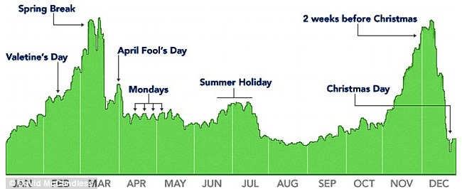
With the next example, I can explain better what I mean. David McCandless has made a, rather simple, visualization of when there are Facebook break-ups. It is not interactive, yet it is very appealing.
It is very appealing because immediately you make up stories in your mind.
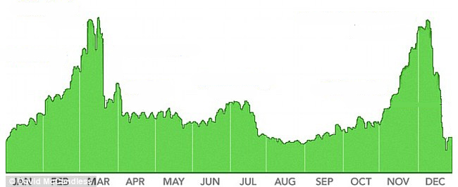
In the next image, you see what a lot of data visualizations are today.
It is plain data, saying nothing and actually quite boring.
Obviously, we can argue to what extend the application should provide the story. Some may ask, ‘isn’t discovering the story yourself a big part of the fun?’ In game design, this is what Julian Kücklich (2002) calls creative abduction. In narratives, not all is told but a lot of things are left to the imagination or for discovering later. Creative abduction implies that the reader has to reconstruct a series of events without having access to all the necessary information. The question is whether we want a data visualization to have that ‘feature’. I assume that different kind of data visualizations should have different amounts of creative abduction. We have to ask ourselves; do we present it all or do we leave things out and let the imagination and curiosity of the user fill up the story? Do we want to teach or do we want to entertain?
Hans Rosling’s TED Talk:
Sources
Bowman, A. & McMahan, R.P. (2007) Virtual Reality: How Much Immersion Is Enough?. IEEE Computer Society, Virginia Tech.
Brown, E. & Cairns, P. (2004) A Grounded Investigation of Game Immersion. ACM, University College London Interaction Centre (UCLIC)
Card, et al. (1999) Readings in Information Visualization: Using Vision to Think. Academic Press, Morgan Kaufman Publishers.
Dickey, M. D. (2006) Game Design Narrative for Learning: Appropiating Adventure Game Design Narrative Devices and Techniques for the Design of Interactive Learning Enviroments. Association for Educational Communications and Technology, Vol. 54, No. 3, p. 245-263, 2006.
Gee, J. P. (2003) What Video Games Have to Teach Us About Learning and Literacy. ACM Computers in Entertainment, Vol. 1, No. 1, October, BOOK01.
Kücklich, J. (2002) The Study of Computer Games as a Second-Order Cybernetic System. Tampere University Press. In F. Mäyrä, (ed), Computer Games and Digital Cultures (pp101-111).
Laurillard, D. (1998) Multimedia and the learner’s experience of narrative. Computers & Education, 21, 229-242.


