Visualizing Food Systems
What did you have for breakfast? It’s an easy enough question. But how about, where did your breakfast come from? Using innovative data visualization tools, a growing number of developers and activists have created dynamic ways in which human consumers interact with their food systems, such as tracking the geographic journey of their food from farm to table. In this post, I want to address the issues of locative media and existing projects in visualizing the data of our food production industry.
Locative media describes the way in which place is tagged by virtual methods (that is, when people check in on Foursquare), or how an individual or object is traced through its progression through space and time (such as the open data project Open Paths that uses GPS tracking on your smartphone to trace your movement). For a quick review of the field and some preeminent examples, see this recent MoM post by Laura Burlacu and Daan Fliervoet. I find most interesting here the link between locative media and Bruno Latour’s Actor-Network Theory, that is the role that objects, entities, and groups take on as actors in a network of heterogeneous parts. Such a network, which places as much emphasis on the consumer of a product as the producer, transporter, and overarching economic system in which this traction takes place, would then create an exciting space for the exploration of food systems.
The current global food system is in need of analysis and transformation. Our current food system model in our Western-dominated, capitalist society is built on cheap goods and services. As any addict knows, the first step is admitting you have a problem. The West has a problem: it relies too heavily on food originating in foreign lands and is not held accountable for the non-monetary cost of this cheap food production. These non-monetary costs include detrimental environmental effects on food transport, health deficiencies for individuals who do not eat enough healthy food (and cannot afford to), and lack of personal responsibility and connection between consumers and food products.
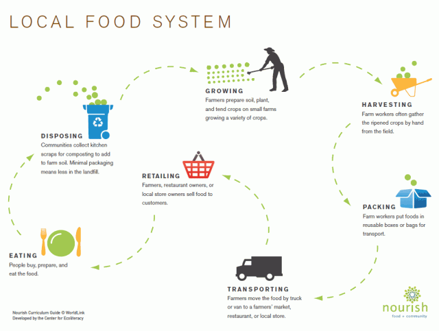
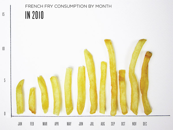
Information design using its tools of data visualization and infographics has developed into a field that makes data easier to understand for the average person. From a media and cultural point of view, these techniques can be used for a variety of uses to make the lives of citizens more productive and worthwhile. My research question begins with the idea that we should look at our existing infrastructure and determine which lasting components need fixing and in what ways our new media technologies can be used. In this way, I would like to imagine how food systems can be better explained and transformed through the use of data visualization. Luckily, many other researchers have already initiated projects in this field, and in this space I will briefly recount their work.
Arlene Birt is a scholar and visual storyteller who finds interesting ways to visualize sustainability. She refers to much of her work as “background communication,” which I think is a successful approach to calling often invisible, or hidden, relationships to the fore. Her work on education and sustainability has produced a website, Background Stories, which creates a discussion of the consumer’s role in food systems through the perspective of cultural, political, and environmental means. She explains her approach to sustainability through education:
“I am fascinated by the idea that we are endlessly tied to the world through the objects that we consume. Small, seemingly inconsequential objects populate our every-day, and yet the intricate lifestories of these objects are hidden from the eyes of their present consumer. I refer to my work as “visual storytelling” because I seek to visualize the narratives behind the seemingly ubiquitous everyday objects that we interact with as consumers; focusing on the larger influence that these interactions hold on the world. By bringing the attention of the viewer to the detailed, factual and sometimes even fantastical background narratives of objects and ideas, my intent is to inspire people to understand how their everyday choices impact global environment and society.”
A particularly interesting project by Birt is TraceProduct.info, an application that can be used in-store at the moment of sale where scanning a product presents information for the consumer on the product’s history and tracking. Along the lines of locative media and ANT, this application emphasizes the role the user plays in the grand scheme of the food production network, while not masking the background interactions by farmers and both large and small-scale food distributors.
As a sort of precursor to this project, Birt developed an installation entitled “Visualizing Grocery Impacts” in which scanning a bar code on a product will then “project interactive and visual information on the product’s background impacts (including global, ecological, political, social and cultural impacts) onto a nearby wall.” Both these projects rely on the fundamentals of data visualization: interactive user design, data-driven information, and social awareness through a unified graphic representation (see Engelhardt).
On December 4, 2010, the Food+Tech Hackthon took place in New York City where hackers, developers, and food lovers converged with the goal of creating new ideas to use new media technologies and open data for the benefit of sustainable food systems. The wiki of the site contains a good amount of data sets, APIs, and tools for other developers to carry out lasting projects. The problem the teams were tackling could simply be seen as making a food system process or activity easier for the user. For instance, the NYC Community Garden Map is an application and directory of resources for community gardens, so interested persons could search for community gardens in their area as well as find other people to invest in the garden with them. Similarly, the CSA (Community-Supported Agriculture) Tool works by gauging interest with nearby friends and neighbors in your community who would want to join a CSA. The final outcome of the CSA Tool involves a visualization of a heat map of neighbor interest, and designates separate colors for the different roles of the individual, organizer and purchaser.
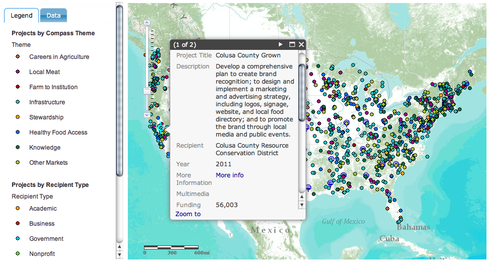
I want to conclude with the example of a data visualization produced by the United States Department of Agriculture entitled “Know Your Farmer, Know Your Food.” Emphasizing the growing demand for local and regional-based food directly from farmers, the USDA has given numerous grants to these specific types of farmers and organized their use in an interactive tool. Using data from local and regional food systems, the interactive map shows where money is allocated in order to show these resources in their productive economic and community development. The intended effect is to clearly indicate local food systems that spur economic development, create local jobs, and maintain the environmental sustainability of open space and farmland.
Through these examples, I hope I have introduced ways in which information design can be used with consumer conscious-raising endeavors that shape how individuals position themselves in their economic, social, and political environments. While the field of data visualization in food systems may seem like a lofty goal, its end result may simply answer where your breakfast strawberry banana smoothie came from.
References:
- Burlacu, Laura and Daan Fliervoet. “When Objects Talk with Each Other – The New Turn in Locative Media.” Masters of Media. 20 March 2012.
- Engelhardt, Yuri (2012). “Graphics with a cause – Neurath, Rosling, and the universal principles of visual representations.”
- Latour, Bruno (2005). Reassembling the Social: An Introduction to Actor-Network Theory. Oxford: Oxford University Press.
- Tuters, Marc and Kazys Varnelis (2006). “Beyond Locative Media: Giving Shape to the Internet of Things.” Leonardo, 39.4: 357-363.


