Data | Visualization | Art?
When it comes to the aesthetic aspect of data visualizations, many times I feel like a nine year old girl (which is very strange) in a candy store who is blinded by all the pretty colors and shapes. Yes indeed, this example might not be the ideal way to start a critical approach on any object of study, but somehow it grasps the experience certain visualizations can provoke.
The graphical component is the first element of a visualization that meets the eye and often times the last thing that comes to mind when remembering a visualization. However, it seems there is a certain tendency within the field of data visualization that is somewhat reserved towards explicit graphical data visualizations. The necessity or in-necessity of certain visual elements in a visualization is a much discussed topic. One of the questions that seems to follow from these discussions is: To what extent does the aesthetic/graphical aspect of the visualization draw its user/perceiver away from the “essence” of a visualization: its data?
In the following I want to discuss a variety of theorists in the field of data visualization. They tend to have strong and clear ideas on the subject matter, and have expressed how they think data is related to graphic visualization and how it is to be presented. At the same time I want to introduce a number of projects that would (probably) not completely fit the data-visualization-ideals of these theorists. These are projects which I regard as rather visual/graphical and – without moving on dangerous ground by determining what is art – could resemble certain (e.g. abstract) works of art. So, before we proceed, a small trip to the candy shop in order to understand what, in my opinion, is an artistic and graphical visualization.
The Candy Store
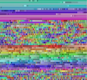
Chromogram by Martin Wattenberg, Fernanda B. Viégas, and Kate Hollenbach (hint.fm research group): Chromogram investigates how participants in Wikipedia allocate their time, by visualizing textual sequences through a color coding scheme.
Wind Map by the hint.fm research group: A visualization of wind flows (and speeds) over the United States.
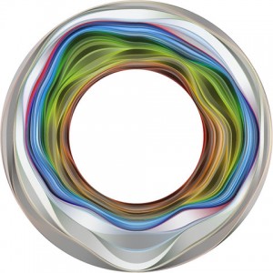
Flickr Flow by the hint.fm research group: The relative proportions of different colors seen in photos (posted on Flickr) taken in each month of the year have been calculated (self developed algorithm), and plotted them on a wheel. Summer is at the top, time proceeds clockwise.
Data and visualization
In order to define what a ‘visualization,’ actually is, I would like to use the definition provided by Card et al. in Readings in information visualization: “The use of computer-supported, interactive, visual representations of data to amplify cognition” (6). This definition on what a visualization is, reveals some important components on how data visualization is perceived by a number of data theorist. In the center of a work (of all works), lies the data. And so to “amplify cognition,” to gain insight and to understand the data, one uses computer-supported visual representations. In line with Card et al., Heer describes the goal of visualization in A Tour Through the Visualization Zoo:
“The goal of visualization is to aid our understanding of data by leveraging the human visual system’s highly tuned ability to see patterns, spot trends, and identify outliers. Well-designed visual representations can replace cognitive calculations with simple perceptual inferences and improve comprehension, memory, and decision making” (59)
I think it is safe to say that there is a general consensus on what data visualization is (Card et al., 1999; Heer et al., 2010; Mazza, 2004; Unwin et al., 2008). A notion of using specific forms of visualizations in order to (amongst others) gain insight, reveal patterns and gain understanding (or finding meaning) of specific sets of data.
Data and graphic
However, when the use of graphical elements in a visualization is concerned, there might still be some disagreement on how a dataset is effectively/appropriately visualized. In the Handbook of data visualization, Unwin et al. provide their readers with a view on what a ‘good graphic’ does:
“A good graphic will convey information, but a graphic is always part of a larger whole, the context, which provides its relevance. So a good graphic will complement other related material and fit in, both in terms of content and also with respect to style and layout. […] Whether or not a graphic is then successful as a display depends on its subject, on its context and on aesthetic considerations. It depends on what it is supposed to show, on what form is chosen for it and on its audience” (58; 63)
To put it a bit blunt or somewhat provocative, a ‘good graphic’ will fit in, adapt and complement other ‘related material’ and its subject. Somehow (when reading about ‘graphic’) the thought of a background vocalist comes to mind here. To continue this subject with Heer et al.:”The challenge is to create effective and engaging visualizations that are appropriate to the data” (2010: 59). And to complement this (general) thought with Tufte: “[…] excessively original artwork just plays around with the information” (1997: 49). As mentioned above, the overall opinion on graphics is that they can be an effective instrument for enhancing the understanding (and interaction) with the data and other elements of the visualization. But, they are most definitely not perceived as the center point or basis of a visualization. Though I have to admit the aforementioned reasoning is solid, and I actually agree with it (for most parts), I would still like to raise an alternative perspective on the use of graphic elements.
The Candy Store (part II)
ZIPScribble by Robert Kosara: A data visualization that involves the connecting of all the ZIP codes in the US in ascending order. Leading questions for the visualizations (according to Kosara) are: Is there a system behind the assignment of ZIP codes? Are they organized in a grid?
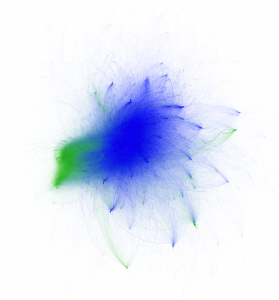 Twitter Network Map by Axel Bruns. An analysis of Twitter activities in the #egypt and #libya hashtags (defined by the Latin and Arabic character set) presented in a network graph. Axel Bruns was interested in exploring the interactions between users tweeting in Arabic and users tweeting in other languages (mainly in English).
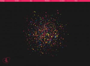
We Feel Fine by Jonathan Harris and Sep Kamvar: We Feel Fine scrapes weblogs (“every few minutes”) in order to harvest blog entries that involve the words “I feel” and “I am feeling”. “The interface to this data is a self-organizing particle system, where each particle represents a single feeling posted by a single individual. The particles’ properties – color, size, shape, opacity – indicate the nature of the feeling inside, and any particle can be clicked to reveal the full sentence or photograph it contains.”
Artistic visualization
In Visualization criticism-the missing link between information visualization and art, Robert Kosara mentions two types of cultures in visualization: “[…] very technical, analysis-oriented work on the one, and artistic pieces on the other hand” (1). The first type is what he calls “pragmatic visualization,” the latter is called “artistic visualization” (Ibid.). These two types of cultures might also express the manner of thinking about data visualization. That is, the thought about how data should be visualized: a data-centric, technical and pragmatic perspective versus a perspective where the goal is to communicate a concern (instead of specifically showing the data at the core of the visualization). It must be mentioned that the projects presented in this post are not necessarily works of art (or ‘data art’). There are variable ways to approach these visualizations. It is still possible to have an artistic (very graphical) data visualization whereby the general concern at the core of the visualization is the data (e.g. the main questions for ZIPScribble according to Kosara).
Closing the store
I would like to return to Tufte for a brief moment and cite him on two principles he mentioned, concerning graphics:
“The representation of numbers, as physically measured on the surface of the graphical itself, should be directly proportional to the numerical quantities represented. [and] Clear, detailed, and thorough labeling should be used to defeat graphical distortion and ambiguity. Write out explanations of the data on the graphic itself. Label important events in the data” (2001: 56)
All the visualizations/projects presented in this post share a number of properties. Al cases are very graphical and color (or exactly the opposite in the case of Wind Flow) is explicitly present in the visualization. Also, the background (except for Chromogram) consists of only one color. One could compare it to a canvas on which a piece is presented. Simplicity combined with strong graphical elements might be a decent way to describe it. And finally, very importantly, there is a general absence of grid lines, text and numbers. Strong (artistic) graphics do not necessarily have to rule out the other important elements of a visualization. And different or new ways of presenting/visualizing might eventually add something to the knowledge about data visualization and the current known collection/types of visualizations.
Instead of making it a divide between pragmatic and aesthetic aspects within data visualization, I would like to argue, in line with Kosara et al., that art (or artistic forms of visualizing) might/will set new borders in what is common to data visualization. Thereby, “Expanding the “box” within which the thinking […] has been done” (2008: 13). Just to see or to prone what is actually possible in visualizations.
References
Card, Stuart K., Jock D. Mackinlay, and Ben Shneiderman. Readings in information visualization: using vision to think. Morgan Kaufmann, 1999.
Chen, Chun-houh, Wolfgang Karl Härdle, and Antony Unwin, eds. Handbook of data visualization. Springer, 2008.
Heer, Jeffrey, Michael Bostock, and Vadim Ogievetsky. “A tour through the visualization zoo.” Communications of the ACM 53.6 (2010): 59-67.
Kosara, Robert. “Visualization criticism-the missing link between information visualization and art.” Information Visualization, 2007. IV’07. 11th International Conference. IEEE, 2007.
Mazza, Riccardo. “Using information visualisation to facilitate instructors in web-based distance learning.” Faculty of Communication Sciences (2004).
Tufte, Edward R., The visual display of quantitative information. Cheshire, CT: Graphics Press, 2001.
Tufte, Edward R., and E. Weise Moeller. Visual explanations: images and quantities, evidence and narrative. Cheshire, CT: Graphics Press, 1997.
