Making Visible the Invisible: Information Visualization Through a Fine Art Lens
“Big Data will replace ideas, paradigms, organizations and ways of thinking about the world.” –Steve Lohr
It is difficult to mention the present-day ubiquity of data without resorting to clichés. We are frequently reminded that data is in use all around us–from academic institutions to corporations to the military–and its prevalence has come quite naturally coupled with the greater societal shift towards science and technology. In the United States, a discussion about the rise of the disciplines known as STEM (science, technology, engineering, and mathematics) has been ongoing for some time, both within the education system and with relation to employment and immigration law.
With this shift towards the quantitative, a noticeable anxiety has also surfaced regarding the fate of the arts and humanities, as fears surrounding the decline in arts education (at all levels of schooling) have been continually brewing.
Data, Meet Art
Meanwhile, and perhaps as a response to these concerns, art and artists have slowly been incorporated into the mix of data science. In terms of visualization, design and creativity have naturally taken on greater importance as the data itself has become more complex and abundant. Examples of the artistry in data visualization are not hard to come by, and this is a space frequently cited as one into which art can be integrated.
Bridges have also been built between the spheres of art and information through the increased commissioning of artworks by institutions that collect data, built around their available resources. Jer Thorp, for example, recently landed a spot as the New York Times data artist-in-residence, producing several works using the publication’s Article Search API.
The effort to pull art into this arena has even resulted in the aestheticization of data related objects, such as Google’s impressive photographs of its data centers. However, this narrative would be incomplete if the examination only surrounded the ways in which art can be added to data science, and the tendency has been to forget that artists have been independently engaged with data collection and visualization long before the current obsession with it.
“Haven’t We Already Met?”
“The act of visualizing data—the information we hold as facts—is old. It is recognized in the way humans earnestly pressed shapes into clay and later printed letters in a row: an observance of regularity and repetition. It is also reflected in the way we first came to understand our environment, through diagramming the arc of the Sun as it appears and recedes upon the landscape: the celebration of a pattern.” –Kim Rees
The practice of information visualization involves observing phenomena or recognizing patterns, researching and collecting data, and finally translating the results into a visual format. Fine art practice frequently involves similar methods, and many artworks function as data visualizations in their own right. While there are certainly artists working today employing such techniques via digital means, these are more obviously correlated to science, and so I will focus my discussion here to those whose work was created through at least somewhat analog processes.
“Art does not reproduce the visible; rather, it makes visible” -Paul Klee
German American artist Hans Haacke began showing an interest in systems and information in the late 1960s. His work Shapolsky et al. Manhattan Real Estate Holdings, A Real-time Social System, As of May 1, 1971 (1971) was based on public data that he collected at the New York Public Library surrounding the ownership and control of urban spaces in Manhattan. His research then took visual form as photographs of the properties paired alongside facts he compiled about them in order to reveal the “empires of slum housing,” namely the power and economic imbalances present within them.

Hans Haacke, Shapolsky et al. Manhattan Real Estate Holdings, A Real-time Social System, As of May 1, 1971 (1971)
More recently, American artist Trevor Paglen has been documenting the powerful military machine in the US in order to expose embedded patterns that have mostly been kept hidden from the eyes of ordinary civilians. Projects such as The Other Night Sky (2010-11) required Paglen to research the astronomical positions of satellites and other space debris in order to photograph their movements and illustrate their otherwise unnoticed presence.
In works such as Code Names (2007), Paglen meticulously compiled a list of classified words and phrases used in US military programs. The list’s subsequent visualization–starkly installed spanning an entire gallery wall–overwhelms the viewer with its sheer number of terms.
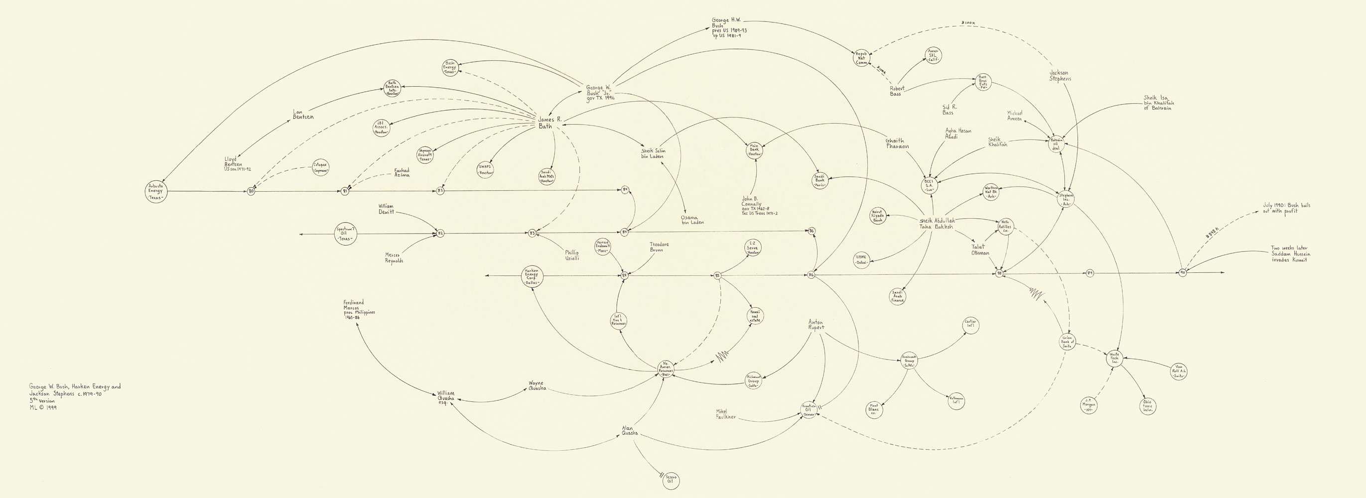
Arguably the quintessential example of a fine artist who has employed data visualization methods prior to the rise of ‘big data’, was American artist Mark Lombardi. Lombardi spent years carefully collecting facts from mainstream publications such as the New York Times and Washington Post and recording them on approximately 14,000 index cards. He then used this data in order to create large-scale pencil drawings, mapping the connections between the documented entities in order to create highly elaborate flow charts which revealed hidden financial and political ties. These diagrams served to visualize conspiracies, even to the point of posthumously drawing attention from the FBI. His most famous work, George W. Bush, Harken Energy and Jackson Stephens, ca 1979–90 (5th Edition, 1999), brought to light a surprising connection between the Bush and Bin Laden families (the piece is shown above as the lead image of this article, click twice for a detailed view). Lombardi’s complex structures and delicate graphite lines are not only organically beautiful, but also function as an infographic.
The work of these artists illustrates that the central concerns of information visualization have already operated as artistic concerns, even through analog modes of production (either data collection, data visualization, or both). While it is crucial to champion the importance of the arts in the midst of this more technologically and scientifically-centered era, it is limiting to do so by merely attempting to inject art practices into existing data workflows. Let us not underestimate the ability of artists to address information-related questions through their own language and modes of production, and remember that they have actually been at this for quite some time.


