Visualizing Our Global Mood 140 Characters at a Time
“We need a new way to convey information, a method which is simple to teach and to learn, and at the same time comprehensive and exact. What I might call ‘consistent visualization’ is such a way.“
These are the words of the Australian philosopher Otto Neurath who already underlined the importance of visual impressions for education purposes back in 1937. This type of visual education would be a foundation for the more successful education of tomorrow in relation to important cultural and social movements of today, ensuring the involvement of a broader audience in the understanding of social and economic facts.
Now more than 70 years later, Neurath’s envisioned education – better known as Data Visualization – is rapidly taking shape and becoming a reoccurring phenomenon of our Web 2.0. His ideology is positively embraced by authors such as Raul Niño Zambrano and Yuri Engelhardt who both noticed an increase in public interest for diagrams that can help explain a particular issue (Zambrano & Engelhardt 2008), and feel Neurath aimed for a new way to convey information that could be comprehensible for a wide range of people. Serving as a tool to present big chunks of raw information in a simple manner, data visualization allows us to gather insight on those millions of rows of data within a short amount of time and tells us something about its underlying patterns and relationships. Furthermore, data visualization is allowing an illustration of complex problems and results which are generally difficult to present to the public.
The Issue of Global Mood Research
One of the difficult tasks currently existing within the field of research is a proper representation of our global mood. As our mood fluctuates per day, previous studies have only lead to conflicting and inconsistent results about our mood cycles. The biggest issue however is that, while it is generally known that various factors such as work, sleep and amount of daylight are able to affect our mood, researchers simply lacked a way to confirm this theory on a global level. The arrival of smartphones and social media brought forth a change into this matter, granting researchers more datasets and tools to work it to support the claims of their research. Some of these tools, such as the popular smartphone applications MoodTracker and MoodPanda, collect information about your current mood based on your input and provide the user with detailed visualizations about their mood cycle.


Researchers are able to request this data and use it for their personal research, however both applications still contain a certain level of privacy as users can choose with whom they feel comfortable sharing their personal information with. Furthermore, these applications are still in an early phase of their lifespan and is the total number of users still insufficient to support the global claims of a researcher.
Monitoring the World through Twitter
Remarkably enough, the best data for global mood research does not derive from applications as the ones mentioned above, but instead can be obtained from a social network we have been using for years… Twitter. By analyzing tweets from the popular social network with a special text analysis program – which hunted for words that betray a number of different positive and negative feelings – two Cornell University researchers were able to use it as a tool to monitor the world’s feelings. Tracking half a billion tweets from 2.4 million people in 84 different countries, researchers Scott Golder and Michael Macy discovered that work, sleep and daylight do affect our mood as tweets were generally positive in the early morning and near midnight. Negative tweets were mostly present during the day, pointing at a downhill in mood as the workday goes on. Furthermore, tweets were relatively positive throughout the entire weekend, possibly due to the absence of office-related activities.

Source: http://blogs.discovermagazine.com
While these results seem obvious and expected, the two researchers actually provided the world with illustrative results that support this theory, which they published in their 2011 report. The two researchers praised Twitter for its openness and constant flow of fresh data, as it provided them with a unique platform to look at these issues of mood swings across the globe:
“People criticize the Internet for being mundane or filled with gossip, but that’s really not so. The Internet records everything, so Twitter is a giant archive of time-coded conversations.”
While tweets remain not as accurate as factual data – Twitter does not represent the entire general population – Golder and Macy showed how social networks can be used effectively for scientific purposes, mainly research which attempts to study people.
‘Do-it-yourself’
Twitter’s involvement within global mood research is further acknowledged through websites such as timeu.se, which is created by earlier mentioned Scott Golder to further explore the possibilities of Twitter.
The website allows users to enter a specific keyword and see how those behaviors are distributed throughout the day. For example searching for “Chinese” will display a peak on Saturday, possibly pointing that the majority of the Twitter community orders Chinese food on Saturday. Open datasets like Twitter allow users to explore, produce and even share data, blurring the distinction between the consumer and producer (Zambrano & Engelhardt 2008). As a consequence, consumers become more involved in data visualization and change their former role as the passive viewer to the active creator of diagrams for the masses (ibid).
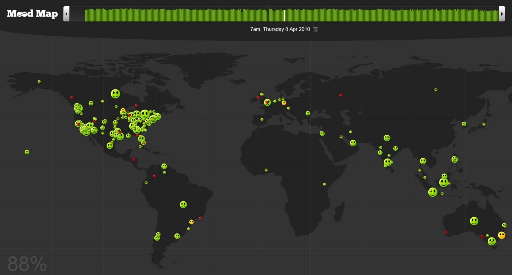
This is recognizable when we examine the website MoodMap, created by a non-expert in the field of data visualization and displays the mood of the world at any particular time. MoodMap gathers and analyzes data from Twitter, calculating the mood of a tweet based on the presence of positive or negative emoticons which then can be geocoded and placed on the map.
Source: MoodMap.com
However, a closer look on the website reveals its lack of professionalism. While the simple visualization remains consistent and does the use of emoticons dismiss the presence of possible language barriers, the users are dropped into the data with little orientation and simply lack a tacit tutorial (Segel 2010). There is no display of specific events or a story to explain the data itself. Furthermore, Twitter users mostly express themselves through hashtags and not so much through emoticons, possibly explaining why there is an insufficient amount of results per country. Non-expert visualizations like MoodMap further emphasize the criticism of new media writer Clay Shirky, who feels regular users simply lack the required skill to create data visualizations and should remain a job for the experts, as skill remains a decisive factor (Shirky 2002).
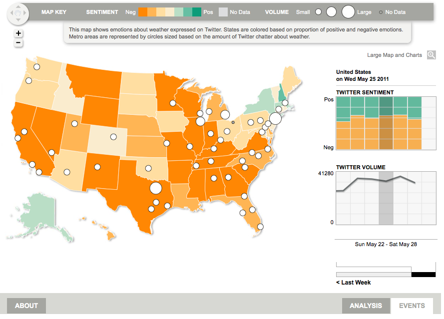
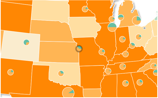
This is becoming apparent when we compare MoodMap with the expert visualization of Pulse. Created by the nonprofit media enterprise Dialogue Earth, this interactive tool displays the general mood across the United States based on the daily weather. It does so by analyzing different tweets which display any affection about the weather and attempts to link them with a certain level of expression. The final data is then visualized on the map as shown below and offers a lot more interactivity and information than the previous mentioned MoodMap.
Source: Pulse.com
The interface allows the use of zooming, analyzes a sufficient amount of tweets, has a clear color scheme to display distinctions between the different states and offers the user a story to explain all the data. One could therefore argue that Clay Shirky was spot on concerning his criticism towards ‘do-it-yourself’ data visualization.
Going Beyond
With Twitter’s easily accessible amount of fresh data and its potential for global mood studies, researchers are constantly discovering new ways to visualize our global mood to the world. Some of these ways even go beyond data visualization like discussed so far, as the Twitter Mood Light shows us. This small box, directly connected with any wireless network, changes its color based on the current mood in the world. It does so by analyzing every tweet which involves a certain emotion and calculates the overall dominating mood of the Twitter community, which is then reflected through the LED light. For instance anger will be reflected with a red color, happy with yellow and sadness with blue. Another example is the Jell-O Pudding Mood Face which is a physical 3D billboard looming over New York City that captures and displays the world’s mood as expressed via Twitter. Based on the world’s mood, the mechanical face smiles or frowns and further shows how social media can function as an asset to data visualization. Only time will tell when we unlock its full potential, but one thing is certain though; social media and mainly Twitter prove that raw data is no longer inconceivable.
———————————————————————————————————————————————————
References:
Neurath, Otto. 1937. Visual education: A new language. In: Survey graphics: Magazine of social interpretation, XXVI (1), January 1937, pp. 25-28.
Niño Zambrano, Raul, and Yuri Engelhardt 2008. Diagrams for the masses: Raising public awareness – from Neurath to Gapminder to Google Earth.In: G. Stapleton, J. Howse, J. Lee (Eds.). Diagrammatic Representation and Inference. Berlin: Springer, pp. 282-292.
Segel, Edward, and Jeffrey Heer. “Narrative visualization: Telling stories with data.” Visualization and Computer Graphics, IEEE Transactions on 16.6 (2010): 1139-1148.
Shirky, Clay. 2002. Excerpt from “Information visualization: Graphical tools for thinking about data”, Esther Dysons’s monthly report, Volume 20, no. 8, pp. 1-33


