Tangible Data Visualizations
We live in a world of three dimensions (alright 4, and a spattering of more depending on which school of quantum theory you adhere to). However, when it comes to visualizing data, the results are surprisingly 2-dimensional, and mostly lack a tactile or tangible element. Data such as world co2 levels, life expectancy, climate change information, and other massive databases could seriously benefit from an interactive and decidedly tactile user interface. With the surge in 3d printing technology, and devices like MIT’s Dynamic Shape Display, information can now be visualized in a way that increases understanding through physical interaction. This post will cover three types of tangible data visualizations. It will begin by discussing static examples such as 3d maps and sculptures, then move toward projects that are dynamic, moving in real-time, and finally end with examples and possible futures of fully dynamic, tangible, and interactive designs.
While there is no solid evidence that targeting specific learning styles (tactile, auditory, visual) in education produces better results, kinesthetic learning has been shown to increase overall understanding, as many people retain more information through ‘doing,’ rather than listening or writing. As Edward Tufte notes “An especially effective device for enhancing the explanatory power of [time-series] displays is to add spatial dimensions to the design of the graphic.” While in this case Tufte is referencing 2D graphics, the same importance of spatial dimensions can be applied to 3D visualizations. This could be particularly useful when attempting to make massive and complex datasets more accessible to the average consumer, as this simplification and exploration of information leads to increased comprehension.
While Tufte would generally argue against this simplification, behavioral economists such as Dan Ariely are discovering that for people to make correct/rational decisions based on data it needs to be as simple and easy-to-process as possible. Tufte may be right that more complex variables and exploratory tools help some people generate further context about presented information, but if a decision is needed from average users (say surrounding climate change or health) simple information is better. Since everyone processes and understands information differently, the traditional delineation between learning styles (the idea that people only have one type) can also be changed in order to make learning easier. While some may learn slightly better through touch, the addition of projected video or pictures, audio, and text all create a more robust expression of the data available
Let’s start by looking at static 3D visualizations. A great example of how 3D printing can be used as a ‘functional art,’ as Alberto Cairo would say, is the work by a Copenhagen-based creator Andrew Spitz.
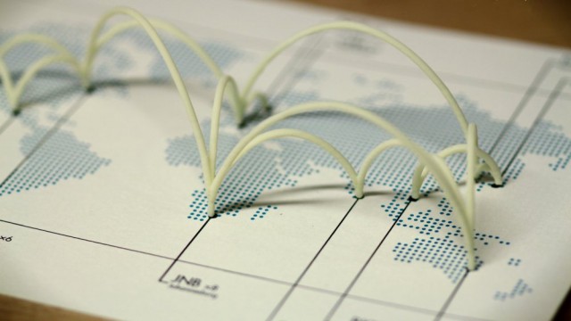
As the video demonstrates, the user can interact with flight data online, using a variety of tools like Foursquare, Tripit, and a custom interface. The difference arises when 3d printing technology is applied to the visualization, as a physical map and routes are produced, providing an output of “graceful arcs in a 3D-printed sculpture that acts as a tangible travelogue.”
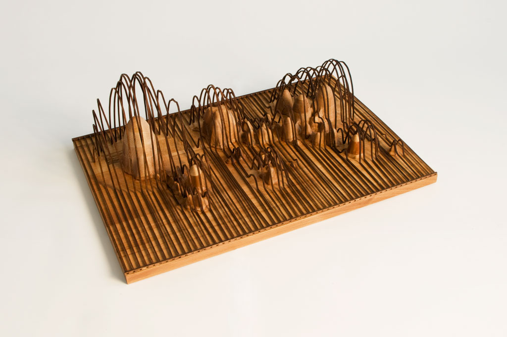
This could be seen as both a fun way to remember a favorite trip, and a means to ground (pun intended) flight data in the offline. This is just the start of what is possible with tactile data visualizations. In a similar fashion to the flight maps, the work of Andreas Nicolas Fischer aims to create sculptures based on data. He describes one of his works, Fundament, as “A statistical map, a hybrid between physical and conceptual space. The horizontal arrangement equates to the Mercator projection of a world map and the vertical axis metaphorically corresponds to the financial activity of the country.”
While beautiful as a piece of art, this project also shows valuable data, specifically global financial information. While the exact and specific data is obfuscated, someone observing the sculpture can easily see that North America, Europe, and Asia have the largest markets. It takes complex and often confusing statistical information and turns it into a visualization that can be touched, absorbed, and understood in a more accessible way. This kind of work can be seen as a realization of what Cairo’s ‘ functional art.’ as is provides information in an aesthetically pleasing manner. Obviously there are criticisms of these kind of projects, as a standalone piece they lack legends and other explanatory additions. This can be remedied however, through the design being changed more to the data side than the artistic goals. So far, we have covered static yet tangible projects, the next section will discuss dynamic, yet not necessarily interactive data visualizations.
Moving to a more complex example, ‘pulse’ is a system that takes real-time information and produces a physical graph using string and motors that can be hung on a wall or placed on a desk. The user connects the system to any live feed that can be expressed as a graph, such as financial data, heart rates, air quality, and similar information.
However, adding dimensions and features just because it’s possible does not necessarily add any value for the user, or provide more information. The creators of the project (Cargo Collective) write on their website “Facebook and twitter feeds consume our focus, when in reality, the majority of the data we are being fed does not affect us. Pulse filters out the blur, leaving the user with a clear, pure visual representation of the information they seek.” While this sounds like it makes sense initially, adding more dimensions for the sake of aesthetics may not filter, but rather add to, the blur. Jeffery Heer has written that “Confusing widgets, complex dialog boxes, hidden operations, incomprehensible displays, or slow response times can limit the range and depth of topics considered and may curtail thorough deliberation and introduce errors.” This seems to be the case with Pulse. The third dimension adds no additional data or context to what could easily be displayed on a 2d chart. This is not to say that all additional dimensions or features are unhelpful, but rather to warn that the designer must make important decisions about what is actually be expressed, and for what purposes.
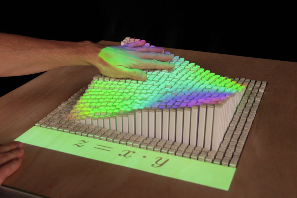
The next step tactile visualization could take is incorporating an interactive element. A perfect example of where these designs may be heading is MIT’s Dynamic Shape Display, a project from the Tangible Media Group.
As you can see in the video above (and featured image for this post), the display can be used to produce an almost unlimited variety of graph, image, and information based visualizations. It is telling that the photos out of the Media Lab itself show people interacting with and touching the dynamic display (and the video shows many more amazing examples of how this technology can be used.) One could imagine a map projected on a display of this nature, with bars at levels depicting a variety of variables. Imagine having a display showing co2 levels worldwide, and allowing the user to push the bars down in certain countries to see how that would affect overall and future models. This tangible interaction with big data would provide an innovative and simple means of exploring, and one humans are particularly adept at, interacting with our hands.
It is also important to note that there is a side to tangible data visualization that is not computer generated or produced using high tech devices such as 3d printers. For example, the Of All The People In All The World project uses “grains of rice to bring formally abstract statistics to startling and powerful life.”
Numerous members of the team spent days meticulously weighing grains of rice and positioning them in piles as a way to show population data in a physical format. Each grain of rice represented one person, and the gallery-presentation format allowed visitors to explore this vast data in a way that is more easily understood. While big-data is a current buzzword, and it often thought to only be processed by comparatively big servers and algorithms, it’s useful to note that tangible data visualization is one area where computers can be removed from the equation.
While the processing for data visualization is moving toward computer displays, and rightly so given their capabilities, it is important to recognize the value of producing physical data visualizations, from static sculptures, dynamic designs, and fully interactive projects. The theory of exaptation (which is worth reading more about in the Cairo text referenced below) in the context of data visualization, is fitting for this post. Much as new technologies have been used to collect and process information, the use of old forms can also be used to create new functions related to how we interact with data. These projects can be as small as visualizing your own pulse via quantified-self devices to creating global dynamic and interactive designs that allows users to see how data is interrelated, and thus develop conclusions and decisions based on this exploration.
References
Ariely, Dan. Predictably Irrational: The Hidden Forces That Shape Our Decisions. New York, NY: HarperCollins, 2008. Print.
Cairo, Alberto. The Functional Art: An Introduction to Information Graphics and Visualization. N.p.: n.p., n.d. Print.
Heer, Jeffrey, and Ben Shneiderman. “Interactive Dynamics for Visual Analysis.”Queue 10.2 (2012): 30. Print.
Tufte, Edward R. The Visual Display of Quantitative Information. Cheshire, Conn. (Box 430, Cheshire 06410): Graphics, 1983. Print.
Artists, Design Labs, and others have been linked to homepages in text


