The distinct disciplines of infographics and information visualisations
Within the data visualisation community there is in general a strong premise that infographics and information visualisation are two distinct disciplines. Infographics present information as statistical charts, maps, and diagrams which are often annotated with text and beautified with illustrations. As Alberto Cairo points out in his book “The Functional Art: An Introduction to Information Graphics and Visualization” Infographics have traditionally been created within art departments and have a background that stands in journalism, design and the art of story telling. So in the most basic form infographics refers to the tools and techniques involved in the graphical representation of data (Masud et al. 447). They are often seen in newspapers and in online blogs because infographics work best in visually communicating information to a broad, non-expert target. But because they are often created by designers the functionality of the graph is often outweighed by iconic style elements. Or as Alberto Cairo puts it:
“Thinking of graphics as art leads many to put bells and whistles over substance and to confound infographics with mere illustrations.”
(Cairo 2)
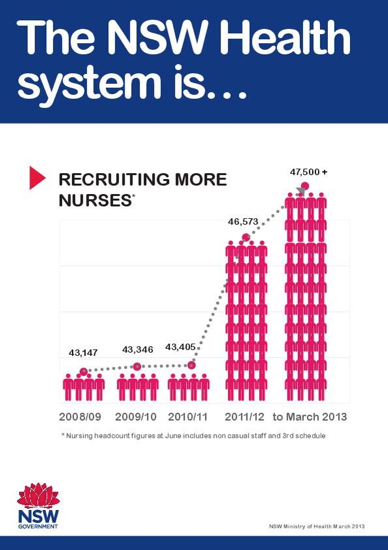
The example below is from the New South Wales ministry of health and shows the increase in the number of nurses from 2008 to March 2013. From a first glance the image shows a huge growth in the recruitment of nurses. But when you look more closely to the figures you realise that the scale must be off. Here it is useful to look at Edward Tufte who introduced the “Lie Factor” in his book “The Visual Display of Quantitative Information.” He introduces the principle that:
“The representation of numbers, as physically measured on the surface of the graphic itself, should be directly proportional to the quantities represented.”
(Tufte 57)
The “Lie Factor” is a value to describe the relation between the size of effect shown in a graphic and the size of effect shown in the data. This value needs to be as close to 1 as possible, when the lie factor is greater than 1 the visualisation is exaggerating and when it is less than 1 the visualisation is understating the actual effect. The lie factor is calculated by dividing the size of effect shown in the graphic by the size of effect shown in the data. When we look at the example below we see that the third bar represent 43,405 nurses in 2010/11 with four stick figure icons, the next bar shows 32 stick figures, an increase of 28 icons for an increase of 3168 nurses. Thus the size of effect shown in the graphic is 7 times bigger ( (32-4) /4 = 7). And the size of effect shown in the data is 0,0729 which is just 7% ( (46573 – 43405) /43405 = 0,0729). This gives an exaggerating lie factor of 95,9 (7/0,07298698306647).
Infographic from Ministry of Health New South Wales March 2013.
Source: http://static.guim.co.uk/sys-images/Guardian/Pix/pictures/2013/8/1/1375343461201/misleading.jpg
Information visualisations on the other hand are often seen as tools that users can use to explore and analyse data. Information visualisations can be defined as the use of computer-supported, interactive, visual representations of data to amplify cognition (Card et al.). Information visualisation provides a powerful means of making sense of data. By mapping data attributes to visual properties such as position, size, shape, and colour, visualisation designers leverage perceptual skills to help users discern and interpret patterns within data. Many authors advocate the need of a strictly functionalist and analytic approach inspired by Edward Tufte, pioneer in the field of data visualisation. According to Tufte, excellence in graphics consists of complex ideas communicated with clarity, precision, and efficiency. Graphical displays should induce the viewer to think about the substance, present many numbers in a small space, make large data sets coherent, encourage the eye to compare different pieces of data, reveal the data at several levels of detail, from a broad overview to the fine structure (Tufte). Alberto Cairo follows this by saying that:
“The first goal of an infographic is not to be beautiful just for the sake of eye appeal, but, above all, to be understandable first, and beautiful after that; or to be beautiful thanks to its exquisite functionality.”
(Cairo 7)
This is what he calls functional art, when we see information visualisation as a tool that help the viewer to discover new patterns and compare different subsets of the data we accept that the discipline it belongs to is not just art, but functional art (Cairo 23). The destination between infographics and information visualisations can thus be seen as follows: infographics tell stories designed by journalists and designers, where information visualisation helps readers discover stories by exploring through the data themselves.
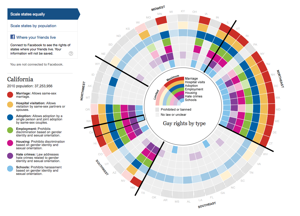
A good information visualisation is in my view the visualisation of gay rights laws in the United States of America per state made by The Guardian.
The Guardian’s interactive guide to gay rights in the United States
Source: http://www.theguardian.com/world/interactive/2012/may/08/gay-rights-united-states
In this information visualisation interactive designer Feilding Cage visualised gay rights laws in America for the Guardian. Gay rights issues vary by state and have evolved to allow, but in some cases ban, rights for gay, lesbian and transgender people. The visualisation is structured by different types of gay rights, including marriage, hospital visitation, adoption, housing, employment and school bullying which all have a specific colour. Full colours are used to indicate the maximum rights, for adoption this entails that adoption is allowed by same-sex couples. A lighter shade indicates limited rights (for example it allows domestic partnerships, but does not allow same-sex marriage). A line pattern indicates that the particular right is prohibited or banned for gay people. The circle mimics overall geography by positioning the states by geographical orientation, allowing side by side comparisons and allow to follow trends by region. Therefore you can tell at a glance that the North-East and South-West are more progressive than other regions. The breakdown by category helps to reinforce the regional variation and allow to look at the complexity of each category.
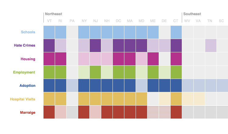
However, if we follow a strictly functionalist approach you could argue like Edward Tufte that this circle diagram is not the best option to visualise and compare the difference between states for a specific type of right. For example, the circle diagram fails in comparing the employment rights for each state. As proposed by others a colour-coded matrix might work better.
 Alternative by Bryan Connor. “The Guardian’s Gay Rights Rainbow Graph.”
Source: http://thewhyaxis.info/rainbow/
With a matrix you do not have to look around the circle to compare two states. The geographic groupings could sill be visible from left to right, but with this matrix you could easily sort the rows of different right types. For instance, you could sort the states by employment laws to see states with similar levels of legality. In the original visualisation this is done by adding an overview per type of gay right as separate visualisations, which forces viewers to scroll al the way down.
While Tuftean authors advocate the need of a strictly functionalist and analytic approach, journalists and designers often have a more communicative approach to visualisation which can be seen in the visualisation of The Guardian. I prefer the original circle diagram because the information visualisation is meant for a general audience of the Guardian newspaper. Visually it is more pleasing than the plain alternative matrix which might be the reason that this visualisation went viral in the first place. In addition, it reflects the geographic relationships better which allows for better interpretation of regional trends. Whatever discipline you stand for every infographic and information visualisation need to, above all, able the viewer to distillate interesting findings out of the data and need to allow a certain degree of exploration.
References
Bryan Connor. “The Guardian’s Gay Rights Rainbow Graph.” The Why Axis. May 9, 2012. 05 April 2014. <http://thewhyaxis.info/rainbow/>.
Cairo, Alberto. The Functional Art: An Introduction to Information Graphics and Visualization. New Riders, 2012.
Masud, Luca et al. “From Data to Knowledge – Visualizations as Transformation Processes within the Data-Information-Knowledge Continuum.” IEEE, 2010. 445–449.
Stuart Card, Jock Mackinlay and Ben Shneiderman, Readings in Information Visualization: Using Vision to Think (London: Academic Press, 1999).
Tufte, E. 1983. The Visual Display of Quantitative Information. Cheshire, CT: Graphics Press.
