How are gender norms reconstructed through app store ecologies and visual interfaces?
A look at popular medical, health & fitness apps in the Google Play store (NL)
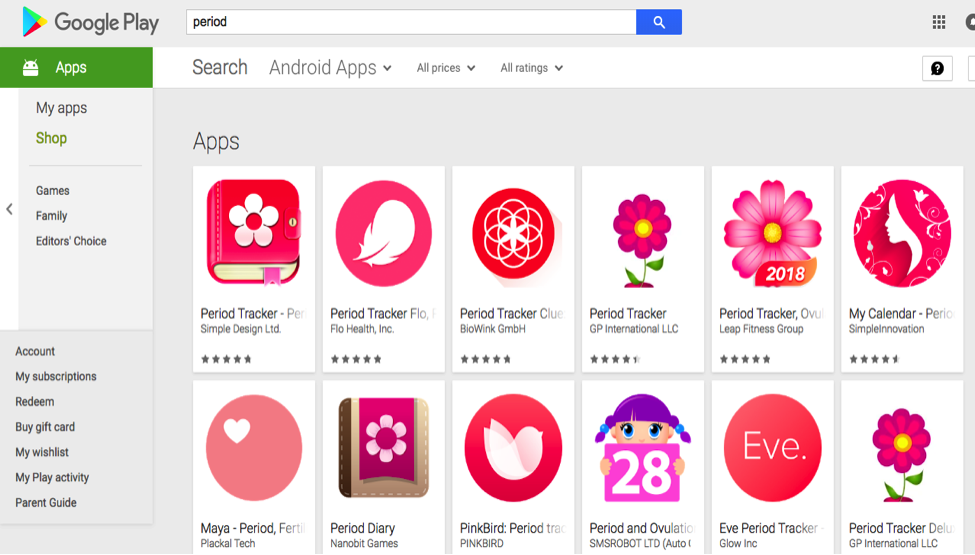
Figure 1: Google Play Store search results for “period” mobile applications
Introduction
This research project interests itself in the gender dynamics at play in the ecosystems and visual interfaces of mobile applications. When searching for “women’s health” in the Google Play Store, one is overwhelmingly confronted with traditional and loaded symbols of femininity, as pictured above. Flowers, the colour pink, as well as hearts and nature imagery recur, constructing an image of womanhood deeply embedded within traditional gender norms.
Applications are a ubiquitous technology within our technologically mediated life. That they should reinforce and strengthen pre-existing gender norms at play within our culture should be problematised. The aim of the research is to investigate how new media objects are related to social practices and what forms our prejudices and stereotypes take. Specifically, this project asks; how are gender norms reconstructed through app store ecologies and visual interfaces? It focuses firstly on the algorithmic logic behind the Google Play Store and what gendered app ecologies it could create, then on the visual interfaces of health and fitness as well as medical apps, a category where we could potentially see gender bias occur.
Context & Relevance
This topic lies in the debates surrounding algorithms influence on human agency, especially “black-box” algorithms. This terms refers to algorithms “whose workings are mysterious; we can observe its inputs and outputs, but we cannot tell how one becomes the other” and thus the internal workings are unknown (Pasquale, 3). Debates around artefact ecologies that revolve around digital devices, applications and “when a new technology is infused into an artefact ecology” (Bodker) should, therefore, encompass the algorithms shaping and structuring the marketplace where ecologies are being created.
App stores are considered to be an “online curated marketplace” (Jansen & Bloemendal) that constructs individuals interactions with mobile applications. Algorithms should be understood as structurings interactions with new media and recent scandals around algorithms bias. Mobile applications are a ubiquitous and popular form of technology that “construct and configure” human capacities and desires (Lupton). They are interactive artefacts society uses daily and extend to digital artefact ecologies and have the potential to influence its users. The aim of this research is to analyse gender dynamics and representation, as well as how new media mirrors wider societal norms, stereotypes and prejudices. As new media objects, applications are born out of culture with a certain set of associations and internalised hierarchies, and therefore looking at these ideals are perpetuated through the objects we produce continue to institutionalise gender norms is especially relevant in this culture. Algorithms should be understood as architecturally structuring societies interactions with new media. Algorithms should be looked at as human-developed tools and looking at the values imbued into them reveals. With this it is important to understand how gender bias and gender identity is constructed in society. Men have always been held more economic, political and social power they have also had more influence on cultural and historical events (Beauvoir). This had lead men to be the ones defining societal norms. This leads to the construction of femininity by men and in turn the other-ing of women (Beauvoir). Therefore making male the neutral gender that defines what being a women means. Women thus are only viewed in society in relation to men.
When looking at app stores as gatekeepers to these essential tools, app store ecologies should, in theory, be neutral (Petsas) and mobile app ecosystems should be easily readable and visible. In an attempt to uncover any potential gender bias, the study will examine apps that could be categorized as gendered apps, specifically health-related apps. With around 9 percent of women more likely to use mobile health apps compared with 4 percent of men, women’s health apps are a growing market with a target audience in mind (Derbyshire).
Methodology
For the purposes of the project, a mixed method approach was used in order to provide multiple empirical perspectives. New media was essential to the research, as it automized the collection of relevant apps and data, as well as allowing for collaborative contributions to the methods, observations and insights. The results of the following two methods were combined for the purposes of analysis and conclusions.
Method 1 – DMI Similar Apps Tool & Gephi
The top 60 apps from both the ‘Health & Fitness’ and ‘Medical’ categories of the Google Play App Store were extracted using the DMI Link Ripper tool. This resulted in URLs to 120 apps in the Google Play Store. The URL links to the apps were cleaned on Google Sheets to produce a list of 120 App IDs that were then entered into the DMI Google Play Similar Apps tool and processed. The results were downloaded as a .gexf file and uploaded to Gephi, a network visualisation program (Jacomy et al.). The resulting graph was edited and spatialized in terms of layout and appearance using the ForceAtlas2 algorithm as well as other aesthetic tweaks to optimise visualisation of the network. The network consisted of 2400 nodes that represented apps in the Google Play Store, connected by the ‘Similar Apps’ feature.
The nodes were set to be larger based on their ‘in-degree,’ as this clearly displayed which apps are more frequently found in the ‘Similar Apps’ feature of the app store. There were not many variables to work with to set the node colours, however, but they were coloured by the price of the app where green indicates a free app; cyan less than €1; dark blue €1 – €5; purple €5 – €10 and red more than €10. The final graph is shown without labels in Graph 1, and Graph 2 with labels.
Method 2 – Coding Apps as Presented in the Google Play Store
For the second methodology, the apps were divided amongst the project’s collaborators and coded, recorded using Google Sheets. They were coded based on the following categories, as well as any additional comments that could be made in regards to the research question:
1. Logo Colour
2. Logo Shape
3. Keywords
4. Description
5. Language
6. Similar Apps
This resulted in a master spreadsheet documenting aspects of each app that could be interpreted and coded as ‘male,’ ‘female’ or ‘gender neutral’.
Limitations
There were a number of limitations to this project. As the project took place in The Netherlands, the Similar Apps Tool could analyse only the Dutch App Store, meaning that exploring popular apps in other countries was not an available option. This also created a language barrier in the study as some of the applications were only available in Dutch. This lead to a limited ability to analyze some of the applications.
The methodology used also had certain limitations. The DMI Similar Apps tool is only relevant to the Google Play store, so it was not possible to include the Apple App Store in the research project. This may have had the potential to offer new insights and valuable findings. When examining applications interfaces and coding in the second methodology multiple limitations were found. Firstly, the huge variety of application interfaces and intended uses made it difficult to propose consistent coding and conclusions. Secondly, the scope of the project also limited the number of applications that could be analysed – it was limited to the top applications by popularity, which is subject to change on a daily basis. Examining a greater number of applications could widen the scope of the findings.
Crucially, it was also very challenging in determining what counted as being coded ‘male’ or ‘female’ in the first place. For example, does a purple interface mean that an app is targeted to women? These apps were being coded as ‘male’ or ‘female’ based entirely on the researchers pre-conditioned notions of what it means to be these genders, therefore it is arguable that classing these apps in this way is purely subjective and not entirely empirical.
Analysis & Results
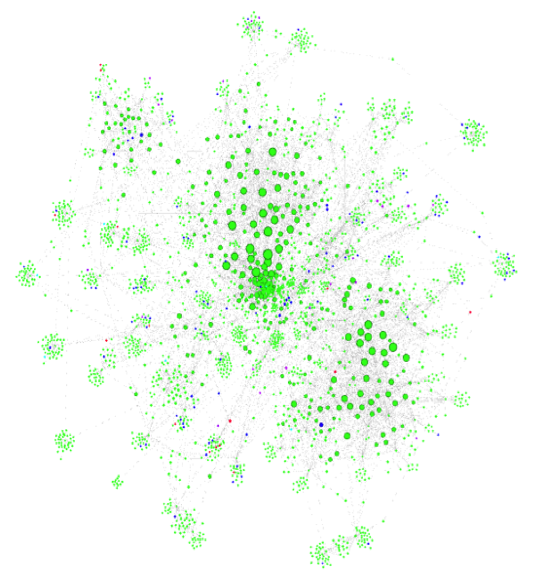
Graph 1: Similar Apps Network
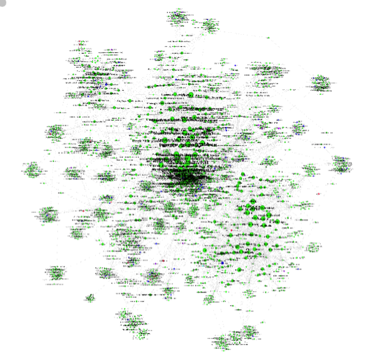
Graph 2: Similar Apps Network with labels
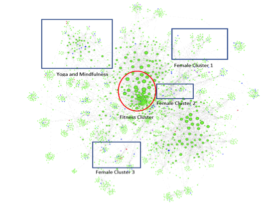
Graph 3: Main similar apps clusters
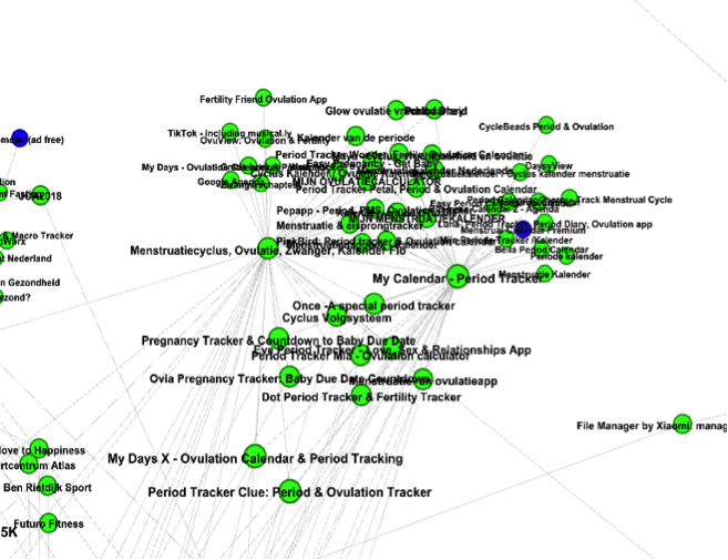
Female Cluster 1: Menstruation and Ovulation Tracker apps
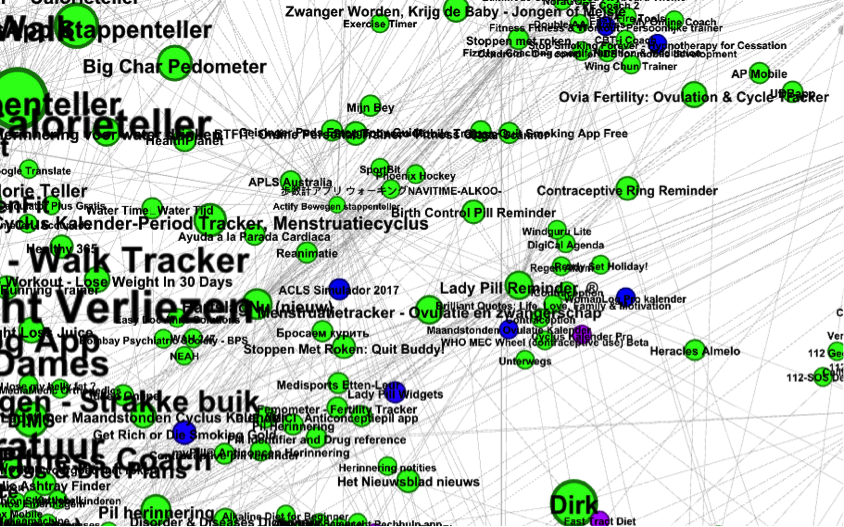
Female Cluster 2: Birth Control Reminder apps
Female Cluster 3: Pregnancy apps
Graph 4: Female Cluster 1
Analysis:
Network analysis:
Graph 3 indicates the location of Female Cluster 1, the predominant cluster of female apps in the network. This cluster consists of menstruation and ovulation trackers that would typically be used by women. The cluster is fairly distinct from the rest of the network, with few ties to the center. This indicates that these apps are rarely classed as a ‘similar app’ outside their own app ecosystem. The secondary ‘female’ cluster, Female Cluster 2, again with its position in the network shown in Graph 3, was oriented around birth control reminder apps. It was positioned much closer to the center of the network due to its ties with more general medication reminder apps.
Graph 5: Female Cluster 2
What is significant is that despite there being at least these two distinct clusters of ‘female’ apps, there was no distinct ‘male’ cluster in the network. All of the apps that were determined to be ‘male’ by the second methodology were in the center of the network with essentially no links to other clusters. This might be expected given the app categories of this project, as women have more niche medical and health needs than men, especially when it comes to reproductive health.
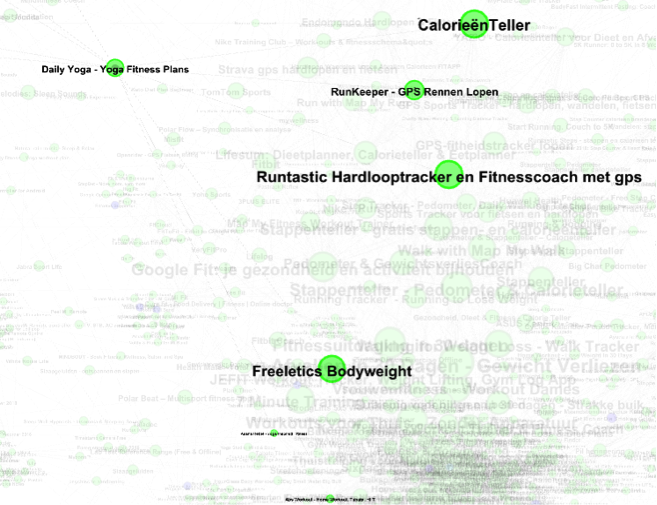
However, it was found that a cluster of apps not directly related to gender, that of yoga and mindfulness apps, was gendered by the Similar Apps algorithm. This cluster was arranged around the “Daily Yoga App”, which is itself only connected to either ‘gender neutral’ or ‘female’ fitness apps. Daily Yoga links as well to both CalorieenTeller & Abs Workout – Home Workout, Tabata, HIIT (Graph 4 – N.B Abs Workout is small at the bottom). CalorieenTeller, as we shall soon see, has other links to gendering certain types of apps and Abs Workout is a distinctly ‘female’ app (see Figure 2). No other distinctly ‘female’ apps bridge together a cluster in this way in the network. This makes yoga & mindfulness a gendered cluster even though the apps themselves are non-gendered. This was the most significant case found of the Google Play Store’s Similar Apps algorithm gendering apps.
Graph 6: Connections of Yoga & Mindfulness cluster
Application Interface Analysis
The analysis of the application interfaces brought insights regarding the patterns of genderings. One of the most interesting clusters that was examined was the cluster of fitness apps found in the center of the network. Out of the 60 Fitness & Health applications, six were coded as ‘female and five were coded as ‘male’.
The majority of the ‘male’ applications, although offering product for men, were described as suitable for both men and women. However ‘female’ applications repeatedly and explicitly stated that they were exclusively for women, as one application states “each exercise is carefully considered by our trainer team and there will be differences between man and woman”.
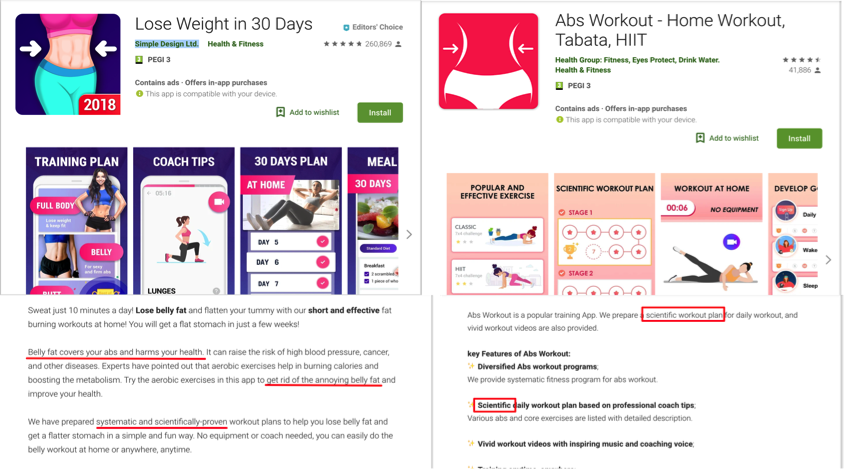
Figure 2: Female fitness apps analysis
When analysing the language used by the developers of the apps it was found that the language used in the ‘female’ coded applications were more emotionally charged and tended to rationalize the decision to download the app often by referring to scientific information and focusing on health (Figure 2). In contrast, the language used in the ‘male’ coded apps emphasized strength and power. These apps also referred to the efficiency and ‘ease of use’ of the application instead of emphasizing health (Figure 3). It can be reasoned that this is a reflection of stereotypes associated with each gender and what is seen as important for them.
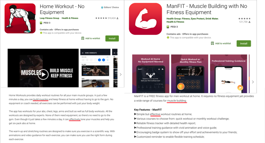
Figure 3: Male fitness apps analysis
While men are expected to have muscles and be strong, women are supposed to be thin and feminine. These ideals are thus reflected in the coding and language of these applications.
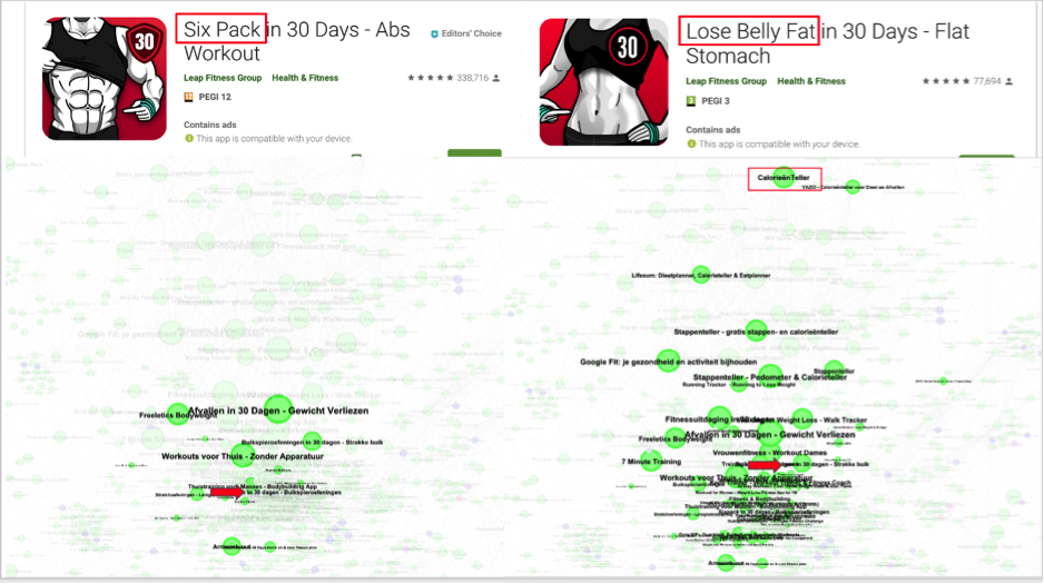
Figure 4: Leap Fitness Group applications for abs workout & network graph
By cross referencing an app’s location in the network with interface analysis, some additional observations can be made. This was found in apps by the Leap Fitness Group and their connection to dieting apps. It could be observed that ‘female’ fitness apps are commonly connected to the Calorie Counter application (CalorieenTeller in Figure 4), whilst almost no ‘male’ fitness apps were connected to it. Such an observation emphasises a certain model of femininity associated with the stereotypical idea of women’s health and beauty norms (Englis et al.) It can be reasoned that the lack of a connection between male apps and calorie counters suggest different social expectations from men. This might also be interpreted in the naming of certain applications: e.g. a ‘male’ app emphasising strength in “Six Pack in 30 Days” versus the ‘female’ version emphasising weight loss in “Lose Belly Fat in 30 Days” (Figure 4).
Applications that were coded as gender neutral during the analysis were in most cases step counters and running applications. However, even when an app’s functionalities were marketed as gender neutral e.g. Runtastic (Figure 5), the visual interface, in this case logo and featured video, were in some cases presenting men.
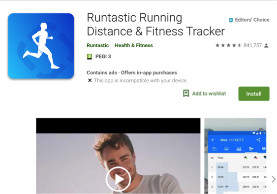
Figure 5: Runtastic application in Google Play Store
When examining this from a gender theory point of view it can be seen that the male-gendered applications were described as being for both genders because male is seen as the neutral gender. However women’s applications are coded specifically as female based because female is only seen in relation to the neutral male (Beauvoir). It can also be seen that there is a lack of male coded applications because ‘male’ is coded as neutral while ‘female’ is coded as female. This also accounts for the large number of female gendered applications. Therefore it can be seen that societies understanding of ‘female’ and ‘male’ are reflected in the Google Play Store health, fitness, and medical categories.
Conclusion
This project looked for female clusters in the Medical and Health and Fitness categories as they could have the most potential results due to the specificity of women’s needs in terms of health. This gave rise to a number of female clusters, but no significant male clusters. Female clusters were coded mostly through their visual interfaces and function. However, another cluster was found that, though composed of apps that were visually coded as gender-neutral and whose function was unisex, was gendered through its Google Play Store “Similar Apps” recommendation.
Looking at the interface of fitness apps, the core cluster of these results, was especially relevant in seeing how visual cues and language was used to shape our interactions with these apps as gendered subjects. Our results have shown that it is hard to code apps as male as ‘male’ is often coded as neutral while ‘female’ is coded as female. This could be seen in numerous gender-neutral coded apps, such as Runtastic. While its logo and certain elements in its interface privileged the male body, the categories used to code apps through language, function and keywords found that these were in effect gender neutral app. Male is often seen as a neutral gender while female is seen as other, giving rise to several female clusters but no male clusters.
Going further with this research could interrogate other categories of App stores. Categories that are potentially more likely to present distinct male and female clusters could be areas of life that have traditionally been more gendered, such as the “Auto & Vehicles” and “Sports” categories. Categories such as “Family”, which represents children’s entertainment would provide further insight into how children are socialised into these gender norms that are later enforced in life through more other technologies. These could represent a more divisive separation between gendered apps and their ecosystem.
Bibliography
Beauvoir, Simone de. The Second Sex. Knopf Doubleday Publishing Group, 1949. Open WorldCat, http://banq.lib.overdrive.com/ContentDetails.htm?id=00038A93-7B24-4653-94E6-9C4689DA09EA.
Bødker, Susanne, and Clemens Nylandsted Klokmose. ‘Dynamics in Artifact Ecologies’. Proceedings of the 7th Nordic Conference on Human-Computer Interaction: Making Sense Through Design, ACM, 2012.
Derbyshire, Emma, and Darren Dancey. ‘Smartphone Medical Applications for Women’s Health: What Is the Evidence-Base and Feedback?.”’. International Journal of Telemedicine and Applications, no. 9, 2013.
Englis, Basil G., et al. ‘Beauty Before the Eyes of Beholders: The Cultural Encoding of Beauty Types in Magazine Advertising and Music Television’. Journal of Advertising, vol. 23, no. 2, June 1994, pp. 49–64. Crossref, doi:10.1080/00913367.1994.10673441.
Hall, Miranda. ‘The Strange Sexism of Period Apps’. Motherboard, 2017, https://motherboard.vice.com/en_us/article/qvp5yd/the-strange-sexism-of-period-apps.
Jacomy, Mathieu, et al. ‘ForceAtlas2, a Continuous Graph Layout Algorithm for Handy Network Visualization Designed for the Gephi Software’. PLoS ONE, edited by Mark R. Muldoon, vol. 9, no. 6, June 2014, p. e98679. Crossref, doi:10.1371/journal.pone.0098679.
Jansen, Slinger, and Ewoud Bloemendal. ‘Defining App Stores: The Role of Curated Marketplaces in Software Ecosystems’. International Conference of Software Business, Springer, 2013.
Lupton, Deborad. ‘Apps as Artefacts: Towards a Critical Perspective on Mobile Health and Medical Apps’. Societies, vol. 4, no. 4, 2014, pp. 606-622.
Pasquale, Frank. The Black Box Society: The Secret Algorithms That Control Money and Information. Harvard University Press, 2015.
Petsas, Thanasis, et al. ‘Rise of the Planet of the Apps: A Systematic Study of the Mobile App Ecosystem’. Proceedings of the 2013 Conference on Internet Measurement Conference – IMC ’13, ACM Press, 2013, pp. 277–90. Crossref, doi:10.1145/2504730.2504749.