www.visualcomplexity.com
“VisualComplexity.com intends to be a unified resource space for anyone interested in the visualization of complex networks. The project’s main goal is to leverage a critical understanding of different visualization methods, across a series of disciplines, as diverse as Biology, Social Networks or the World Wide Web. I truly hope this space can inspire, motivate and enlighten any person doing research on this field.” (Manuel Lima)
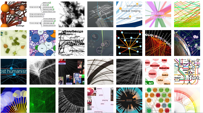
This mesmorizing page can be an inspiration to all who like to try to picturalize the world into graphical visualizations. Visualcomplexity is an interesting attempt to research the different methods to annotate complex networks. They either provide advancement in terms of visual depiction techniques/methods or show conceptual uniqueness and originality in the choice of a subject. By using different filters like Art, Biology, Business, Networks, Computer Systems, Food Webs, etc. the user can focus to his area of interest. With its visual attraction, it seems we can morph the world into comprehensible systems and therefor control, understand and influence the netwerk we are in ourselves. This appealing idea is maybe not true but certainly sympathetic, and in any case, a pleasure to look at and to contemplate on. (See also: http://blog.ok-parking.nl/ and http://www.reboot.dk/artefact-1995-en.html for further reflections on what images can do with our sense of clickable interactivity.)

 href=’https://mastersofmedia.hum.uva.nl/wp02/wp-content/uploads/2007/09/picture-9.png’ title=’picture-9.png’>
 href=’https://mastersofmedia.hum.uva.nl/wp-content/uploads/2007/09/picture-8.png’ title=’picture-8.png’>
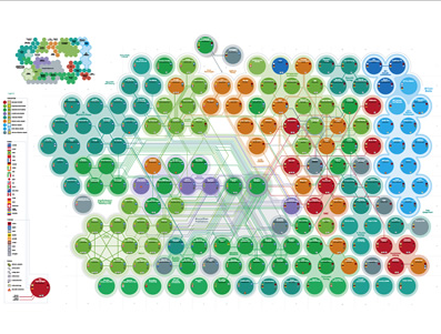
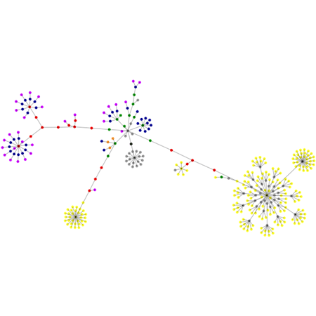
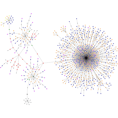
A friend mine, showed me a related project, the website with a project made by Sala: http://www.aharef.info/2006/05/websites_as_graphs.htm
HTML consists of so-called tags, like the A tag for links, IMG tag for images and so on. Since tags are nested in other tags, they are arranged in a hierarchical manner, and that hierarchy can be represented as a graph. I’ve written a little app that visualizes such a graph.
On this site you can send in your own website and the backlaying structure is promised to be shown as a schedule.
i tried to get our mastersofmedia graph, unfortunately this seems not to work. There is also a flickrpage where you can see a lot of graphs made this way. It is a beautiful snowcristal-like overview of different websites.
Because Sala uses a simple colour schedule you can easily ‘read’ the different sites and their networks who differ from centralized, decentralized to distributed.
blue: for links (the A tag)
red: for tables (TABLE, TR and TD tags)
green: for the DIV tag
violet: for images (the IMG tag)
yellow: for forms (FORM, INPUT, TEXTAREA, SELECT and OPTION tags)
orange: for linebreaks and blockquotes (BR, P, and BLOCKQUOTE tags)
black: the HTML tag, the root node
gray: all other tags
Because of this simple schedule the graphs do look alike eachother more or less, but the differnce in structure is certainly visible. It is more ‘readable’ like text, but less ‘mindboggling’ than the visualcomplexity.com shows us.
some examples:
cnn.com

Boinboing
Google