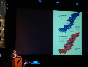
Charles M. Blow at the infographics 2010
Charles M. Blow was the opening presenter at the Infographics 2010 Conference in Zeist last Friday (March 5th) and in my opinion, one of the best presentations of the day along with the always inspiring work of Catalog Tree.

Mr. Blow started his presentation by telling an anecdote about a reporter from a big city interviewing a farmer about his three legged pig, whereas the reporter didn’t understand why in heavens the farmer would want a three legged pig, the farmer praised the bravura of the pig which had saved him and his wife from a terrible fire but the reporter frustrated insisted once more “But why the 3 legs?” and the farmer went: “Well you wouldn’t eat a pig like that all in one day , would you?”. This funny story was more powerful than the coffee served and served the purpose of putting the audience in a receptive mood to hear what Mr. Blow had to tell.
The presentation was about “Finding his way back to basic” and he introduced the Info viz theme by confessing that he no longer believed in most of the things he used to believe when it came to info graphics. The confession reached a superior level when he said that he felt that on a certain point they, the New York Times (NYT), were suffering from info lust, they were filling the holes on pages instead of filling gaps in understanding, they were consumed with the wrong arguments, instead of being focused on the readers’ needs they were doing it for their own pleasure. This was followed by what I would hold as the motto of his presentation: “Beautification is not communication”.
Substance and purpose are the big arguments that they were missing while distracted by the trivia. After sharing his ideas about the meaning of info graphics, he told us stories with graphics.

Stories about politics, about religion, about guns and how the number of purchases rose four months after Barack Obama was elected, on an anxiety build where probably people thought there was a revolution coming; about dating and how twelve graders who don’t date frequently finally overtook those who always date – he called this the hookup culture, which says ”let’s have sex a couple of times and if I really like you, I will take you out”.
Mr. Blow’s presentation was inspiring up to the point of putting me on my way to the NYT info graphics and interactive department, and here are some links that I found interesting:
The New York Times Visualization lab
A Peek Into Netflix Queues
Vancouver’s Olympic Venues
Leading to an Oscar Win
Olympic Pictograms Through the Ages
Full results, but recounts to Come
Turning a Corner?
How Different Groups Spend Their Day