Information visualization, going public
2010 has great potential in being the year that Information Visualization (InfoVis) went public and moved from being a term only used by enthusiasts, to an interest shared by a broader audience.
I am not saying this just because my interest in InfoVis has considerably grown during the last months; I am stating this because several initiatives that were recently brought to public prove that InfoVis is no longer a subject that appeals exclusively to science, business, or curious minds for that matter. Today InfoVis has gone public, and by public it is meant: data available for free and tech independent free desktop or web apps that let you visualize, interact with and share those data visualizations.
Soon, data visualization will appeal as strongly to society on a more general level, once people realize that they can use both data and tools to analyze and visualize it. In other words, not only have we been exposed to more data visualizations during the recent years as there are now conditions that allow for us to built them. Hans Rosling with his remarkable trend-revealing software has been talking about world poverty and other topics in his TED talks since 2006, Davis Guggenheim with his movie “An inconvenient truth” about the climate crisis showed us the correlation of CO2 emissions and the rise of temperature, the Crisis of Credit Visualized from last year explained to all of us with animated clever diagrams an otherwise difficult to grasp topic, this just to name a few of influent data visualizations.
On a different level, a new breed of infoVis aficionados started to show up around 2006/2007 in cutting-edge and trendsetting festivals such as OFFF, showcasing their work: Casey Reas and Ben Fry promoted Processing workshops, Bestiario showcased their work about social representations, Stamen Design presented Cabspotting, their great research project about live data visualization which traced San Francisco’s taxi cabs as they travel throughout the Bay Area, Sagmeister presented “Move your Money” an initiative created to make the public more aware about the amount of money going into military & the Pentagon in the US, and last year in 2009 Manuel Lima caused also a big commotion when he show cased his Visual Complexity project as well as Aaron Koblin with Flight Patterns, Disaster Data, NYTE, Amsterdam SMS messages on New Year’s Eve, TV Allegiance, the 10,000 Sheep, Bicycle Made For 2000 and finally Radiohead’s House Of Cards Music Video.
Even governments have recently been using data visualization as a means of showing transparency, detect fraud, waste or mismanagement and communicate with its electors, being the exponent of that one of Obama’s choice to serve on the Recovery Independent Advisory Panel: Edward Tufte, an expert in the presentation of information graphics and author of several books about information visualization.
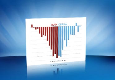
 Another display of Obama’s affection for information graphics is on the movie that was put online on his website. “Road to Recovery” brings to light and celebrates one year after Obama’s signature of the Recovery Act. What more illustrative than the V shaped bar chart, half red (this is where we were, under Bush’s administration) half blue (this is where we are) to show publicly the recovery of job loss in the U.S.?
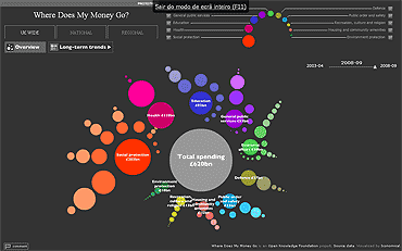
 A similar initiative was embraced by the U.K. government. Launched on December 2009, the website “Where does my money go?” which aims to promote transparency and citizen engagement through the analysis and visualization of information about public spending.
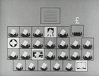
We may think that this is something recent, but even back in 1947 Paul Rotha’s biopic about Manchester “A City Speaks” already employed information visualization to put across a message.
Rotha co wrote the movie and produced it but he also had the cooperation of the Isotype Institute for the maps and charts used.
The message that Rotha wanted to convey in 1947 was that after the war, the city needed its people to be engage in its rebuilding, more, it needed its people to make the effort of shifting from the town center – where old and not suitable for healthy living condition buildings needed to be brought down – to the outskirts where life flourished in much healthier and happier conditions.
The movie in today’s light may seem as an act of propaganda indulging on national values to push a message and trying to engage its citizens but despite that, it communicates in a very clear form several concepts which otherwise would probably be too abstract. It also uses information visualization to tell a story like for instance the city growth or as a visual aid in explaining how much money was needed to run the city in 1946 (8,5 M £, each circle is equal to 100 T £) and to answer the questions: “What was all that money spent on?” and “Where did that money come from?”


Indeed the field of Information Visualization has been maturing for some years now. Some will argue that over 23 years when it was mentioned by McCormick in 1987 on “Visualization in Scientific Computing” as “a tool or method for interpreting image data fed into a computer and for generating images from complex multi-dimensional data sets”, or for a longer period if we decided to position under the same umbrella the kind of info graphics chosen by the Isotype Institute to illustrate and better tell the stories and messages which needed to be passed along.
Regardless of size and complexity, having data was of course a step needed and achieved towards the easiness of data visualization. And a great step was given in 2007 when the UN agreed upon making their data, which was previously paid only, freely available.
Last year the OECD announced the launch of the OECD Factbook eXplorer, an interactive graphical web tool for analyzing country statistics from the OECD Factbook 2009 and also in 2009 the Data.gov website was launched with the purpose to increase public access to high value datasets.
Availability of Data and of web tools are the two factors that created exceptional conditions for being now possible the total democratization of the information visualization.
Andrew Vande Moere, from infosthetics, this weekend said at the SEE#5 conference in Wiesbaden, that big changes have been happening in data visualization, being one of them the social visualization. One and the first website that promoted the social factor on data visualization is the website from IBM, Manyeyes. Manyeyes was also the first that tried to democratize data visualization for “normal” people: “think about youtube for data visualization”. The social aspect of Manyeyes is that, not only can you use your own data, as you can try different visualization tools, and then publish it for others to see, use and comment. What years ago seemed a domain only for those who could master programming languages, is now at hand without great constrains.
Other tools have also gone public in the meantime. In March 2007 Google acquired Trendalyzer from the Gapminder and in March 2010 The Google Public Data Explorer, which uses some of the Trendalyzer technology, went live as a new Google Labs experiment.
If examples such as Davis Guggenheim’s movie have the ability of moving people and making them aware of social issues, the works of Aaron Koblin and such have the talent of inspiring young people to do similar projects and now Manyeyes, Google and many other available web or desktop tools will bring that power to the reach of the normal people.
Out of the exclusive scientific computing labs or academic research rooms and into everyone’s homes.
I would like to thank the North West Film Archive at Manchester Metropolitan University for sending me a copy of the movie “A City Speaks” and for letting me use the printscreens.