Information visualization, not only an academic practice?
The definition by Card et. al. of information visualization as “the use of computer-supported, interactive, visual representations of abstract data to amplify cognition (1999),” is the basis of many authors. From this definition we can extract that this field needs a rather complex gathering of skills or good management of interdisciplinary teams to come to a meaningful product. If we take a deeper look – information visualization combines knowledge from the computer, information and cognitive sciences, in addition to knowledge from the fields of human-computer-interaction and graphical/visual design. Information visualization is still a relatively new phenomenon, since the ability for computers to work with high-end visual representations has only been developed in the last two or three decades.

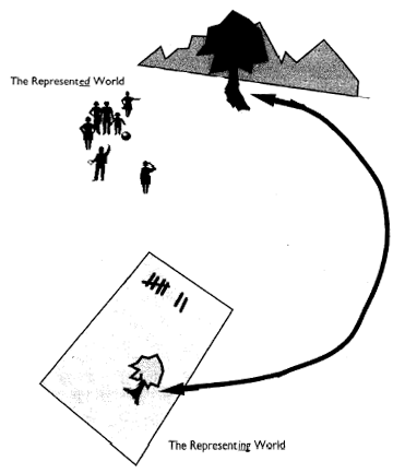
Figure 1: Donald Norman’s illustration of the represented and representing worlds (1993, Ch. 3, p. 50). The represented world is shown in the top, e.g. the mountain, people and tree. While the representing world is shown below, in the form of a piece of paper with an abstract simplification of the represented world, namely the seven people and the tree.
Still, some of the knowledge used in information visualization, has a very longstanding history, it works e.g. with the tradition of conveying meaning through abstract representations. As Donald Norman argues in the chapter ‘The power of representation,’ of his book ‘Things That Make Us Smart,’ representations enabled us to do complicated tasks externally (Figure 1) – it is external cognition that makes us smart and he therefore argues that “the power of the unaided mind is highly overrated.” But Norman also writes that “the critical property of the representations supported by cognitive artifacts is that they are themselves artificial objects that can be perceived and studied (1993),” thus always leaving room for discussion and improvement. Card et. al. also feel that it is fundamental to gain understanding of the important role the external world has on our reasoning and thought; they have therefore defined cognition in their own work as “the acquisition or use of knowledge,” in combination with the term ‘external cognition’ as the “use of the external world to accomplish cognition (1999).” Card et. al. therefore agree with Norman, that “the use of the external world and especially the use of cognitive artifacts or physical inventions to enhance cognition, is all around us (1999).” They build further on his work and argue that defining these important concepts, gives a manner to “express the way in which internal and external representations and processing weave together in thought (Card et. al., 1999).”
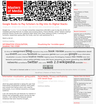
From this short description of information visualization, one could already draw that information visualization is a field which is influenced by several scientific and academic fields. But there are more parties involved in the popularization of information visualization, as the research scientists at IBM’s Visual Communication Lab, Fernanda Viégas and Martin Wattenberg (1) write in their article ‘Tag clouds and the case for vernacular visualization.’ “It’s a time when the mainstream media is embracing sophisticated techniques born in university research labs—a time when you can open The New York Times and see complex treemaps and network diagrams. But just as exciting is the fact that some new visualizations, ones that get people talking and thinking about data in a new way, are emerging from outside the academy as well (2008).” According to them this phenomenon is happening so often that they felt it would be worth coining a term for visualization techniques which have found their origins outside the academic research communities – lending from the design world (2), they decided to call it vernacular visualization and explained it further by a case study of “one ubiquitous type of streetwise visualization: tag clouds (Viégas and Wattenberg, 2008)” (Figure 2) – which are truly ‘vernacular’, because they did not come from the visualization community or other scientific/academic fields and even break some (theoretical) ‘golden’ design rules (3). Still the popularity of tag clouds suggests that they just work well in practice as tools for collective text analysis of e.g. the contents of a blog or political speech – despite possible theoretical critiques.

Figure 2: A screenshot from the MoM weblog with centrally the tag cloud placed in the black outlined box. With this visitors can get a first glance of the topics and see which topics have been more popular.
The Master of Fine Arts and founder of VisualComplexity.com, Manuel Lima, praises the article of Viégas and Wattenberg for the way “they observed how the last couple of years have witnessed the tipping point of a field that used to be locked away in its academic vault, far from the public eye. The recent outburst of interest for information visualization caused a huge number of people to join in, particularly from the design and art community (2009),” resulting in the development of a multiplicity of projects. It is in the light of these developments that Lima decided to write his ‘Information Visualization Manifesto‘ – so that the “goals of information visualization” can be reemphasized and we might be able to make a “clear departure from other parallel, yet distinct practices” – which he feels is necessary because, “with more agents [e.g. non-academic designers and artists] in a system [such as in the field of information visualization,] you also have a stronger propensity for things to go wrong (2009).” Wrong, in the sense that for example a project is labeled as ‘data/information visualization,’ while it is clearly closer related to the artistic world. The big problem with this is that it confuses potential new information visualization students, with wrong expectations of the field, as Lima explains in response to a comment of Andrew Vande Moere of Infosthetics.com.
Lima mentions in his manifesto, that it is not that he wants to come over as “harshly censorial” towards projects that are related to conventional academic information visualization projects but e.g. “over-glorify aesthetics over functionality (2009).” This is because they are, in Lima’s vision, just part of the “continuous growth and maturity” within the field of information visualization – one of the many steps towards the “long progression for discovery” – in which “we are still trying to understand how we can find new things with the rising amounts of data at our disposal (2009).” However, it is still important that we make clear categorizations in the ever growing divergence of projects – Lima therefore ads to Viégas and Wattenberg observations of the emergence of vernacular visualizations, by arguing that we should also make a clear distinction between visualizing purely for aesthetic reasons, which he calls Information Art – or visualizing for the amplification of human cognition, which is the traditional goal (see Card et. al., 1999) of information visualization (2009). “Even though a clear divide is necessary, it doesn’t mean that information visualization and information art cannot coexist” – Lima even argues they should, “since they can learn a lot from each other and cross-pollinate ideas, methods and techniques [–] however, it’s important to bear in mind that the context, audience and goals of each resulting project are intrinsically distinct (2009).”
Besides Lima, there are many other authors (e.g. Kosara 2007, Pouseman et. al. 2007) which make a distinction between information visualization systems that amplify cognition and provide new insights, in contrast to visualization systems that are created for artistic reasons, such as the sublime. I personally believe (like Lima and other authors) that there is room for different cultural practices/subfields to coexists and learn from each other in the general field of visualization. To shut works out that are more focused on beauty then cognition would be a waste, by trying to analyze the work we can learn more about aesthetics and the pleasing and contemplative effects it has on the mind (although this might be bound to the personal preferences per person). Through analyzation there might be a possibility of detecting e.g. aesthetics methods or guidelines which could be applied to more general data visualization projects. Applying such aesthetics could possibly encourage discovery and exploration of new insights through ‘beautiful’ or aesthetic information visualization even further.
On a related note, I would also like to point out that Margarida Fonseca (a fellow student of mine) has also written a blog-post about information visualization and its popularization of lately. It is called ‘Information visualization, going public,’ in which she points towards a lot of interesting developments of the field in 2010. If you are interested in information visualization and want to know more about it, her post is a good starting point in which she also mentions some the longer historic aspects of the field. There have been more postings on the MoM-blog in the past about information visualization and on top of that, there will also be more postings from myself and my fellow information visualization students, (so stay tuned for more).
Footnotes
(1) They are currently working as a team at IBM, on the project Many Eyes, which “explores the power of Web-based visualization and the social forms of data analysis it enables (Viégas and Wattenberg, 2008).”
(2) “In a nod to Tibor Kalman’s admiration of ‘low’ art (Viégas and Wattenberg, 2008)”
(3) Viégas and Wattenberg mention for example: “Long words get undue emphasis over short ones, it is cumbersome to find any single word, and font sizes can be difficult to compare. Alphabetical ordering means that sets of related words are scattered: ‘East’ is close to ‘Easter’ but far from ‘west’ (2008).”
Source listings
Literature:
Card, S.K., J.D. Mackinlay, and B. Shneiderman (1999). Excerpts from: Readings in information visualization: Using vision to think. San Francisco: Morgan Stanley Kaufmann Publishers. (Chapter 1, “Information Visualization”, pp. 1-34).
Kosara, R., 2007. ‘Visualization Criticism – The Missing Link Between Information Visualization and Art’.
Norman, Donald A. (1993). Things That Make Us Smart: Defending Human Attributes in the Age of the Machine. Addison Wesley Publishing Company. (Chapter 3, “ The power of representation”, pp. 43-51)
Pouseman et. al., 2007. ‘Casual Information Visualization: Depictions of Data in Everyday Life.’
Viégas, Fernanda B. and Martin Wattenberg. “TIMELINES – Tag clouds and the case for vernacular visualization.” interactions 15 (2008): 49-52.
Other sources and materials:
Lima, Manuel. ‘Information Visualization Manifesto’, VisualComplexity.com, August 30th, 2009. Available at: http://www.visualcomplexity.com/vc/blog/?p=644, (accessed 27-4-2010).