The rebirth of data – between database and narrative
In arts, it has always been customary that artists influence each other and build upon the work of their peers. However, in the 20th century, this tendency magnified even further. Art movements like pop art and Dada, with their ready-mades and collages, used existing material to create their artworks, instead of creating from scratch. The concept of sampling is often used in music, in particular in hip-hop and dance. By using music samples of artists before them, hip-hop and dance producers restructure existing elements and added new elements on top to create new productions.
The use of existing elements is very common in new media art. New technologies, like the Internet and editing software, have made it possible for artists to use existing images, sounds and texts and to share data more easily. The abundance of material that is now available can also be used more easily, through computer applications with simple functions, like copy-paste.
The sharing of data has driven artists to open source software, partly to avoid problems with copyright. An important characteristic of open source is collaboration, and we see this prominently in new media art. Artists make their work freely available, so other artists can easily build upon it and remix it to create new works. Thereby artists employ the collection of data, also ‘the database’, to create new ways creating new artworks.
This way of making art characterizes an artist’s work in the following fashion:
“Many new media objects do not tell stories; they do not have a beginning or end; in fact, they do not have any development, thematically, formally, or otherwise that would organize their elements into a sequence. Instead, they are collections of individual items, with every item posessing the same significance as any other” (Manovich 2001: 218)
Our present cultural moment seems marked by the database. The database is the symbolic form that structures, or rather, destructures the data that it holds. The database is anything but a simple collection of items. Rather, the database is structured so that the production or consumption of its data is inherently non-linear, navigational, and counter-narrative. Or, how Manovich puts it: “The user’s experience of computerized collections is, therefore, quite distinct from reading a narrative or watching a film” (Manovich 2001: p.219).
This exhibition looks at how art projects can make the appearance of data today significantly differ from “older” representations of data. For instance, the so-called narrative, dominantly exemplified by ‘the book’, has become just one way of accessing data. The exhibition frames an argument that is bordered on one side by counter-narrative forms of data presentation and on the other, far side by remix culture. The works presented in this exhibition attempt to present an alternative reading of data appearance that brings about critical thinking of how data can otherwise be presented in an unexpected fashion.
Conceptual thinking behind the choice for these works of art departs from Lev Manovich’ notion of the prevalence of the database in contemporary media art. Christiane Paul’s reading of database and narrative allows us to move away from the mere technical realm to, ultimately, the conceptual notion of remix culture. As Christiane Paul notes:
“Art projects frequently apply the principles and logic of the database to existing, often originally analog information—ranging from a book to movies, television series, and postcards—to reveal relationships that remain unseen in the original format” ( Paul 2007: p.101).
This mini exhibition seeks to start answering the question of how the database can manifest itself in media art aesthetics. We have selected the following works.
1. Lev Manovich & Jeremy Douglass – Mapping Time (2010)

Manovich and Douglass took 4535 Time magazine covers, from 1923 to 2010, and ordered these covers in a number of different ways to show patterns. He took all of the Time covers as a database and showed what one can do with these data. It shows certain tendencies in design and even content over time. As Manovich says: “our goal is to demonstrate how we can visualize gradual changes over time at a number of scales.” For example, you see color getting introduced after the first black-and-white covers, but to the end of the 20th century, you see that the designers start using less color. By visualizing these already existing data and showing them in an appealing way, people can more easily look at these changes.
It should be noted that ironically, the way they put the artworks up in this exhibition, is really not that different from traditional art exhibitions. The artwork is in a frame; people are standing before it and looking at it. It’s a picture that you can hang on your wall. It’s arguably bringing a form of aesthetics back into new media art, that is not usually its focus. Manovich takes aesthetics quite literally by making it visually compelling as well.
In 2001, Manovich wrote: “Although the database form may be inherent to new media, countless attempts to create “interactive narratives” testify to our dissatisfaction with the computer in the sole role of encyclopedia or catalog of effects. We want new media narratives, and we want those narratives to be different from the narratives we have seen or read before. We want them to be new media specific. How can our new abilities to store vast amounts of data, to automatically classify, index, link, search, and instantly retrieve it, lead to new kinds of narratives?” (Manovich 2001: p. 237) This artwork is exhibited 9 years after he wrote this and, at least with this artwork, he did not manage to create a radically different narrative. ‘Mapping Time’ is still chronological and linear.
2. Kevin and Jennifer McCoy – Every shot, every episode (2000)

Kevin and Jennifer McCoy took every shot of twenty episodes of the 70s series Starsky & Hutch to create their project ‘Every shot, every episode’. It deconstructs the television program by sampling it digitally and putting it in a database, so that they can reconstruct the original work in new ways. The project illustrates the concept of database-aesthetics of Manovich, in that it doesn’t tell a story with a beginning and an end. Kevin and Jennifer McCoy order the different scenes according to themes and put these categories on a display, so you see the related scenes instead of following the narrative of the separate episodes. They used themes like ‘every racial stereotype’, ‘every sudden stop’, ‘every crazy hair’ and ‘every subject moves left’. By deconstructing the original narrative, they show the aesthetic foundation of the series.
Christiane Paul analyses the artwork as follows: “There is no reason to expect that this type of classification would result in the construction of an interesting new narrative in the traditional sense. What Every Shot Every Episode creates, however is a record of the elemental aesthetics of familiar genres, the subtexts of stereotypes, and formulaic representation that the viewer otherwise would not necessarily perceive in this clarity.” (Paul 2007: p.102-103) What Kevin and Jennifer McCoy do, is really quite simple, but the surreal new narratives they create out of the database, show the original works in a different light.
Watch a similar project by the McCoys, with Looney Tunes scenes.
3. Olia Lialina – My Boyfriend Came Back From the War (1996)

Just like in dance music, where the remix culture is very prominent, some art works have been remixed very often. A striking example of this is ‘My Boyfriend Came Back From The War’. What we also see here is a form of open source sharing of data and creativity via the Internet. Other artists have used this particular artwork to create new works. One artiest does something similar with different images, another puts it into a blog form. The original artwork itself is interactive, you create your own narrative within the limits of this project.
Lialina has a background in film, and you see this clearly in this early work of new media art. ‘My Boyfriend Came Back From the War’ is a love story, about two people who meet again after the boy comes back from a military conflict. It are all fragments of seemingly random dialogue, but altogether they tell the story of their meeting and the problems they have to reconnect. The girl in the story confesses that she has had an affair with the neighbor while the boy was out fighting for his country. The boy also asks the girl to marry him.
The work uses parts of a database in a different way to construct the narrative. This is still very much so a narrative, but not in the traditional form as with cinema. It uses hypertext to construct the story, and it does so in a non-linear way. Hypertext has made it possible to make an artwork and tell a flexible story, in a way that is specific to new media.
4. Vuk Cosic – Deep ASCII / ASCII History of Moving Images (1998)

This artwork uses the medium film and is made by the Slovenian artist Vuk Cosic, who is an original player in the history of new-media art. He is also generally recognized as the one who actually came up with the term “net.art”.
The title of one of his most famous works, History of Moving Images, refers to Cosic’s interest in the way how art becomes history. In this work he changes clips from classical American films and televisionseries, for example Psycho, Deep Throat, and Star Trek. Cosic uses special software to transform an image of the original film into an image that shows ASCII-characters as pixels or dots. ASCII stands for American Standard Code for Information Interchange and is a character-encoding scheme based on the ordering of the English alphabet. By replacing the pictorical values of the image by characters, and by playing these new images in a fast way the work of art becomes a new film.
Cosic studied Archaeology, and his ASCII-cinema illustrates a media-archaeological approach of the arts and shows his interest in outdated techniques. He was certainly not the first artist who worked with ASCII-characters. One of the pioneers was Kenneth Knowlton who reconstructed a photographic nude into typographical characters using a special camera that scanned the original onto magnetic tape. This can be seen as the ancestor of ASCII art.
Cosic himself explains his work as the following: “Works and experiments with moving ASCII, ASCII audio, ASCII camera and such, are all directed towards conversions of contents between one media platform and an other, every time carefully directed at their full uselessness from the viewpoint of everyday high tech and all it’s consequences. By using given technologies one is also accepting the creativity limits of the technology maker, maybe, and I like to believe that my creativity is possibly elsewhere than the one of the engineer’s, however much respect I express for the makers of tools. My reaction to this is to look in the past and continue the upgrade of some marginalized or forgotten technology. Gebhard Sengmüller calls this archaeology of media.
This form of ASCII-art can be seen in the line of thought of Hertzt’s and Parikka’s essay about Zombie Media. Cosic choses to use a technique that is not new or innovative, but apparently is also not dead. According to Herzt and Parikka: “Media may disappear in a popular sense, but it never dies: it decays, rots, reforms, remixes, and gets historicized, reinterpreted and collected.” (Hertz & Parikka 2010: p.15) And that is exactly what Cosic does here. He reforms, or remixes the existing artworks. Cosic chose to pick recognizable images, like the famous shower-scene from Psycho from 1960, the controversial pornographic images from Deep Throat from 1972, and the popular sci-fi television series of Star Trek from 1966-1969. These well-known images from the American pop-culture are displayed in a different way, not by re-organizing the data, but by changing the aesthetics of the data. The data of the photographic, colorful images are replaced by black-and green typographical data. The original image however is still left recognizable and untouched.
Hertz and Parikka stress the importance of reuse of the data of existing works.
“We (…) propose that reuse if an important dynamic of contemporary culture, especially within the context of electronic waste. (…) We agree in that open and remix culture should be extended to physical artifacts.” (Hertz 3& Parikka 2010: p.15)
This example of a remix of of classical icons of the American pop-culture in a very visual, graphical way is a good example of showing these icons in a different or unexpected way. The new, typographical image is very aesthetical in its own way. These aesthetics are build up on characters of the English/American alphabet, which is of course, a very long existing database in itself. Cosic changes the aesthetics of pictures of well-known films, making use of a tool that is a well-known database, the alphabet. We see these characters normally strictly ordened from a-z but now they are functioning as a pixel of a bigger picture.
5. DJ Spooky – Rebirth of a Nation (2004)

Miller, who calls himself DJ Spooky, is an influential DJ, writer and artist. The work called Rebirth of a Nation is a series of live performances whereby clips from the controversial film Birth of a Nation of D.W Griffith from 1915 are remixed. The soundtrack as well is remixed and composed of several layers of sound.
Birth of a Nation is a well-known movie, that is seen as a classical American film. However, the film was, and remains, highly controversial due to its portrayal of African American men (played by white actors in blackface) as unintelligent and sexually aggressive towards white women, and the portrayal of the Ku Klux Klan (whose original founding is dramatized) as a heroic force. There were widespread protests against The Birth of a Nation, and it was banned in several cities. The outcry of racism was so great that D.W. Griffith was inspired to produce Intolerance the following year.
Miller used images from this original work and made a remix by restructuring them. Just like Cosic, Miller uses images of a very well-known classical American film, and he does something new with it. The story, based on a novel, was a linear narrative, up until DJ Spooky cut it into pieces. He made a remix by restructuring the images. So, different from Cosic, he is not changing the aesthetics of the image so much, but he is changing the order of the sequences, frames, shots. He is deconstructing the linear narrative into a counter-narrative, as he explained himself: “into a implosion, one where new stories arise out of the ashes.” Also the combination of the images with the sound, during the performance, is new. As you can notice the sound that DJ Spooky uses for his performances is very different (and probably has it roots in Afro-American music), from the original soundtrack of Birth of a Nation. The “remix”- vibe is clearly stated, by the name REbirth of a Nation. The idea of rebirth may also refer to “start overnew”, or “work from clean slate”, concerning the white mans respect of the Afro-American culture.
About the inspiration to make this work, Miller states:
“Griffith’s film has been a historical object of fascination for me for a long while – it’s been one of the defining images of America in the 20th century. As we enter the 21st Century it sometimes helps to know like the philosopher Santayana said so long ago, that “those who do not understand the past are doomed to repeat it.”
“Birth of a Nation” focuses on how America needed to create a fiction of African American culture in tune with the fabrication of “whiteness” that undergirded American thought throughout most of the last several centuries: it floats out in the world of cinema as an enduring albeit totally racist – epic tale of an America that, in essence, never existed. The Ku Klux Klan still uses this film as a recruiting device and it’s considered to be an American “cinema classic” despite the racist content.
By remixing the film along the lines of dj culture, I hoped to create a counter-narrative, one where the story implodes on itself, one where new stories arise out the ashes of that explosion. These are some of the images that are taken from the film and well… you can see, it’s a bit hectic.
This work perfectly fits in the concept Manovich of the database as an alternative of the normal linear narrative, as it exposes a counter-narrative, as Miller states. Miller builds upon the work of a pioneer filmmaker, an critically reflects on it. By deconstruction the Birth of a Nation the series of images does not have a beginning or end; in fact, it does not have any development, thematically, formally, or otherwise that would organize their elements into a sequence.
6. W. Bradford Paley’s – TextArc Reading Alice in Wonderland (2002)

This work of art is questioning the structure of and playing with the idea of a narrative. W. Bradford Paley’s TextArc is an example of an art project that applies the principles and logic of the database to existing, often originally analog information—ranging from a book to movies,television series, and postcards—to reveal relationships that remain unseen in the original format. In the reading of Alice in Wonderland it treats the book—itself a data container—as a database and arranges it in its smallest units, words, and lines that can be filtered according to various principles. (Paul 2007: p.101)
Christiane Paul explains the idea behind the artwork TextArc, and how it works.
“TextArc is a visual model that represents an entire text on a single page. The text appears as a concentric spiral on the screen, with each of its lines drawn in a tiny, illegible font size around the outside. In a second spiral, each word is represented in a more readable size, and a pool of words appearing in the middle of the spirals forms the main organizing structure. Menus allow users to turn each word contained in the pool “on” or “off” and thus make it visible or invisible. In the central pool, words that appear more than once are located at the average position in which they are found in the spirals’ text and frequently used words appear brighter, standing out from the background. If users select words, thin lines appear and connect the word to its positions in the text. A text-view window can show every line that uses the word, and a reading function allows the text “to read itself” by drawing a constantly moving line between the words as they appear in sequence.“(Paul 2007: p.101)
In this work “the narrative itself moves to the background, while the patterns of its construction become a focus of attention. What the project illuminates are structural patterns and symmetries that presumably are not very obvious during the reading (and writing) process.” (Paul 2007: p.101)
This example of TextArc artwork also show a remix of an older, really well-known artwork, in this case Alice in Wonderland. Almost everyone knows this story. However, this project succeeds in showing us a totally different en new way of this storytelling. It is changing a classical form into a visual and graphical form of narrative. Its emphasis and focus lay on the aesthetics, on the visual spectacle instead of making meaning of the words. Thus, in this form of remixing, is also a deconstruction of the original work at state , whereby the different parts, in this case words, are structured in a different way, in a specific relational order.
7. Mark Napiers – Schredder 1.0 (1998)

Mark Napiers’ Schredder deconstructs the original website that is put through the Schredder. It chops up text, images and source code and forms abstract compositions with it.
It drags the code of the webpage through Perlscript, which deconstructs and rearranges the code and then sends it to the web browser. The Perlscript is written so that the results visually resemble one another, which creates an algorithm. It asks the user to submit an Url which is to be shredded. The user can submit the same Url many times and get various results with the same website. Sometimes you can still somewhat recognize the old design, but the shredded visual aesthetics resemble abstract modernist, surrealist paintings. Napiers himself has a background as a painter, therefore there is also an emphasis on the aesthetically pleasing factor of the outcome.
The artist describes his artworks as an interface, the user is part of the design. By interaction, the visitors form the work. Napiers wants to draw the viewers attention to the fundamental technological characteristics of the Internet. In this case the code that is usually hidden, the background of the website is partially pushed to the foreground making it visible and the user aware of it. The website can be seen as a black box (Hertz & Parikka 2010: p.6) for many users the inner workings of the website as a medium remain unknown, they only know what they put in and what they get out of it. Shredder is actually destroying the website, it does not have keep the old functionality, however the user is made aware that the website is build from many elements, code, images, logo’s, colors etc. and that the specific combination of elements together creates the website.
Schredder provides the audience or user of a webpage with a whole new experience derived from the old form. It is a remix of the website. The old website is the database from which the new is constructed, presenting it in an unexpected way. In a way it is the re-use of a website as a non-physical artefact.
8. Radical Software Group – Carnivore (2001)

Carnivore is the name of a digital software system designed by the FBI to spy on information going through the servers of Internet providers in the 90’s. It allowed agents to read the e-mails and chats of ordinary citizens and collects their personal online data. As a response to this development a group of artist, the Radical Software Group or RSG, developed CarnivorePE (personal edition). RSG was founded by Alex Galloway.
The project uses an open source tool with the name packet sniffer, it eavesdrops on the network it is installed in. It basically does the same as the original Carnivore, but while the FBI used their system to catch criminals, RSG used the data to create artistic interfaces using it as an instrument. These interfaces are called ‘clients’. The project thus created a database for other artists to use for their projects.
An example of one of these clients is Amalgamatmosphere (2001) by Joshua Davis, Branden Hall and Shapeshifter. Each circle represents an active user, the color of the circle indicates a certain activity. For example, green represents an AOL user, dark blue means the user is surfing.
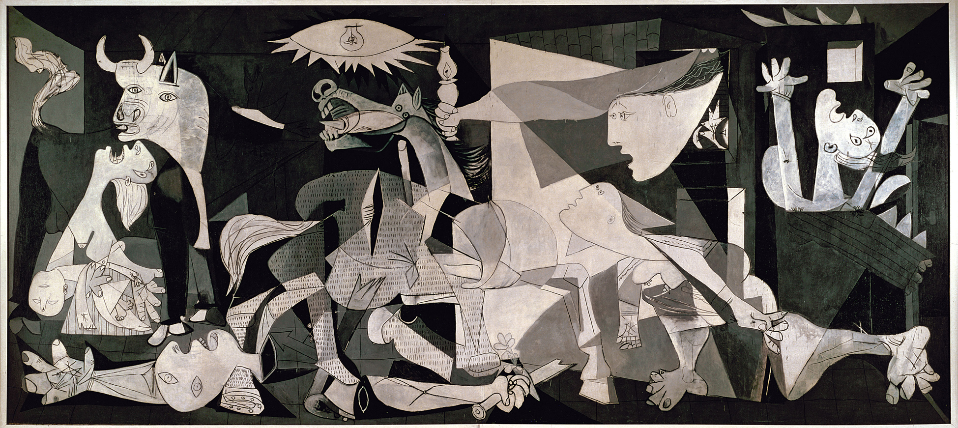
Another example is Guernica (2001), the artists behind it, the group Entropy8Zuper!, imagine the Internet as an anti-utopia, a black and white dead landscape. There are aeroplanes circling around it that represent fragments of e-mails. Other types of data are visualized as rockets, building etc. It is a reference to Picasso’s Guernica, a political painting. These artists also have a political agenda and want to emphasize the political implications of netspying. They believe that information equal propaganda. They want to expose the true content of the bits that stream through your computer.
A final example is that of Police State, by Jonah Brucker-Cohen. It is an installation, which controls a fleet of toy police cars in response to keywords derived from the database that can be linked to terrorism. So ironically, the same data that is being spied on by the authorities is the data that controls the police cars, turning the police in a puppet of their own surveillance system.
Carnivore is a huge artistic database it provides a list of unordered items, it is a collection of data. Artist can use this data to create different trajectories. Christiane Paul described the project as perfectly displaying the tensions between the linear and hierarchical structure of databases and on the other end the seemingly infinite possibilities of what you can do with the information contained inside those structures. (Paul 2007: p.97) Carnivore displays the tension between data structures and the visual form they can take. Carnivore offers so many different ways to visualize the data, which often seems detached from the original data form like in Police State or Guernica. But also because the project has an open source setup it does the complete opposite as to what the FBI project does. The FBI database controls, while RSG liberates the data.
9. Raqs Media Collective – Opus (2001)

Another open source like project is OPUS, an interesting and utopian project, The Open Platform for Unlimited Signification by the Raqs Media collective. It is an online platform for sharing creative work. Media artist can leave their art there so it can become part of a greater artwork. Artists and writers are encouraged to upload their original source files to the system. Others can remix the found sources or change them and upload them again into the OPUS system. Every upload is labelled in the online database system with tags and keywords. A lot of it is text but there are also images.
OPUS uses an algorithm to compare keywords to each other and uses the result of this to further position the relationships between the icons in the space of the visualization. If you mouse-over a certain icon in the visualization you will see that the related Projects are highlighted.
They creators and users use the comparison with genealogy, the source files are parents, and everything that is derived from them is their child. The newly created works are called Rescensions and they describe it as not a legal or illegal copy, nor a better or worse version, just like a child is none of the above in relation to its parents.
The idea is based on open source software and everyone has access to different source codes. The key concept here is ‘transfer’ and this idea goes back to Dadaism and pop art. Transfer is the practice of using existing elements and adding or changing aspects. As in the interview by Geert Lovink with Wolfgang Ernst (Lovink 2003: p.6) he states that culture often still thinks in concepts of inaccessible storage system like in old media archives, libraries. Wolfgang however thinks that the future lies in permanent transfer. In this light Opus is a very futuristic project, even for back in 2001.
10. ART+COM – The invisible shapes of things past (1995-2007)

The art project “The Invisible Shapes of Things Past” has tried to, what they call, parametrically translate the traditional linear film into a three dimensional object in space. Individual frames of a film sequence are made into a spatial object that follows the movement of the camera with which the footage was filmed.
In a film, time is translated to individual frames that together form the work of art to look at. Space is not literally present, since a film is two dimensional. “The Invisible Shapes of Things Past” project makes a film into a three dimensional object.
Let’s look at a clip that clearly explains how it works and what is meant with these works of art. I have to note, however, that this clip is made before they used 3D printers to actually make physical objects. This clip is made when these works of art were only to be seen in a virtual reality world of a city.
So, how does this work of art relate to the literature and how does this work of art refer to the curatorial statement?
Our curatorial statement says the following:
In arts, it has always been customary that artists influence each other and build upon the work of their peers. However, in the 20th century, this tendency magnified even further. Art movements like pop art and Dada, with their ready-mades and collages, used existing material to create their artworks, instead of creating from scratch. The use of existing elements is very common in new media art. New technologies, like the Internet and editing software, have made it possible for artists to use existing images, sounds and texts and to share data more easily.
The Invisible Shapes of Things Past project already in the title refers to the repurposing of objects from the past to create shapes that have been invisible; using the same data as the original object. Or, put simply, if the collection of single frames is the data and formerly it was the movie or film that made these frames visually accessible, then the art com group has changed the in which this data is used to create a visualization.
Here, we can refer to Lev Manovich who probably will regard the collection of frames as the database that consists of all this passive data. And it is the so-called algorithm that orders and structures that data into at one time in history a film, and now into a three-dimensional object. According to Manovich it is the very logic of the computer, the logic of the digital, to have the ability to produce endless variations of elements and to act as a filtering system. So, again, if the frames are the elements, then this particular presentation by the invisible shapes of things past project is the filter.
Any visual, digital image—from print to video—has ultimately been produced by instructions and the software that was used to create or manipulate it. The digital medium is not by nature visual but always consists of “back end” algorithms and data sets that remain hidden and a visible “front end” that is experienced by the viewer/user, the latter being produced by the former. The project is characterized by its own distinctive “database aesthetics” which consists of a reconfiguration of the interface and front-end, through which we experience the frames in the “film’s database”
Again, we would like to refer to our curatorial statement and quote Christiane Paul to conclude this art work’s presentation: “Art projects frequently apply the principles and logic of the database to existing, often originally analog information—ranging from a book to movies, television series, and postcards—to reveal relationships that remain unseen in the original format” (Paul 2007: p.101). This is of course in essence what The Invisible Shapes of Past Things does.
11. Ben Rubin and Mark Hansen – Moveable type (2010)

For Moveable Type, Ben Rubin and Mark Hansen used data traffic inside the building of the New York Times as the artwork’s source of data. The installation gets its content from three sources: a live feed from The New York Times, capturing text and data in near real-time as the information is published; the activities and comments of visitors to The Times’ Website; and the complete Times archive dating back to 1851.
The algorithms are designed to select quotes based on certain rules. One feature is to let all the 560 fluorescent screens display letters to the editor (accompanied by typewriter sounds). Another is the appearance of quotes from that day’s paper that begin with the words ‘I’ and ‘You’, placing them next to each other by contrast (or not).
For Moveable Type the idea is to view the news as seen by the New York Times in an exploding charged environment. To take bits of news and display them all together, ripped out of their original context and giving them a new context.
This idea strongly relates to what we know as hypertext theory, or at least the entering of hypertext into literary theory. As Peter Krapp, puts it: hypertext draws on processes of subverting, inverting, and exploding the apparent linearity of the page. See how Krapp speaks also, like Rubin and Hansen, of exploding the linearity of the page, prompting subversion, thus creating new context.
Rubin and Hansen try to give their content a new context, thereby transforming the passive database into a big living organism. It behaves very randomly and every day it has its busy moments and its quiet moments. Its behavior is related to the behavior of the people and the flow of information in the physical and information spaces of the leading newspaper in the US. Moveable Type may not be as readable as The New York Times but it provides unique insight into the site of the newspaper’s production in an aesthetically stimulating way.
To give this artwork some more theoretical ground, I want to refer to the distinction made between the notions of the database logic (of let’s say telling a story) and the narrative. In short, if the narrative is characterized by linearity, then the database is characterized by total chaos. And it is up to the user or creator of, in this case, the work of art to use the passive data from the database to tell a story. Let’s quote Paul:
The characteristics of the database as a collection of information that can be structured according to various criteria and result in a meta-narrative in many ways differ from the concept of the traditional narrative (in the broadest sense) as it unfolds in a book,film,or even a single visual image.
This is of course what Rubin and Hansen almost explicitly state that they’re doing. They take from various sources of the new york times snippets of information, and present them in a radically different way, to tell the story of newsmaking or the production of the newspaper. Interestingly enough, it is the exact same data as has, will, or would have been in the new york times, but when presented differently it tells a different story.
Let us now briefly look at an interesting piece of art that makes the making of a narrative very literal.
12. Epicpedia – Annemieke van der Hoek (2008)

In relation to what we ended with just then (database and narrative), we must take a look at the Epicpedia. According to its creator: Epicpedia is a web script that renders Wikipedia articles and their revision/editing history as a theater script. So this work of art literally makes a narrative of a collection of archival data that is the Wikipedia edit history.
Bibliography
Christiane Paul, ‘The Database as System and Cultural Form: Anatomies of Cultural Narratives’, in Victoria Vesna (ed.) Database Aesthetics: Art in the Age of Information Overflow, Minneapolis: University of Minnesota Press, 2007, pp. 95-109.
Lev Manovich, ‘The Database as Symbolic Form’, in The Language of New Media, Cambridge, MA: MIT Press, 2001, pp. 218-243.
Geert Lovink, ‘Archival Rumblings: Interview with German Media Archaeologist Wolfgang Ernst’, Nettime (2003), http://www.nettime.org/Lists-Archives/nettime-l-0302/msg00132.html
Garnet Hertz and Jussi Parikka, ‘Zombie Media: Circuit Bending Media Archaeology into an Art Method’, Leonardo [forthcoming]