Visualizing Scientific Research Collaboration: A Review of the Beauchesne-Map
Introduction
In recent years there has been an increase in interest for international scientific collaboration (Luukkonen, 1993, Ponds, 2008), but the phenomenon is anything but recent: the first signs of it where seen in the nineteenth century (Luukkonen, 1993: 1).
According to Roderik Ponds we can define ‘scientific research collaboration’ as an collaborative arrangement between organizations [or institutions] on the development of new scientific knowledge that might or might not be used for the development of new products or services (Ponds, 2008: 3). While this definition is quite vague, it still contains one important element: the development of new scientific knowledge by working together internationally. It can be thus said that this form of collaboration leads to an increasing global knowledge. Also, according to Jasjit Singh, an important benefit of an international collaboration is a faster diffusion of scientific knowledge, creating the possibility for a smarter world with a further increasing knowledge (Singh, 2005).
There not only is an increase in interest, but also in global collaboration in general. Several factors can be designated to this, as explained by Ponds (Ponds, 2008: 4). The first factor is the creation of international research facilities that work together on a global level. Secondly, there has been a decrease of transport-costs, making an arranged meeting with scientists possible. Another factor is the increased importance of the English language, which is more and more considered “lingua franca” in most scientific fields. And – last but not least – the emergence of the internet and improvements of other communication technologies, making possible an easier and cheaper means of international communication.
Visualizing Scientific Research Collaboration
Investigating and visualizing the current global scientific collaboration can lead to interesting information. For instance, it can show which countries are scientifically connected with each other and which are not. Also, it can be seen which continent or country has the highest amount of connections and which one the lowest. Visualization the data “can convey information to our minds that allows us to search for patterns, recognize relationship between data and perform some inferences more easily” (Mazza, 2004:7).
But how can one visualize the data of millions of articles and how can international relations be extracted and generated from them?
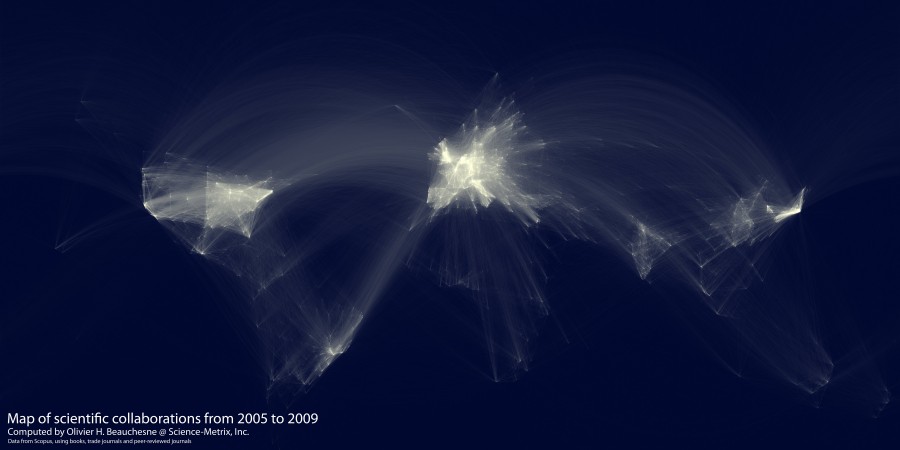
An example to do this is by looking at the articles that are co-published or co-authored and plot these “connections” on a map. Or at least, that is what Olivier Beauchesne did, a research analyst at Science-Metrix with the advantage of having a huge article-database at his disposal containing exactly the information needed. In his visualization he was influenced by Paul Butler’s Facebook Friendship Map (figure 1). The dataset he used was taken from a scientific collaboration database, with entries from Elsevier’s Scopus and Thompson Reuter’s Web of Science (Beauchesne, 2011).
I extracted and aggregated scientific collaboration between cities all over the world. For example, if a UCLA researcher published a paper with a colleague at the University of Tokyo, this would create an instance of collaboration between Los Angeles and Tokyo.
He used a similar mapping tool that Butler used, namely a Mercator projection, to project the geographical coordinates into the map. Beauchesne’s map shows a somewhat similar visualization consisting of different information, as seen in figure 2.

Figure 1 – Paul Butler’s Facebook Friendship Map
Figure 2 – Beauchesne’s Scientific Collaboration Map
As explained by Beauchesne:
The brightness of the lines is a function of the logarithm of the number of collaborations between a pair of cities and the logarithm of the distance between those same two cities.
The brightness of a line thus shows the strength of the scientific connection between countries. He used the Geonames.org database to convert the names of the cities to geographical coordinates and the Great Circle Algorithm to trace lines between cities (Solon, 2011).
Criticism
The end result shows a beautiful visual, but that is where criticism comes in. It looks like Beauchesne focused too much on creating a “stunning design” than on generating a usable map. While some general information can be derived from it – such as a high density of links between countries in Europe – the map shows only an abstract version of the world, without properties like exact location or quantity. According to Card graphics are a mean for finding and identifying structures and properties in a given data set (Card et al, 1999). Some structures can indeed be seen, but properties are entirely missing.
A way to overcome this Beauchesne could have added a second layer underneath the created visual consisting of a basic/plain world map. While American statistician Edward Tufte is probably very happy with Beauchesne’s visualization – and its use of little “data-ink” – the outcome and the dataset are in my opinion hardly researchable.
Also, further enhancement of the visualization can be done by making it interactive and by placing it on a timeline. Interaction can be implemented by providing the user with extra details when hovering over the connections. The factor time can show the transition and change in global scientific connections, showing current and previous trends.
While the map is visually appealing, its scientific use is debatable. Time for someone else to come with an enhanced version…
References
Beauchesne, O.H. (2011). “Map of scientific collaboration between researchers”, 23/01/2011, accessed on 11/04/2011, http://olihb.com/2011/01/23/map-of-scientific-collaboration-between-researchers/.
Card, K. S., Mackinlay, J. D., & Shneiderman, B. (1999). “Readings in Information Visualization,using vision to think”. Morgan Kaufmann, Cal. USA.
Luukkonen, T., Tijssen, R.J.W., Persson, O. & Sivertsen, G. (1993). “The measurement of international scientific collaboration”, Scientometrics VOL. 28 No. 1 (1993), 15-36.
Mazza, R. (2004). “Introduction to Information Visualisation”.
Ponds, R. (2008). “The limits to internationalization of scientific research collaboration”, Springer Science+Business Media, LLC 2008.
Singh, J. (2005). “Collaborative networks as determinants of knowledge diffusion patterns”. Management Science, 51(5), 756–770.
Solon, O. (2011), “Bibliometric data maps global scientific collaboration”, Wired.co.uk, 31/01/2011, accessed on 13/04/2011, http://www.wired.co.uk/news/archive/2011-01/31/scientific-collaboration.
