The Fuzzy Edges
Emotion has long since been a fraught with subjectivity and complex interpretations for as long as scholars have sought to understand it. When scientists became interested in emotion in the late 19th century it suffered under labels like “feminine”, “spiritual” and “out of control”. As an object of study it was at odds with the scientific laboratory that was a “masculine”, “physically grounded” and “highly controlled” space. The notion of science as a rational activity therefore clashed with the study of difficult-to-grasp, fuzzy, uncontrolled emotions. After all, scientific principles involved rational thought, logical arguments, testable hypotheses, and repeatable experiments. The only leeway allowed was for “non-interfering emotions” like curiosity, frustration and the pleasure in new discoveries.*
This notion of relegating emotion to the non-scientific in today’s age (which some even call the “age of emotion”) is almost an alien concept. Thanks to neuroscientists like Antonio Damasio it’s clear now that emotion is not merely connected but actually enmeshed with our rational thought and we can appreciate the role emotion plays in the critical functioning of everyday life. It helps us to evaluate options, make decisions, navigate social convention, prioritize and perform tasks in our work and home lives. Seen in this way emotion becomes part of the very fabric of our functioning society and the basis for social bonds.
Long before the birth of Twitter, Darwin wrote in 1872 that, “the way in which emotions are expressed and perceived is certainly of importance for the welfare of mankind”. Arguably we have never lived in an age more eager to give voice to our emotions. Your Facebook status updates and Tweets broadcast your frustration about this morning’s traffic to all your friends. Or how happy that sushi meal made you feel. Or how sad you are after a break up. Social media confirms that other people share your feelings (or at least like what you say). The majority of Twitter’s 200 million users’** tweets are just daily chatter, much of which is about how users feel. It can be a “venting” machine; a digital porthole you can scream loudly into, a place for others to “hear you”.
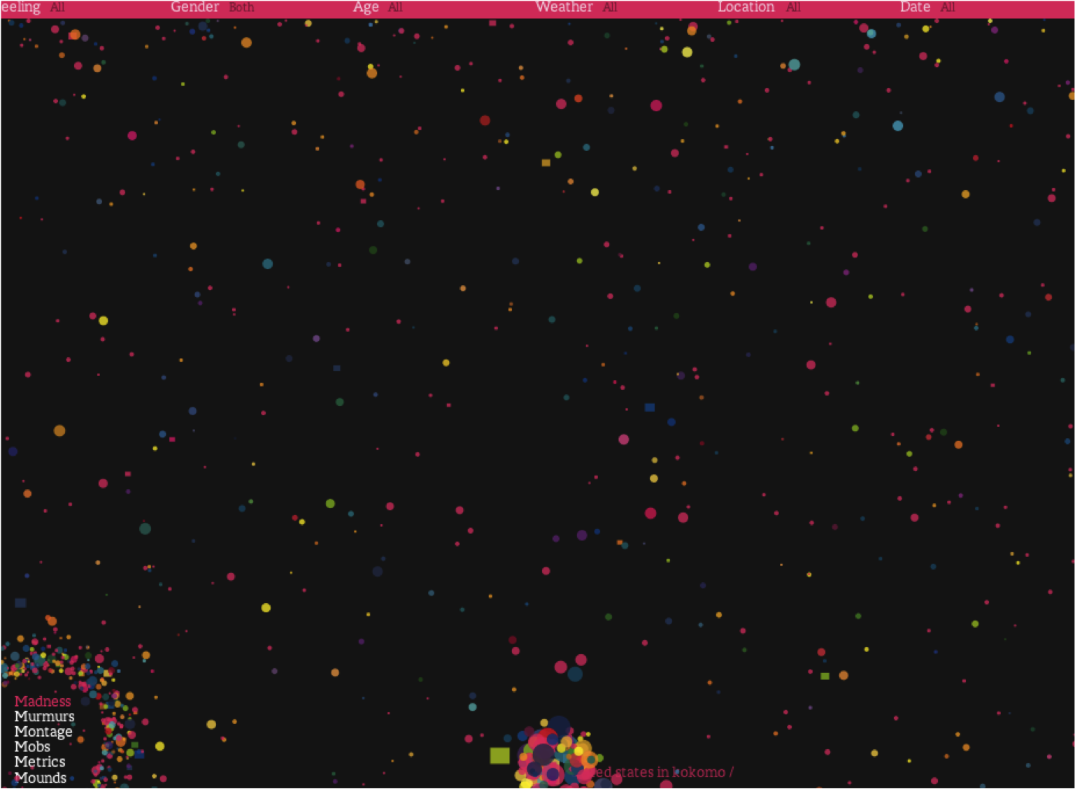
Data visualization has also extended the digital landscape so we can explore and understand emotion better. Co-creator of the well-known data visualization project We Feel Fine (which uses blog and Twitter data) Sep Kamvar said in an interview, “One of the things that surprised us the most is when you strip away thoughts and opinions and focus on emotions, people are much more similar than they are different. The top 10 emotions are the same for men as for women, for people in London and in Bangkok, for blacks and whites. So this project for us has been about self-exploration as much as it has been about voyeurism.”

Visualizations like this project and others (see Emotionally Vague ) not only help amplify our understanding of a subject and gain insights into it but also gives rise to emotion in users/viewers. Where Kamvar’s insights like “as people grow older, they tend to get happier and define happiness differently” and “Younger people tend to associate happiness with excitement, while older people tend to associate happiness with calm” are interesting, the other powerful component of this visualization is its ability to give rise to emotion in the user and /or viewer.
Where Tufte might argue that We Feel Fine represents real “Chart Junk” there is little doubt that the random coloured balls frenetically popping from side to side create a feeling in the viewer; a feel for the epic volume and frequency of emotion. And when users find a post that resonates with them the visualization starts operating in the same way as Twitter and Facebook: it can confirm our feelings and thoughts. We are not alone! You are not the only person who feels lonely in New York, so do 1,576 other people on We Feel Fine! Can we argue that the visualization even becomes a player in our emotional processing?
It’s certainly becomes no less complex when you mix food and emotion. The two have long since been awkward bedfellows and in recent years this relationship has only become more complex. Michael Pollan claims that until recently Americans have had the luxury of not worrying about their food. Food issues like, where it comes from or what effect it will have on their bodies were of no importance. It’s only in the last decade that food has risen to near the top of social, political and social agendas. The slow food movement; food documentaries like Fast Food Nation and Supersize Me; even the U.S first lady photographed planting a vegetable garden adds credence to the notion that food, the food industry, food politics and food culture is at a tipping point. And as a natural extension much of that food “expression” is finding it’s way onto Twitter.
Food Tweets:
@lexsara ha ha ha yeah!!!! I’m just borin with food, cornflakes with loads of sugar, I HATE ANYTHING HEALTHY
RT @EpicTweets_: Life will let you down. People will let you down. But food? Food will never let you down
First day of my healthy eating plan. Wonder how long this will last, I have no self control when it comes to food #fattyforlife
Good morning today is my b-day party with the family. Bowling, good food, my family and gifts. I can’t believe I’m 18.
Visualizing food and emotion data from Twitter is as complex as the individual subjects themselves. Again, data visualization helps us manage that complexity and allows users to form their own opinions. As author Willard Brinton said, “We daily see facts presented in the hope of creating interest and action for some really worthy piece of work to benefit the people as a whole” and this is no different. Will visualizing food emotion add (if only in small increments) further information to the knowledge base surrounding emotion? Whether it’s a lofty assumption or not, in an arena as subjective as food the likely outcome will again be the visualization’s ability to give rise (or at least confirm) emotions in the user. How will this value be measured? Perhaps it’s less about Info Visualization adding to the epistemological base but to the emotional experience of users and participants. I love pancakes too! Happiness = cupcakes! This is (surely) the one instance where unlike visualizations about GDP and population growth (although worthy and insightful in their own right) the concept of data and its value is not only about helping to discover but to also aid emotional and social connections.
* Boehner, K, DePaula, R, Dourish, P, Sengers, P. “How Emotion is Made and Measured”. International Journal of Human-Computer Studies Vol 65 issue 4, pgs 275 -291. Elsevier, 2007.
* Picard, R.W. “Affective Computing” Perceptual Computing. Cambridge: M.I.T Media Laboratory, 1995.
** according to the BBC.
