Visualizing what is happening
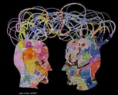
Going through an older post in the MoM’s blog referring to Walter’s Ong book “Orality and Literacy”, I discovered a term referring to a new “hybrid form” of culture that has spread on the internet: The Secondary Orality. The term is emphasizing the “re-emergence of an oral type of discourse within literate cultures which is fostering a communal sense and is mostly concentrated on the present moment”. In that sense, platforms of mediated communication, and in particular Twitter, are combining the narrative structure of oral discoursive forms that tend to highlight and enhance the memorability of a discourse, with certain characteristics and cognitive processes that evolved with the written discourse .
What struck my interest is the fact that, when features of oral communication – such as being subjective, grounded in the observable, close to the everyday human life and building consensus collectively and contextually – are technologically mediated, they may provide new possibilities for leveraging both the subjective and objective, transcending barriers of time and space, focusing on everyday life events , enhancing collaborative knowledge, archiving, as well as, allowing both situational and abstract analysis.
I found the term Secondary Orality an interesting source of inspiration when trying to understand and evaluate discussions on Twitter. For that reason, I would like to relate this concept to microblogging practices, and investigate how this written discourse -yet enhanced with oral features-, becomes a valuable source of data for visualization projects that aim in leveraging what is happening.
Twitter as a source of data
Three years ago, Twitter engaged participants by asking them “what are you doing now”. The 140 letter constraint and the answers that such a question would someone expect to provoke, gave birth to a rapid and fleeting written exchange with a conversational tone which allowed real-time communication within groups of people in a manner that could resemble more to oral storytelling and which did not require physical co-presence.
In the recent, “What is happening” era, however, this mediated expression of feelings and thoughts, rooted more deeply in the lives of the participants serving multiple needs. Twitter – the social media network, twenty-four-hour news site, conversation and blogging platform, wedding and death announcement site, gossip patrol, and the general online information center that connects all of us across the world (as described here) – eventually also became a valuable source of data or even a market, that contain mainly text and time, for researchers, news reporters, designers, programmers and artists.
A hybrid discussion: an oral yet written discourse about a current event
A current event may be a political speech, a sport competition, a natural disaster, or any other large event. As people are watching, attending, engaging or even dealing with these different kinds of events, they increasingly share brief and timely pieces of information which create persistent conversations about events of social significance. Microblogging communities not only enable participants to share their experience and shape how observers perceive an event, they are also used to help participants influence the unfolding of an event and its outcome (Dork et al, 2010).
Microblogs may prove a valuable repository of user-generated content about world events. But this endless production and reproduction of thoughts, this public interplay of voices, is building a database of information through interaction that is growing and is taking a life of its own. It becomes a way to engage with others in a universal conversation that fleets away the very moment that we try to grasp it. For people trying to understand events by querying services like Twitter, a chronological log of posts makes it very difficult to get a detailed understanding of an event. Performing, for example, a Twitter search for the most commonly used hashtag about an event produces a list of thousands of individual messages that aren’t grouped or organized in any meaningful way. This inherent feature in the microblogging platform is making it difficult to get an overview of the fast-paced discussions as it happens in the moment and how it evolves over time (Marcus et al, 2011).
The question that arises, therefore, is if we can have a better understanding of what is happening by visualizing this hybrid discourse.
Visualizing Twitter conversations
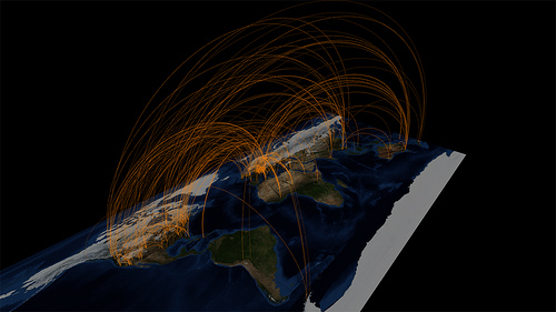
Twitter Conversations Map #1,By Walter Rafelsberger
The meanings of the word “visualize” include “make visible” and “make a mental image”. This implies that until we “visualize” something, this “something” does not have a visual form. It becomes an image through a process of visualization – Manovich, 2010.
But how can actually the voices of thousands of people be visually represented and how can the temporal evolution of topics be indicated? Data analysis and other techniques for seeing patterns in data may add a layer of structure to the raw data stream. A way to provide interpretations about the numerous tweets and gain further insight in the discussions referring to a specific event, is undoubtedly information visualization.
TwitInfo is a system for visualizing and summarizing events on Twitter, developed at the MIT. The system tracks keyword mentions on Twitter and turns them into timeline visualizations which summarize various topics. In the project’s website the researchers present three feature topics and call for the viewers to “Find out what Twitter things about everything”.
How the system works: the user inserts keywords or hashtags related to a particular event and define the point of time. The system identifies a set of tweets that correspond to that criteria and provide an interface that facilitates exploring and understanding the various points of interest (“sub-events”) in this input set. Specifically, TwitInfo provides a graphical timeline interface that groups peaks of high-volume posts into sub-events and highlights important terms and tweets in the conversation around each sub-event. Users can zoom into this timeline to visualize more peaks and sub-events.
The main TwitInfo interface is a dashboard summarizing the event over time. The dashboard displays a timeline for this event, raw tweet text sampled from the event, an overview graph of tweet sentiment, and a map view displaying tweet sentiment and locations.
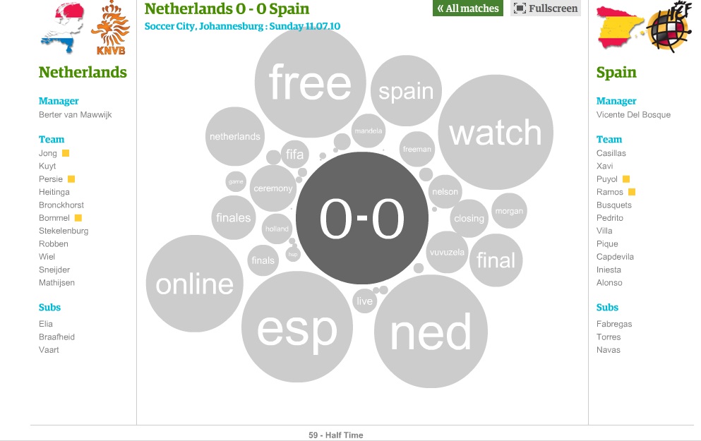
Apart from the aforementioned more systematic research in deploying visualization techniques, an interesting approach in visualizing mentions about a specific event on Twitter is provided by the Guardian. The World Cup 2010 Twitter replay project creates a high-speed replay of the World Cup and attempts not only to provide a fun interactive visualization but also to convey a sense of context, as well as capture the spirit of each game.
Finally, a different perspective for visualizing tweets is the art project “Sea of Tweets” dedicated to the earthquake and tsunami in Japan on March 2011. The project invites participants to tweet wishes to those affected in order for those tweets to be transformed into paper cranes in the color of forsythia flowers (the color of hope) and be released in front of Mt. Fuji.
__
Dork M., et al (2010), “A Visual Backchannel for Large-Scale Events”, posted online 24 October 2010
Marcus A., et al (2011), “TwitInfo: Aggregating and Visualizing Microblogs for Event exploration”, CHI, Vancouver, BC, Canada. Accessed on 12/4/2011 http://people.csail.mit.edu/marcua/papers/twitinfo-chi2011.pdf


