What’s that on the map? Problems with geo-visualization
The last couple of weeks, my data-visualization team and I, have been working on our Europeana project. Europeana is a big heritage-digitization project funded by the European Union. Their goal is to digitize all of Europe’s heritage objects and to make them available online. There are several reasons why the EU wanted to create such a huge and expensive project. One if them is a political one. The idea of Europeana is to let European citizens discover the history of Europe. By showing the cultural treasures of each country in all its glory, the public should get more admiration for the rich history of Europe. At the same time, a project on an European scale allows both the user and Europeana itself to show links between several European countries. Europeana has the potential to go beyond the national histories of each country and show the relations each country had with each other throughout history. This way it aims to encourage a more European identity, next to the national identity of the user.
One of the problems at the moment of Europeana, is that some countries have contributed far more objects than others. For example, the French have at the moment a total share of 19% of all objects within Europeana. At the same time, a country like Spain has contributed only 9%. This means that at this point, the European identity, as seen through Europeana, is rather French. At this moment, the Europeana home page, which is designed as a portal, does not show the differences in size between countries. It only allows the user to search through their entire database. Our project group decided that by visualizing it, these differences would become much clearer and our project was born: Visualize a huge dataset from different countries in such a way, it shows the differences and links between countries. To solve this problem we decided to visualize the data of Europeana on a geographical map of Europe. By doing this we would emphasize on the fact that this is a European project and at the same time it would become possible to show all the differences between the countries in one screen. Because of this choice of a geographical map, I will now emphasize on some of the benefits and problems of using maps for datavisualization.
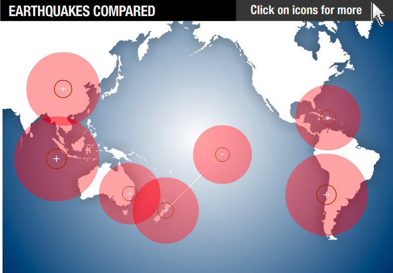
When using a geographical map, the creator should think about the implications this has on the information that it wants to show. Placing artificial elements on map can easily be misinterpreted for several reasons. A good example of how this can go wrong is given by Kaiser Fung on his own blog Junkchart. In this visualization, the creator wants to compare different earthquakes by visualizing them.
Here he makes clear how artificial data placed on a geographical map can be both confusing and wrong. First of all, it looks like one of the earth quakes was in the middle of the Pacific Sea. The creator means however, that there were two earthquakes both in Christchurch in New-Zealand. By creating a line from the bubble in the Pacific to Christchurch, this is made clear. The viewer however, sees first of all something he recognizes, a map of a part of the world. In that element recognized by the the user, is an artificial element placed. The creator of this visualization wants to clarify these two earthquakes in Christchurch by drawing a white line to it. This makes it even more confusing as it now appears that there is a weird stick popping out of New-Zealand. An other element in this visualization is the size of the bubbles. It looks like the earthquake in South-America has a damage range that covers almost the entire country. This is however, not what the creator wants to show. The size of the bubble represents the magnitude of the earthquake, something that becomes clear when one of them is clicked. An other disadvantage that geovisualizations have, that becomes clear in this visualization, is the fact that the circles are not next to each other. This makes it even harder than circles already are to compare with each other. It is hard to tell which earthquake was the most powerful when looking at this map. This visualizations shows that adding artificial elements to a geographical map can be confusing and misleading.
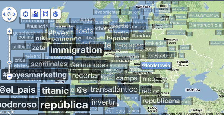
The most obvious, but also one of the biggest problems is the fact that a geographical map has areas in different sizes. As for example in this map where trending twitter words are shown on a geographical map.
The map is completely covered with words, showing almost nothing of the countries. It looks like there are far more trending words in bigger countries than in for example, the Netherlands, this while in the Netherlands, far more tweets are send than in Spain, despite its difference in population. In this map, it becomes very unclear where the tweets are coming from. The word ‘omkleden’ can be found in the middle of Poland, this while it is clearly a Dutch word and it is not very likely that the Polish people suddenly adopted a Dutch word in the morning. In the case of showing worldwide trending topics, it is not very useful to use a geographical map without adding any other information to it.
To overcome this problem, Stephen Few argues that it is useful to combine several quantitative displays next to the map in one view. This way it allows the user to look at the data from different perspectives, simultaneously. In the example of the Twitter map, it would be useful to add a screen where the user could select a certain country to show its current trends.
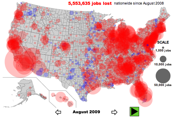
A map has the benefit that it shows a lot of information at the same time, however, when creating a visualization one must always keep in mind what the map is not showing and think of the consequences of this. In this example about the job loss in the United States it appears that a lot more jobs were lost in the area of New York and California. However, this map does not hold in account the population size of each state. At the same time, the amount of jobs lost is counted cumulative. This way the states with more citizens will appear always as the biggest losers/winners.
Using maps for in a visualization is a very appealing option. Because of the knowledge the user already has of a geographical representation of the real world, it is easy to add artificial elements to it in order to create a new story. However, as several examples show and as we found out during our Europeana project, lots of things can be done wrong when using a map. Because of this mixture, it quickly becomes hard to see what this visualization wants to show. When creating a visualization, the creator should carefully select the elements it wants to include in the map and if necessary, combine other visual displays within or next to the map in order to get a better understanding of the data.
Literature:
Few, Stepehen (2009). “Introduction to Geographical Data Visualization”. Visual Business Intelligence Newsletter March/April 2009. http://www.perceptualedge.com/articles/visual_business_intelligence/geographical_data_visualization.pdf


