Biomapping
In my last blog post I explored the notion that information visualization is not merely a tool, or art, or an agent of clarity but also has the capacity to generate emotion in users and arguably, become a player in our emotional processing. However, as our information visualization project develops I realize the bigger challenge is not just how to inspire emotion but how to effectively visualize it. Food (one of the variables in our project) is a highly charged, emotive and textured subject and it deserves to be visualized in all its layers and complexity. This lead me to wonder if visualizing emotional content or emotional intensity is perhaps one of the biggest challenges information visualization faces? And have any projects successfully done this?
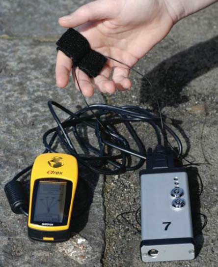
Christian Nold’s biomapping project is one of the few visualizations that explore emotion. It’s also a fascinating example of how obviously subjective and unique emotions are. The project is part art, part info visualization, part psycho-geography and part social visualization. It takes places in a number of cities across the world. Respondents are asked to wear a simple Biomapping device – a biometric sensor that measures galvanic skin response and a GPS all rolled into one. It measures the sweat levels of the wearers’ fingers that serve as indicators of emotional intensity. Respondents then walk around their neighbourhood (or a neighbourhood where everyone has assembled for the project) and the device records their emotional highs and lows. This data is then visualized and respondents add annotations explaining their maps. As Nold describes it: “The resulting ‘Emotion Maps’ encourage personal reflection on the complex relationship between oneself, the environment and one’s fellow citizens.” *
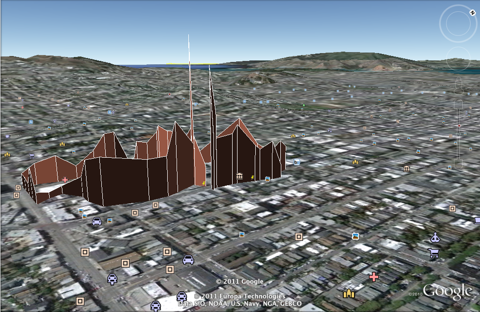
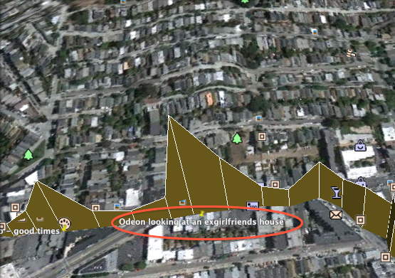
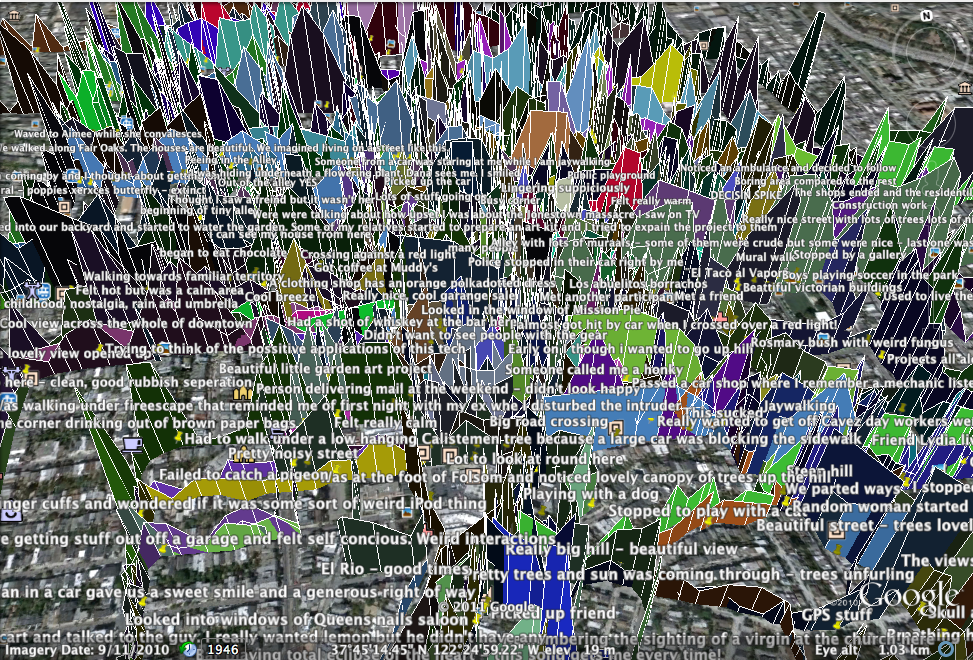
Most respondents comment on the things they recognize or have emotional connections to – an ex-girlfriend’s house or a romantic sunset view. Occasionally it gets dramatic when respondents witness near accidents or are involved in accidents themselves. This data was visualized by superimposing graphs onto Google Earth renderings thus merging geographical data, emotion data and the annotations from respondents.
I found this a visualization fascinating for a couple of reasons:
1. It shows how visualizations can become incredibly social experiences. It brought people together who live in the same community to share stories about their space.
“This process of scaling-up and seeking connections between issues encouraged people to talk both personally and politically in a way they had not often done before with other local people,” said Nold*.
It’s likely that people will disagree about the data and because respondents are sometimes from the same neighbourhood or community may interpret the data differently based on their contextual knowledge.*
2. It maps the emotional landscape of a community (what Nold calls ‘emotional cartography’) and shows patterns of similar points of emotional intensity – for example around a heritage building marked for demolition (in the Greenwich map). In a way this creates a new kind of geography. I would have loved to see how different conversations about the same place could be overlapped in this visualization.
3. It exposes the complete subjective nature of emotion visualizations. Every individual’s reaction is unique, so too are the viewers interpretations of the visualization. Although Nold didn’t use colour as one of the retinal properties* in his visualisation it is often used to give expression to emotion. Colour is well known to have a large impact on our feelings and emotions.* In studies, red is linked to both excitement and aggression while green is linked to calmness and withdrawal and black has been linked to anxiety.* Although it is highly evocative it is (again) also highly subjective and specific to its cultural context. While red represents love in western culture in Hindu culture green is used. See David McCandless’ visualization of colour across cultures.
There is no way of knowing exactly what other people’s interpretation of emotional intensity is either. My dark red might be you light pink. (We also take for granted that everyone can see colour.)
4. It shows how information visualization can be seen as a narrative – if the respondent didn’t fill in the gaps with annotations then the literal “story” of the visualization would be completely lost, in fact the visualization would make no sense at all.
“…people’s interpretation and public discussion of their own data becomes the true and meaningful record of their experience. Talking about body data in this way they are generating a new type of knowledge combining ‘objective’ biometric data and geographical position, with the subjective story’ as a new kind of psycho-geography,” according to Nold.
When the respondents finish their journeys, Nold sometimes uses a gallery to view the trajectories and respondents describe their journey to other people. In doing this they view the journey like they were watching a reality-TV show. Nold describes this in Brecht’s terms of defamiliarisation. The idea being that “this performative distancing allows the viewer to take a critical distance in viewed events.” The viewers become storytellers and can include or leave out as much detail as they like.*
Although this visualization seemed like an interesting ground breaker in “emotional cartography” it fell short on one of Tutfe’s Principles of Analytical Design:
“Show comparison, contrasts, differences.” *
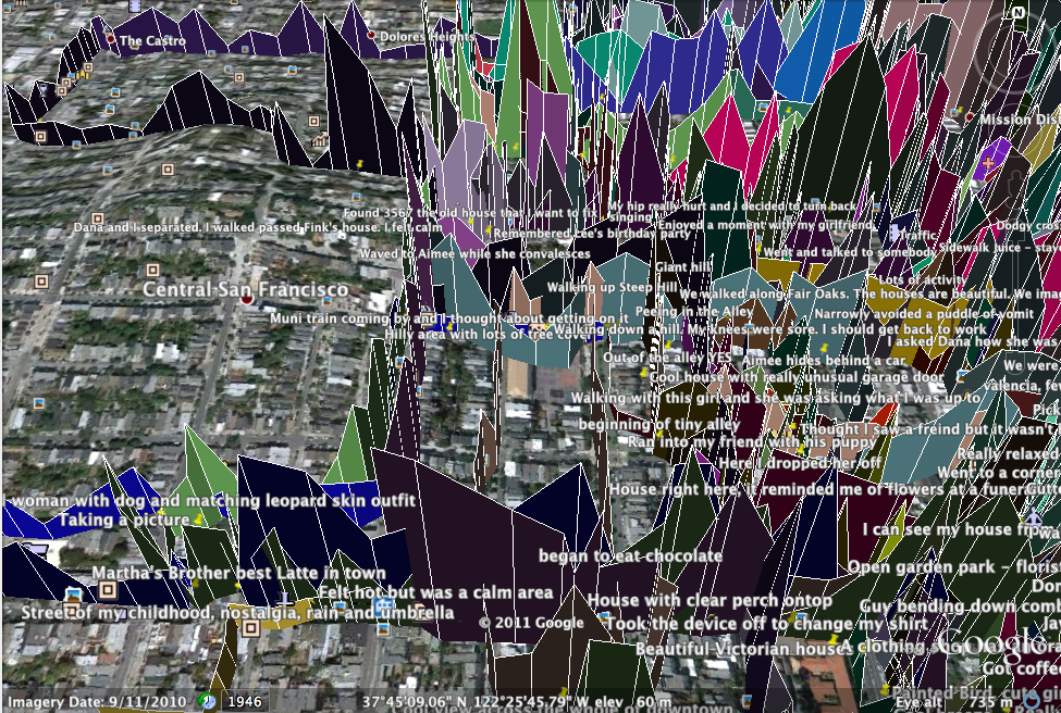
The opening visualization conflates all the respondents’ journeys on the map image creating chaotic first impression. The user can select a specific respondent’s journey to follow but as default setting all the participants journeys are selected.
Besides making this a chaotic user experience it doesn’t allow for users to compare journeys to find similar patterns. Sadly the routes in different cities are different – but it would be nice to see if the English or Americans are more excitable or compare the high and lows of the residents of San Francisco.
One other element of the visualization that could have been improved was the use of colour in differentiating journeys. Each journey was denoted by a different colour. However, the legend did not include colours linked to those used on the map, making it very difficult to connect journey with names. Also, it would have been interesting to see more details about the respondents (age and where they lived) as part of the legend.
I also wondered how Nold would have visualized mixed emotion in this context. I imagine, as in our food and emotion project, this can be done with colour. In Nold’s project only the highs and lows are represented by the peaks and troughs of the graph and there is no way of showing a clear mixture of the two for any one point.
There’s also no timeline for the journeys but here I’m not sure this would have added further understanding to the visualization.
Interestingly, the project doesn’t fully explore causality in the individual trajectories. As a user we are left to sometimes fill in the gap about what happened. Also even when there is an annotation to explain the highs and lows in the graphs we are left to interpret why that event was exciting for someone. The point here is that some data show obvious causal relationships yet human nature doesn’t work in completely logical patterns or follows defined laws and can give rise to some curious data.
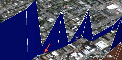
One of the most fascinating aspects of Nold’s project (in relation to our project on emotion and food) is how often the emotional intensity levels skyrockets or drops before and after food experiences (see below from San Francisco). See how the mood of this walker drops off to a deep trough and then skyrockets again after she eats a donut.
But back to the original question: did Nold effectively represent emotion? Perhaps the unwritten disclaimer is that the key to unlocking emotion in visualizations is through integration of evidence.* In Nold’s project this is: a combination of 1. text annotations 2. social interaction taking place between viewers and respondents and 3. narration or personal stories that weave together. These elements add the necessary texture to the “emotionality” of the visualization.
* References
1. Nold, C. Emotional Cartography Technologies of the Self, 2009, p7.
2. Heer, Viegas, Wattenburg. ‘Voyagers and Voyeurs: Supporting Asynchronous Collaborative Information Visualization’ in CHI, April 28 – May3, 2007.
4. Card,S, MacKinlay, J, Shneiderman,B. Readings in Information Visualization. San Diego: Academic Press, 1999, p30.
5. Hemphill, ‘A Note on Adults’ Color-Emotion Associations.’ Journal of Genetic Psychology,1996.
6. Kaya, N, Epps, H. ‘Relationship Between Color And Emotion: A Study of College Students.’ College Student Journal; Sep2004, Vol. 38 Issue 3, p396-405.
7. Nold, C. Emotional Cartography Technologies of the Self, 2009, p6.
8.Tufte, E. Beautiful Evidence. Connecticut: Graphics Press , 2006, p126.
9. Tufte, E. Beautiful Evidence. Connecticut: Graphics Press , 2006, p131.
