Scientific Visualization: how to let the brain understand that it sees itself?
Abstract:
Scientific visualizations are part of the branch of data visualization. They primarily show 3D models of natural phenomena. Scientific visualizations are under-represented compared to information visualization (the other part of data visualization). Time to take a closer look at the way in which scientific information is, and should, be visualized and what that learns us about information visualization.
Scientific Visualization: how to let the brain understand that it sees itself?
Seeing is knowing. The visualization of data is a way to extend our knowledge and it may even extend our brain. It enlarges our capacity of memory instantly and data can be presented in a way that is easily comprehensible for the brain. Whereas complicated tables do not provide us a clear insight in the development and flow of data, interactive graphs make the world around us more visible and sensible.
I use data visualization as an umbrella term to cover all types of visual representations
that support the exploration, examination, and communication of data.
‘Whatever the representation, as long as it’s visual, and whatever it represents, as
long as it’s information, this constitutes data visualization’. (Few, 2009)
Under this umbrella of data visualization are information visualization and scientific visualization. The latter is under-represented according to Michael Friendly (2009), but for reasons of lack of expertise rather than interest. The ways in which scientific information is visualised can have severe influence on the development of science and knowledge in general. Scientific visualizations are primarily 3D models of natural phenomena. Information visualizations are computer based, interactive representations of abstract data. The visualization of the mammal brain overlaps the two fields, because it visualises large, abstract data sets of a natural phenomena that can be used for scientific purposes. Some visualizations of the brain are even interactive. To show a few examples of scientific visualizations, I will first show a brief history of the visualization of the brain. Then the best way to visualize scientific information will be examined.
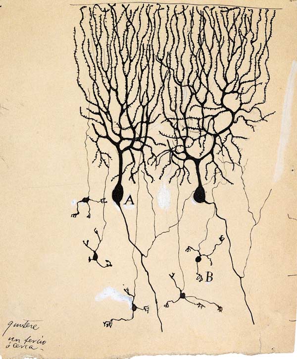
One of the first images of nerve cells was created by Santiago Ramon y Cajal in 1899. He was a neuroscientist who worked with early microscopes and researched the microscopic structure of neurons in the brain. Newer techniques showed the connections between neurons. Ramon y Cayal drew a lot in his youth, and in 1899 he revealed the complex organization of the brain.
(Source: Constandi, Moheb. ‘Time Travel Through the Brain”)
In 1930, the electron microscope was developed and it made possible the visualization of smaller structures in the network of neurons. The cell core became visible through the enlargement of the neuron of 23,900 times. 50 years later, the technology behind the electron microscope developed so much that the internal structures of the nerve cells could be revealed. Researchers found a way to remove the cell membrane, so the 3D interior of the cell was visible through the microscope.

(Source: Constandi, Moheb. ‘Time Travel Through the Brain”)
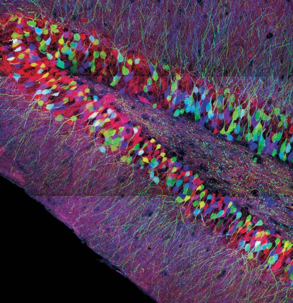
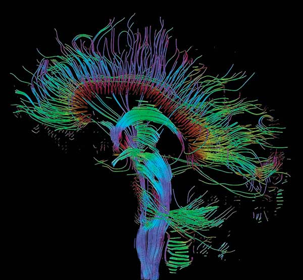
In the 1990s, genetic modification was used to mark specific cells with green fluorescent protein that was extracted from jellyfish. In this way, biochemical reactions and the movements of cellular protein could be tracked in real time. From 2007 on all the colours of a rainbow could label neurons and distinguish every single neuron from the other. The fluorescent dyes also visualised the long extensions (axons) of the neuron to show how information is being transported within the brain. This technique is highly specialized nowadays, so the single axons can be tracked from every brain region to the other.
(Source: Constandi, Moheb. ‘Time Travel Through the Brain”)
The categorical data of the brain – the different types of neurons and how they form tissue – became more clear in the past hundred years. The spatial structures of the brain did not change all this time, but new technologies made it possible for us to see this reality and show it to the world. The restrictions of technology that kept us from seeing the brain how it is are the same restrictions in all data visualizations: ‘[]these include technologies for drawing and reproducing images, advances in mathematics and statistics, and new developments in data collection, empirical observation and recording.’(Friendly, 2008) Data visualization tries to show the-world-how-it-is in the best way that our brain allows us to understand it. So the visualization of the brain must be done in a way that brain understands that it sees itself.
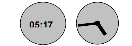
What is the way in which information should be presented to make it ideally understandable for the human brain? According to Geus et all (2007), the most important part is making information for the brain and not for the mouth. Most of the information is designed so that it can be communicated with the use of language. The brain is not designed for language, this is something humans designed themselves. Geus et all differ brain language from communication language. The presentation of information in communication language does not need a translation into brain language when communicated to another person. The left clock below shows a digital time. When someone asks the time and the person sees a digital clock, the information does not have to be transferred from the verbal language to the brain language. When one looks at the analogous clock, the information is processed internally and thus better fit for brain language.
Source: Geus et all (2007)
‘It is thus necessary that scientists of the scientific visualization area have in mind the character of this discipline, emphasizing research tools and techniques which can be compatible with the way that the human brain processes stimuli.’ (Geus, de. et all, 2007)
In the examples of the brain visualizations above, the information is presented as it is. It is brain language, the shapes and connections of the brain can be visualized inside the viewers brain. To explain the image to another person would take the translation of the brain language to communication language: “There is a round shape that changes into thin long threads that connects to other round shapes and form a network of thousands of those shapes.” A lot easier would be to show the other person the image.
Information visualizations, the interactive computer based visualizations of abstract data should also be more intuitive than language based. The user must feel the data instead of understand it with the help of a manual. In this way, a well made interactive application is more like an extension of the brain than a tool.
Sources:
Constandi, Moheb. ‘Time Travel Through the Brain”.
< http://www.technologyreview.com/biomedicine/23758> (2009)
Few, Stephen. Now you see it: Simple visualization techniques for quantitative analysis. Analytics Press, 2009
Friendly, Michael. ‘Milestones in the history of thematic cartography, statistical
graphics, and data visualization’
< http://www.math.yorku.ca/SCS/Gallery/milestone/milestone.pdf> (2009)
Friendly, Michael. A Brief History of Data Visualization. From Springer Handbook of Data Visualization. (2008)
Geus, de. et all. ‘Character and Language of Scientific Visualization: Applications in Medicine.’ Universidade Federal do Parana. (2007)


