Data visualization and story telling
For as long as people have been around, the have used stories to share information, cultural values and experience. Most of the times this is done orally, but even in ancient times, mankind created drawings to visualize their information. With the invention of the printing press, new possibilities arose to share a story, either verbal or with drawings. Until today, technology and culture have constantly provided new and increasingly sophisticated ways to tell stories.
Stories have always been a great way to share information. A well-told story can contain a great deal of information in relatively few words in a format that is easily comprehensible for the listener or viewer.
With the use of data visualization techniques, new stories can be created and told. By presenting data in a visual way it allows the user to discover the story within the data. This way the data is not only presented in a more compelling way, it also interacts with the user. Data visualization can be a good way to show certain stories more clear within a dataset. However, the real power of datavisualization lies in the fact that it can tell stories that could not be found without visualizing it. By presenting the data in a certain visual way, or by combining different datasets in one visualization, new stories can be told. Here, I will emphasize on some examples regarding datavisualization and finding stories.
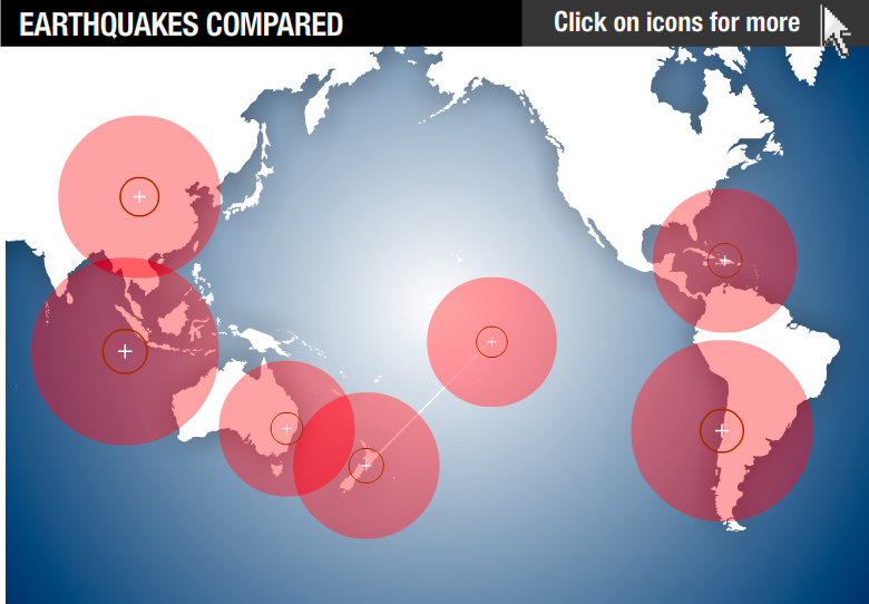
When one dataset is visualized, a pretty straightforward story can appear. This type of visualization is most common in business environments and to point one thing out. For example, here is a map in which different earthquakes are compared to each other. (click map for interactive version)
The (not so great represented) story here is that there have been several earthquakes in the last years and that in Christchurch, there were two. In my previous blogpost, I pointed out that this is a confusing and misleading visualization because of a bad integration between geo-data and artificial elements. Here, I argue that there is an other reason that this is not a good visualization. The main reason for that is the fact that it does not try to tell a story to the user. The data represented has little to do with each other and the only thing this interactive image makes clear is the fact that there were some earthquakes in the last 25 years and that Christchurch was hit twice. Despite the fact that it is interactive, the user can click the bulbs, it is still a static image. The datavisualization does not add anything to the story and therefore quite boring and maybe even redundant.
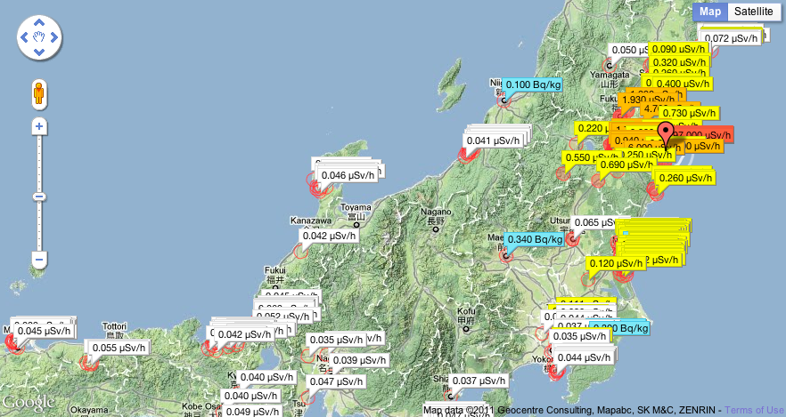
A better example of an interactive visualization, is this map about the earthquakes in Japan. (click map for interactive version)
In this visualization, all the geiger counter readings from across Japan are recorded. The different colors poitn out the strength of the earthquake. Because it is real-time, it shows the user the strength en location of the disaster immediately. This map makes perfectly clear which areas have been struck the hardest and how far the shocks are felt. Below the map is a Twitter feed with live mentions about the earthquakes. This visualization tells an immediate story about what is happening in Japan and how people respond to that.
As shown above, a visualization becomes interesting when it lets the user find a story in the dataset. By presenting raw numbers and other data in a visual way, the data not only becomes more understandable, it also lets the user interact with the data and lets him create his own story. As shown in the above example, this becomes even more interesting when when two or more datasets are combined. By putting data together, it allows the user to discover new stories that were not visible before in any of the datasets. This way the visualization becomes more than a pretty sight. It really adds something to the data. In the case of Japan the data about the earthquakes is combined with a geo-data and the Twitter feed.
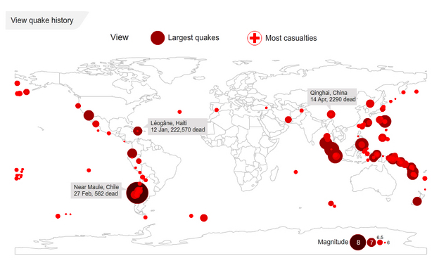
In the map of Japan, the story is created in real time. However, New stories can also be created by researchers and journalists when combining certain datasets. A good example of this is the interactive visualization Peter Aldhous, San Francisco Bureau Chief for New Scientist magazine created (click image for interactive version).
Here, step by step, the data is unfold and put into the visualization. The information about the amount of earthquakes that is shown first does not tell us that much. By adding the amount of casualties to it and at the same time explaining the biggest peaks, it becomes clear that a small amount of earthquakes is responsible for most of the deaths by earthquakes. The the creator skips to a world map which shows all the earthquakes and their strength in 2010. The bigger a dot is, the more powerful the earthquake was. This shows the user that the earthquake in Haiti really was not that strong compared to other earthquakes that year. However, when the user clicks the “most casualties” button, it appears that Haiti has by far the most deaths because of the earthquake. Combining the information about the strength of the earthquake and the casualties caused by it shows an entire new story: The amount of casualties caused by n earthquake is not determined by its size or strength, but by other factors. In this case, the overcrowding poor urban areas and lax of poorly enforced building codes. By viewing and interacting with the data, the story unfolds step by step (in the above example, quite literally).
This way datavisualizations can create new stories and insights which would otherwise not be so easy, or even impossible to see. Either the creator or the user can with the use of visualization tools search for new stories in massive datasets. By creating a story, the data not only becomes better understandable and more fun to watch, but also has the opportunity to really tell something.


