Getting data, sharing data and raising political awareness.
Using vision to amplify cognition. According to the Light Switch Theory, vision appeared on Earth around 543 million years ago and triggered the Cambrian explosion (evolution’s Big Bang). Before that none of the living entities could see and relied to other senses for their survival. The evolution of the eye changed life dynamics. When living organisms were able to see and look around them they suddenly became aware of the context they were in, who was around, and started building new relationships with the surrounding objects.
“There are three classes of people: those who see. Those who see when they are shown. Those who do not see.”
—Leonardo da Vinci
For Leonardo, the eye was tremendously important. He believed that the eye was “the window of the soul” and the most important of the senses by which we experience the natural world. B. Shneiderman in his talk about information visualization -given in Merrill College (UMD) about two years ago – says, “Leonardo told us that the eye was the best way to see the world and we believe that”. The argument is that the eyes are not just input devices but they are also used for decision making as they spot clusters, patterns, gaps and outliners.
“To understand something is called “seeing” it. We try to make our ideas ‘clear,’ to bring them into ‘focus,’ to ‘arrange’ our thoughts.” (Card et al, 1999).
In that sense, our ability to see, our vision, should not be restricted only to the direct gaze of the physical world. Awareness is not only gained by looking around us and redefining our relationship to objects in our vicinity. It is also gained by looking at information that was once abstract, that had not any obvious spatial mapping, through creative and intuitive new visual forms and presentations. However, our eyes need to be trained to see, i.e. to decode the thousand words that one picture worth’s, in order for us to gain insight and to become aware.
So, should the ones who see, also show to all the other’s how to be liberated from their predispositions and how to enhance their world view?
Visual education is related to the extension of intellectual democracy within single communities and within mankind, it is an element of international social planning and engineering. —Otto Neurath
Looking at graphic presentations of data. For that instance, it is worth mentioning the pioneering work of Otto Neurath, founder of the Vienna Circle, and tireless advocate of visual education. He believed that visual education would enforce a more human approach than education through words. His claim was that with visual aids, one could create something that is common to all, that could educate people in various countries. Neurath’s means of spreading social knowledge were the pictorial statistics of the “Vienna Method,” later coined ISOTYPE (International System of Typographic Education).
The information visualization guru, H. Rosling has also dedicated his work in communicating real facts to the world. He co-founded Gapminder, “a non-profit venture promoting sustainable global development and achievement of the United Nations Millennium Development Goals by increased use and understanding of statistics and other information about social, economic and environmental development at local, national and global levels” (from the About page).
What we find common in both Neurath and Rosling is their passion to communicate data and facts to the people in the most clear and effective way possible in order to educate them and raise awareness. So to speak, to amplify cognition we need our eyes, creative and devoted practitioners, powerful and intuitive tools to visualize and we also need data, in abundance and most importantly open.
Political awareness. Visualization is a powerful tool for breaking down complex information and understanding data. Used in the field of politics it can provide unprecedented means for leveraging transparency in the governmental affairs but also can be used as a tool for telling stories efficiently and communicating meaningfully information about historical or current political events, debates and so on.
The US has provided us with some good examples both for an open data initiative and for different ways to visualize the contemporary political scene. President Obama’s first executive action in early 2009 was the Open Government Memorandum calling for more transparent, participatory, and collaborative government. The former deputy chief technology officer Beth Noveckhas led for two years (2009-2011) the Open Government Initiative. In line with that initiative the Data.gov website has also been launched, with an intention to increase public access to high value, machine readable datasets.
“Loved data lives longer”, Noveck has claimed, and she encourages citizens to “embrace the datasets and use it to make the kind of mash-ups that are being done by Stamen design, […] and when they try to make raw data visual, that is the loving of data and a labor of love”.
Sharing data creates new opportunities for impact. Of course raw data is not that interesting for everyone, nor everyone loves it. But in order to democratize data and to raise awareness someone has to do that labor of love (like Neurath and Rosling) and to do it in that effective way that will also engage a large number of people to look and to see i.e. understand data.
There has been many examples of data lovers ready to make the work, for example, non-profit organizations like Sunlight Foundation, the research project Earmark Watch, or dashboards to help us summarize and graph the political activity we are interested in (i.e. the US elections in 2008). Data being available by the USDA, the Federal Register, the Data.gov and the Census 2010 websites, gave the possibility to researchers, designers and developers to experiment and try to visualize and communicate all these information.
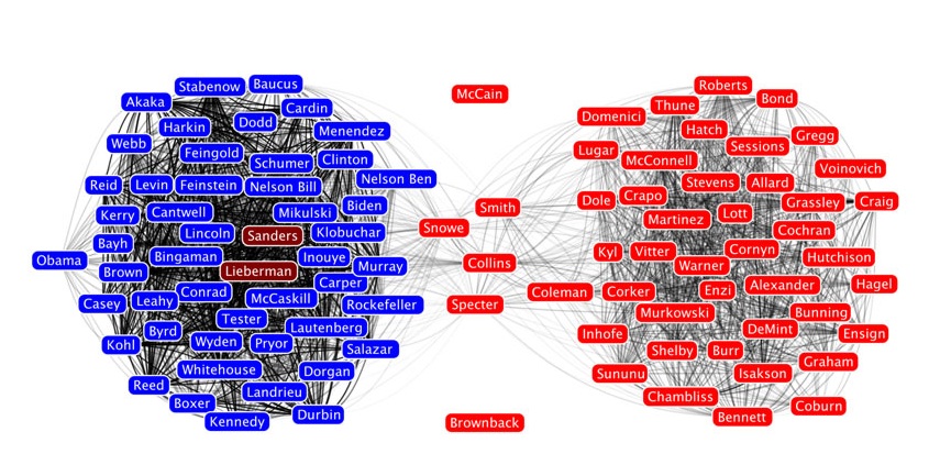
The 2008 US presidential elections were the first to be visualized in such an excessive way. Data sets derived from varied sources -official, historical, real-time or user-generated- like political websites, campaign material, polls, statistics, news, and also from blogs, social media and networks, were used in an attempt to give a deeper insight into the elections. A top 35 of those visualizations are listed in the Chandoo.org website. B. Shneiderman’s very interesting network analysis of the Senatorial voting patterns is also included.
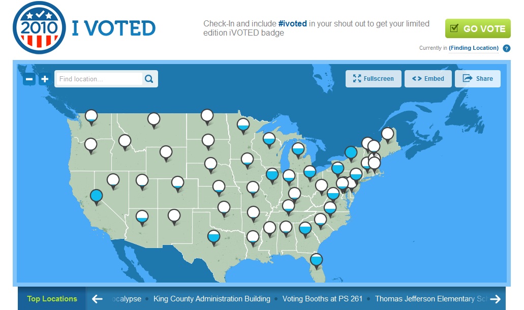
User-generated and real-time data are also becoming a powerful source of data for visualizations. In the US Senate elections on November 2010, Foursquare partnered up with JESS3 to create I VOTED, a live, interactive map of each check in at polling sites.
“We see this as an opportunity to look at the data that’s out there and to use the reach that Foursquare has,” says Ben Slavin, JESS3’s head of tech, at politico MT. “It gives insight into how our democracy works.”
It is not surprising for such a cooperation to emerge and to aim in an application that will map location data for which users give their consent. This kind of visualizations that are relied on mobile technology and user-generated data, as well as visualizations that make use of AR may sure provide a new perspective for our actions and our relationship to others, as well as redefine our contextual cues, but it is still quite early to know of whether they can be further insightful and educational and if they could follow Neurath and Rosling’s path. In the case of I VOTED, for example, I very much doubt that earning the limited edition IVOTED budge would bring any sort of awareness to any mobile user.
Although the US has led the way to this exponential growth and use of data related to politics and elections, other countries are also starting to explore this field. The Netherlands for example may not have such a huge collection of visualizations for the last national elections that were held in 2010, but such efforts are expected to become the norm. For example, for the Provincial Elections on the 2nd of March, the Statalyze website provided a political barometer based on tweets from various parties. Also, there in an ongoing interest in open data and access to information to foster transparency and knowledge, as for example, The Network in Transparency and Impact in Development.
As more and more people and the business world is getting to love data and do that labor of love I believe that it should be important to have in mind the work of those pioneers that found meaning and cause in information visualization and tried to communicate their findings. If not for saving the world such a powerful tool could make a difference.
—
Card, et al. (1999). Readings in Information Visualization: Using Vision to Think. Academic Press, Morgan Kaufman Publishers.
Noveck (2010). Making Sense of Raw Data: A Labor of Love http://www.youtube.com/watch?v=hYODE_dZaSc&NR=1
Parker (2003) In the Blink of an Eye. Perseus Publishing
Shneiderman (2009). Data visualization http://vimeo.com/4373793
Zambrano & Engelhardt (2008). Diagrams for the Masses: Raising Public Awareness – From Neurath to Gapminder and Google Earth. In G. Stapleton, J. Howse, and J. Lee (Eds.): Diagrams, LNAI 5223, pp. 282–292, 2008. © Springer-Verlag Berlin Heidelberg. — [In this text, the authors address the correspondences between Neurath’s idealism and these recent trends in information visualization with regard to ideas about data accessibility, the empowerment that this access may produce and the assumed benefits of using visuals.]

