Notes from Visualizing Europe: the power and potential of data visualization


Last week I attended Visualizing Europe, a one-day conference where a very interesting and diverse group of data visualization experts and designers talked about the power and potential of data visualization.
Below are some notes and comments on some points presented and issues debated in the conference:
- Use cases for data visualization: explorative versus communicative data visualization
“Visualizations are part of our culture.” (Moritz Stefaner)
Enrico Bertini, data visualization researcher at the University of Konstanz, Germany, made a case for the indispensability of data visualization in scientific research and control rooms dealing with large amounts of information. According to Bertini, whereas data visualization is commonly used today as a communication tool: “largely public, mostly static or with little interaction, and mostly to reveal information that has been digested by someone else,” attention must be shifted towards “build[ing] visualization for private use, highly interactive, to allow easy exploration and focus on revealing unknown, that is, help people generate new knowledge.”
The shift that we’ve been witnessing from the use of visualization exclusively by expert populations for analytical tasks to the use of visualization as communication tool of findings or messages, even in everyday life situations with tools like Many Eyes (see astudy of casual information visualization), does not imply a questioning of the indispensability of data visualization in scientific research. But data visualization is now part of our culture as Moritz Stefaner, information visualizer with background in cognitive science and interface design, explained in this talk. What we need to explore are the multiple types of insight that the non-traditional uses of data visualization can enable and what practices like remixing visualizations tell about our culture.
- Levels of narrative control in telling stories with data visualization
A debate emerged around this topic. To Moritz Stefaner, the power and potential of data visualization lie not in telling one story but in telling a thousand stories but not all at once, making them accessible and enabling users to make sense of the world themselves. Structuring these stories is the job of the designer. David McCandless, writer and information designer who maintains the Information is Beautiful website, considers that, in the context of the torrent of information that we live in, a good data visualization should tell one story in order to help people make sense of the abundance of information. To him the power of visualization lies within enhancing our knowledge as not to be taken in by words.
- Data visualizations as a new kind of camera?
Trained as a photo journalist, David McCandless proposed to think of the future of data visualization as a new kind of camera. He considers data visualization to be a new form of photojournalism in that by means of visualizations you take photos of the data. This metaphor however obscures the process of interpretation performed with this representation technique. Jonathan Gray of the Open Knowledge Foundation usefully pointed out later in the day that what is essential about data visualization is not taking good pictures but examining the material we use for taking pictures as well.
Resources:
Enrico Bertini maintains an interesting blog on data visualization: Fell in Love with Data. You can find the slides of his presentation here. In his presentation he strongly recommended Alan MacEachren’s book on visualization “How Maps Work”.
Interesting showcased tools and visualizations:
- Impure: free visual programming language that enables non-programmers to create their own interactive experiences. Project done with Impure published in the Guardian: An animated history of UK. aid 1960-2009 mapped.
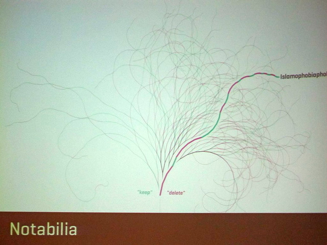
- Notabilia: visualization of deletion discussions on Wikipedia
- The Better Life Index: interactive index which enables users to rate their own country on the things they feel make for a better life.
Image credits: OKFN Flickr stream

