The Making of the MoMUvA app
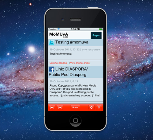
We as master students New Media at the University of Amsterdam rely on several different sources on the web for information regarding our course and objects of study. There is the Masters of Media blog, the MA New Media Facebook group, Twitter and the <mom> mailing list. Our main idea for the MoMUvA app was to bring together these channels so students could get a quick overview of all the important information, presented in a consistent format. In our app, the posts from all different sources appear in one chronological list. Users can either read the syndicated version of the post or follow a link to the post’s original source. We researched methods for creating a native app, but decided on making a well working mobile website instead. We decided on the name MoMUvA (Masters of Media at the University of Amsterdam) and registered the domain momuva.com. Using Yahoo! Pipes combined with WordPress and several plugins, we were able to bring all the information streams together. The MoM-blog, Facebook group, Twitter hashtag #momuva and the mailing list are automatically aggregated by our WordPress installation and accessible through the mobile website. We created a prototype for iPhone with Xcode as well, but we were not able to put our app into the App Store.
In addition to our main goal of combining different news feeds, we also tried to implement other sources of information. We created a page for the time tables of our classes (the UvA schedule) and one with a list of all the UvA locations (UvA places). The time table page automatically scrapes the latest schedule from the UvA website. The UvA places page is basically just Google maps plus a KML list of all the UvA locations, which we found on the UvA’s website. We had many more ideas for different pages, but we were unable to implement all of them since we focused on our main goal of combining the news feeds.
Our project team consisted of Demet Dagdelen, Bree Tahapary, Floris Spronk, Jorrit Schaap and Erik van Mastrigt. Special thanks to Bernhard Rieder for helping us out with technical issues and providing example codes.
What now follows is our report on the development of the app.
Yahoo Pipes!
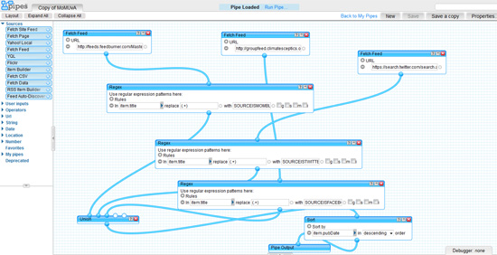
Demet: After we had decided what we wanted our app to be like, I looked around the app stores for inspiration, I found some really good and (pretty complicated) apps for other universities, mainly American ones (see the apps of Princeton, Stanford and Duke). While we were discussing how to aggregate all the information that we needed for our app, Jorrit proposed that we use Yahoo! Pipes, so I looked into it and I was completely mesmerized! It is a really useful tool that helps users combine and filter all sorts of feeds and data from the web. Tim O’Reilly wrote on his blog that the tool is a “milestone in the history of the Internet. (…) Pipes has enormous potential to turn the web into a programmable environment for everyone.” The pipes range from extremely simple to intelligibly complicated ones, but a good thing about the tool is that once someone creates a pipe, you are free to “clone” it and use it as you wish. You do not need to know any sort of a programming language in order to build a pipe, you drag and drop different items from various “modules”, the interface is really easy to use and if you get stuck (like I did) you can always look up different pipes and learn from how they are built. I really urge anyone to try it, I am pretty sure that it will become a part of my daily internet usage.
Here are a few examples of already existing pipes:
Aggregated News Alerts: Performs a keyword search for the latest news and gets results from various different sources
Apartment Near Something: The name says it all!
Search the Blogosphere: Searches the blogosphere for a keyword.
MobileNation
Bree: After Demet tried Yahoo! Pipes to combine the different sorts of feed into one MoMUvA-feed, I experimented with MobileNation. MobileNation is a free online web app editor. So what it basically does, is give the opportunity to create an application that you can access through your mobile browser. Thus, unlike native applications, web apps don’t have to be approved and registered to get into the App Store or Google Market. With MobileNation, app development is made really easy and only basic knowledge of programming is required. Check out the following clip to get an impression of how it all works:
It works fairly simple with the concept of views. With the clearcut GUI, you just create views (similar to the concept of pages) and fill them with the desired content (home, news, about, locations and so on). These views and their content can then be connected to each other through various actions. There were some problems I ran into though. For some reason, the combined feeds did not show in the web app when published. They did however appear in the GUI when editing the app. It took some time to figure out how to combine and connect the whole and if we had more time I believe MobileNation could work as MoMUvA-app. For now, I can just say that MobileNation truly has a lot of potential crossing various borders of native apps.
The Design
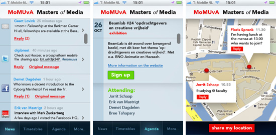
Meanwhile, Floris came up with the design for the app.
Floris: The design is not at all original, it´s just based on the other apps.. I’m sure it can be improved, but it was a good starting point for us.

Fig 2. MoMUvA app design
WordPress + Plugins
Jorrit: My goal was to spend as little time as possible on actually programming the app. The idea was to combine readily available tools and plugins and create our app based on just combining these “building blocks”. One way of doing this is by using WordPress as a content management system. WordPress may have started as blogging software, but it is widely used as a CMS in many different ways and forms. One of the best parts of WordPress is the enormous amount of plug-ins available to extend its functionality. For this particular project, I started with a clean installation of the latest version of WordPress. Then I installed FeedWordPress, a plug-in that makes RSS syndication possible. Using the RSS feed from our Yahoo! Pipe, the plug-in automatically created a post from the content of the RSS feed. The plug-in automatically looks for new posts and updates existing ones if there is a change in the RSS content.
I then installed iPhonsta from Wpshower, a WordPress theme that changes the looks of your website into those of a native mobile app. It includes everything from a list of the items with different possibilies to display the content (title with excerpt or just title) and a nice dropdown menu for the pages.
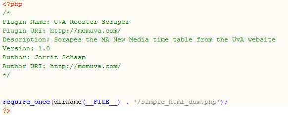
For the UvA Places page, I used the Google Maps API example combined with Bernhard’s geolocation snippet and a code snippet for loading the KML file. For the UvA time tables, I basically edited this example for a HTML scraper.
All I needed to do now was to edit the theme to look like our app design. One of the trickier parts was the presentation of the source for each post (the Facebook, Twitter, MoM Blog icons etc.). Luckily, Bernhard helped us out by improving our Yahoo! Pipe. Basically, each post’s title in the RSS feed starts with the name of the source. So for example “SOURCEISMOMBLOG Occupy Realism: Or How I Learned to Stop Protesting and Love Protocol”. I then created a small WordPress function that replaces the SOURCEISMOMBLOG part with a nice icon of the MoM blog. For Twitter, I extended the function to include the profile picture and name of the person who posted the tweet. (You can extract the name of the person from the tweet’s url). Finally, I created a filter for the excerpt function of WordPress, so that images are excluded from the excerpts to improve consistency between posts from different sources. (For example, the MoM blog posts usually feauture images whereas tweets do not).
Xcode
Erik: We wanted to make the app feel like native. The mobile website is a good start, but apps are used more frequently. That is why we tried to embed the site in an iPhone application. There are several ways to do this, but the very most easiest one is using Xcode, Apple’s developers kit for creating Mac OS X and iOS apps.
The hardest thing with Xcode was to start in general. There are very much tutorials on internet available, but many of them are outdated. For instance, the former Interface Builder has been replaced by Storylines. Despite the basics stayed the same, you are continuously matching old tutorials with your most recent Xcode version. However, after completing a few tutorials, we were able to request an url as well as navigating within the loaded website. Adding navigation buttons was even easier since Xcode includes many predefined functions. In order to make the app look alive when loading a new web page, we added a so called Activity Indicator as well.
Since we are neither official Apple Developers nor willing to pay 99 dollars to become one, the app is not uploaded to the App Store. You should load the website with your regular browser and add a home screen button manually.

Fig 4. The MoMUvA app in Xcode
The Future of the MoMUvA app: MoMUvA 2.0
There were many cool features we were unable to implement because of time restrictions. However, Floris created this promotional video for the fictional version 2.0 of our app showing what it could be like if all these functions were implemented.
MoMUvA for you
Check out the current version of the MoMUvA app by browsing to http://momuva.com/blog on your smartphone.
The mobile website as it is now basically runs itself (everything is updated automatically), so as long as we pay for the webspace, the app will be available for whoever wants to use it.
Dem Pipes:
After we had decided what we wanted our app to be like, I looked around the app stores for inspiration, I found some really good and (pretty complicated) apps for other universities, mainly American ones: here are a few examples of what other similar apps look like. While we were discussing how to aggregate all the information that we needed for our app, Jorrit proposed that we use Yahoo! Pipes, so I looked into it and I was completely mesmerized! It is a really useful tool that helps users combine and filter all sorts of feeds and data from the web. Tim O’Reilly wrote on his blog that the tool is a “milestone in the history of the Internet. (…) Pipes has enormous potential to turn the web into a programmable environment for everyone.” The pipes range from extremely simple to intelligibly complicated ones, but a good thing about the tool is that once someone creates a pipe, you are free to “clone” it and use it as you wish. You do not need to know any sort of a programming language in order to build a pipe, you drag and drop different items from various “modules”, the interface is really easy to use and if you get stuck (like I did) you can always look up different pipes and learn from how they are built. I really urge anyone to try it, I am pretty sure that it will become a part of my daily internet usage.
Here are a few examples of already existing pipes:
Aggregated News Alerts: Performs a keyword search for the latest news and gets results from various different sources
Apartment Near Something: The name says it all!
Search the Blogosphere: Searches the blogosphere for a keyword.
Bree: After Demet tried Yahoo! Pipes to combine the different sorts of feed into one MoMUvA-feed, I experimented with MobileNation. MobileNation is a free online web app editor. So what it basically does, is give the opportunity to create an application that you can access through your mobile browser. Thus, unlike native applications, web apps don’t have to be approved and registered to get into the App Store or Google Market. With MobileNation, app development is made really easy and only basic knowledge of programming is required. Check out the following clip to get an impression of how it all works:
http://www.youtube.com/watch?v=OMcVvpE9lVY
It works fairly simple with the concept of views. With the clearcut GUI, you just create views (similar to the concept of pages) and fill them with the desired content (home, news, about, locations and so on). These views and their content can then be connected to each other through various actions. There were some problems I ran into though. For some reason, the combined feeds did not show in the web app when published. They did however appear in the GUI when editing the app. It took some time to figure out how to combine and connect the whole and if we had more time I believe MobileNation could work as MoMUvA-app. For now, I can just say that MobileNation truly has a lot of potential crossing various borders of native apps.
Meanwhile, Floris came up with the design for the app. (plaatjes)
Jorrit WordPress:
Erik Xcode: We wanted to make the app feel like native. The mobile website is a good start, but apps are used more frequently. That is why we tried to embed the site in an iPhone application. There are several ways to do this, but the very most easiest one is using Xcode, Apple’s developers kit for creating Mac OS X and iOS apps.
The hardest thing with Xcode was to start in general. There are very much tutorials on internet available, but many of them are outdated. For instance, the former Interface Builder has been replaced by Storylines. Despite the basics stayed the same, you are continuously matching old tutorials with your most recent Xcode version. However, after completing a few tutorials, we were able to request an url as well as navigating within the loaded website. Adding navigation buttons was even easier since Xcode includes many predefined functions. In order to make the app look alive when loading a new web page, we added a so called Activity Indicator as well.
Since we are neither official Apple Developers nor willing to pay 99 dollars to become one, the app is not uploaded to the App Store. You should load the website with your regular browser and add a home screen button manually.

