Twisting perspective: Sagmeister
Sagmeister was born in1962, he is an Austrian designer. He studied at the University of Applied Art Vienna and the Pratt Institute in New York where he had a full scholarship. He always was passionate for designing covers for music records and has won some important prizes with his cover arts, this also attracted some famous musicians as clients such as The Talking Heads and Lou Reed. His main works are focused on typography but he has a design studio named Sagmeister Inc. where he also develops works with branding, packaging and graphics for many big companies such as HBO, and the Guggenhein Museum.
A very interesting aspect about his creative process is that from seven to seven years he takes an entire year off just to work in personal projects and experiment with new technics to refresh his ideas. This break allows him to experiment a lot with many different technics and develop very experimental works. In his TED lecture about these sabbatical years he explains a little how they work and how if affects his work.
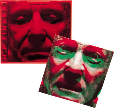
This experimental character is very present in his work and reflects a lot on how he uses resources and apply them in new and different ways.These interesting applications are easilly found in his work with traditional printed media: in posters and cd covers for instance. He has a very famous poster in which he apears naked and all the typographic work was cutted in his skin. It It is such an interesting poster because we can analyze it as the creator of the media becoming the media and the message emboding its creator too. Also a cd covers using translucid color plastic to cover images and make them change once taken out of the cd box (figure 1), for which he won a Grammy.

But they can be found in the new media as well: with phisical and interactive instalations like the one where he made a partnership with the artist Ralph Ammer and created a virtual web with the saying “being not truthful works against me”. Sagmeister work is mainly focused in typography and has a real poetic sense with some sentences that were written by him, he usually create installations with them and this web one would attach to the people who crossed in front of it and would be destroyed by the movement.
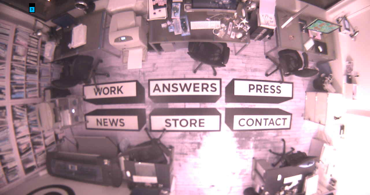
Also his website itself is something really interesting to be seen and analyzed: a webcam installed in the ceiling streams the studio room in New York 24h a day like a big brother experiment, in the ground there are huge stickers, each one with one option for the web site menu and that is how the user navigate through the information. There is no really technological innovation in the technical construction of the web site, but the inventive way that things are presented to the user changes the perspective about the existing tools showing a hole new set of possible applications to it.
He also applies new technologies to create work for companies and provide algorithms that can generate applications for a brand as in the case of Casa da Musica’s logo that he has designed. A computer program was created that could get colors from any image source and use them applied to the simbol that he created inspired on the Casa da Musica’s building orthographic views. This would create different applications to the brand according to the necessity from the given material such as specific events and shows.
There is much more in his site about him and his works, but the most interesting thing to notice here is the new forms of applications that he has develop for old and new already existing and well known resources and how it creates a new perspective for the observer from the impact and surprise generated by the contact with it.
