Visualizations of space, social data and a bit of history at the 2012 InfographICs conference
Secrets of the far-distant corners of the Universe, paths of human activities seen from above, the history of infographics and even some shots of time travels on board of a DeLorean: the fifth edition of the InfographICs conference, held in the Dutch city of Zeist on 9 March, has been the meeting point of more than 300 professionals for sharing their knowledge and ideas.
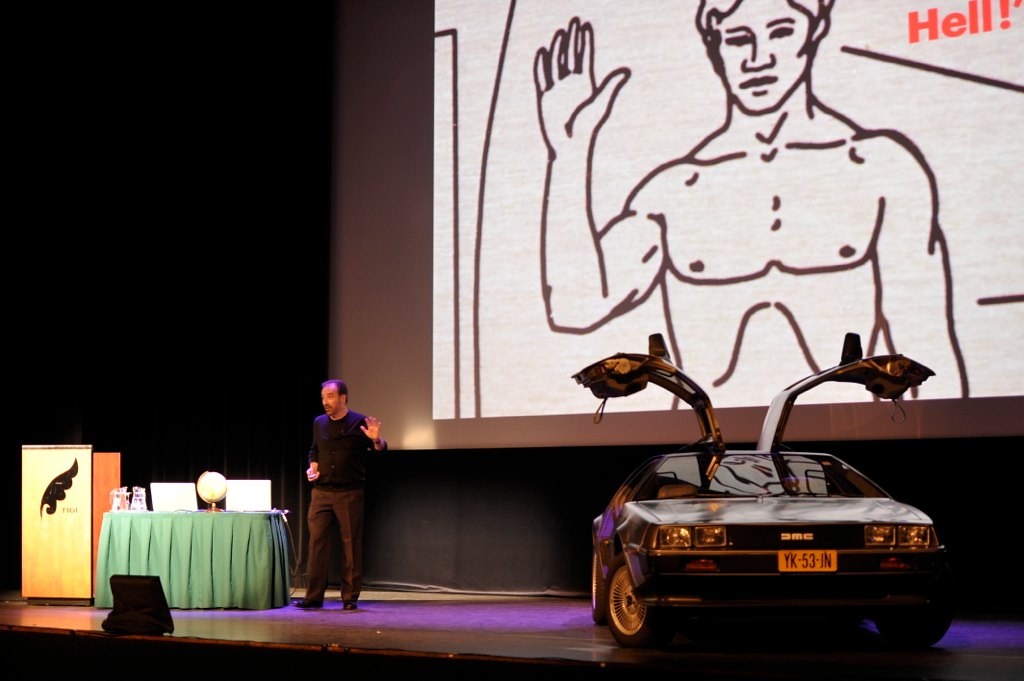
John Grimwade on stage at InfographICs 2012 with a DeLorean. Image by Infographic Congres
The day started with an intergalactic travel commanded by Sean McNaughton, staff member of National Geographic until recently, and now senior visual communications designer at Chase Design.

Sean McNaughton on stage at InfographICs 2012. Image by Infographic Congres
McNaughton, a passionate visual journalist, gave valuable insights about how infographics are created at the magazine. Unlike newspapers, where content is mainly driven by text, in this publication “every story is visual; if there is no visual, there is no National Geographic story.” From there, McNaughton told the audience about his joy of playing with new formats as a way “to attract new readers; that’s a question of seduction.” The relaxed ambient of a monthly magazine, without the pressure of breaking news, helps creativity.
Although “infographics are not always the best way to tell a story,” they are about wonder, joy and discovery. He believes in this triumvirate and offers the graphics on fifty years of space exploration and exoplanets as examples: they are close to questions like ‘Are we alone?’, that have fascinated the human kind for ages. If visualizations “amplify cognition” using “computer-based, interactive, visual representations”, as the already classic definition of Card, Mackinlay and Shneiderman says, these projects are the ultimate way to help us understand these far-distant physical objects. Before saying goodbye, McNaughton also shared a remarkable headline: “If you handle it well, complexity is beautiful.”
After traveling to far distant galaxies, the audience went back in time to the early 20th century thanks to the talk given by Michael Stoll, Educational Director of SND. Stoll showed beautiful pieces of vintage infographics. How did he manage to collect all these books? “I watch stuff on the Internet and talk to colleagues. There is a history written in books.” That history is full of demographic tables, which were the preferred topics of early visualizations, like those of J.G. Bartholomew’s Atlas of the World’s Commerce from 1907. Its maps show a fragmented narrative, the blank spaces being filled by bar charts representing the density of population.

Atlas of the World’s Commerce. Screenshot from the National Library of Russia website
His Flickr profile is worth visiting, as it hosts a massive collection of infographics.
Dutch artist Jan Rothuizen introduced his original work combining text and drawings. Rothuizen, author of De Zachte Atlas van Amsterdam (The Soft Atlas of Amsterdam), a collection of hand-drawn maps of the city, wants to tell stories that contain emotions with facts. “Things can only be understood by putting them in stories.” One of these cases is his drawing of Timo Smeehuijzen’s bedroom, included in the Atlas. Smeehuijzen was one of the first Dutch soldiers killed in Afghanistan, and Rothuizen’s work reflects both the intimacy of a post-teenager and the struggle of a mother trying to overcome the death of his son.
Jan Willem van Eck, strategy director of Esri Nederland, offered the cartograph’s perspective and showed the pros and cons of using maps in our times: visualizing things is easier thanks to open data, but this does not mean that information designers will communicate better with their audiences. Projecting means introducing error, stated Van Eck, from the stereographic to Mercator. The slides of Van Eck’s presentation can be found on SlideShare.
The afternoon sessions started with Kat Downs, interactive projects editor at the Washington Post. Young and talented, Downs explained that social data can be a precious resource for journalists, letting them tell stories that would not have space in traditional reporting otherwise. Downs focused her talk on big media like the Guardian, the New York Times and the Washington Post, which have already applied this idea in projects like the interactive presentation of the false rumours spread during the London riots of last summer. In many cases this data comes from social networks, but journalists can also ask their audience directly. That is what the New York Times did after the death of Osama Bin Laden. Many academic texts have addressed the relation between the journalists and their audiences and how new media have changed it. The projects shown by Downs in the InfographICs congress prove how the new forms of journalism improve public life. In these projects readers are not considered users or consumers anymore, but citizens, and their participation is higher than ever. They cannot be considered as citizen journalism, because they are not “responsible for gathering content, visioning, producing and publishing the news product”, according to Joyce Nip’s definition, but there is no doubt about their connection with the classic definition of public journalism as coined in the decade of 1990 by Jay Rosen, helping public life.
As many other speakers, Downs warned about the limits of visual storytelling: “There’s no need to tell stories with every dataset that we have with social data,” as in many cases the graphic presentation does not offer new insights on the content.
The successful series Nederland van Boven (Netherlands from Above) was introduced by the data journalist Frédérik Ruys, one of its authors.

Their task was finding the patterns behind the data they received from different sources, in all forms and shapes. The method consists of four steps: explore the data, analyze and combine it to eventually visualize it. Good beautiful visualizations are born only from good datasets and their proper combination – “This is fundamental for creating interesting stories” -, added Ruys, who reminded the audience about the importance of having a story you want to tell before putting together the dataset.
The day finished with the unforgettable talk of John Grimwade, who appeared on stage driving a DeLorean car inviting the audience to travel back in time to discover the secret history of graphic visualizations.
The graphics director of Condé Nast Traveler started with DNA’s double helix to move backwards to the classic diagram on the fate of Napoleon’s Army in their attempt of conquering Russia, the Mercator projection of the late 16th century, Da Vinci’s Vitruvian Man, the cave paintings – “the first infographs,” acoording to him -, and finally the Big Bang.
The words of Luke Dubois recalled by Grimwade closed the conference and reminded the audience about the importance of their work: “Last century was the century of electricity. This century is the century of data.”
This article was originally published on Data Driven Journalism. This version is a slightly modified edition of that text.