Using map projections in data visualizations
In an era of internet users actively creating their own content, easily accessible tools are available for the public to create their own data visualizations. Applications like Many Eyes or Tableau Public give statistic enthusiasts the appropriate possibilities to show their work in a graphical way. Otto Neurath, one of the prime members of the Vienna Circle, was the creator of Isotype: an attempt to create a universal graphical sign language that could be understood worldwide. His desire was to establish a way of educating that would narrow down the gap between the educated and the non-educated. The key to achieving this goal was ‘consistent visualization’ through the use of graphical images. Neurath, who experimented with interaction in his visualizations, would have approved the recent wave of interactive graphics being developed and spread through the internet. And even bigger possibilities emerged when software developers created the tools for everyone to create their own visualizations, which they could subsequently share online. The abundance of data sets and sharing possibilities meant a new way for looking at our culture. Creating visualizations does not simply mean pie charts and bar graphs; using maps can be an excellent way of showing distance or proportion. Google is one of the developers aiding this development. Google Maps offer their API (application programming interface) online to their users, and even created Google Chart Tools for an easier access to the software.
Space and spatiality are important factors in data visualization. Any environment can become significant when relevant factors are being assigned. Yuri Engelhardt calls this a ‘meaningful space’, or more in the case of Google Maps a ‘map space’. He describes in Graphics with a cause how the implementation of two labeled axes already constitutes a meaningful space. Signifying elements does not necessarily require paper or pixels: it can emerge everywhere, as exemplified by Engelhardt: “Imagine sitting in a bar and using the arrangement of empty beer glasses on the bar table to explain, say, the location of Berlin with respect to London and Paris. The positioning of only two beer glasses, standing for London and Paris, creates a Meaningful Space – every position on the bar table has been assigned a geographical meaning.” But in a world where visualization tools are plentiful, people do not have to reinvent the wheel and locate Berlin and London on a self-drawn map. They can turn to Google Maps.
Using it should be met with caution, though. Google Maps, but also Yahoo Maps and Bing Maps use the Mercator projection, one of the many projections created to display the earth on a flat image. Given the fact that a sphere can never be represented without distortion, developers using maps must make a decision in what projection to use. Google’s choice was the Mercator projection, perhaps most famous for its distortions around the poles. The further you veer away from the equator, the more the map stretches out. Because of this, the poles can never be shown on the map, but the angles will always be preserved. The key to using this projection is its conformal projection: zooming can occur seamlessly because of this phenomenon. So, Google has valid reasons to use the Mercator projection. While the distortion can be easily spotted on a world level, the street-level images are closer to reality because of this preservation of angles, as a Google employee points out. And since the majority of the people use Google Maps on the street detail level, Google decided they are “sticking with this projection for now”. While Google continues using the Mercator projection because it suits their needs, other problems may arise. Because of the availability of Google Maps API, it is an attractive possibility for designers to use the application in data visualizations. These users can use the maps for anything they want, obscuring Google’s original goals and control over its limitations. How does that play out?
When data is implemented on a city level, no harm by any map projection issue is done. Online newspaper The Bay Citizen created a map of San Francisco Bay Area, projecting bike accidents over a four-year period onto a map. Using a combination of predefined Google icons and a self-allocated color scheme, the visualization is a useful tool in finding where bike accidents occur more frequently. Another example, but on a country level, is the Syria Incident Tracker. Using official news reports, it displays the amount of crimes like murders and abductions on a map of Syria. The effect of map projections is still negligible, since Syria’s size is average compared to other countries.
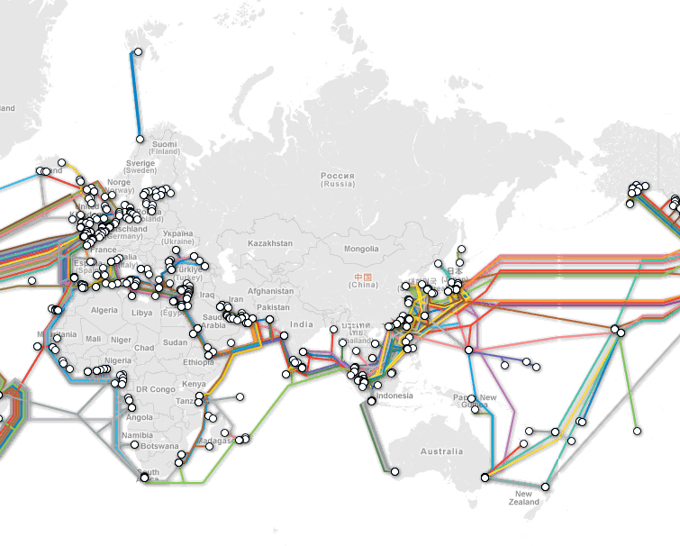
Market research firm TeleGeography introduced a map, showing a range of submarine communications cables laid out on our ocean floors. Here, when the human eye automatically starts comparing distances of cables, we encounter the major problem of the Mercator projection: the distortion of scale. Compare for instance the ‘blue’ cable between Norway and Svalbard, and the ‘green’ cable from Hawaii to French Polynesia. At first glance, they might seem just as long. Clicking on the lines reveals the truth though: while the Norwegian line is 2,714 km long, the French Polynesian line is actually 4.500 km. A relevant project is Dencity, by Fathom Information Design. It is a map displaying the world population, using both circle size and color to indicate the density of the people and their congregation in major cities. While the visualization is aesthetically appealing, one could wonder what the effects of using a distorted map projection are when observing the northern countries. A fine tool to grasp the distortion is the Google Maps Distance Calculator by Daft Logic, who also dived into the Google Maps API to create this tool. Try drawing a line near the equator, and then a similar sized line near the top of Greenland. It unveils the trickery of a map projection; one that is unavoidable but important to take in consideration when your visualization is based on perception and first impressions.
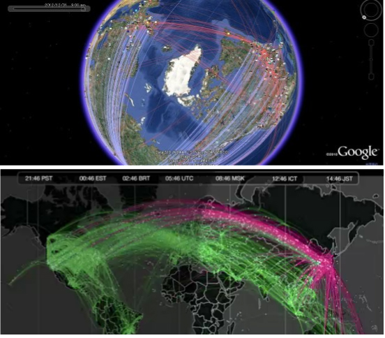
For whatever reason, an evil-doer can tamper with data visualizations – either through adjustments in the data, or in the visualization. One can also unknowingly be the victim of errors – again either in the data or the visuals. Creating a visualization where distance is a decisive factor, demands a comprehension of the map that is being used. If we look at this issue in a wider perspective, we can describe a map as a cultural object, and should be dealt with as such. Neurath’s work showed that a universal language should be approached in a reductionist fashion: humans come in all shapes and colors in real life, but become simple a simple black figure distinguished merely by head and limbs. Using a detailed, cultural artifact to indicate an abstract factor like distance can lead to the aforementioned problems. Still, Google Maps offers great possibilities in the field of data visualization, but as the earlier mentioned Google response expressed: for a true representation, one should turn to Google Earth. Many designers building data visualizations already agreed on this and used globe-like images to display the planet. A good example is this tool to superimpose the 2010 Deepwater Horizon oil spill size onto other locations. The use of Google Maps would not work here, unless the size of the spill adjusts to the stretching of the projection. Therefore, the use of Google Earth here is an understandable decision. Another example is a comparison of these two projects: using either Google Earth or Google Maps to visualize tweets. It presents us with some food for thought: a seemingly ‘natural’ object like a map must be used with caution, because it can unintentionally affect a sign that seemed so undisputed.
References
- Engelhardt, Yuri. “Graphics with a cause – Neurath, Rosling, and the universal principles of visual representations”. 2012.
- Neurath, Otto. “Visual Education: A New Language“. Survey Graphic, vol. 26, no. 1 (January, 1937), p. 25.

