Generation Next: six promising data visualization applications introduced in Show Me the Data 2012
Experience and youth are combined every year in Show Me the Data, an event organized by the University of Amsterdam and the Utrecht Graduate School of the Arts in which different groups of master students introduce data visualization projects developed in multidisciplinary teams during an eight weeks course. This year, three relevant guest speakers gave talks and offered their advice for newcomers on how to start with data visualization.
Alberto Cairo: ethical implications of infographics
Streaming from Miami, where he teaches infographics to journalists with no previous experience in this field, Alberto Cairo offered the first talk of the afternoon. There are three steps for a good visualization, according to him: “It must be functional as a hammer, multilayered as an onion and beautiful and true as a mathematical equation.”
Cairo made some valuable remarks on the relation between good visualizations and good journalism: data, as he stated, must be properly encoded because doing it in ways that “obscure your infographics have ethical implications.” In other words: some visualizations, like bubble charts, are worse than others for specific purposes. They might be good for showing patterns or trends, but not to show areas and compare them. Cairo opens the door to beginners by inviting them to experiment with easy-to-use applications: “Many of my graphs are made with a little bit of Excel and a little bit of Illustrator, you can still make good graphics using low technology tools.”
Jan Willem Tulp: the power of practice
The second guest speaker of Show Me the Data 2012 was Jan Willem Tulp, a well-known Dutch interactive designer who started his own company last year, after one decade of programming and designing for others. Winner of the 2011 Eyeo Challenge for his project Ghost Counties, Tulp explained his working process. He usually gets a first sense of the data in an early stage, while building preliminary visualizations through an explorative process: “Quite often I feel that I need more data, or a different kind of exploration, so I return to early stages.” Trial and error methods must be applied: “It’s even good to fail in the preliminary visualizations because it does give you ideas for other approaches.”
As somebody that has just started his own business, audience was waiting for his advice on how to start a professional career in data visualization: “The last year I worked for my former boss I devoted one day a week to participate in contests, attend conferences and connect with people.” Practice is also compulsory: “It’s also a matter of exercising: play with the applications and get feedback from others.”
Bas Broekhuizen: learning from other disciplines
Bas Broekhuizen closed the conference with his vision on how e-learning research could help and improve data visualization design. He quoted some principles stated by Richard E. Mayer. Internal coherence is needed, as well as pre-training people: is better for readers to know the main concepts beforehand. Also, attention guides to specific parts of the display must be applied: layovers and contextual menus, as well as splash pages, are useful in this sense.
Broekhuizen, who is currently teaching at the University of Amsterdam, gave his opinion on the eternal debate about the use of the words “infographics” and “data visualization.” He prefers the first term, because it has been used by journalists since the decade of 1970, although a live debate with the audience present at Show Me the Data led to the same conclusion as previous debates on this topic: everybody will keep on using their preferred term.
The three guest speakers’ talks were the perfect ‘side dish’ for the ‘main course’, composed by the students’ applications. The projects introduced in Show Me the Data were built during eight weeks in multidisciplinary teams with 4-5 members from the masters in New Media, Editorial Design and Artificial Intelligence of the University of Amsterdam and the Utrecht Graduate School of Arts. They address different topics using various visualization tools. Here is a summary of them:
EU 2020 TARGETS MONITOR
This project went “from critiquing a EU program with data to critiquing the EU program on data.” The official EU 2020 Program delivers a growth strategy for this decade in seven fields like employment, education and climate change. It has its own website with visualizations, but the team considered that it lacked context, had confusing graphs and was not useful for comparison between countries.
The new application aims to solve these problems, adding also algorithmic predictions based on available data from Eurostat. Users can select different targets and countries, and see their behavior through two different visualizations, a choropleth map and a histogram. According to their own conclusions, the EU 2020 Targets Monitor is a tool that “supports existing narratives, shows the complexity of EU politics and raises awareness on gaps inside the EU data program.”
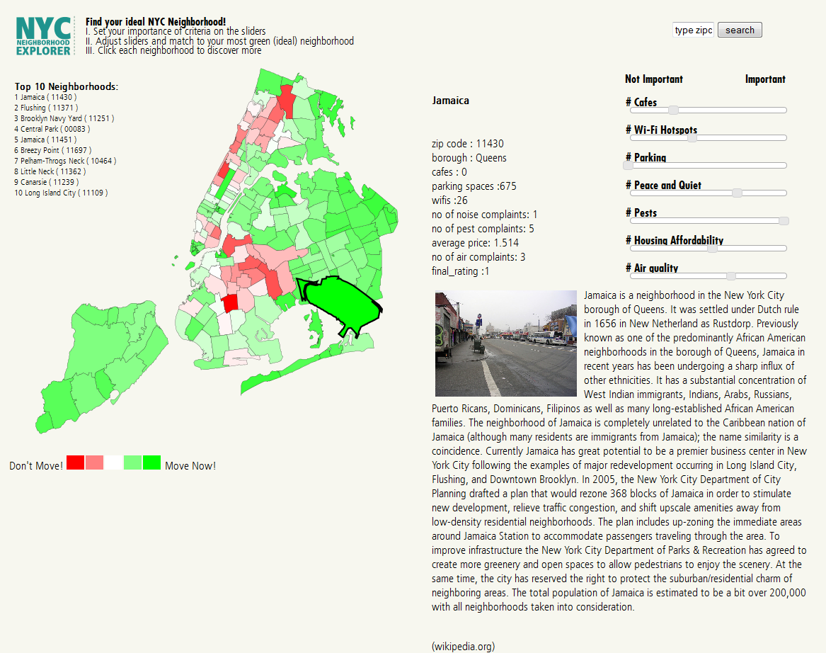
Moving to a new city and finding a good neighborhood is hard. The New York City Neighborhood Explorer is a visual tool that aims to help newcomers to New York in finding living areas that suit their expectations. It is based on data retrieved from NYC Open Data and distributed around seven categories like the availability of parking slots and the air quality. Every value had its own dataset with information from 262 zip codes.
The NYC Neighborhood Explorer shows an interactive chloropleth map that changes colours according to the relevance given by the user to the seven targets. Additional information from every area can be accessed when rolling over it with the mouse. With this tool, the team has been able to “test the reliability of NYC Open Data policy” and aims to build new versions with more accurate data and the possibility of applying this idea to different cities.
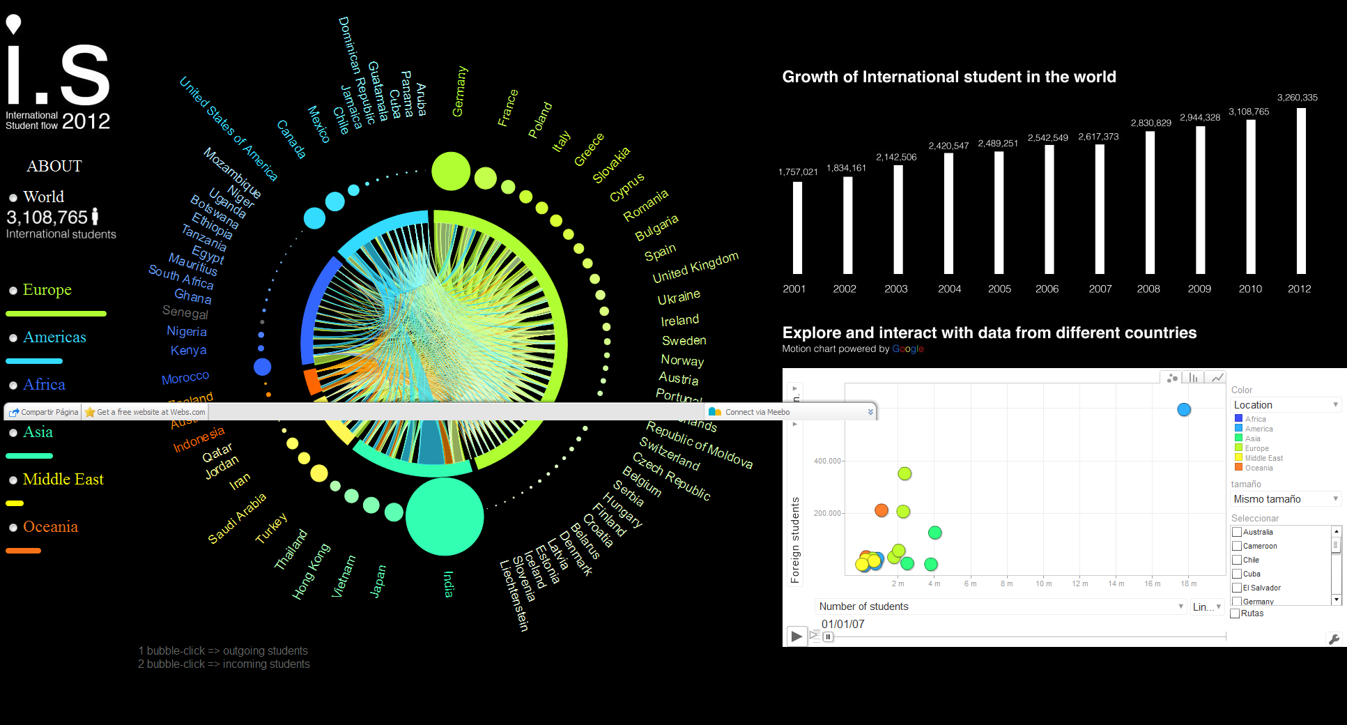
Is it possible to talk about flows between countries without maps? Of course, and this application shows how to do it. The team behind International Students Flow did not want to use them “because of possible overshadowing between small and large countries.” The objective of this project is quite clear: to visually represent the movement of education-related human migrations throughout the world.
Based on Javascript, HTML, D3 and Google interfaces, this application consists of a chord diagram showing the countries as circles and the continents as clusters whose flows are highlighted when rolled over. The motion chart on the right gives a more detailed view on certain aspects, like the cost of living. With this application is easy to see how colonial and linguistic ties push many students to certain countries.
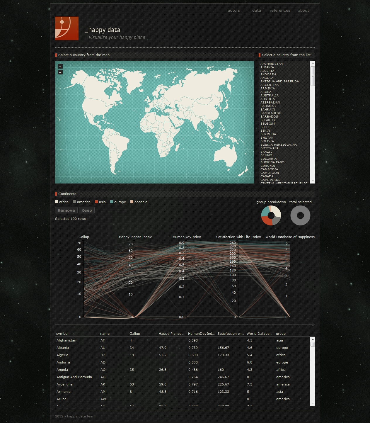
Happiness is as subjective as beauty is: we all have our own concept and whatever increases our joy can be something horrible for other people. All over the world, different organizations have researched happiness and they all lead to different results. This team wanted to “let the user have their say in what they define as well-being” and help them in finding which countries suit better their preferences. Data comes from different organizations and surveys.
Happy Data shows a clickable world map with a list of countries and a parallel coordinates graph with the performance of every country for every given factor. Some of them are serious, like GDP, and others are more trivial but nevertheless relevant, like the average price of a pint. Users can select the most relevant factors according to their thoughts and the list of countries will be reduced to those offering the desired life conditions. According to their authors, “the tool provides a way to quickly consume data for 30 factors, with information available for 130 countries.”
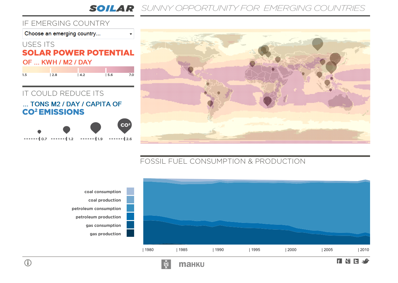
“A sunny opportunity for emerging countries.” The goal of this project is as simple as effective: proving how developing nations, big consumers of fossil energies, are also geographically placed in ideal locations for solar energy that could benefit them and the whole planet. Their visualization is supported by data from NASA, the Carbon Dioxide Information and Analysis Centre and the US Energy Information Administration.
Users of Soilar can select an emerging country and see what is its performance concerning renewable and fossil energies. If, for instance, country A makes a full use of its X kWh/m2 daily solar power, it could reduce up to Y tons/m2 its daily CO2 emissions. The application shows a world map with the solar power potential and the level of CO2 emissions, as well as a stream graph with the historic evolution of fossil fuel production and consumption.
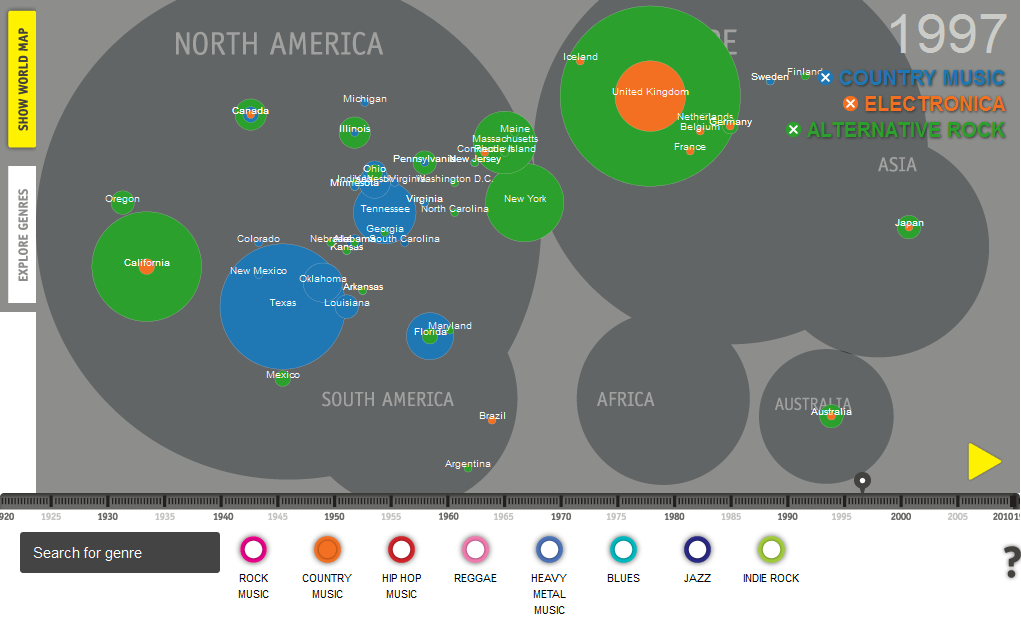
Cultural content is relevant in Wikipedia. Its quantitative presence is similar in numbers to politics-related content, but what kind of articles are there? Do they reflect the variety of cultural movements across the world? In order to cast some light on this topic, this team has developed an application that traces the origins of music genres through space and time according to Wikipedia. Beatmap offers information on 32,000 albums corresponding to 600 music genres with data downloaded from DBpedia.
The application shows a force directed graph with music genres. Users can explore this visualization and select up to three genres. Their geographical and historical evolution can be seen in the second visualization, a world map exaggerated according to the data in which bubbles represent the number of related albums recorded every year in a specific location. According to their authors, “without the filtering abilities gained by this visualization, the data itself would be too comprehensive to easily explore at these various levels.”
Show Me the Data 2012 is available online in two separate videos (this and this) with all the talks and presentations.
