NYC Neighborhood Explorer: Data Visualization Tool
I want you to think back to the time you moved to the neighborhood you currently live in. Was it a difficult move? Hard to adjust and find libraries, cafes, and parks near you? Of course it was! I want to briefly introduce you to the NYC Neighborhood Explorer, a data visualization tool, that I helped create in last Spring’s University of Amsterdam and Hogeschool voor de Kunsten (HKU) intensive seminar in information visualization.
Led by Yuri Engelhardt and Almila Akdag, the “New Media Project: Data Visualization” intensive 7-week course combined students from a variety of disciplines to create original data viz tools. These teams were comprised of designers from the HKU (Hogeschool voor de Kunsten Utrecht), computer programmers from the UvA (University of Amsterdam), and new media students from UvA.
While Jacobo Corujeira has already blogged extensively on both the infographICs Conference that many students participated in, as well as the Show Me the Data presentation event itself, I would like to describe my project in detail and the way in which the course was outlined.
New York Neighborhood Explorer: The Tool
The New York City Neighborhood Explorer is a prototype application designed for the use of individuals new to New York to find their ideal neighborhood. The application was created as a way to engage citizens more directly with their urban environment and with open government data – the data used to create the Explorer originated from NYC’s 50+ government agencies. Created as a model for future use with other cities and data sets, the NYC Neighborhood Explorer is a dynamic way for average residents of a city to open up the relationship between private citizens and public information.
The team was comprised of Natalia Miszczak (UvA New Media), Ana Ordonez (HKU), Nikolaas Steenbergen (UvA Computer Science), and myself (UvA Research MA Media Studies). Our system has the simple goal of making open government data more accessible, while also providing a practical tool for new residents of New York (or for potential use, any city with open government data) to discover new aspects of their city and ultimately their ideal neighborhood. Since the data visualization and information design field has been shaped by Otto Neurath’s concept of Isotype pictorial system (a way for users to quickly visually grasp difficult concepts), we believed that establishing a user’s criteria choices into an easy color-coded geographic map of New York would provide a simple answer to a difficult question: Which neighborhood is best for me?
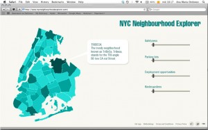
To get an idea of our first ideas, here are some initial sketches by our designer, Ana.

Choice of Values
Searching through the thousands of records and databases from New York government agencies was no easy task. In order to make a tight, coherent user experience, we knew we would have to choose a limited number of value sets based on the NYC Open Data initiative. From these records, we parsed out the solid records – the first criteria being those that organized records based on zip code rather than neighborhood or borough district. After this we labeled certain databases with value names, such as matching “Peace and Quiet” with Noise Complaints. We finally ended up with these values: Cafes, Wi-Fi Hotspots, Parking, Peace & Quiet (noise complaints), Pests, Housing Affordability, Air Quality. While not an extensive or satisfactory value list, as an initial prototype we were happy with the way this method could be replicated in other cities with a vast array of databases.
Future Goals
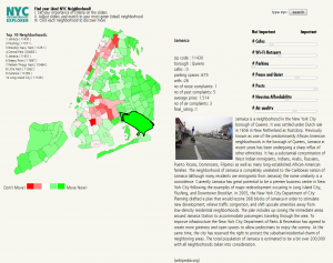
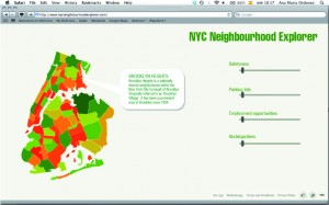
The Explorer played an important role on location, which is the main reason to include a map in real scale of the five boroughs of New York City divided by zipcode, due to the kind of data we found was categorized by zipcode as well. The project was a mix of design, programming, user functionality, and project management. For instance in showing the difference in user’s choices the team had to make a decision on color choice with corresponding value choices. The color selection was made according to the idea of display the results on the sliders with a color code, in which green indicates “the most suitable” and red indicates the opposite. Shades of lighter green, to white (neutral) to lighter red are in between the brightest possibilities. The typefaces used for the text in the app were Frutiger and Futura, both well known for being clear, easily readable and they have been used for more than 50 years in projects and signs related to locating places and public information design.
We firmly believe that creating access to open data from different cities around the world would create an idea that can be put in practice for all, not only for people who are moving, but also, for people that are visiting those places who would be interested in getting immediate feedback about different criteria with available data online. The NYNE application uses available open new media data sets (combination of NYC Open Data and Wikipedia articles), which would not ordinarily be utilized by the public in general to this extent. Thanks to the NYNE, data sets can be used by many types of users, regardless of their background, skills, origin and interest in technology or open data movement. The primary advantage this application has over, say, rental property search engines, is that the user has a high level of personal aspects to which compare different neighborhoods of the city. The users of NYNE can select their own criteria for the neighborhood that they are interested in, and it enables them to give different weightings on the location variables based on their individual preferences. We feel this level of interaction is far more useful to the user then a generic response (e.g. a neighborhood ranking in a local newspaper), where there is little recognition of the users’ weighted criteria. Further to this, the results of the users requirements are linked with the interactive map of New York, including a concise description of the top-ten neighborhoods matching their criteria. To our knowledge, there is no other application like this available online to date. We know that the potential for further use of open data sets is well beyond what we have achieved thus far, which will accommodate the expected future demand for such application.
How Tasks Were Divided
With the behind-the-scenes aspect of the project, it is interesting to note the variety of tasks involved with the course and undertaking a data visualization project. To briefly run through the working method, I put together a rough task-assignment list:
- Visual design (layout, colors, fonts, implementation with technical possibilities)
- Schedule and timeline organization
- Support to media students by looking for information/pictures online, organizing files
- Cleaning data sets, choosing variables
- General user interface testing and aesthetic layout
- Quality control of the data
- Converting and refining datasets
- Design and implementation of the software-system
- Layout changes (Due to technical and temporal limitations)
Conclusion
Every year, this UvA seminar gathers designers and scholars together to create data visualization projects that build upon design and information concepts in this discipline. By providing students this space to research and create their own data viz tools, we are creating a strong portfolio to represent Amsterdam, HKU, and UvA as frontrunners in the growing field of information visualization.

