App Review: The Fancy
“Fancy is part store, blog, magazine and wishlist. It’s a place to discover great stuff, to curate a collection of things you love, to get updates on your favorite brands and stores and to share your discoveries. We built it because we love to show off the things we have and to window-shop for things we admire.” www.thefancy.com
A first glimpse of the Fancy App
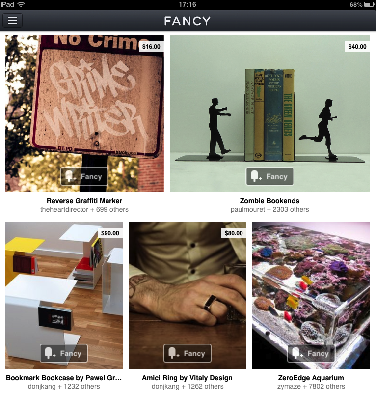
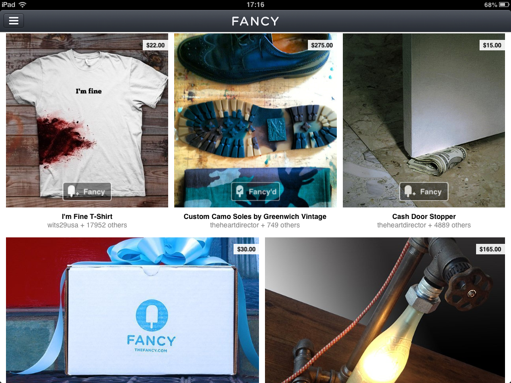
When we first interacted with the Fancy iPad App, the analogy with window-shopping was striking. The app is a gallery that displays products ranging from $ 20 T-shirts to $ 5800 floating bed frames. Services are also made available, for example bookings to exquisitely designed hotels, houses and travel destinations in general.To add something to cart for purchase, the user simply clicks a “Buy now” button. At the same time, not everything on display is priced; a lot of visual content is simply shared, appreciated and commented between users through the Fancy “like” button. In this sense, each user is a collector and curator of items on his own account. Popular users (most followed and appreciated) are ranked high in the community and are regarded as trend watchers or “authorities”.
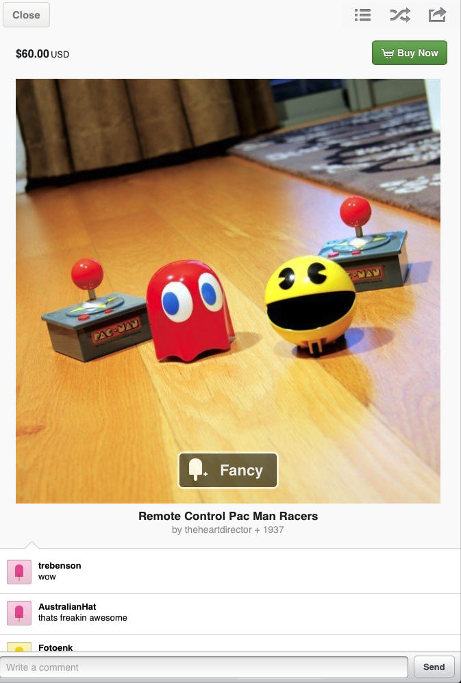
The design of the app is quite impressive. When you start the app, you encounter high quality and professional photos, each enlarging in a different lightbox. The lightbox also shows the price, products details and the “Buy now” button. The social aspect is strongly emphasized, users being able to comment, share the item on their social media networks, get recommendations and see who recently Fancy’d it.
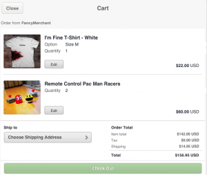
 Further options are available in the sidebar. Users can browse through different categories like Men’s, Food, Art and Gadgets. Besides categories, users can have an overview of the available brands in the app. The sidebar also embodies an “Add” button where any user can upload photos – items he or she considers fancy and wishes to share with the community. The cart is also in the sidebar. Fancy has its own payment methods and shipping. This means that considerable development effort and budget has been dedicated to its software.
Overall, the Fancy App is an interesting mixture of an offline warehouse and a museum/gallery. The basis of this comparison is two-fold. The users can wander through a lot of different categories and explore the items. They can settle to just enjoy, get inspired and share. However, there is also the commercial aspect – users can take a step further and purchase what they see. The experience of this app was positive at the beginning. However, when we started exploring it at a deeper level, we encountered several aspects that raised questions.
Evaluating the app
Our first question was: Who is behind this app and what is their business model? The Ipad App does not include a help or information button, so we decided to explore the website, which could not answer the questions, and then the Wikipedia page. We discovered that Fancy is part of the company Thing Deamon, has more than 100.000 users, raised $10 million and powers more than $10.000 in sales per day.
 This information makes Fancy an app with commercial responsibilities and purposes. This was an aspect we were confused about, because the line between commerciality and pure sociality was quite thin. Accordingly, we were wondering if users really have the opportunity to add products to the home page, or do they only add it to their personal page? Do companies pay for exposure in the app or do they only pay a commission when a product is sold? These questions remained unanswered and showed the intransparency of the app. For example, there was no information for companies to present their services, but only a vague “contact” button. As users, we had some difficulties in creating content. Adding an item seemed very simple. We clicked the “add” button, made a photo of a pen, created a title, put it in a category and that was it. Although, it was unclear what actually happened with the added item. We eventually found it on our personal Fancy page, but was it also sent to the app makers to decide whether or not the item would be useful to present on the homepage?
The same intransparency occurred when we tried to buy an item. The app has its own payment system, where the user fills in personal and card details. What is unusual is the lack of terms of privacy and security. There is also no information about the shipping policy. This might be a real problem, especially if the app was designed to bring revenue alongside with empowering the Fancy brand. As for the customer, it really got us wondering whether users who normally buy on Fancy really take the time to discern how it all functions.
Final rating
 A customer review of an app would not be complete without saying how many stars we think it’s worth.
Do we fancy the Fancy App?
Definitely! The gallery has flawless aesthetics. Exploring and playing with the app is a smooth and engaging experience. The aspect of social networking is well integrated – from the usual social media sharing buttons to actual interaction on the app itself. No wonder users communicate so much: their activity is rewarded with reputation badges and gifts, while they can curate the content and get appreciated for that. Therefore, a 5 star review goes to aesthetics and social sharing.
However, we did not settle for a care-free browsing through the site. The moment we started to questions some mechanisms within the app, it became obvious it has clarity issues. The process of buying is undefined, while the role of a user (as we actually experienced it) seemed to be limited. The thin line between what is commercial or brand-generated and what is user generated makes it even more confusing. Therefore, we would give it a 2 star review in terms of concept and usability clarity.
All in all , we definitely recommend the app. If you’re there for the window-shopping, then you are in for a great experience. Just behave like a good Dutchman: “Kijken, kijken, niet kopen!”
Irina Enache and Jeroen Rademakers
