Usability: Customer service of NS site under the microscope.
 Every year there is a Usability Award for the most user-friendly website. On www.frankwatching.nl (the web guide with tips, trends and events) they place weeks in advance of this award all kinds of interviews with randomly placed nominees. I found an article in which I read that in 2009 the site of the Nederlandse Spoorwegen is in the top five from 129 submitted websites.
Regularly I travel regularly with the NS, I have my students OVcard and can travel for free during weekdays by train. At the weekend however I have to pay if I want to travel by train. You can buy an old fashioned card in the machine, but the modern way is to check in and out with your OV chipcard. You put money on this card, and when you check in and out, they write off money for the trip. Because I more often travel on weekdays than in the weekends, it sometimes happens that I forget to check out. Like last week, on Sunday. Frightened by the rumours of fines that you get when you forget to check out, I became slightly panicked. I knew I could go back to still check out, but because of my appointment, I had no time for that. What to do? I grabbed my laptop and hurried to the site of the NS.
Search, click, incorrectly, back, stress, help, fine! In short great annoyance. Where was the handy usability of this site, that I need so badly? Definition usability: “Usability is the extent to which a product by certain users in a particular user’s environment can be used for certain goals effectively, efficiently and satisfactorily achieve.” Well at this site, this definition certainly didn’t match. After a long search and clicks I came to the conclusion that the NS customer service is closed on Sunday. They couldn’t do anything for me. So I could not avoid my fine.

To answer my questions, I want to test the usability of the NS site. I use a summative evaluation. This means that I will evaluate a finished product (in this case the site of the NS) so maybe in the next version improvements can be made. I will focus on a small part of the site, namely the custumor service.conclusion, I am unhappy about the usability of the site of the Nederlandse Spoorwegen, it is incomplete and thus is not optimal usability. Maybe a quick conclusion. So did a little research, maybe there were more people with this problem. And after this ‘incident’, I am also very curious why the NS was nominated for the Usability Award?
The way to make a site as ‘useful’ as possible, is using usability engineering. Jakob Nielsen is a very famous scientist in this field. He wrote the book “Usability Engineering” and describes it as follows: “to help non-technical people improve the systems so that they are not only error-free but also easier and more pleasant to use, and more efficient.” He is talking about the best way to communicate between a multimedia web application and the user. There are a number of different aspects that you can look at when talking about usability engineering. You can use the ‘usefulness’ of a product the best in two parts. ‘Performance’ and ‘experience’.
The performance is kind of the ‘score’ of the product. There can be different measurements be done to calculate this score. On the basis of “performance-based usability goals”, the product can be tested. These are measurable goals that enhance the usability of the product. The person who designs the product, will try to optimize these goals. With the different results there will be a measured result of the product. According to the book “Interaction Design” from Sharp, Rogers & Preece (2007), there are six usability goals based on performance. These are effectivity, efficiency, safety, utility, learnability and memoralibility.

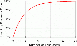
With these six factors, the usability of a product is defined, and I am using these factors to measure the usability of the NS site. It is a realistic situation, so I choose the ‘field study style’. With this style I test what users would do in their natural environment. Through observation and interviews, I try to make a complete picture. For observing I will be recording the test. And for the interviews, I use a cognitive walk-through Questions like “what would you do now” and “why choose this option” are discussed. I choose 5 participants, because according to Nielsen, with this number you will find almost all usability problems. As seen in the figure.
For the full research method and result details, click here.
After the research, it is a lot clearer to me why the website of the Nederlandse Spoorwegen was nominated for the Usability Award 2009. The site has a good score on all six components. And that is with this research in customer service only. Only if the participants get to the use case ‘forget to check out on Sunday’, you see different results in comparison with other use cases. Eventually this use case gave the same result as I had that particular Sunday; confusion and not satisfied at all with the answer by the customer service of the NS. Overall a good evaluation, good predictions and reassuring results.
Of course there are a lot of tips and tricks to improve the usability of your website. And also tips and tricks what you should not do. Here for example ten reasons for bad usability:
Top 10 reasons for bad usability:
1. Too much focus on features and technology
2. Designers and developers thinking in terms of their own personal knowledge
3. Forgetting the question of the user
4. The ultimately responsible has insufficient knowledge
5. Too much focus on quantitative measurement
6. Too much responsible persons in the team
7. Poorly defined objectives
8. User friendly websites aren’t promoted
9. It is known that the website is not user
10. Not see the wood for the trees
Good luck with the usability of your site!