Twitter’s Homepage Evolution
Every website has a history, even though it is sometimes difficult to trace. This history or evolution can tell a lot about the company and it’s goals. Twitter is an example of a website that has encountered many different layout interfaces on it’s welcome homepage. But what do the signs really signify and how do they produce meaning? By using the semiological model of Roland Barthes I will discuss Twitter as a case study to attempt to answer the question: what connotative meaning can be read of Twitters homepage evolution? This case study will examine Twitter’s homepage vizualations of the years: 2006,2008-2012 and will focus mainly upon the text that is found on the homepage because: “Image does not illustrate text, it is the text which amplifies the connotative potential of the image” (p. 96).The different homepage layouts of the years 2006,2008-2011 can be seen by following this link and further on the homepage of 2012 is portrayed. The choice of Twitter as research topic is due to the viewing of a news broadcasting on the dutch RTL news show of October 7th 2012.
Roland Barthes built further upon the work of Ferdinand Saussure to approach popular culture with a methodology of semiology (Storey, 2006 p. 92). Using a secondary signification, Barthes analyzes signs and their connotation to reveal the myth/ideology behind the sign. Yet, having said this, signs have a polysemic nature and therefore have the potential to signify multiple meanings (p. 93). Therefore using this theory to analyze Twitter with, it is only an attempt to understand the main dominant signs and prevailing structures that produces a myth or ideology. In other words, I will focus mainly on the signs that have not changed during this evolution.
The six years of which Twitter has constantly changed it’s layout, it has also maintained certain elements. Having used Wordle as a helping tool, I was able to clearly see which words stayed the same over the course of time.

To start off with, Twitter has kept the signing up button as a main feature on the webpage. Almost always situated on the right side of the homepage, the signing up aspect remains an eye catcher due to also their color usage. Only in 2008 and 2009 did they use the color green to illustrate the sign up button, yet in all the other years (2006, 2010-2012) did they color it as yellow. 
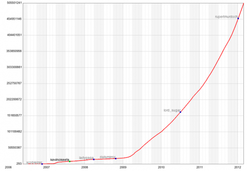
Looking then at the growth chart of Twitters users, their growth is a key element of their success. Therefore the button should of course have an essential role. But can one ask if the role of new members is more important then the current users? Going back to the layout of the homepage, every year until 2010, Twitter incorporated a visualization of other Tweets that were written. Now in 2011 and 2012 this aspect has vanished, there are no example tweets or trending hash tags visible. A possible reading or Parole of this sign, in combination with the extreme rise of users, one can say that this is Twitters capitalist myth/ideology of becoming a larger and dominant company in today’s Social Network era. This may seem as an obvious fact yet: “what allows the reader to consume myth innocently is that he does not see it as a semiological system but as an inductive one…[like a] casual process: the signifier and the signified have a natural relationship” (p. 95). If this myth is being consumed and the focus remains only on new members, Twitter forgets that it is the usage of the members now that creates the hype.
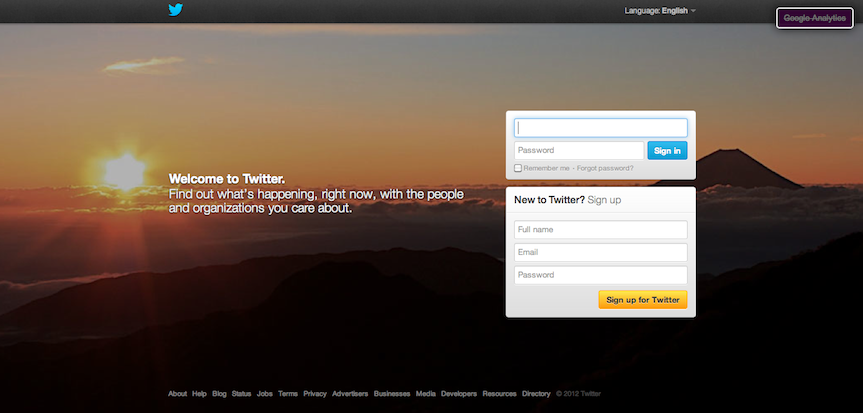
Another interesting aspect of Twitter that stayed in the course of its “evolution”, is the hence on the words global and world, as can be seen in the Wordcloud. Building further upon the claim of Twitters dominant pursue of growth, it is during the same years 2011 and 2012 that twitter has visually emphasized these words. In 2011 Twitter portrayed the world in a blue shade as a background setting for the home page. In 2012, Twitter now uses color photographs of “exotic” areas as their background and therefore leaving the blue coloring. The reason of the explaining word “exotic” is due to the composition and subject choice that is presented in the photo. To take Twitters background of October 2012 as and example, exotic is represented here due to the misty clouds curved around enormous peaking mountains with an endless horizon reaching the sky that is accompanied with a warm orange sun. Not only do the peaking mountains represent a powerful dominating feeling of: (to quote originally Ashford and Simpson) “Aint no mountain high enough” in combination with the endless horizon also symbolizes a future that can only be seen at the top, along with Twitter since that’s where they “are” and how they “look over the world” as there’s to be explored with sign ups.
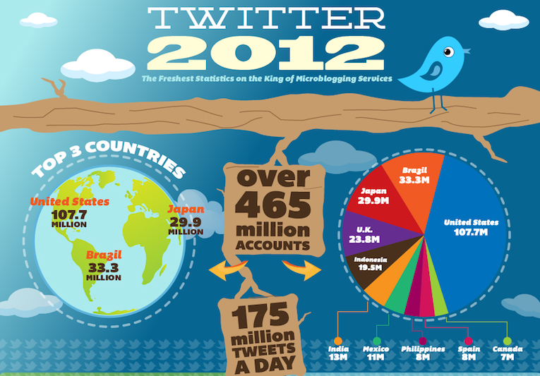
Many different continents have already joined Twitter during there existence as can be seen in the image above. Again to briefly touch back upon the choice of “exotic” as word to explain the Twitter (American company) background of 2012, it also falls into Edward Saids category of Orientalism in which “this flexible positional superiority, which puts the Westerner in a whole series of possible relationships with the Orient without ever losing him the relative upper hand” (Said, 1975 p. 7). In this case the Orient can be seen as every part of the world where Twitter has not yet found new members. Of course I should mention that this is an attempt to perform a methodology of semiology onto Twitter and find the connotation of their signs to reveal their Myth as used by Barthes. “By myth [Barthes] means ideology understood as a body of ideas and practices, which by actively promoting the values and interests of dominant groups in society, defend the prevailing structures of power” (Storey, 2006 p. 93).
To conclude, after having analyzed Twitters homepage evolution two aspects remained the same and found an emphasis when applying a semiological case study. Twitter’s focus on new global members accompanies the myth of a capitalistic power hunger company with a Western view point on there soon to be concurred world/Orient. Again there must be said that this is just one reading of the divers and polysemic nature of signifiers and their signified. Keeping in mind that a reading is also dependent n historical and cultural knowledge and therefore can differ from culture to culture (Storey, 2006 p. 97). But, the fact remains that there is no coincidence for the choice of certain images and texts that together boost each other: “Formerly, there was reduction from text to image; today, there is amplification from one to the other” (p. 96).
Bibliography
Said, Edward. “Orientalism”. New York: Vintage books, 1975.
Storey, John. “Cultural Theory and Popular Culture. An Introduction”. Athens GA: University of Georgie Press, 2006.